项目是用vuecli 2.9构建 用vuecli 3.x的用户自行重构部分代码
MVVM框架:Vue.js (版本2.x)
状态管理:Vuex
前端路由:Vue Router
服务端通讯:axios、jsonp
移动端滚动库:better-scroll
构建工具:webpack 2.0
源码:es6 .
├── README.md
├── build
│ ├── build.js
│ ├── check-versions.js
│ ├── dev-client.js
│ ├── dev-server.js
│ ├── utils.js
│ ├── vue-loader.conf.js
│ ├── webpack.base.conf.js
│ ├── webpack.dev.conf.js
│ └── webpack.prod.conf.js
├── config
│ ├── dev.env.js
│ ├── index.js
│ └── prod.env.js
├── index.html
├── package.json
├── prod.server.js
├── src
│ ├── App.vue
│ ├── api
│ │ ├── config.js
│ │ ├── rank.js
│ │ ├── recommend.js
│ │ ├── search.js
│ │ ├── singer.js
│ │ └── song.js
│ ├── base
│ │ ├── confirm
│ │ │ └── confirm.vue
│ │ ├── listview
│ │ │ └── listview.vue
│ │ ├── loading
│ │ │ ├── loading.gif
│ │ │ └── loading.vue
│ │ ├── no-result
│ │ │ ├── no-result.vue
│ │ │ ├── [email protected]
│ │ │ └── [email protected]
│ │ ├── progress-bar
│ │ │ └── progress-bar.vue
│ │ ├── progress-circle
│ │ │ └── progress-circle.vue
│ │ ├── scroll
│ │ │ └── scroll.vue
│ │ ├── search-box
│ │ │ └── search-box.vue
│ │ ├── search-list
│ │ │ └── search-list.vue
│ │ ├── slider
│ │ │ └── slider.vue
│ │ ├── song-list
│ │ │ ├── [email protected]
│ │ │ ├── [email protected]
│ │ │ ├── [email protected]
│ │ │ ├── [email protected]
│ │ │ ├── song-list.vue
│ │ │ ├── [email protected]
│ │ │ └── [email protected]
│ │ ├── switches
│ │ │ └── switches.vue
│ │ └── top-
│ │ └── top-.vue
│ ├── common
│ │ ├── fonts
│ │ │ ├── music-icon.eot
│ │ │ ├── music-icon.svg
│ │ │ ├── music-icon.ttf
│ │ │ └── music-icon.woff
│ │ ├── image
│ │ │ └── default.png
│ │ ├── js
│ │ │ ├── cache.js
│ │ │ ├── config.js
│ │ │ ├── dom.js
│ │ │ ├── jsonp.js
│ │ │ ├── mixin.js
│ │ │ ├── singer.js
│ │ │ ├── song.js
│ │ │ └── util.js
│ │ └── stylus
│ │ ├── base.styl
│ │ ├── icon.styl
│ │ ├── index.styl
│ │ ├── mixin.styl
│ │ ├── reset.styl
│ │ └── variable.styl
│ ├── components
│ │ ├── add-song
│ │ │ └── add-song.vue
│ │ ├── disc
│ │ │ └── disc.vue
│ │ ├── m-header
│ │ │ ├── [email protected]
│ │ │ ├── [email protected]
│ │ │ └── m-header.vue
│ │ ├── music-list
│ │ │ └── music-list.vue
│ │ ├── player
│ │ │ └── player.vue
│ │ ├── playlist
│ │ │ └── playlist.vue
│ │ ├── rank
│ │ │ └── rank.vue
│ │ ├── recommend
│ │ │ └── recommend.vue
│ │ ├── search
│ │ │ └── search.vue
│ │ ├── singer
│ │ │ └── singer.vue
│ │ ├── singer-detail
│ │ │ └── singer-detail.vue
│ │ ├── suggest
│ │ │ └── suggest.vue
│ │ ├── tab
│ │ │ └── tab.vue
│ │ ├── top-list
│ │ │ └── top-list.vue
│ │ └── user-center
│ │ └── user-center.vue
│ ├── main.js
│ ├── router
│ │ └── index.js
│ └── store
│ ├── actions.js
│ ├── getters.js
│ ├── index.js
│ ├── mutation-types.js
│ ├── mutations.js
│ └── state.js
└── static
├── 1.png
├── 2.png
├── 3.png
├── 4.png
└── 5.png

基础组件
1.confirm:确认对话框组件
2.listview:通讯录列表组件
3.loading:加载态组件
4.no-result:无结果展示组件
5.progress-bar:进度条组件
6.progress-circle:圆形进度条组件
7.scroll:移动端滚动组件
8.search-box:搜索框组件
9.search-list:搜索列表组件
10.slider:轮播图组件
11.switches:开关切换组件
12.top-:顶部消息提示组件
1.  song-list:歌曲列表组件
业务组件
1.add-song:添加歌曲到列表组件
2.disc:歌单详情页组件
3.m-header:页面头部组件
4.music-list:歌曲列表页面组件
5.player:播放器内核组件
6.playlist:播放列表组件
7.rank:排行榜页面组件
8.recommend:推荐页面组件
9.search:搜索页面组件
10.singer:歌手页面组件
11.singer-detail:歌手详情页组件
12.suggest:搜索提示列表组件
13.tab:顶部导航栏组件
14.top-list:排行榜详情页组件
15.user-center:用户中心页组件再开始开发项目之前,你必须要创建项目,并且安装好开发要用的依赖 插件等
- 创建项目
$ vue init webpack XXXXvuecli3 开发 vue create XXXX
- 设计目录结构

- 移动端初始化缩放
<meta
  name="viewport"
  content="width=device-width,initial-scale=1.0 minimum-scale=1.0 maximum-scale=1.0 user-scalable=no"
/>-
初始化样式 并且写好项目要用到的icon 样式 全局样式 背景图调用样式 等
样式和字体图标的 svg 文件建议放在 common 里面

reset.styl
/**
 * Eric Meyer's Reset CSS v2.0 (http://meyerweb.com/eric/tools/css/reset/)
 * http://cssreset.com
 */
html, body, div, span, applet, object, iframe,
h1, h2, h3, h4, h5, h6, p, blockquote, pre,
a, abbr, acronym, address, big, cite, code,
del, dfn, em, img, ins, kbd, q, s, samp,
small, strike, strong, sub, sup, tt, var,
b, u, i, center,
dl, dt, dd, ol, ul, li,
fieldset, form, label, legend,
table, caption, tbody, tfoot, thead, tr, th, td,
article, aside, canvas, details, embed,
figure, figcaption, footer, header,
menu, nav, output, ruby, section, summary,
time, mark, audio, video, input
  margin: 0
  padding: 0
  border: 0
  font-size: 100%
  font-weight: normal
  vertical-align: baseline

/* HTML5 display-role reset for older browsers */
article, aside, details, figcaption, figure,
footer, header, menu, nav, section
  display: block

body
  line-height: 1

blockquote, q
  quotes: none

blockquote:before, blockquote:after,
q:before, q:after
  content: none

table
  border-collapse: collapse
  border-spacing: 0

/* custom */

a
  color: ##7e8c8d
  -webkit-backface-visibility: hidden
  text-decoration: none

li
  list-style: none

body
  -webkit-text-size-adjust: none
  -webkit-tap-highlight-color: rgba(0, 0, 0, 0)
icon.styl
@font-face
  font-family: 'music-icon'
  src: url('../fonts/music-icon.eot?2qevqt')
  src: url('../fonts/music-icon.eot?2qevqt##iefix') format('embedded-opentype'),
          url('../fonts/music-icon.ttf?2qevqt') format('truetype'),
          url('../fonts/music-icon.woff?2qevqt') format('woff'),
          url('../fonts/music-icon.svg?2qevqt##music-icon') format('svg')
  font-weight: normal
  font-style: normal

[class^="icon-"], [class*=" icon-"]
  /* use !important to prevent issues with browser extensions that change fonts */
  font-family: 'music-icon' !important
  speak: none
  font-style: normal
  font-weight: normal
  font-variant: normal
  text-transform: none
  line-height: 1

  /* Better Font Rendering =========== */
  -webkit-font-smoothing: antialiased
  -moz-osx-font-smoothing: grayscale

.icon-ok:before
  content: "\e900"

.icon-close:before
  content: "\e901"

.icon-add:before
  content: "\e902"

.icon-play-mini:before
  content: "\e903"

.icon-playlist:before
  content: "\e904"

.icon-music:before
  content: "\e905"

.icon-search:before
  content: "\e906"

.icon-clear:before
  content: "\e907"

.icon-delete:before
  content: "\e908"

.icon-favorite:before
  content: "\e909"

.icon-not-favorite:before
  content: "\e90a"

.icon-pause:before
  content: "\e90b"

.icon-play:before
  content: "\e90c"

.icon-prev:before
  content: "\e90d"

.icon-loop:before
  content: "\e90e"

.icon-sequence:before
  content: "\e90f"

.icon-random:before
  content: "\e910"

.icon-back:before
  content: "\e911"

.icon-mine:before
  content: "\e912"

.icon-next:before
  content: "\e913"

.icon-dismiss:before
  content: "\e914"

.icon-pause-mini:before
  content: "\e915"
variable.styl
// ! 颜色定义规范
$color-background = ##222
$color-background-d = rgba(0, 0, 0, 0.3)
$color-highlight-background = ##333
$color-dialog-background = ##666
$color-theme = ##ffcd32
$color-theme-d = rgba(255, 205, 49, 0.5)
$color-sub-theme = ##d93f30
$color-text = ##fff
$color-text-d = rgba(255, 255, 255, 0.3)
$color-text-l = rgba(255, 255, 255, 0.5)
$color-text-ll = rgba(255, 255, 255, 0.8)
// !字体定义规范
$font-size-small-s = 10px
$font-size-small = 12px
$font-size-medium = 14px
$font-size-medium-x = 16px
$font-size-large = 18px
$font-size-large-x = 22px
base.styl
@import "variable.styl"

body, html
  line-height: 1
  font-family: 'PingFang SC', 'STHeitiSC-Light', 'Helvetica-Light', arial, sans-serif, 'Droid Sans Fallback'
  user-select: none
  -webkit-tap-highlight-color: transparent
  background: $color-background
  color: $color-text
mixin.styl
// 背景图片
bg-image($url)
  background-image: url($url + "@2x.png")
  @media (-webkit-min-device-pixel-ratio: 3),(min-device-pixel-ratio: 3)
    background-image: url($url + "@3x.png")

// 不换行
no-wrap()
  text-overflow: ellipsis
  overflow: hidden
  white-space: nowrap

// 扩展点击区域
extend-click()
  position: relative
  &:before
    content: ''
    position: absolute
    top: -10px
    left: -10px
    right: -10px
bottom: -10px 发送ajax请求插件: "axios": "^0.16.1",
浏览器兼容性插件: "babel-runtime": "^6.0.0",
滚动屏幕插件:"better-scroll": "^0.1.15",
动画创建插件:"create-keyframe-animation": "^0.1.0",
解决移动端点击延迟300ms插件"fastclick": "^1.0.6",
vuex相关插件"good-storage": "^1.0.1",
"js-base64": "^2.1.9",
网络请求插件:"jsonp": "0.2.1",
"lyric-parser": "^1.0.1",
预处理器:"stylus": "^0.54.7",
"stylus-loader": "^2.5.1",
"vue": "^2.5.2",
懒加载:"vue-lazyload": "1.0.3",
路由:"vue-router": "^3.0.1",
管理状态:"vuex": "^2.3.1"export default new Router({
routes: [{
// 配置默认根路径
path: '/',
redirect: '/Recommend'
}, {
path: '/Recommend',
name: 'Recommend',
component: Recommend
}, {
path: '/rank',
name: 'rank',
component: rank
},
{
path: '/singer',
name: 'singer',
component: singer
},
{
path: '/search',
name: 'search',
component: search
}
]
})
结构代码
<template>
  <div class="m-header">
    <div class="icon"></div>
    <div class="text">Magic music</div>
    <router-link tag="div"
                 class="user"
                 to="#">
      <i class="icon-mine"></i>
    </router-link>
  </div>
</template>
样式代码
.m-header
  position: relative
  height: 44px
  text-align: center
  color: $color-theme
  font-size: 0
  .icon
    display: inline-block
    vertical-align: top
    margin-top: 6px
    margin-right: 9px
    width: 30px
    height: 32px
    bg-image('logo')
    background-size: 30px 32px
  .text
    display: inline-block
    vertical-align: top
    line-height: 44px
    font-size: $font-size-large
  .user
    position: absolute
    right: 0
    top: 0
    .icon-mine
      display: block
      padding: 12px
      font-size: 20px
color: $color-theme实现路由(推荐-歌手-排行-搜索)的切换 并且添加基本样式
代码很简单 所以直接贴
<!-- router-link 组成的tab栏 -->
<template>
  <div class="tab">
    <router-link tag="div"
                 class="tab-item"
                 to="/recommend">
      <span class="tab-link">推荐</span>
    </router-link>
    <router-link tag="div"
                 class="tab-item"
                 to="/singer">
      <span class="tab-link">歌手</span>
    </router-link>
    <router-link tag="div"
                 class="tab-item"
                 to="/rank">
      <span class="tab-link">排行
      </span>
    </router-link>
    <router-link tag="div"
                 class="tab-item"
                 to="/search">
      <span class="tab-link">搜索</span>
    </router-link>
  </div>
</template>

<script>

export default {
  name: 'tab',
  props: [''],
  data () {
    return {

    }
  },

  components: {},

  computed: {},

  beforeMount () { },

  mounted () { },

  methods: {},

  watch: {}

}

</script>
<style lang='stylus' scoped>
@import '~@/common/stylus/variable.styl'
.tab
  display: flex
  height: 44px
  line-height: 44px
  font-size: $font-size-medium
  /* flex布局使得不管屏幕大小如何 四个tab都平均分布 */
  .tab-item
    flex: 1
    text-align: center
    .tab-link
      padding-bottom: 5px
      color: $color-text-l
    &.router-link-active
      .tab-link
        color: $color-theme
        border-bottom: 2px solid $color-theme
</style>
点击路由时显示的样式 vue自动会给路由链接套上一个router-link-active的class,所以只需要给这个选择器下的span添加样式即可 还要实现一个下边框哦
该页面由轮播 推荐歌单页面 歌单详情页面组成
- 使用vue-awesome-swiper第三方插件构成轮播图 轮播模板 相关插件地址 vue-awesome-swiper
<template>
  <div class="recommend">
    <div class="recommend-content">
      <div class="slide-wrapper">
        <swiper :options="swiperOption"
                ref="mySwiper">
          <!-- slides -->
          <swiper-slide v-for="(item,index) of recommends"
                        :key="index">
            <a :href="item.linkUrl">
              <img width="100%"
                   :src="item.picUrl"
                   alt="">
            </a>
          </swiper-slide>
          <!-- Optional controls -->
          <div class="swiper-pagination"
               slot="pagination"></div>
        </swiper>
      </div>
      <div class="recommend-list">
        <h1 class="list-title">热门歌单推荐</h1>
        <ul></ul>
      </div>
    </div>
  </div>
</template>
.....
data () {
    return {
      recommends: [],
      swiperOption: {
        // 使用轮播控制dots 轮回轮播 三秒自动跳转
        pagination: '.swiper-pagination',
        loop: true,
        autoplay: 3000,
        autoplayDisableOnInteraction: false
      }

    }
在使用组件前 最好全局注册

文件目录

书写自定义组件前安装好better-scroll插件 项目依赖
<template>
  <div class="slider"
       ref="slider">
    <div class="slider-group"
         ref="sliderGroup">
      <slot></slot>
    </div>
    <div class="dots">
      <span v-for="(item,index) of dots"
            :key="index"
            :class="{active:currentpageindex===index}"
            class="dots-item">
      </span>
    </div>
  </div>
</template><style lang='stylus' scoped>
@import '~@/common/stylus/variable.styl'
.slider
min-height: 1px
.slider-group
position: relative
overflow: hidden
white-space: nowrap
.slide-item
// * 轮播图slidergroup的样式
float: left
box-sizing: border-box
overflow: hidden
text-align: center
a
display: block
width: 100%
overflow: hidden
text-decoration: none
img
display: block
width: 100%
.dots
position: absolute
top: 130.075px
right: 0
left: 0
bottom: 12px
text-align: center
font-size: 0
height: 8px
.dots-item
display: inline-block
margin: 0 4px
width: 8px
height: 8px
border-radius: 50%
background: $color-text-l
&.active
width: 20px
border-radius: 5px
background: $color-text-ll
</style>
 props: {
    loop: {
      // *循环轮播
      type: Boolean,
      default: true
    },
    autoPlay: {
      // *自动轮播
      type: Boolean,
      default: true
    },
    interval: {
      // *轮播间隔
      type: Number,
      default: 3000
} _setSliderwidth (isResize) {
this.children = this.$refs.sliderGroup.children
// better-scroll 会多复制两份
let width = 0
// 拿到slide宽度
let sliderwidth = this.$refs.slider.clientWidth
// 计算slidegroup的宽度
for (let i = 0; i < this.children.length; i++) {
let child = this.children[i]
// 添加dom样式
addClass(child, 'slide-item')
// child的宽度
child.style.width = sliderwidth + 'px'
// 总宽度
width += sliderwidth
}
if (this.loop && !isResize) {
// 循环切换 width加两倍sliderwidth
width += 2 * sliderwidth
}
// 设置slider-group宽度
this.$refs.sliderGroup.style.width = width + 'px'
}其中为每个slider的children添加样式时采用的是调用模块 ,通过正则表达式判断是否有该class,然后再将class添加到dom上。
模块代码dom.js为
export function hasClass (el, className) {
  let reg = new RegExp('(^|\\s)' + className + '(\\s|$)')
  // 判断是否有class
  return reg.test(el.className)
}

export function addClass (el, className) {
  if (hasClass(el, className)) {
    return
  }
  // 空白间隔开
  let newClass = el.className.split(' ')
  newClass.push(className)
  // 连接成新class
  el.className = newClass.join(' ')
} _initSlider () {
this.slider = new BScroll(this.$refs.slider, {
scrollX: true,
scrollY: false,
// !惯性 循环 轮播间隔 可以点击
momentum: false,
snap: true,
snapLoop: this.loop,
snapThreshold: 0.3,
snapSpeed: 300
}) data () {
return {
dots: [],
currentpageindex: 0
}
},
_initdots () {
this.dots = new Array(this.children.length)
}监听slider的scrollEnd事件 然后获取下标
 // 获取当前下标 滚动派发scrollEnd事件
      this.slider.on('scrollEnd', () => {
        // pageX 当前pageindex
        let pageIndex = this.slider.getCurrentPage().pageX
        if (this.loop) {
          // 默认第一个元素会添加拷贝 所以要减掉一
          pageIndex -= 1
        }
        this.currentpageindex = pageIndex
        if (this.autoPlay) {
          //! 轮播前必须清除 不然跳到第二章图片会stop 然后因为settimeout只执行一次 所以再执行一遍_play()
          clearTimeout(this.timer)
          this._play()
        }
      })
    },
获取到下标后 给dom设置active样式
 <div class="dots">
      <span v-for="(item,index) of dots"
            :key="index"
            :class="{active:currentpageindex===index}"
            class="dots-item">
      </span>
</div>利用better-scroll的goToPage接口实现
_play () {
      let pageIndex = this.currentpageindex + 1
      if (this.loop) {
        pageIndex += 1
      }
      this.timer = setTimeout(() => {
        // x下标 y下标 每个轮播切换动画300ms 设置时间间隔
        this.slider.goToPage(pageIndex, 0, 300)
      }, this.interval)
    }
注意:此时的轮播图轮播到第二张图还是不会继续自动轮播,这是因为slier的autoplay是设置了setTimeout函数 所以必须在初始化时清除掉timer,然后再重新计算一遍,还需要监听到窗口变化然后重新计算宽度,传一个参数控制是否重新计算
  if (this.autoPlay) {
          //! 轮播前必须清除 不然跳到第二章图片会stop 然后因为settimeout只执行一次 所以再执行一遍_play()
          clearTimeout(this.timer)
          this._play()
        }

....
 mounted () {
    setTimeout(() => {
      this._setSliderwidth()
      this._initdots()
      this._initSlider()
      if (this.autoPlay) {
        this._play()
      }
    }, 20)
    // 监听到窗口发生改变就重新计算宽度
    window.addEventListener('resize', () => {
      if (!this.slider) {

      }
      this._setSliderwidth(true)
      this.slider.refresh()
    })
  },
请求recommends是一个异步请求,它加载出资源有延时,所以再slot渲染到父组件前可能recommeds是一个空数组,会导致样式添加失效 解决方法:在slider组件的父dom上绑定v-if控制
   <div v-if="recommends.length"
           class="slider-wrapper">
        <slider>
          <div v-for="(item,index) in recommends"
               :key="index">
            <a :href="item.linkUrl">
              <img :src="item.picUrl"
                   alt="">
            </a>
          </div>
        </slider>
      </div>
综上,slide组件算是完成了,自己写插件组件还是挺爽的,很有利于造轮子的能力提升
dom结构
 <div class="recommend-list"
             ref="recommendscroll">
          <h1 class="list-title">热门歌单推荐</h1>
          <ul>
            <li v-for="(item,index) in recommendsList"
                :key="index"
                class="item">
              <div class="icon">
                <img width="60"
                     height="60"
                     v-lazy="item.imgurl"
                     alt="">
              </div>
              <div class="text">
                <h2 class="name"
                    v-html="item.creator.name"></h2>
                <p class="desc"
                   v-html="item.dissname"></p>
              </div>
            </li>
          </ul>
        </div>
这个recommendList获取的数据不是用jsonp抓取的,而是修改devserve代理,利用axios发送ajax数据获取 代码如下: 首先修改webpac-dev-config.js
// !模拟数据需要引入的依赖
var express = require('express')
var axios = require('axios')
var app = express()
var apiRoutes = express.Router()
app.use('/api', apiRoutes)

  before(app) {
            app.get('api/getRecommendlist', (req, res) => {
                var url = 'https://c.y.qq.com/splcloud/fcgi-bin/fcg_get_diss_by_tag.fcg'
                axios.get(url, {
                    headers: {
                        referer: 'https://c.y.qq.com/',
                        host: 'c.y.qq.com'
                    },
                    params: req.query()

                }).then((response) => {
                  // response是获取到的qq音乐
                  的response
                    res.json(response.data)
                }).catch((e) => {
                    console.log(e)
                })
            })
        }
返回回调获取数据
export function getRecommendlist () {
  const url = '/api/getRecommendlist'
  const data = Object.assign({}, commonParams, {
    platform: 'yqq',
    hostUin: 0,
    sin: 0,
    ein: 29,
    sortId: 5,
    needNewCode: 0,
    categoryId: 10000000,
    rnd: Math.random(),
    format: 'json'
  })
  return axios.get(url, {
    params: data
  }).then((res) => {
    return Promise.resolve(res.data)
  })
}css样式:运用flex布局
 .recommend-list
      .list-title
        height: 65px
        line-height: 65px
        text-align: center
        font-size: $font-size-medium
        color: $color-theme
      .item
        display: flex
        box-sizing: border-box
        align-items: center
        padding: 0 20px 20px 20px
        .icon
          flex: 0 0 60px
          width: 60px
          padding-right: 20px
        .text
          display: flex
          flex-direction: column
          justify-content: center
          flex: 1
          line-height: 20px
          overflow: hidden
          font-size: $font-size-medium
          .name
            margin-bottom: 10px
            color: $color-text
          .desc
color: $color-text-d由于better-scroll组件运用起来太命令化,所以自己动手造轮子 开发scroll组件
 props: {
    probeType: {
      // 监听滚动事件类型
      type: Number,
      default: 1
    },
    click: {
      type: Boolean,
      default: true
    },
    data: {
      type: Array,
      default: null
    }
}, methods: {
_initscroll () {
if (!this.$refs.wrapper) {
return
}
this.scroll = new BSroll(this.$refs.wrapper, {
probeType: this.probeType,
click: this.click
})
},
enable () {
// 启用better-scroll
this.scroll && this.scroll.enable()
},
disable () {
// 启用better-scroll
this.scroll && this.scroll.disable()
},
refresh () {
this.scroll && this.scroll.refresh()
}
},scroll的点击事件会和fastClick的点击冲突,解决办法是在dom的父容器上加一个needsclick的class
watch: {
    data () {
      // 监听到data变化 重新refresh计算高度
      setTimeout(() => {
        this.refresh()
      }, 20)
    }
}使用vue-lazyload插件
// 传入默认图片参数
Vue.use(VueLazyload, {
  loading: require('./common/image/default.png')
})
然后直接在img标签上将:src替换为v-lazy就OK了
解决bug:等待数据渲染dom之后才能重新计算高度 且要等到完全加载再进行计算 示例代码 给image添加load事件
    loadimage () {
      if (!this.checkLoaded) {
        // !图片加载完 重新计算 第一张图片加载就计算高度 后面不需要重新计算
        this.$refs.scroll.refresh()
        this.checkLoaded = true
      }
    }
你通过jsonp拿到的singer数据并不是符合vue调用的jsonp格式 你必须要封装字母表类排序的对象数组

- 定义一个map对象:里面包含了热门歌手list对象(title,items[]),还有歌手list对象(title,items)
let map={
  hot:{
    title:'热门,
    items:[]
  }
}- 创建Singer类,后面需要往items数组中push该对象
export default class Singer{
constructor({id,name}){
  this.id=id
  this.name=name
  this.avtar=`ttps://y.gtimg.cn/music/photo_new/T001R300x300M000${id}.jpg?max_age=2592000`
}
}- 循环遍历,封装数据
  list.forEach((item,index)=>{
    // 热门歌手区
    if(index<10){
      map.hot.items.push(new Singer({
        id:item.Fsinger_mid
        name:item.Fsinger_name
      }))
    }
    // 歌手区
    const key=item.Findex
    if(!map[key]){
      map[key]={
        title:key,
        items:[]
      }
    }
    map[key].items.push(new Singer({
      id:item.Fsinger_mid
      name:item.Fsinger_name
    }))

  })
这样数据就会变成如下形式
以字母顺序排列的map对象

我们只是用map对象盛满了hot对象和map[key]对象,然而vue遍历对象会是一个无序的结果,所以我们还是要将 对象经过过排序装入数组,得到一个满意的对象数组
let hot=[]
let singers=[]
for(let key in map){
  let value=map[key]
  if(value.title.match(/[a-zA-Z]/)){
    // 如果匹配的是字母
    singers.push(value)
  }else if(value.title === '热门'){
    hot.push(value)
  }
}
....
return hot.concat(singers)Get到预期的效果:

- dom结构:通常是scroll>ul>li>h2,ul>li>img,name
 <ul>
      <li v-for="(group,index) in data"
          :key="index"
          class="list-group">
        <h2 class="title">{{group.title}}</h2>
        <ul>
          <li v-for="(item,index) in group.items"
              :key="index"
              class="list-group-item">
            <img v-lazy="item.avatar"
                 class="avatar"
                 alt="">
            <span class="name">{{item.name}}</span>
          </li>
        </ul>

      </li>
</ul>- css样式:listview相对定位,定义容器为当前屏幕,对应的list-group-item是一个flex布局 ,元素垂直居中对齐
.listview
  position: relative
  width: 100%
  height: 100%
  overflow: hidden
  background: $color-background
  .list-group
    padding-bottom: 20px
    .title
      height: 30px
      line-height: 30px
      padding-left: 20px
      font-size: $font-size-small
      color: $color-text-l
      background: $color-highlight-background
    .list-group-item
      display: flex
      align-items: center
      padding: 20px 0 0 30px
      .avatar
        width: 50px
        height: 50px
        border-radius: 50%
      .name
        margin-left: 20px
        color: $color-text-l
font-size: $font-size-medium- 首先索引表里面的数据是需要截取group.title的第一个字符串 所以这里会对数组进行处理
// 计算属性中定义
 shortcutlist () {
      return this.data.map((group) => {
        // *map方法 得到一个经过处理后的数组 热门区 字母索引区 substr拿第一个字符
        return group.title.substr(0, 1)
      })
    }
Array.map(callback)方法是返回一个处理过后的数组, substr(a):取对应下标之后的元素 substr(a,b):取下标为a-b的元素 substring(a):截取对应下标元素 substring(a,b):截取a-b下标的元素
- dom结构
<div class="list-shortcut">
      <ul>
        <li v-for="(item,index) of shortcutlist"
            :key="index"
            class="item"
            :data-index="index"
            @touchStart.stop.prevent="OnshortcutTouchstart"
            @touchStop.stop.prevent="OnshortcutTouchstop">{{item}}</li>
      </ul>

</div>- 对应样式:1.垂直居中 2.绝对定位靠右 3.对应容器样式
  .list-shortcut
    position: absolute
    z-index: 30
    right: 0
    top: 50%
    padding: 20px 0
    text-align: center
    border-radius: 10px
    transform: translateY(-50%)
    background: $color-background-d
    font-family: Helvetica
    .item
      padding: 3px
      line-height: 1
      color: $color-text-l
      font-size: $font-size-small
通常是使一个容器垂直方向居中的做法是: posiition:absolute top:50% margin-top:-height 但是这是在知道容器高度的前提下,我们在不知道元素高度的前提下使用transform平移的方法来进行处理 posiition:absolute top:50% transform:translateY(-50%)

js的touchstart()和touchmove能够有效地帮助实现功能
业务分析
- 获取到右侧索引区域的下标 触发一个touchstart事件
- 封装原先定义好的scroll组件,添加scrollTo和scrollToElemnet事件
- 设置两个ref,分别是scroll父dom和group子dom,调用scrollToElement Api
推荐 推荐封装一个方法来获取dom中的变量的值
dom.js
export function getData(el,name,val){
// shortcut区域定义data-name变量 记录index等属性
  const prefix='data-'
  if(val){
    return el.setAttribute(prefix + name,val)
  }
  return el.getAttribute(prefix + name)
}
获取到了index之后 对scroll组件代理两个滚动方法
methods:{
...
scrollTo(){
  // 通过apply改变this指向为this.scroll这个betterscroll的实例中 其实就是betterscroll的这个方法的参数修改为this.scroll
  this.scroll && this.scrollTo.apply(this.scroll,argument)
}
scrollToElement(){
  this.scroll && this.scrollToElement.apply(this.scroll,argument)
}
}
调用scrollToElement事件
let touchstartindex=getData(el.target,'index')
this.$refs.scorll.scrollToElement(this.$refs.listgroup[touchstartindex])获取touchstart记录的y值和touchmove记录的y值,计算二者之间差值,然后除以锚点的高度[padding+高度],计算出锚点数量,滑动到位置的下标就等于刚开始的touchstart的下标+锚点数量
 onshortcutTouchstart(e){
   let touchstartindex=getData(el.target,'index')
   let firstTouch=e.touches[0]
   this.touch.y1=firstTouch.pageY
   this.touch.startindex=toustartindex
 }
 onshortcutTouchmove(e){
  let firstTouch=e.touched[0]
  this.touch.y2=firstTouch.pageY
  let moveindex=Math.floor((this.touch.y2-this,touch.y1)/18)+parseInt(this.touch.startindex)
  _scrollToElement(moveindex)

 }
此处应该连续滚屏事件 给scroll传一个probeType:3 经过处理后就可以实现滑动右侧索引区域左侧跟着滚动了
业务逻辑
- 首先要监听scroll的scroll事件,然后算出左侧滚屏的位置
- 算出滚屏的位置后,计算出各个group的高度,存入listheight数组中
- 根据这个高度数组,监听scrollY的变化,计算出currentindex的值 就是当前是哪一个title
- 根据currentindex确定是哪一个index需要加高亮的样式
首先要给scroll传入一个listenscroll的boolean变量,然后在初始化的时候确定是否调用监听的事件,然后向父组件传一个scroll事件
props:{
...
listenscroll:{
  type: Boolean,
  default: true
}
methods:{
_initscroll(){
  ...
  if(this.listenscroll){
    let me = this //这里要确保this指向vue实例
    this.scroll.on('scroll',(pos)=>{
      me.$emit('scroll',pos)
    })
  }
}
}
}
注意 定义好后父组件在created钩子中定义listenscroll为true传入子组件
计算这两个高度之前,先想一下为什么要计算出滚屏的高度,和各个group的高度
scrollY:用来计算滚屏的位置,后面通过watch监听这个滚屏的变化就能计算出当前的title
listheight:确定各个group的高度,一个上限 一个下限确定当前的currentindex的值
scroll组件绑定处理scroll事件
@scroll="handlescroll"
methods:{
  handlescroll(pos){
    this.scrollY=pos.y
    // scroll.Y是一个负数 顶部部分是会大于0
  }
}
计算出各个group的高度
_calculateheight(){
  const singerlist=this.$refs.listgroup
  let height=0
  this.listheight.push(height)
  for(let i=0 ;i<singerlist.length;i++){
    let item=singerlist[i].clientHeight
    height+=item
    this.listheight.push(height)
  }
}每当data变化时,重新计算高度
watch:{
  data(){
    setTimeout(()=>{
      this._calculateheight()
    },20)
  }
}
计算currentindex之前,想一下之前做过的外卖项目 之前计算出currentindex是这样做的:
currentindex(){
  for(let i=0;i<this.listheight.length;i++){
    let height1=this.listheight[i]
    let height2=this.listheight[i+1]
    if(!height || (this.scorllY>=height1 && this.scorllY<height2>)){
      return i;
    }
  }
  return 0;
}
但是你会发现,当滚屏滚动到顶部或者底步的时候scrollY的值可能永远取不到那个范围,会出现高亮bug,所以进行进一步改善。
scrollY(newY){
  <!-- 滚屏顶部 -->
  if(newY > 0){
    this.currentindex=0
  }
  // 中间部分
  for(let i=0;i<listheight.length-1;i++){
    let height1 = listHeight[i]
        let height2 = listHeight[i + 1]
        //  listheight的元素比索引表元素多一个 listHeight 0~23 右侧 0~22
        if (-newY >= height1 && -newY < height2) { // !height2表示列表的最后一项
          this.currentindex = i
          this.diff = height2 + newY
          // console.log(this.currentIndex)
          return
        }
  }
  // 底部 由于listgroup的元素比shorcut的元素多一个 所以就应该减去一个
  this.currentindex = listheight.length-2
}
这些工作做完之后,在shortcut上绑定动态样式即可显示高亮
为了达到体验优化的最大化,上下滑动列表固定一个title区块,当数据加载成功时,title的值跟着list滚动而滚动,watch监听能够帮助到你
- 确认业务逻辑(我们要做的就是把fixedtitle显示出来,可以通过计算属性吧fixedtitle内容计算出,然后应用在dom)
dom结构
    <div class="fixedtitle"
         v-show="fixedtitle"
         ref="fixed">
      <h1 class="title">{{fixedtitle}}</h1>
    </div>
.fixedtitle
position: absolute
left: 0
top: 0
width: 100%
.title
height: 30px
line-height: 30px
padding-left: 20px
font-size: $font-size-small
color: $color-text-l
background: $color-highlight-background- 计算出fixedtitle的值,v-show控制显示
computed:{
  fixedtitle(){
    if(this.scrollY>0){
      return ''
    }
    return this.data[this.currentindex]?this.data[this.currentindex].title:''
  }
}
建议 这样显示会有一个小bug,就是当滑动到标题交替处会出现标题重叠的现象,影响体验,可以通过计算出diff距离的大小将上一个title平移上去
// 这里是计算滚动位置距离上限的差值
this.diff=height2+newY
watch:{
diff(newval){
  let fixedTop=(newval > 0 && newcal <titleHeight ) ? newval-titleHight : 0
  if(this.fixedTop === fixedTop){
    return
    // 避免重复计算
  }
  this.fixedTop=fixedTop
  this.$refs.fixed.style.transform='translate3d(0,`${fixedTop}px`,0)'
}
}综上,singer的listview组件开发完成,读者可以借鉴listview里面才用的经验去处理一系列的索引表问题,star别忘了
分析
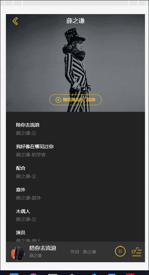
我们拿到的数据里面如下图,歌手详情页面的 hotsongs 是我们想要的数据 name是歌曲名 al专辑相关 ar歌曲演唱的歌手 还有就是歌手名 mvid 等等
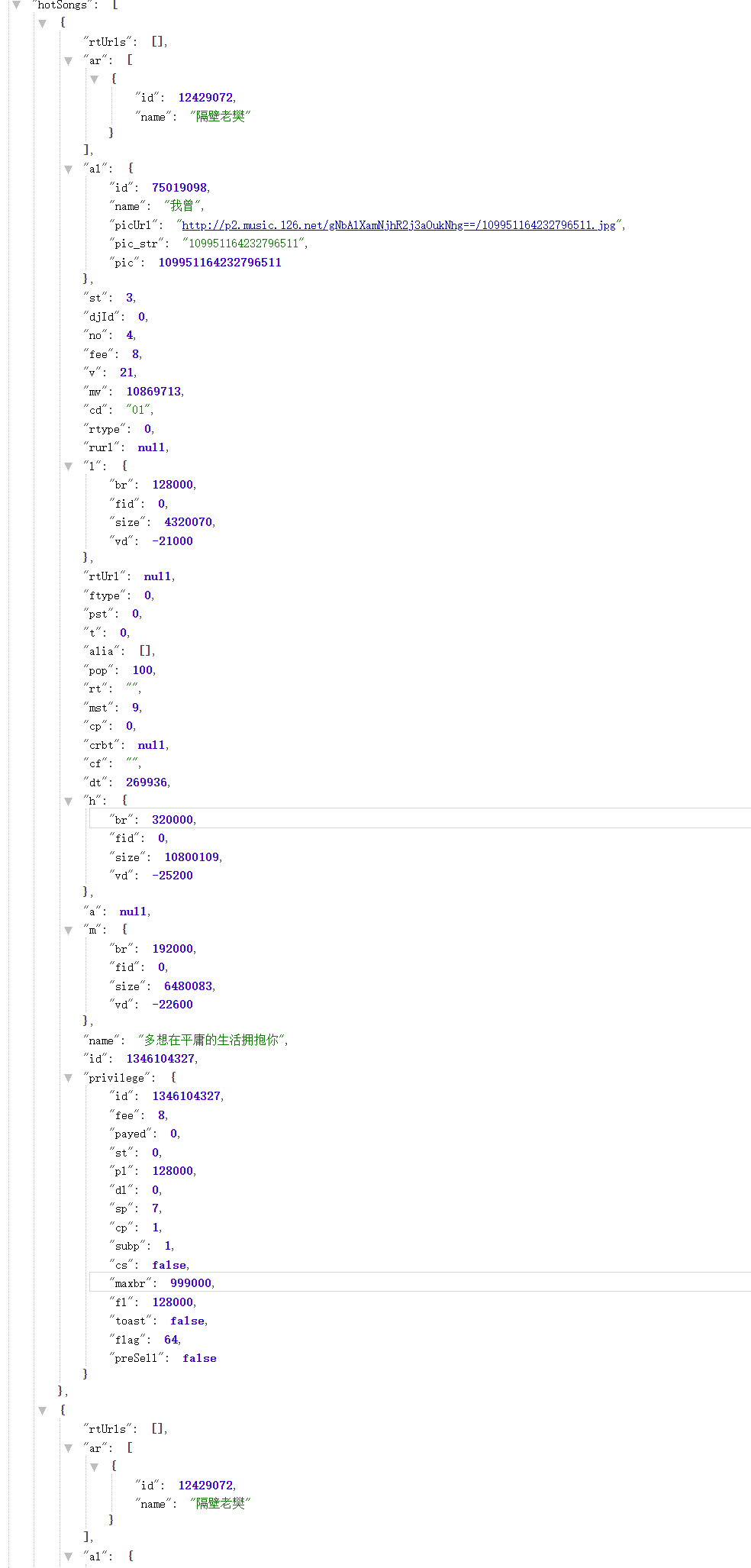
以后遇到这种需要封装数据到一个对象 就应该用工厂模式去实例一个类 然后遍历数据添加对象到初始化数组里即可
创建 song 类
export default class Song {
  constructor({ id, singer, name, album, image, mv }) {
    this.id = id
    this.singer = singer
    this.name = name
    this.album = album
    this.image = image
    this.mv = mv
  }
}
工厂模式创建实例函数
export function createSong(music) {
  return new Song({
    // 根据api修改参数
    id: music.id,
    singer: filterSinger(music.ar),
    name: music.name,
    album: music.al.name, //专辑名
    image: music.al.picUrl,
    mv: music.mv,
  })
}
注意 这里的歌手不止一个,这种情况就定义函数返回一个分隔开歌手数据的数组
function filterSinger(singer) {
  let ret = []
  ret = singer.map((item) => {
    return item.name
  })
  return ret.join('/')
}
事先做好的事情都准备好了,开始处理数据
_normalizeSong(list){
  let ret=[]
  list.forEach((item)=>{
    ret.push(createSong(item))
  })
  return ret
}
## 📣总结
这样就完成了所有的封装数据任务,后续要完成的事情就是利用数据完成 singerDetail 组件,加油!
首先解决上一次开发遗留下的问题:处理 song 数据然后向 list 数组中添加工厂对象 forEach 会报错,原因是请求数据是异步加载 页面刚没渲染 item 就没有值 就会报错
解决办法:
// 定义一个监控data变量
data(){
  return {
    listdetail:[],
    node:null

  }
}
methods:{
  getSingerdetail(this.singer.id).then((res)=>{
    this.node=res.data.hotsongs
  })
},
watch:{
  node(val){
    this.listdetail=this._normalize(val)
  }
}
watch监听到数据把数据置于代理变量中 然后传给子组件 就可以解决异步加载的问题
数据解决完毕后,开发 dom
<template>
  <transition name="change">
    <div class="singer-detail">
      <!-- musiclist音乐列表组件 -->
      <musiclist
        :songs="listdetail"
        :title="title"
        :bgImage="bgimage"
      ></musiclist>
    </div>
  </transition>
</template>
这样点击链接跳转到子路由的太干了,设置一个进场动画
.change-enter-active,.change-leave-active
  transition: all 0.3s
.change-enter,.change-leave-to
  //向由往左划 入场相反
  transform:translate3d(100%,0,0)
由此联想到设置加载中的时候也用到了 translateY 设置居中显示 总结一下页面居中技巧
- 已知元素的宽高,设置元素决定定位居中显示
position:absolute;
top:50%;
left:50%;
margin-left:-50%width
margin-top:-50%height- 未知宽高,设置元素居中
position:absolute;
top:50%
left:50%
transform:translate3d(-50%,-50%,0)- 利用 flex 布局进行垂直居中
display:flex
//横轴
justify-content:center
纵轴
aligin-items:centermusiclist包括back图标 bg-image背景图 filter蒙层 play-wrapper随机播放按钮 songlist歌曲列表组件 loading加载组件
dom 结构
<template>
  <div class="music-list">
    <div class="back" @click="back">
      <i class="icon-back"></i>
    </div>
    <h1 class="title" v-html="title"></h1>
    <div class="bg-image" :style="bgimage" ref="image">
      <div class="filter"></div>
      <div class="play-wrapper" ref="playwrapper" v-show="songs.length">
        <div class="play-button">
          <i class="icon-play"></i>
          <span class="text">随机播放热门歌曲</span>
        </div>
      </div>
    </div>
    <div class="layer" ref="layer"></div>
    <scroll
      :probeType="probetype"
      :listenScroll="true"
      @scroll="scroll"
      :data="songs"
      class="list"
      ref="list"
    >
      <div class="songlist-wrapper">
        <songlist :songs="songs"></songlist>
      </div>
    </scroll>
    <div v-show="!songs.length" class="loading-container">
      <loading></loading>
    </div>
  </div>
</template>.music-list
position:fixed
top:0
right:0
left:0
bottom:0
z-index:100
background-color:$color-background
.back
position:absolute
top 0
left 6px
z-index 50
.icon-back
display block
font-size $font-size-large-x
padding 10px
color $color-theme
.title
position:absolute
top 0
left 10%
width 80%
line-height 40px
font-size $font-size-large
color $color-text
text-align center
z-index 40
no-wrap()
.bg-image
position relative
width 100%
height 0
padding-top 70%
transform-origin top
background-size cover
.play-wrapper
position absolute
bottom 20px
z-index 50
width 100%
.play-button
box-sizing border-box
width 9.685rem
padding 7px 0
margin 0 auto
text-align center
border 1px solid $color-theme
color $color
.icon-play
display inline-block
vertical-align middle
margin-right 6px
font-size $font-size-medium-x
.text
display inline-block
vertical-aligin middle
font-size $font-size-small
.filter
position absolute
top 0
left 0
width 100%
height 100%
background rgba(7,17,27,0.4)
.layer
//除了bg-image的屏幕内容 用于计算高度
position relative
height 100%
background $color-background
.list
position fixed
top 0
bottom 0
width 100%
background $color-background
.songlist-wrapper
padding 20px 30px
.loading-container
position absolute
width 100%
top 60%
transform translateY(-50%)
样式书写完成后,开始书写逻辑部分
- bgimage 用 computed 获取
computed:{
  bgimage() {
    return `background-image:url(${this.bgimage})`
  }
}- soglist 开发
直接贴代码,比较简单
<template>
  <div class="songlist">
    <ul>
      <li v-for="(item, index) in songs" :key="index" class="item">
        <div class="content">
          <h2 class="name">
            {{ item.name }}
          </h2>
          <p class="desc">{{ getdesc(item) }}</p>
        </div>
      </li>
    </ul>
  </div>
</template>

<script>
export default {
  name: 'songlist',
  props: {
    songs: {
      type: Array,
      // default: []
    },
  },
  data() {
    return {}
  },

  components: {},

  computed: {
    desc() {
      return this.songs.singer + this.songs.album
    },
  },

  beforeMount() {},

  mounted() {
    console.log(this.songs)
  },

  methods: {
    getdesc(song) {
      return `${song.singer}-${song.album}`
    },
  },

  watch: {},
}
</script>
<style lang="stylus" scoped>
@import '~@/common/stylus/variable.styl'
@import '~@/common/stylus/mixin.styl'
.songlist
  .item
    font-size: $font-size-medium
    box-sizing: border-box
    align-items: center
    display: flex
    height: 64px
    .content
      line-height: 20px
      overflow: hidden
      .name
        no-wrap()
        color: $color-text
      .desc
        no-wrap()
        margin-top: 4px
        color: $color-text-d
</style>- 滚动 songlist 设置
- 向 scroll 组件传值(listenScroll:true,probeType:3 监听 scroll 事件,data 数据)
data() {
  return {
    proveType:3,
    scrollY:0
  }
},
created(){
  this.listenScroll=true
}-
设置 songlist 滚动到一定位置不动 且文字盖过图片 上面留一个 bg-image 一小部分 实现想法 先发现图片会消失不见 dom 方法获取到 bg-image 的高度 然后给 songlist 设置高度 通过监听到
scroll事件 获取到实时的位置 然后监听scrollY的值 固定最大偏移量 然后监听过程中拿到偏移量 设置layer的向上偏移 layer 的作用(这时需要一个位于歌单列表下方的图层(bg-layer),当歌单列表向上滑动的时候 filter 也跟着向上滑动,盖住下方的图像) 然后 如果到达到顶部(val<translateY)时 设置图像区域的高度为 40px 其他情况就和之前相似 这个过程中 bg-image 的 index 都是 0 如果是顶部位置 就是 10这个讲起来有点复杂 接下来一步一步来
- 监听 scroll
scroll(pos){
  this.scrollY=pos.y
}- 设置图片的高度撑开
mounted() {
  this.imageHeight=this.$refs.image.clientHeight
  //获取组件的dom 后面$el
  this.$refs.list.$el.style.top=`${this.imageHeight}px`
}- layer 偏移一定量 固定不动
this.minTranslateY= -this.imageHeight +TITLE_HEIGHT
watch() {
  scrollY(val){
    let zIndex=0
    let translateY=Math.max(this.minTranslateY,val)
    this.$refs.layer.style['transform']=`translate3d(0,${translateY}px,0)`
    this.$refss.layer.style['webkitTransform']=`translate3d(0,${translate3Y}px,0)`

    if(val < translateY){
      <!-- 顶部 -->
      z-index = 10
      this.$refs.image.style.paddingTop = 0
      this.$refs.image.style.height = '40px'
      this.$refs.playwrapper.style.display='none'
    }else {
      this.$refs.image.style.paddingTop = '7-%'
      this.$refs.image.style.height = 0
      this.$refs.playwrapper.style.display=''
    }
    this.$refs.image.index = zIndex

  }
}- 实现向下拉图片 图片放大效果
let scale=1.0
const present=Math.abs(val / this.imageHeight) //这样就可以是图片层的高度变为1+放大的高度
if(val > 0){
  scale=1 + present
  z-Index = 10
}

····
this.$refs.image.style[`transform`]=`scale(${scale})`
综上 歌手详情页就开发完成 使用到了 scroll 组件 根据高度盖住图层 知道了 index 的重要性 后面开发开发中最难的组件-播放起组件 加油!!
开发前先思考 播放器可能需要这几个数据
- playing 暂停或者播放
- fullScreen 控制播放器是否全屏显示
- playlist 播放列表
- sequenceList 顺序播放模式歌曲列表
- mode 播放模式
- currentIndex 当前播放歌曲的下标(可以通过此下标得到currentSong:state.playlist[state.currentIndex])
OK,我们开始书写vuex相关 定义公共配置 config.js
export const playMode ={
  sequence:0,
  loop:1,
  random:2
}import {playMode} from 'config.js'
const state ={
singer:{},
playing:false,
fullScreen:false,
playlist:[],
sequencelist:[],
mode:playMode.sequence,
currentIndex:-1
}
export default stateexport const SET_PLAYING='SET_PLAYING'
export const SET_FULLSCREEN='SET_FULLSCREEN'
export const SET_PLAYLIST='SET_PLAYLIST'
export const SET_SEQUENCE='SET_SEQUENCE'
export const SET_MODE='SET_MODE'
export const SET_CURRENTINDEX='SET_CURRENTINDEX'const mutations ={
[types.SET_PLAYING](state,flag) {
state.playing=flag
},
[types.SET_FULLSCREEN](state,flag) {
state.fullScreen=flag
},
[types.SET_PLAYLIST](state,list) {
state.playlist=list
},
[types.SET_SEQUENCE](state,list) {
state.sequence=list
},
[types.SET_MODE](state,mode) {
state.mode=mode
},
[types.SETCURRENTINDEX](state,index) {
state.currentIndex=index
}
}
export default mutations+export const playing = state => state.playing
export const fullScreen = state => state.fullScreen
export const playlist = state => state.playlist
export const sequencelist = state => state.sequencelist
export const mode = state => state.mode
export const currentIndex = state => state.currentIndex
export const currentSong = (state) => {
return state.playlist[state.currentIndex] || {}
}基本dom结构
<template>
  <div class="player" v-show="playlist.length">
    <transition name="normal-player">
<div class="normal-player" v-show="fullScreen">
  <!-- 背景图 -->
  <div class="background">
    <img width="100%" height="100%" :src="currentSong.image" alt="">
  </div>
  <!-- 顶部标题 -->
  <div class="top">
    <div class="back" @click="back" >
      <i class="icon-back" ></i>
    </div>
    <h1 class="title" v-html="currentSong.name">
    </h1>
    <h2 class="subtitle" v-html="currentSong.singer" @click="tosinger"></h2>
  </div>
  <!-- 中间部分cd唱片 歌曲歌词 -->
  <div class="middle">
    <div class="middle-l">
      <div class="cd-wrapper">
        <div class="cd" >
          <img class="image" :src="currentSong.image" alt="">
        </div>
        <div class="play-lyric-wrapper">
          <div class="playing-lyric">
          </div>
        </div>
      </div>
    </div>
    <div class="middle-r">
      <div class="lyric-wrapper">
      </div>
    </div>
  </div>
  <!-- 底部进度条 歌曲操作 -->
  <div class="bottom">
    <!-- 滑块条 -->
    <div class="dot-wrapper">
    </div>
    <!-- 进度条 -->
    <div class="progress-wrapper">
      <div class="progress-bar-wrapper"></div>
    </div>
    <!-- 操作区 -->
    <div class="operators">
      <div class="icon i-left">
        <i class="icon-sequence"></i>
      </div>
      <div class="icon i-left">
        <i class="icon-prev"></i>
      </div>
      <div class="icon i-center">
        <i class="icon-play"></i>
      </div>
      <div class="icon i-right">
        <i class="icon-next"></i>
      </div>
      <div class="icon i-right">
        <i class="icon icon-not-favorite"></i>
      </div>
    </div>
  </div>
</div>
 </transition>
 <transition name="min-player">
<div class="mini-player" @click="open" v-show="!fullScreen">
  <div class="image">
    <img class=""  width="40" height="40" :src="currentSong.image"  >
  </div>
  <div class="text">
    <h2 class="name" v-html="currentSong.name"></h2>
    <p class="singername" v-html="currentSong.singer"></p>
  </div>
  <div class="control">
    <i class="icon-mini icon-play-mini"></i>
  </div>
  <div class="control">
    <i class="icon-playlist"></i>
  </div>
</div>
 </transition>
<audio autoplay muted ref="audio" @canplay="getDuration" :src="songsUrl"></audio>
  </div>
</template>
plaer分为全屏播放器和迷你播放器,全屏播放器里面有(模糊背景图 顶层(back图标 歌曲名 歌手名) 中间层(唱片图 歌词区 右划歌词区 进度条 dot区) 底层(操作区)) 迷你播放器(左(歌曲图) 中间(歌曲名 歌手名) 右边(歌曲暂停播放图标 进度 歌曲列表) )
- 迷你播放器flex布局最好,横轴改为纵轴 垂直方向居中 然后中间desc flex:1 其他都分配好宽度最好
- 全屏播放器建议cd和操作区的样式难些 多练习
.player
  .normal-player
    position fixed
    left 0
    right 0
    bottom 0
    top 0
    z-index 150
    background $color-background
    .background
      //高斯模糊背景图
      position absolute
      left 0
      top 0
      width 100%
      height 100%
      z-index -1
      opacity 0.6
      filter:blur(20px)
    .top
      position relative
      margin-bottom 25px
      .back
        position absolute
        left 6px
        top 0
        z-index 50
        .icon-back
          padding 9px
          display block
          font-size $font-size-large-x
          color $color-theme
          transform rotate(-90deg)
      .title
        width 70%
        margin 0 auto
        line-height 40px
        text-align center
        no-wrap()
        font-size #font-size-large
        color $color-text
      .subtitle
        line-height 20px
        text-align center
        font-size $font-size-medium
        color $color-text
    .middle
      position fixed
      wdith 100%
      top 80px
      bottom 170px
      white-space nowrap
      font-size 0
      .middle-l
        display inline-block
        vertical-align top
        position relative
        width 100%
        height 0
        padding 80%
        .cd-wrapepr
          position absolute
          left 10%
          top 0
          width 100%
          height 100%
          .cd
            width 100%
            height 100%
            box-sizing border-box
            border 10px solid rgba(255,255,255,0.1)
            border-radius 50%
            .image
              position absolute
              left 0
              top 0
              width 100%
              height 100%
              border-radius 50%
               .playing-lyric-wrapper
            width: 80%
            margin: 30px auto 0 auto
            overflow: hidden
            text-align: center
            .playing-lyric
              height: 20px
              line-height: 20px
              font-size: $font-size-medium
              color: $color-text-l
        .middle-r
          display: inline-block
          vertical-align: top
          width: 100%
          height: 100%
          overflow: hidden
          .lyric-wrapper
            width: 80%
            margin: 0 auto
            overflow: hidden
            text-align: center
            .text
              line-height: 32px
              color: $color-text-l
              font-size: $font-size-medium
              &.current
                color: $color-text
      .bottom
        position: absolute
        bottom: 50px
        width: 100%
        .dot-wrapper
          text-align: center
          font-size: 0
          .dot
            display: inline-block
            vertical-align: middle
            margin: 0 4px
            width: 8px
            height: 8px
            border-radius: 50%
            background: $color-text-l
            &.active
              width: 20px
              border-radius: 5px
              background: $color-text-ll
        .progress-wrapper
          display: flex
          align-items: center
          width: 80%
          margin: 0px auto
          padding: 10px 0
          .time
            color: $color-text
            font-size: $font-size-small
            flex: 0 0 30px
            line-height: 30px
            width: 30px
            &.time-l
              text-align: left
            &.time-r
              text-align: right
          .progress-bar-wrapper
            flex: 1
        .operators
          display: flex
          align-items: center
          .icon
            flex: 1
            color: $color-theme
            &.disable
              color: $color-theme-d
            i
              font-size: 30px
          .i-left
            text-align: right
          .i-center
            padding: 0 20px
            text-align: center
            i
              font-size: 40px
          .i-right
            text-align: left
          .icon-favorite
            color: $color-sub-theme
      &.normal-enter-active, &.normal-leave-active
        transition: all 0.4s
        .top, .bottom
          transition: all 0.4s cubic-bezier(0.86, 0.18, 0.82, 1.32)
      &.normal-enter, &.normal-leave-to
        opacity: 0
        .top
          transform: translate3d(0, -100px, 0)
        .bottom
          transform: translate3d(0, 100px, 0)
    .mini-player
      display: flex
      align-items: center
      position: fixed
      left: 0
      bottom: 0
      z-index: 180
      width: 100%
      height: 60px
      background: $color-highlight-background
      &.mini-enter-active, &.mini-leave-active
        transition: all 0.4s
      &.mini-enter, &.mini-leave-to
        opacity: 0
      .icon
        flex: 0 0 40px
        width: 40px
        padding: 0 10px 0 20px
        img
          border-radius: 50%
          &.play
            animation: rotate 10s linear infinite
          &.pause
            animation-play-state: paused
      .text
        display: flex
        flex-direction: column
        justify-content: center
        flex: 1
        line-height: 20px
        overflow: hidden
        .name
          margin-bottom: 2px
          no-wrap()
          font-size: $font-size-medium
          color: $color-text
        .desc
          no-wrap()
          font-size: $font-size-small
          color: $color-text-d
      .control
        flex: 0 0 30px
        width: 30px
        padding: 0 10px
        .icon-play-mini, .icon-pause-mini, .icon-playlist
          font-size: 30px
          color: $color-theme-d
        .icon-mini
          font-size: 32px
          position: absolute
          left: 0
          top: 0
在写两个交互动画 打开normal播放器或者mini播放器
.normal-player-enter-active,.normal-player-leave-active
  translate all 0.4s
  .top,.bottom
  //贝赛尔曲线定义环动
    transition all 0.4s cubic-bezier(0.86,0.18,0.82,1.32)
.normal-player-enter,.normal-player-leave-active
  opcity 0
  //定义top初始向上100px bottom初始向下100px 动画自下而上 自上而下 渐隐渐现
  .top
    transform translate3d(0,-100px,0)
  .bottom
    transform translate3d(0,100px,0)

&.min-player-enter-active,&.min-player-leave-active
  transition all 0.4s
&.min-player-enter,&.min-player-leave-active
opcity 0书写完player组件,由于他跟路由没啥关系,而且很多组件会用到,所以定义在app.vue中,莫忘记注册
我们需要控制player的显示与隐藏,不然会盖住singer-detail
computed:{
  ...mapGetters([
    'fullScreen',
    'playlist',
    'currentSong'
  ])
}
 <div class="player" v-show="playlist.length > 0">
 <div class="normal-player" v-show="fullScreen">
 <div class="mini-player" v-show="!fullScreen">
这样就不会默认显示了,接下来我们去写songlist的事件
<ul>
      <li @click="selectItem(song, index)" v-for="(song, index) in songs" :key="index" class="item">
          <div class="content">
              <h2 class="name">{{song.name}}</h2>
              <p class="desc">{{getDesc(song)}}</p>
          </div>
      </li>
    </ul>

  .....
  methods:{
    selectItem(item,index) {
      this.$emit('select',item,index)
    }
  }
父组件music-list接受事件 因为这里我们需要将点击的歌曲信息传入vuex并修改 发现需要修改多个mutation,所以定义action.js
import * as types from './mutations-type'
export const selectPlay = function ({commit, state}, {list, index}) {
  commit(types.SET_SEQUENCE, list)
  commit(types.SET_PLAYLIST, list)
  commit(types.SET_CURRENTINDEX, index)
  commit(types.SET_FULLSCREEN, true)
  commit(types.SET_PLAYING, true)
}
定义好了批量操作 传入数据修改mutation
@select="selectItem"
...
methods:{
  ...mapActions([
    'selectplay'
  ])
  selectItem(item,index) {
  this.selectPlay(
    {
      list:this.songs,
      index
    }
  )

  }
}
接下来取出currentSong 挂到dom上,这里不详细介绍。 我们在点击歌曲后需要将fullScreen置为true,但是不能直接去修改getters的数据,需要进行mutations修改
...mapMutations(
{
  setfullScreen:'SET_FULLSCREEN'
})

methods:{
  back() {
    this.setfullScreen(false)
  }

  play() {
    this.setfullScreen(true)
  }
}
这样就可以图标控制隐藏显示 或者迷你播放器打开 添加点击事件即可 下一节将介绍播放器核心部分
vue的js钩子可以帮助我们实现这个动画
- @enter=""
- @after-enter=""
- @leave=""
- @after-leave=""
首先引入第三方创建动画库create-keyframe-animation
具体思路:
- 计算两个圆心的坐标,根据坐标计算出水平竖直偏移量
- 定义并使用动画
- 清除动画
_getPosAndScale () {
  // * 要做一个大图片从mini播放器飞到大图层cdWrapper的动画 使用到create-keyframe-animation第三方插键
  // ! 思路:1.计算出偏移横纵坐标 2.横轴偏移(屏幕宽度/2-min播放器左侧偏移) 3.纵轴偏移(屏幕高度-大图层paddingTop-min播放器圆心距底部位置-cdwrapper的高度/2) 4.书写动画
  const targetWidth = 40//图片宽度
  const paddingLeft = 40//mini圆心左翩移
  const paddingBottom = 30//底部距圆心距离
  const paddingTop = 80 //顶部距圆心距离
  const width = window.innerWidth * 0.8 //整个cd-wrapper的宽度
  const scale = targetWidth / width//原始缩放比例
   const x = -(window.innerWidth / 2 - paddingLeft)
      const y = window.innerHeight - paddingTop - width / 2 - paddingBottom
      return {
        x,
        y,
        scale
      }

}//import之后
//进入时
enter(el,done) {
const {x,y,scale} =this._getPosAndScale()
// 定义动画
let animation = {
// 底部飞到大图片 然后从60到100 scale先1.1然后回调
0:{
transform:`translate3d(${x}px,${y}px,scale(${scale}))`
},
60: {
transform: `translate3d(0,0,0) scale(1.1)`
},
100: {
transform :`translate3d(0,0,0) scale(1)`
}
}
// 注册animation
animations.registerAnimation({
name:'move',
animation, //定义好的动画
presets: {// 预设参数
duration:400,
easing:'linear'
}
}),
// 运行animation
animations.runAnimation(this.$refs.cdWrapper,'move',done)
}
// 进入后清除
afterEnter () {
// 清除animation
animations.unregisterAnimation('move')
this.$refs.cdWrapper.style.animation = ''
}关闭窗口时 原理也是相似的
leave (el,done) {
  const {x, y, scale} = this._getPosAndScale()
  this.$refs.cdWrapper.style['transform'] = `translate3d(${x}px,${y}px,0) scale(${scale})`
  this.$refs.cdWrapper.style.transition = 'all 0.4s'
  // 监听transitionend事件 之后执行afterLeave
  this.$refs.cdWrapper.addEventListener('transitionend', done)

  //清除transition transform
   afterLeave () {
      this.$refs.cdWrapper.style['transform'] = ''
      this.$refs.cdWrapper.style.transition = ''
    },
这样cd的打开关闭都会有一个效果不错的动画效果
歌曲的播放功能,主要是利用 html5 的 audio 标签实现
<audio
  autoplay
  muted
  ref="audio"
  @canplay="getDuration"
  @error="error"
  :src="songsUrl"
  @timeupdate="UpdateTime"
></audio>由于这个 webapp 使用到的 api 是网易云的 api,所以这里我们需要调用获取歌曲的 url
export function getMusic(musicId) {
  const url = HOST + `/music/url?id=${musicId}`
  return axios.get(url)
}
play 组件里面调用 api
 currentSong (newSong, oldSong) {
  //  如果两首歌曲的id都一样 就不刷新currentSong
      if (newSong.id === oldSong.id) {
        return
      }
      getMusic(this.currentSong.id).then((res) => {
        this.songsUrl = res.data.data[0].url
      })
      // 如果有歌词在播放 这个Lyric对象停止播放
      if (this.currentLyric) {
        this.currentLyric.stop()
      }
      this._getLyric(this.currentSong.id)
},之后当歌曲 ready 的时候,才能点下一首歌,设置一个标志位控制加载成功
data () {
  return {
    songReady: false
  }
}
添加一个@canPlay 函数 当其 songReady 为 true 才能
   getDuration () {
      // 获取到歌曲
      this.duration = this.$refs.audio.duration
      this.songsTime = this.$refs.audio.duration
      // 可以播放 songReady置为true
      this.songReady = true
    }
写好了 songReady 之后,回到 next 和 prev 函数控制歌曲的上一首下一首 点击播放歌曲 togglePlaying()
next () {
  if(!this.songReady) {
    return
  }
  let index = this.currentIndex + 1
  if(index === this.playlist.length) {
    // 当切到最后一首歌
    index = 0
  }
  this.setCurrentIndex(index)
  // 切换到写一首歌时保证播放状态
  if(!this.playing) {
    this.togglePlaying()
    this.songReady = false //重置
  }
....
prev () {
  if(!this.songReady) {
    return
  }
  let index = this.currentIndex - 1
  if(index === -1) {
    // 第一首歌 index切换到最后一首歌的index
    index = this.playlist.length
  }
  this.currentIndex(index)
  if(!this.playing) {
    this.togglePlaying()
    this.songReady = false
  }
}
....
toggleplaying () {
   if (!this.songReady) {
        return
      }
      this.setPlaying(!this.playing)
      if (this.currentLyric) {
        this.currentLyric.togglePlay()
      }
}
}
当按钮不能点击时 就是歌曲没有 songReady 的时候给按钮一个 disable 属性
disableCls () {
  return this.songReady ? '':'disable'
}
播放器进度条 dom
<!-- 进度条 -->
<div class="progress-wrapper">
      <span class="time time-l">{{format(currentTime)}}</span>
      <div class="progress-bar-wrapper">
        <progressbar :currentTime="currentTime" :songsTime="songsTime" :precent="precent" @percentChangeEnd="onProgressBarChange"></progressbar>
      </div>
      <span class="time time-r">{{format(songsTime)}}</span>
    </div>
歌曲在播放时会派发 timeupdate 事件
updateTime (e) {
  this.currentTime = e.target.currentTime
}
但是这个时间是小数点的 需要进行格式化
format (inteval) {
  inteval = inteval | 0
  let minute = inteval /60 | 0
  let second = this._pad(inteval % 60)
  return `${minute}:${second}`
}

// 当秒的字符串长度小于于2 就在前面补0
_pad(num,n=2) {
  let len = num.toString().length
  while(len < 2) {
    num = '0' + num
    len++
  }
  return num
}
调用格式化时间 然后挂在 dom 上
在play组件上的样式flex布局,垂直居中,水平也居中,上下有两个padding 左右span文字对齐方式不同
.progress-wrapper
  display flex
  align-items center
  width 80%
  margin 0 auto
  padding 10px 0
  .time
    color:$color-text
    font-size $font-size-small
    flex 0 0 30px
    line-height 1.875rem
    width 1.875rem
    &.time-l
      text-align left
    &.time-r
      text-align right
  .progress-bar-wrapper
    flex 1
progress-bar 组件
dom 结构:
<template>
  <div class="progress-bar" ref="progressbar" @click="progressClick">
    <!-- 总进度条 -->
    <div class="bar-inner">
      <!-- 进度条左侧 -->
      <div class="progress" ref="progress"></div>
      <!-- 进度条按钮 -->
      <div class="progress-btn-wrapper">
        <div
          class="progress-btn"
          ref="progressbtn"
          @touchstart.prevent="progressTouchStart"
          @touchmove.prevent="progressTouchMove"
          @touchend.prevent="progressTouchEnd"
        ></div>
      </div>
    </div>
  </div>
</template>
进度条样式
.progress-bar
  height 30px
  .bar-inner
    position relative
    top 13px
    height 4px
    background rgba(0,0,0,0.3)
    .progress
      position absolute
      height 100%
      background $color-theme
    .progress-btn-wrapper
      position absolute
      left -8px
      top -13px
      width 30px
      height 30px
      .progress-btn
        position relative
        top 7px
        left 7px
        box-sizing border-box
        wdith 16px
        height 16px
        border 3px solid $color-text
        border-radius 50%
        background $color-theme
对应的效果图
挂到 play.vue 上
<div class="progress-bar-wrapper">
        <progressbar :currentTime="currentTime" :songsTime="songsTime" :precent="precent" @percentChangeEnd="onProgressBarChange"></progressbar>
      </div>
precent 对 progress-bar 组件进度条有用
computed :{
  precent () {
    return this.currentTime / this.songTime
  }
 }
使进度条睡着歌曲进度而改变
watch:{
  currentTime (val) {
    if(val > 0) {
      // 总进度条长度
      const progressTotalWidth =this.$refs.progressbar.clientWidth -16
      // 左侧progress偏移
      cost precentx = val /this.somngTime
      const progressWidth = progressTotalWidth * precentx
      this.$refs.progress.style.width = `${progressWidth}px`
      this.$refs.progressbtn.style[transform] = `translate3d(${progressWidth}px,0,0)`
    }
  }
}
进度条拖拽 实现方法:
- 定义好偏移函数
- 使用 js 的三个钩子(
touchstarttouchmovetouchend) 对进度条实现偏移 - 向外派发事件 将当前 precent 转发到 play 组件
_offset (offsetWidth) {
  this.$refs.progress.style.width = `${offsetWidth}px`
  this.$refs.progressbtn.style[transform] = `translate3d(${offsetWidth}px,0,0)`
}created() {
this.touch = {}
}
// 记录第一次触屏位置 和初始进度条偏移
progressTouchStart (e) {
this.touch.initiated = true
this.touch.startX = e.touches[0].pageX
this.touch.left = this.$refs.progress.clientWidth
},
// 记录拖动偏移量,现在偏移量等于初始偏移量+拖动偏移 但是不能呢个超过进度条的总宽度
progressTouchMove(e) {
if (!this.touch.initiated) {
return
}
const moveWidth = e.touches[0].pageX - this.touch.startX
const offsetWidth = Math.min(this.$refs.progressbar.clientWidth - 16, Math.max(0, this.touch.left + moveWidth))
this._triggerPrecent()
this._offset(offsetWidth)
},
// 初始化为false 将拖动信息转发出去
progressTouchEnd (e) {
this.touch.initiated = false
const barWidth = this.$refs.progressbar.clientWidth-16
const precent = this.$refs.progress.clientWidth / barWidth
this.$emit('percentChangeEnd',precent)
},
_triggerPrecent () {
// 派发当前precent
const progressTotalWidth = this.$refs.progressbar.clientWidth - 16
const precent = this.$refs.progress.clientWidth / progressTotalWidth
this.$emit('precentChange', precent)
}**play 组件上监听转发事件 **
onProgressBarChange (precent) {
  // 控制播放时间
  this.$refs.audio.currentTime = this.songTime * precent
  if(!this.playing) {
    // 如果拖动进度条暂停了 就继续播放
    this.togglePlaying()
  }
  if(this.currentLyric) {
    // 寻找歌词
    this.currentLyric.seek(this.$refs.audio.currentTime * 1000)
  }
}
实现效果图
添加完了拖动事件,接下来添加点击变换进度条事件.
原理也是一样,也是计算 progressgress 偏移和 progressbtn 偏移,然后派发 precent 出去
 // 点击进度条事件
    progressClick (e) {
      //  ! e.pageX 获取到的位置有bug
      const rect = this.$refs.progressbar.getBoundingClientRect()
      // rect.left 元素距离左边的距离
      // e.pageX 点击距离左边的距离
      const offsetWidth = e.pageX - rect.left
      // console.log(rect, e.pageX)
      this._offset(offsetWidth)
      const barWidth = this.$refs.progressbar.clientWidth - 16
      const percent = this.$refs.progress.clientWidth / barWidth
      this.$emit('percentChangeEnd', percent)
    },
bug
此处如果直接使用 e.pageX 记录元素距左边的位置会有 bug,我们这里使用 getBoundClientRect()相对视口位置 bar 相对浏览器的左侧视口位置 偏移量就等于 e.pageX-rect
这样我们就完成了进度条的点击和拖拽进度效果
接着我们要给 min-player 也制作一个圆形播放进度条效果
同样我们创建 progress-circle 基础组件
<template>
  <div class="progresscircle">
    <!-- wdith height 是svg圈的大小 stroke-dasharray是描边总周长 dashOffset描边偏移量  -->
    <svg
      :width="radius"
      :height="radius"
      viewBox="0 0 100 100"
      version="1.1"
      xmlns="http://www.w3.org/2000/svg"
    >
      <circle
        class="progress-background"
        r="50"
        cx="50"
        cy="50"
        fill="transparent"
      />
      <circle
        class="progress-bar"
        r="50"
        cx="50"
        cy="50"
        fill="transparent"
        :stroke-dasharray="dashArray"
        :stroke-dashoffset="dashOffset"
      />
    </svg>
    <slot></slot>
  </div>
</template>

<script>
export default {
  name: 'progresscircle',
  props: {
    radius: {
      type: Number,
      default: 100
    },
    precent: {
      type: Number,
      default: 0
    }
  },
  data() {
    return {
      dashArray: 314
    }
  },

  components: {},

  computed: {
    dashOffset() {
      return (1 - this.precent) * this.dashArray
    }
  },

  beforeMount() {},

  mounted() {},

  methods: {},

  watch: {}
}
</script>
<style lang="stylus" scoped>
@import '~@/common/stylus/variable.styl'
 .progresscircle
    position: relative
    circle
      stroke-width: 6px
      transform-origin: center
      &.progress-background
        transform: scale(0.9)
        stroke: $color-theme-d
      &.progress-bar
        transform: scale(0.9) rotate(-90deg)
        stroke: $color-theme
</style>- radius radius 用来控制 svg 图的宽高 我们这里 radius 传入 32
- precent svg 图下 progress-bar 有两个参数
- stroke-dasharray描边周长 这里应该是 314(23.1450)
- stroke-dashoffset 外层有颜色描边的长度 这里我们用(1-precent)*dasharray 来表示当前进度
一开始播放模式我们是写死的 icon,接下来就不用写死了
<div class="icon i-left" @click="changeMode">
        <i :class="iconMode" ></i>
      </div>
.... iconMode () { return this.mode === playMode.sequence ? 'icon-sequence' :
this.mode === playMode.loop ? 'icon-loop' : 'icon-random' }
更换模式的实现,模式以共有三种所以我们设置模式 3 个里面循环
changeMode () {
  const mode = (this.mode + 1)%3
  this.setMode(mode)
  let list =null
  if(this..mode === playMode.random) {
    list = shuffle(this.sequencelist)
     this.resetCurrentIndex(list)
        this.setsplaylist(list)
  }else {
        list = this.sequencelist
        this.resetCurrentIndex(list)
        this.setsplaylist(list)
      }
}

.....
洗牌函数(遍历数组用array[i]去和随机的min到max下标的数祖元素去交换 这样数组就会很乱)

function getRandomInt(min,max){
  // 保证取到min-max的随机数
  return Math.floor(Math.random()*(max - min + 1) + min)
}
function shuffle(arr){
  let _arr = arr.slice()
  for(let i= 0; i<_arr.length;i++){
    let j= getRandomInt(0,i)
    let t = _arr[i]
    _arr[i] = _arr[j]
    _arr[j] = t
  }
  return _arr
}
注意 这里用到的定义的两个方法
resetCurrentIndex(list){
// 找到当前歌曲id相同的list元素索引 这样歌曲就不会再切换了模式之后 list改变 currentSong改变 当前歌曲被切换了
let index1 = list.finIndex((item)=>{
  return itlem.id === this.currentSong.id
})
this.setCurrentindex(index1)
}

// 然后我们在监听currentSong时这样去写
currentSong(newSomng,oldSong){
  if(newSong.id === oldSong.id){
    return
  }
}- 歌曲播放到末尾 自动切换下一首
// 监听ended事件
 End () {
      if (this.mode === playMode.loop) {
        this.loop()
      } else {
        this.next()
      }
}- 循环播放模式设置
loop() {
  setTimeout(()=>{
    this.$refs.audio.currentTime = 0
    this.$refs.audio.play()
  },1000)
  if(this.currentLyric) {
    this.currentLyric,seek(0)
  }
}- 实现封面随机播放
// 添加点击事件
random() {
  this.randomPlay({
    list:this.songs
  })
}


// 这里需要设置actions
export const randomPlay = function ({commit}, {list}) {
  commit(types.SET_PLAY_MODE, playMode.random)
  commit(types.SET_SEQUENCE, list)
  let randomlist = shuffle(list)
  commit(types.SET_CURRENTINDEX, 0)
  commit(types.SET_PLAYLIST, randomlist)
  commit(types.SET_FULLSCREEN, true)
  commit(types.SET_PLAYING, true)
}获取歌词部分
import axios from 'axios'
export function getLyric(id) {
  const url = `http://neteasemusic.yangxiansheng.top/lyric?id=${id}`
  return axios.get(url)
}
methods 里面定义好获取歌词方法
 _getLyric (id) {
      getLyric(id).then((res) => {
        // 调用第三方库 将currentLyric转化为一个time-text对象
        this.currentLyric = new Lyric(res.data.lrc.lyric, this.handleLyric)
        if (this.playing) {
          this.currentLyric.play()
        }
      })
    },
这里使用到了第三方库
Lyric-parser这个插件的作用就是讲 currentLyric 转化为一个 time-text 对象 便于使用
在 watch 里面监听 currentSong 调用
currentSong(newSong,oldSong) {
  if(newSong.id === oldSong.id) {
    return
  }
  getMusic(this.currentSong.id).then((res)=>{
    this.songurl= res.data.data[0].url
  })
  if(this.currentSong.id) {
    this.currentLyric.stop()
  }
  this._getLyric(this.currentSong.id)
}
这样就可以实现歌词的自动跳转
我们要实现歌词到了第五行后面自动向下滚动
handleLyric({lineNum,txt}) {
  // 当前行
  this.currentLineNum = lineNum
  if(lineNum > 5){
    let LineEl = this.$refs.lyricLine[lineNum-5]
    this.$refs.lyricList.scrollToElement(LineEl,500)
  }else{
    this.$refs.lyricList.scrollTo(0,0,1000)
  }
  // 记录歌词
  this.currentLyrictxt = txt
}
实现歌词左右滑动 切换(同样使用到了 touch 事件)
<Scroll
  class="middle-r"
  ref="lyricList"
  :data="currentLyric && currentLyric.lines"
>
<div class="lyric-wrapper">
  <div v-if="currentLyric">
    <p ref="lyricLine"
        class="text"
        :class="{'current':currentLineNum === index}"
        v-for="(line,index) in currentLyric.lines" :key="index">{{line.txt}}</p>
  </div>
</div>
</Scroll>
滑动处理
    midleTouchStart (e) {
      // 设置标志位已经初始化
      this.touch.initiated = true
      this.touch.startX = e.touches[0].pageX
      this.touch.startY = e.touches[0].pageY
    },
    midleTouchMove (e) {
      if (!this.touch.initiated) {
        return
      }
      // 拿到差值
      const deltaX = e.touches[0].pageX - this.touch.startX
      const deltaY = e.touches[0].pageY - this.touch.startY
      // 歌词纵向滚动 当纵向偏移大于左右偏移的时候 我们不应该左右移动
      if (Math.abs(deltaY) > Math.abs(deltaX)) {
        return
      }
      // 拿到滚动过程中middle-r距离左右两侧的屏幕的差值
      const left = this.currentShow === 'cd' ? 0 : -window.innerWidth
      const offsetWidth = Math.min(0, Math.max(-window.innerWidth, left + deltaX))
      this.touch.percent = Math.abs(offsetWidth / window.innerWidth)
      // lyricList是一个Vue(scroll)组件,是无法直接造作它的dom的,用$el来代替它的dom
      this.$refs.lyricList.$el.style[transform] = `translate3d(${offsetWidth}px,0,0)`
      this.$refs.lyricList.$el.style[transitionDuration] = 0
      // 透明度的渐变
      this.$refs.middleL.style.opacity = 1 - this.touch.percent
      this.$refs.middleL.style[transitionDuration] = 0
    },
    middleTouchEnd () {
      // 用来决定停在哪个位置
      let offsetWidth
      let opacity
      if (this.currentShow === 'cd') {
        // 从右向左滑,只需要滑10%就行
        if (this.touch.percent > 0.1) {
          offsetWidth = -window.innerWidth // 最终停止的位置
          opacity = 0
          this.currentShow = 'lyric' // 改变dot的css样式
        } else {
          offsetWidth = 0 // 否则就回到原来的位置
          opacity = 1
        }
      } else { // 从右向左滑,看的是0.9
        if (this.touch.percent < 0.9) {
          offsetWidth = 0
          this.currentShow = 'cd'
          opacity = 1
        } else {
          offsetWidth = -window.innerWidth
          opacity = 0
        }
      }
dot区域
    <div class="dot-wrapper">
    <span class="dot" :class="{'active':currentShow === 'cd'}"></span>
    <span class="dot" :class="{'active':currentShow === 'lyric'}"></span>
    </div>
后面发现一个问题 就是iphone无法播放出声音,这是因为iphone设备或者微信浏览器对用户流量进行监控 不允许用户在浏览器上对audio进行播放 对此我采用了监听touchstart事件对audio标签进行播放
 firstPlay () {
      this.$refs.audio.play()
},我们发现实现后的滚动条的组件 滚动到底部几乎不能被看到,这是因为背mini播放器阻挡住了,所以我们需要给这些组件的scroll重新refresh,然后给组件设置mini播放器高的bottom
通过mixin的方式引入代码到组件是一个很方便的方法,这些代码会被复用,然后merge到组件的原来的钩子上import {mapGetters} from 'vuex'
export const playlistMixin ={
computed:{
...mapGetters([
'playlist'
])
},
mounted() {
this.handlePlaylist(this.playlist)
},
// keep-alive的方法
activated () {
this.handlePlaylistMixin(this.playlist)
},
watch:{
playlist(newval){
this.handlePlaylist(newval)
}
},
methods:{
handlePlaylist() {
thorw new Error(' methods must be define')
}
}
}综上,播放器组件全部写完,里面包含了player组件 progress-bar组件 progress-circle组件,使用到了vuex实现状态管理,学习到了样式处理 播放状态管理 以及模式切换涉及到的知识等等,接下来就是开发榜单组件,加油~~~
附上效果图

 React
React
 Typescript
 Django
 Laravel
 Facebook
 Microsoft
 Google
 Alibaba
 D3
D3
 Tencent