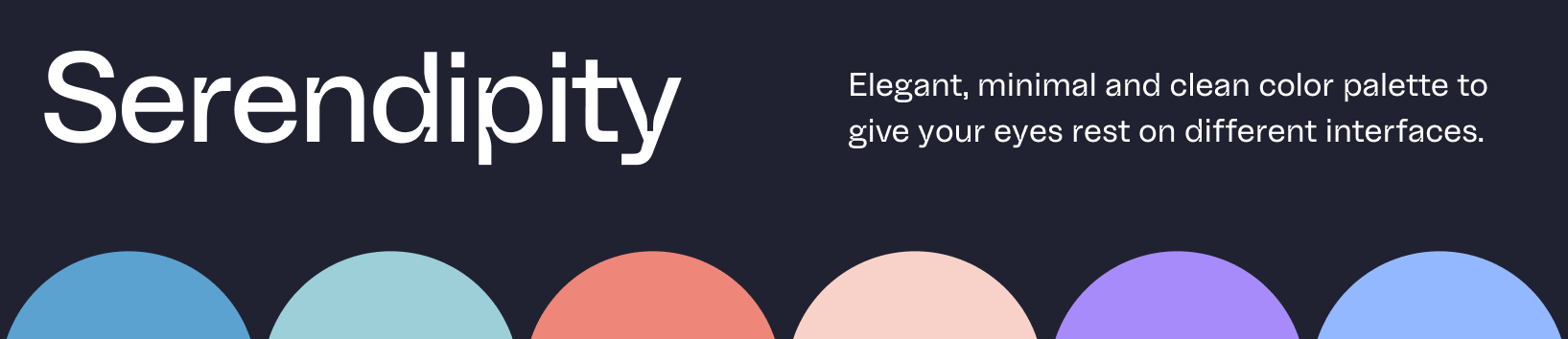
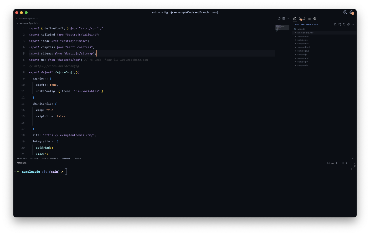
The color palette is designed to be easy on the eyes, with enough contrast to make individual elements distinguishable but not so bright as to be jarring in a darkened coding environment.
See other interfaces at the official website.
- Open Extensions sidebar panel in VS Code.
View → Extensions - Search for
Serendipity - Click Install to install it.
- Code > Preferences > Color Theme > Serendipity Midnight - Serendipity Sunset - Serendipity Morning - Serendipity Electric
The theme is available for editors, shells, UI's and more coming up.
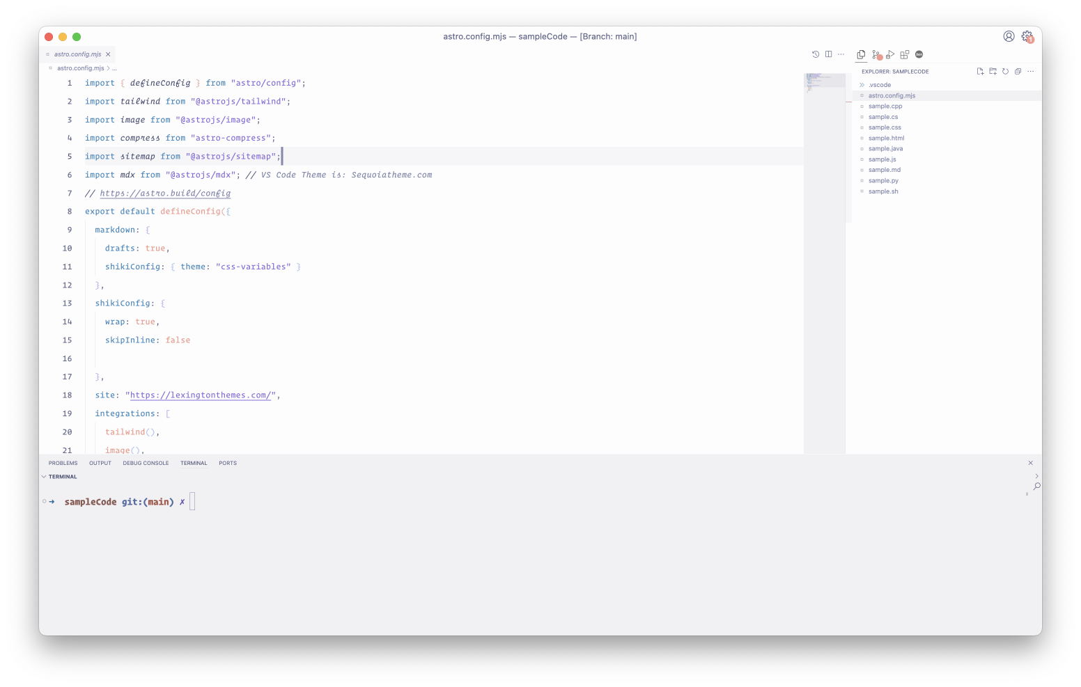
- Light Morning
- Dark Sunset
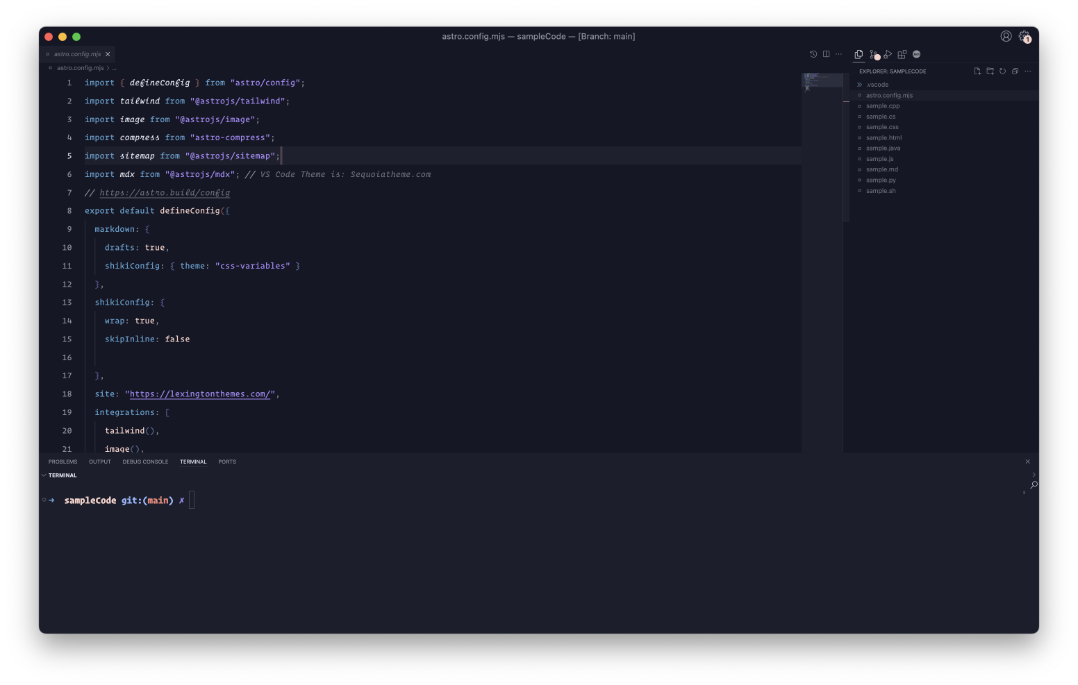
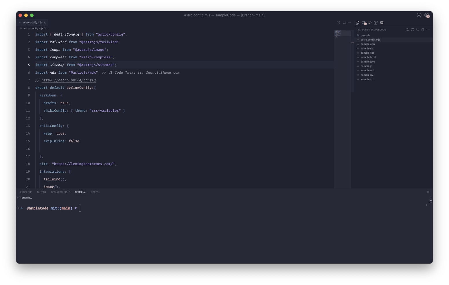
- Dark Midnight
- Dark Electric
Only for VS code — This version is a remixed version of the original theme is and adpated version to Serendipity V2 and using V1 color scopes.
A super simple set of four super hyper mega cool icons for file, folder, open folder and special files.
![]()
{

  "editor.fontFamily": "'Operator Mono', monospace",
  "editor.fontSize": 18,
  "editor.lineHeight": 38,
  "editor.letterSpacing": 0.5,
  "files.trimTrailingWhitespace": true,
  "editor.fontWeight": "normal",
  "prettier.eslintIntegration": true,
  "editor.cursorStyle": "line",
  "editor.cursorWidth": 5,
  "editor.cursorBlinking": "phase",
  "editor.renderWhitespace": "all",
}
All themes use italics for certain language tokens by default.
To disable italics for all themes, add this snippet to your settings.json:
- quotes and italic strings (like in markdown) will be unaffected and still be italic
- if you want to exclude one of the themes from this change, simply remove its name (along with the brackets
[]) at the top of the snippet
"editor.tokenColorCustomizations": {
  "[Serendipity Morning][Serendipity Sunset][Serendipity Midnight]": {
    "textMateRules": [
      {
        "scope": [
          "comment",
          "variable",
          "variable.other.object.js",
          "variable.other.object.property",
          "variable.language",
          "punctuation.accessor",
          "markup.changed",
          "markup.deleted.diff",
          "markup.inserted.diff",
          "keyword",
          "keyword.operator.relational",
          "keyword.operator.comparison",
          "keyword.control.flow.js",
          "keyword.control.flow.ts",
          "keyword.control.flow.tsx",
          "keyword.control.ruby",
          "keyword.control.module.ruby",
          "keyword.control.class.ruby",
          "keyword.control.def.ruby",
          "keyword.control.loop.js",
          "keyword.control.loop.ts",
          "keyword.control.import.js",
          "keyword.control.import.ts",
          "keyword.control.import.tsx",
          "keyword.control.from.js",
          "keyword.control.from.ts",
          "keyword.control.from.tsx",
          "keyword.operator.instanceof.js",
          "keyword.operator.expression.instanceof.ts",
          "keyword.operator.expression.instanceof.tsx",
          "support.constant",
          "support.function",
          "entity.other.attribute-name",
          "entity.other.inherited-class",
          "entity.name.function",
          "entity.name.tag.doctype",
          "entity.name.function",
          "meta.directive.vue",
          "meta.diff.header.git",
          "meta.diff.header.from-file",
          "meta.diff.header.to-file",
          "meta.var.expr",
          "meta.delimiter.period",
          "meta.selector",
          "meta.tag.sgml.doctype",
          "meta.tag.sgml.doctype.html",
          "meta.class meta.method.declaration meta.var.expr storage.type.js",
          "storage",
          "storage.type.property.js",
          "storage.type.property.ts",
          "storage.type.property.tsx",
          "source.elixir .punctuation.binary.elixir",
          "source.go keyword.package.go",
          "source.go keyword.import.go",
          "source.go keyword.function.go",
          "source.go keyword.type.go",
          "source.go keyword.struct.go",
          "source.go keyword.interface.go",
          "source.go keyword.const.go",
          "source.go keyword.var.go",
          "source.go keyword.map.go",
          "source.go keyword.channel.go",
          "source.go keyword.control.go",
          "string.quoted.docstring.multi.python",
        ],
        "settings": {
          "fontStyle": ""
        },
      },
    ],
  },
},
Serendipity Theme created by Micheal Andreuzza. Twitter