Greenhouse provides a set of functions for defining CSS styles in Clojure using the Garden syntax. It's primary feature for the moment is a lightweight grid system that dynamically computes column and gutter sizes. By generating these values on the fly rather than using statically defined classes like in bootstrap you are not restricted to any fixed number of columns, and you don't need to include lots of superfluous nested divs.
Add the following dependency to your project.clj file:

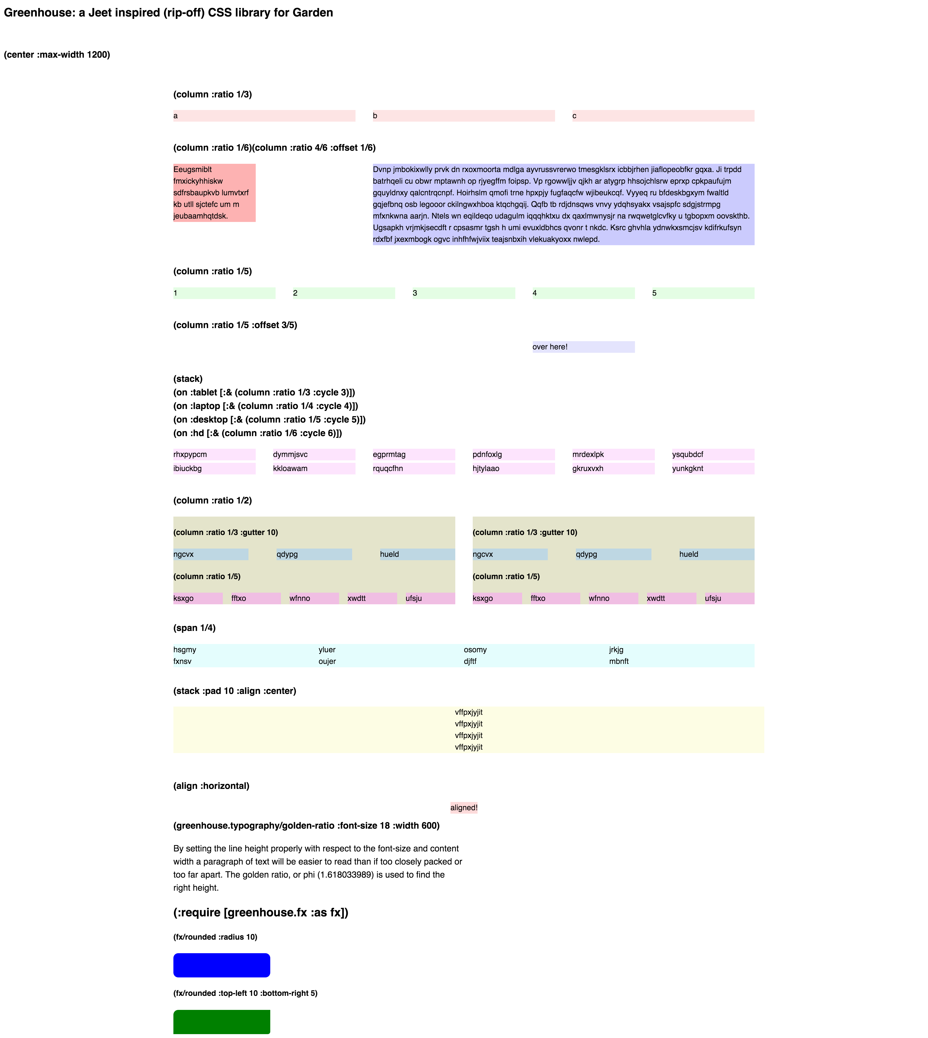
Checkout the screenshot at the bottom of this page, or run the demo, in order to visually see examples of the different layout tools included.
Then add the necessary namespaces to your require form:
(ns greenhouse.demo.core
  (:require
    [garden.def :refer [defstyles]]
    [garden.units :as u :refer [px pt em percent]]
    [garden.color :as color :refer [hsl rgba]]
    [greenhouse.grid :refer [column span clearfix center stack align on]]
    [greenhouse.typography :refer [golden-ratio]]
[greenhouse.fx :as fx]))Use the column function to create a column of a particular size, which by
default also has gutters of 3% width. To create a three column layout in
thirds you would use this hiccup:
[:div.thirds
     [:div "a"]
     [:div "b"]
     [:div "c"]]
and this garden style:
[:div.thirds
  [:div
    (column :ratio 1/3)]]
Using the offset argument to column you can shift a column over, so
a sidebar and content layout could look like this:
[:div.uneven
     [:div.sidebar (rand-sentence 10)]
     [:div.content (rand-paragraph 2)]]
with the corresponding style:
[:div.uneven
    [:div.sidebar
     (column :ratio 1/6)]
    [:div.content
     (column :ratio 4/6 :offset 1/6)]]
You can create flexible grid layouts that automatically flow across grid rows
and dynamically adjust based on the screen width using the :cycle argument to
column, optionally paired with the (on <device> ...) form to set
media query breakpoints.
Here we create 12 divs.
[:div.cycling
     (repeatedly 12 (fn [] [:div (rand-string 8)]))]
And then set them up in different numbers of columns depending on the screen
size. Also note the stack function (which has a corresponding
unstack) which can be used to stack divs vertically. In this case we
stack by default (mobile first), but expand into multiple columns as screen
space permits.
[:div.cycling
    [:div
     (stack)
     (on :tablet
         [:& (column :ratio 1/3 :cycle 3)])
     (on :laptop
         [:& (column :ratio 1/4 :cycle 4)])
     (on :desktop
         [:& (column :ratio 1/5 :cycle 5)])
     (on :hd
         [:& (column :ratio 1/6 :cycle 6)])]]
The span function works just like column, except it does not use gutters.
Lines of text are ideally spaced using the line-height CSS property based on the
font size and width. The golden-ratio function is a little helper to
compute the ideal line-height for you. So a paragraph like this:
[:div.golden
     "By setting the line height properly with respect to the font-size and content width a
     paragraph of text will be easier to read than if too closely packed or too far apart.
     The golden ratio, or phi (1.618033989) is used to find the right height."]
Can be nicely styled like this:
[:div.golden
(golden-ratio :font-size 18 :width 600)]To view the demo and documentation page do this:
lein garden once
lein cljsbuild once
lein run
Now open localhost:3000
It should produce a page like this:


 React
React
 Typescript
 Django
 Laravel
 Facebook
 Microsoft
 Google
 Alibaba
 D3
D3
 Tencent