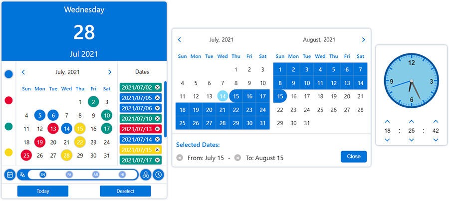
Simple React datepicker component for working with gregorian, persian, arabic and indian calendars
with the ability to select the date in single, multiple, range and multiple range modes.

You can change the appearance of the datepicker to prime or mobile by importing css files from the styles folder.

Ability to further customize the calendar and datepicker by adding one or more plugins.
npm i react-multi-date-picker
import React, { useState } from "react";
import DatePicker from "react-multi-date-picker";

export default function Example() {
  const [value, setValue] = useState(new Date());

  return <DatePicker value={value} onChange={setValue} />;
}<!DOCTYPE html>
<html>
<head>
<meta charset="UTF-8" />
<title>React Multi Date Picker</title>
</head>
<body>
<span>Calendar Example :</span>
<div id="calendar"></div>
<span>DatePicker Example :</span>
<div id="datePicker"></div>
<span>Plugins Example :</span>
<div id="datePickerWithPlugin"></div>
<!-- Ract -->
<script src="https://unpkg.com/react@17/umd/react.production.min.js"></script>
<script src="https://unpkg.com/react-dom@17/umd/react-dom.production.min.js"></script>
<!-- DatePicker and dependencies-->
<script src="https://cdn.jsdelivr.net/npm/date-object@latest/dist/umd/date-object.min.js"></script>
<script src="https://cdn.jsdelivr.net/npm/react-element-popper@latest/build/browser.min.js"></script>
<script src="https://cdn.jsdelivr.net/npm/react-multi-date-picker@latest/build/browser.min.js"></script>
<!-- Optional Plugin -->
<script src="https://cdn.jsdelivr.net/npm/react-multi-date-picker@latest/build/date_picker_header.browser.js"></script>
<script>
const { DatePicker, Calendar } = ReactMultiDatePicker;
ReactDOM.render(
React.createElement(Calendar),
document.getElementById("calendar")
);
ReactDOM.render(
React.createElement(DatePicker),
document.getElementById("datePicker")
);
ReactDOM.render(
React.createElement(DatePicker, {
plugins: [React.createElement(DatePickerHeader)],
}),
document.getElementById("datePickerWithPlugin")
);
</script>
</body>
</html>| Name | Type | Default | Availability (DatePicker/ Calendar) |
|---|---|---|---|
| value | Date, DateObject , String, Number or Array | new Date() | both |
| ref | React.RefObject | both | |
| multiple | Boolean | false (true if value is Array) | both |
| range | Boolean | false | both |
| onlyMonthPicker | Boolean | false | both |
| onlyYearPicker | Boolean | false | both |
| format | String | YYYY/MM/DD | both |
| formattingIgnoreList | Array | both | |
| calendar | Object | gregorian | both |
| locale | Object | gregorian_en | both |
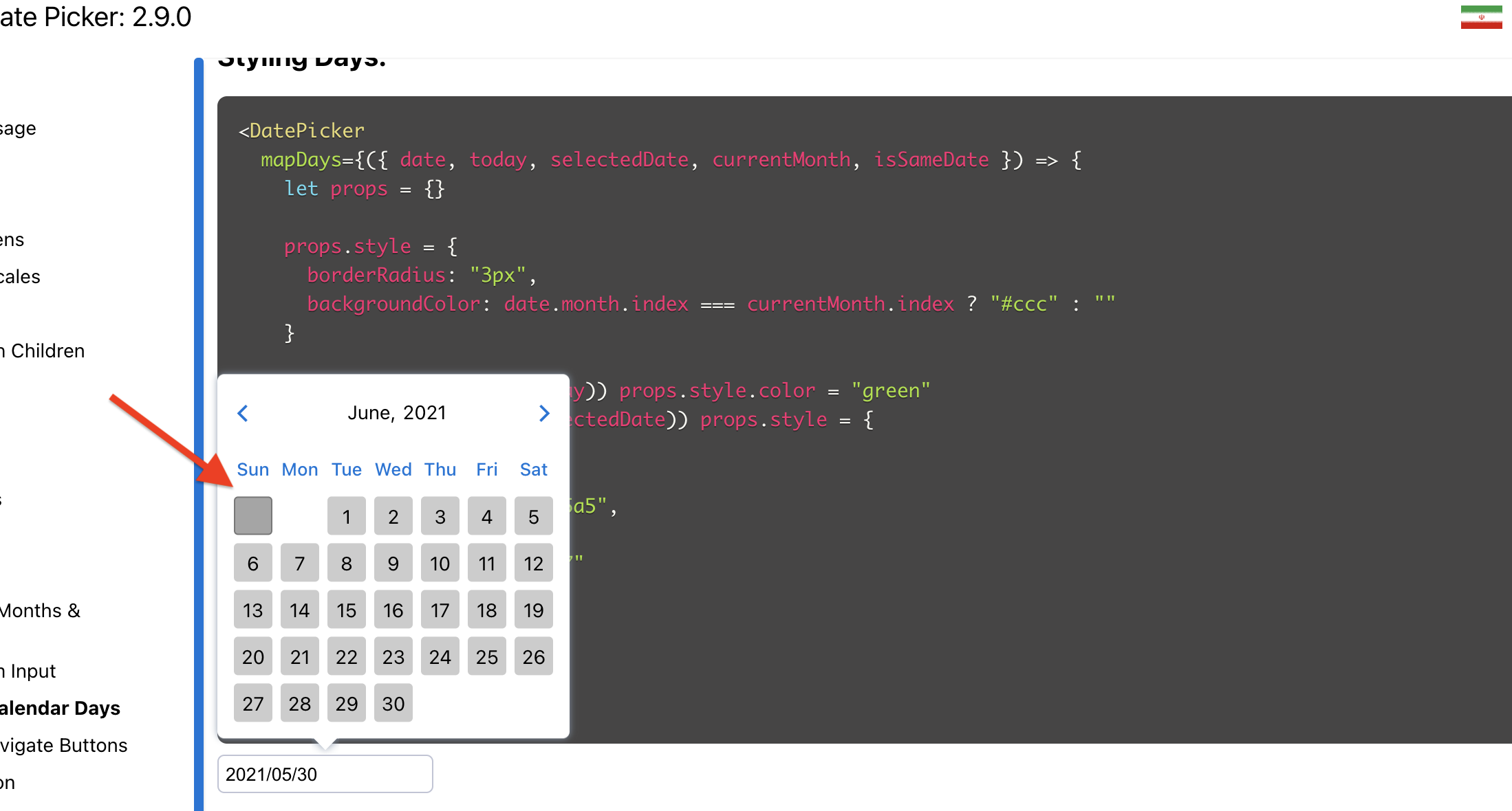
| mapDays | Function | both | |
| onChange | Function | both | |
| onPropsChange | Function | both | |
| onMonthChange | Function | both | |
| onYearChange | Function | both | |
| onFocusedDateChange | Function | both | |
| digits | Array | both | |
| weekDays | Array | both | |
| months | Array | both | |
| showOtherDays | Boolean | false | both |
| minDate | Date, DateObject, String or Number | both | |
| maxDate | Date, DateObject, String or Number | both | |
| disableYearPicker | Boolean | false | both |
| disableMonthPicker | Boolean | false | both |
| disableDayPicker | Boolean | false | both |
| zIndex | Number | 100 | both |
| plugins | Array | [] | both |
| sort | Boolean | false | both |
| numberOfMonths | Number | 1 | both |
| currentDate | DateObject | both | |
| buttons | Boolean | true | both |
| renderButton | React.ReactElement or Function | both | |
| weekStartDayIndex | Number | both | |
| className | String | both | |
| readOnly | Boolean | false | both |
| disabled | Boolean | false | both |
| hideMonth | Boolean | false | both |
| hideYear | Boolean | false | both |
| hideWeekDays | Boolean | false | both |
| shadow | Boolean | true | both |
| fullYear | Boolean | false | both |
| displayWeekNumbers | Boolean | false | both |
| weekNumber | String | both | |
| weekPicker | Boolean | false | both |
| rangeHover | Boolean | false | both |
| monthYearSeparator | String | "," for LTR locales, "،" for RTL locales | both |
| formatMonth | Function | undefined | both |
| formatYear | Function | undefined | both |
| highlightToday | Boolean | true | both |
| style | React.CSSProperties | {} | both |
| headerOrder | Array | ["LEFT_BUTTON", "MONTH_YEAR", "RIGHT_BUTTON"] | both |
| onOpen | Function | DatePicker | |
| onClose | Function | DatePicker | |
| onPositionChange | Function | DatePicker | |
| containerClassName | String | DatePicker | |
| arrowClassName | String | 0 | DatePicker |
| containerStyle | React.CSSProperties | DatePicker | |
| arrowStyle | React.CSSProperties | 0 | DatePicker |
| arrow | Boolean or React.ReactElement | true | DatePicker |
| animations | Array | false | DatePicker |
| inputClass | String | DatePicker | |
| name | String | DatePicker | |
| id | String | DatePicker | |
| title | String | DatePicker | |
| required | Boolean | DatePicker | |
| placeholder | String | DatePicker | |
| render | React.ReactElement or Function | DatePicker | |
| inputMode | String | DatePicker | |
| scrollSensitive | Boolean | true | DatePicker |
| hideOnScroll | Boolean | false | DatePicker |
| calendarPosition | String | "bottom-left" | DatePicker |
| editable | Boolean | true | DatePicker |
| onlyShowInRangeDates | Boolean | true | DatePicker |
| fixMainPosition | Boolean | false | DatePicker |
| fixRelativePosition | Boolean | false | DatePicker |
| offsetY | Number | 0 | DatePicker |
| offsetX | Number | 0 | DatePicker |
| mobileLabels | Object | DatePicker | |
| portal | Boolean | DatePicker | |
| portalTarget | HTMLElement | DatePicker | |
| onOpenPickNewDate | Boolean | true | DatePicker |
| mobileButtons | HTMLButtonElement[] | [] | DatePicker |
| dateSeparator | string | '~' in range mode, ',' in multiple mode | DatePicker |
| multipleRangeSeparator | string | ',' | DatePicker |
| typingTimeout | string | 700 | DatePicker |
Click here to see the descriptions.
| Calendars | Gregorian | Persian (Solar Hijri) | Jalali | Arabic (Lunar Hijri) | Indian | |
|---|---|---|---|---|---|---|
| /calendars/gregorian | /calendars/persian | /calendars/jalali | /calendars/arabic | /calendars/indian | ||
| Locales | English | /locales/gregorian_en | /locales/persian_en | /locales/persian_en | /locales/arabic_en | /locales/indian_en |
| Portuguese - BRAZIL | /locales/gregorian_pt_br | - | - | - | - | |
| Farsi | /locales/gregorian_fa | /locales/persian_fa | /locales/persian_fa | /locales/arabic_fa | /locales/indian_fa | |
| Arabic | /locales/gregorian_ar | /locales/persian_ar | /locales/persian_ar | /locales/arabic_ar | /locales/indian_ar | |
| Hindi | /locales/gregorian_hi | /locales/persian_hi | /locales/persian_hi | /locales/arabic_hi | /locales/indian_hi | |
Of course, you can customize the names of the months and days of the week
in both the calendar & input by using the months and weekDays Props.
Also, you can create a custom Calendar and Locale:


 React
React
 Typescript
 Django
 Laravel
 Facebook
 Microsoft
 Google
 Alibaba
 D3
D3
 Tencent