

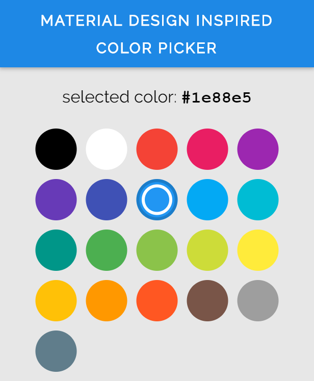
- built-in material color palette with shades and accent colors
- highly customizable
- support for custom color palettes
- display main color first and by clicking on it show its shades or accent colors
- easy to use
- lightweight
- can be used in plain javascript projects or with other js frameworks
With npm:
npm install material-design-inspired-color-picker --save
As script:
Download the md-color-picker.js file from here
Include the script in your app.
If you installed the color picker with npm:
import 'material-design-inspired-color-picker'If you just downloaded the md-color-picker.js file:
<script src="path/to/md-color-picker.js"></script>Then, you can use it like a html tag:
<md-color-picker></md-color-picker>A custom elements polyfill is included, so it will work even in browsers wich do not support the custom-elements specification.
The picker let you pass in some options and attributes so you can customize it.
Note: In html the attributes are seperated by a hyphen instead of using camelCase in JavaScript.
Following properties can be parsed into the picker:
| propertyname (JS / HTML) | type | default | example |
|---|---|---|---|
| colorMargin / color-margin (in px) | number | 6 | 12 |
| colorsPerRow / colors-per-row | number | 5 | 4 |
| colorSize / color-size (in px) | number | 54 | 42 |
| defaultTint / default-tint | number or string | 500 | '200' |
| fixedMinHeight / fixed-min-height | bool | true | false |
| palette | string or object | 'material' | 'material-full' |
| useSpectrumPicker / use-spectrum-picker | bool | true | false |
| value | string | none | #f1c5a9 |
Description:
- colorMargin : The distance between the colors
- colorsPerRow : The number of colors per row
- colorSize : The size of each color circle
- defaultTint : this is the tint for each color wich will be shown at the beginning. Material colors default tint is 500. For custom palettes you can also use strings. *fixedMinHeight : If disabled, the picker will become less high, when the current subpalette has less colors than the mainpalette
- palette : the palette with all colors. If it is a string, the picker will use a built in palette. Currently the following palettes are available:
material : standard material colors
material-full : the material colors including the accent colors
material-accent : only the accent material colors
- useSpectrumPicker : if false, the other color tints can not be selected, so only the color wich matches default tint is selectable.
- value : the color which is selected. Must be a hex number with 6 digits and a hashtag.
Full example:
<md-color-picker value="#abcdef" palette="material-accent" default-tint="300" use-spectrum-picker="false"></md-color-picker>Events:
When the value of the picker changes (means the user selected a color) an event will be triggered. To change the selected color of the picker itself so that the new color is visually selected, you must set the value of the picker by yourself. But don't worry, it's easy and here is a working example:
var picker = document.getElementById('picker') // get the color picker element
function colorChanged (event) {
    var color = event.detail[0] // get the color
    console.log('Selected Color:' + color)
    picker.value = color // set the value of the picker to the selected color
}
picker.addEventListener('change', colorChanged) // add the event to the picker element
For a more detailed example, see the demo page under docs folder or live: https://bennyalex.github.io/material-design-inspired-color-picker/


 React
React
 Typescript
 Django
 Laravel
 Facebook
 Microsoft
 Google
 Alibaba
 D3
D3
 Tencent