A secondary development based upon the DatePicker component of iView.
If you are developing your web page through iView and seeking a different style of the DatePciker, please check it out.
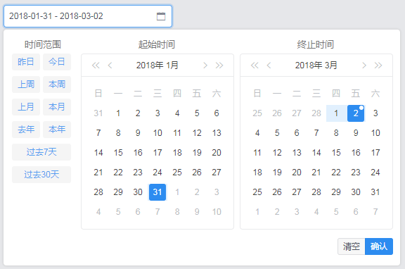
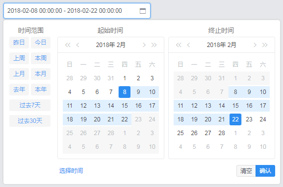
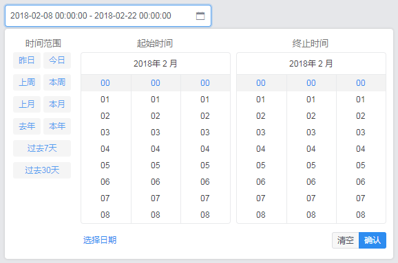
This datepicker component has a different appearance compared with iView's, which comprises of two DatePicker component of iView.
You should install iView before using this component.
$ npm install iview --save
Import this component and register it to your vue instance, then you can use it easily.
props
| Property | Description | Type | Default Value |
|---|---|---|---|
| dateValue | The date value which is an Array contained two Date type items. | Array | An empty Array |
| dateType | Setting the methods you can use to select time. The optional value is 'date' & 'datetime'. 'date': chose date; 'datetime': chose date and time. |
String | date |
| size | The size of the component. The optional value is 'default' & 'large'. | String | default |
| width | The width of the component. | Number | The width can adjust itself automatically according to the setting of 'dateType' and 'size'. |
events
| Event | Description | Return Value |
|---|---|---|
| confirm | It would be triggered when the confirm button or the shortcut button is clicked. | An Array contained two Date type items. |
//supposed the component's name is 'rangeDatepicker'

<range-datepicker @confirm="function" :dateValue="dateArray"></range-datepicker>

<range-datepicker @confirm="function" :dateValue="dateArray" :width="350"></range-datepicker>

<range-datepicker size="large" @confirm="function" :dateValue="dateArray"></range-datepicker>

<range-datepicker dateType="datetime" @confirm="function" :dateValue="dateArray"></range-datepicker>
date
datetime


 React
React
 Typescript
 Django
 Laravel
 Facebook
 Microsoft
 Google
 Alibaba
 D3
D3
 Tencent