📢 Use this project, contribute to it or open issues to help evolve it using Store Discussion.
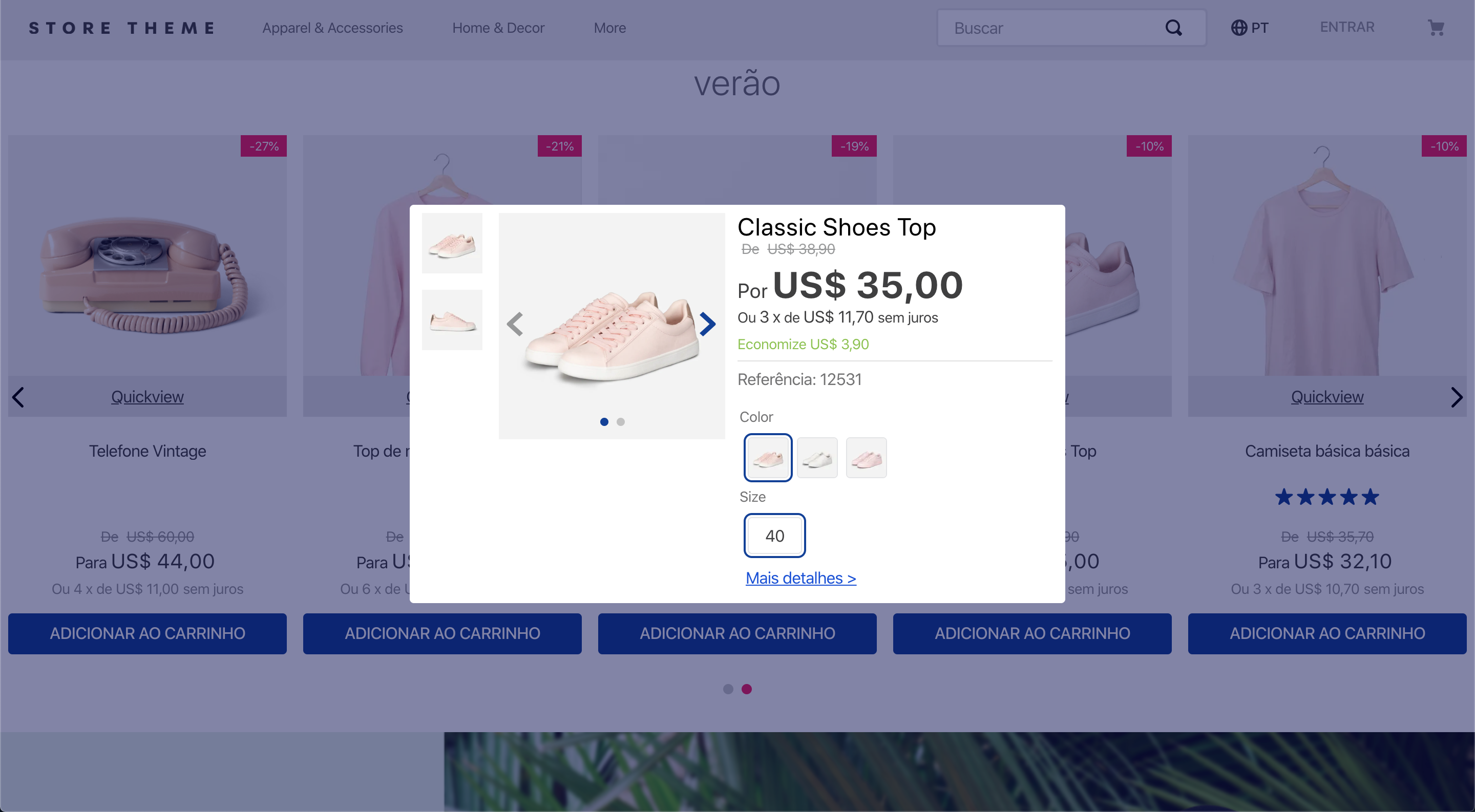
The Modal Layout app provides blocks to help you create modals in your store.
- Add the Modal Layout app to your theme dependencies in the
manifest.json:
  "dependencies": {
+   "vtex.modal-layout": "0.x"
  }
Now, you can use all blocks exported by the modal-layout app. See the full list below:
- Add the
modal-triggerblock in any store template you choose. In the example below, it will be added to the homepage:
{
  "store.home": {
    "children": [
      "modal-trigger#example"
    ]
},- Declare the
modal-triggerblock using its prop and configure the children blocks. The first child block ofmodal-triggermust be a block you choose to trigger the modal content. Then, a sibling block calledmodal-layoutwill be needed to effectively define the modal content through its child block list. For example:
{
  "store.home": {
    "children": ["modal-trigger#example"]
  },
  "modal-trigger#example": {
    "children": ["rich-text#example", "modal-layout#example"]
  },
  "rich-text#example": {
    "props": {
      "text": "Click me"
    }
  },
  "modal-layout#example": {
    "children": ["rich-text#modal-content"]
  },
  "rich-text#modal-content": {
    "props": {
      "text": "Hello"
    }
  }
}
In the example above, the Rich Text block renders the Click me text that will trigger the modal content when clicked. The modal content, in turn, is defined by the modal-layout block. Based on the example above, the modal content triggered by the Click me Rich Text would be a Hello text.
| Prop name | Type | Description | Default value |
|---|---|---|---|
trigger |
enum |
Defines whether the modal content should be triggered by user click (click), when the page is fully loaded (load), or when the page is fully loaded, but the modal will appear just once per session (load-session). |
click |
customPixelEventId |
string |
Store event ID that triggers the modal-trigger block (hence triggering the opening of modal-layout blocks on the interface as well). |
undefined |
customPixelEventName |
string |
Store event name that triggers the modal-trigger block (hence triggering the opening of modal-layout blocks on the interface as well). Some event examples are 'addToCart' and 'removeFromCart'. Note that using this prop will make the associated modal-layout open in every event with the specified name if no customPixelEventId is set. |
undefined |
| Prop name | Type | Description | Default value |
|---|---|---|---|
scroll |
enum |
Defines how users should scroll the modal. Possible values are: body (users can scroll the whole modal by normally scrolling the page) and content (users can scroll the modal content when hovering over it). |
content |
blockClass |
string |
Unique block ID to be used in CSS customizations. | undefined |
disableEscapeKeyDown |
boolean |
Defines whether the modal should be closed when pressing the Esc key (true) or not (false). |
false |
fullScreen |
boolean |
Defines whether the modal should fill the whole screen (true) or not (false). This prop is responsive, i.e., it adapts to the device breakpoints. |
false |
backdrop |
enum |
Defines whether the modal will have a clickable backdrop (clickable) or no backdrop at all (none). This prop is responsive, i.e., it adapts to the device breakpoints. |
clickable |
customPixelEventId |
string |
Store event ID that triggers the modal-layout block (hence triggering the closing of modal-layout blocks on the interface as well). |
undefined |
customPixelEventName |
string |
Store event name that triggers the modal-layout block (hence triggering the closing of modal-layout blocks on the interface as well). Some event examples are 'addToCart' and 'removeFromCart'. Note that using this prop will make the associated modal-layout close in every event with the specified name if no customPixelEventId is set. |
undefined |
| Prop name | Type | Description | Default value |
|---|---|---|---|
showCloseButton |
boolean |
Defines whether the close icon button should be rendered in the modal header (true) or not (false). |
true |
iconCloseSize |
number |
Size (in pixels) of the close icon button in the modal header. | 32 |
| Prop name | Type | Description | Default value |
|---|---|---|---|
label |
string |
Defines the text to be rendered in the close button. The default value of this prop depends on the store's default language, which is set according to the website binding. | Cancel, Cancelar, or Cancelar for stores whose default language is, respectively, English, Spanish, or Portuguese. |
To apply CSS customizations in this and other blocks, follow the instructions given in the recipe on Using CSS handles for store customization.
| CSS handles |
|---|
modal |
backdropContainer |
backdrop |
closeButtonContainer |
closeButton |
container |
contentContainer |
headerContainer |
headerContent |
paper |
topRow |
triggerContainer |
Thanks goes to these wonderful people:
Beatriz Miranda 💻 |
weslybrandao 💻 |
Renan Guerra 💻 |
This project follows the all-contributors specification. Contributions of any kind are welcome!


