GithubHelp home page GithubHelp logo

vtex / styleguide Goto Github PK

View Code? Open in Web Editor NEW
165.0 161.0 33.0 84.13 MB

The VTEX Design System and React component library.

Home Page: https://styleguide.vtex.com

License: GNU General Public License v3.0

JavaScript 68.74% HTML 0.04% CSS 1.51% TypeScript 29.71%
react component-library frontend-components react-library react-components design-system styleguide xp-developer srv-styleguide vtex

styleguide's Introduction

Styleguide

VTEX Styleguide React components (Docs)

Usage

For instructions on how to use the Styleguide in your project refer to the page itself: https://vtex.github.io/styleguide/.

Developing

Setup

yarn install

Running

yarn styleguide

Storybook

We use Storybook environment to help us build and test our components in real time. You can edit the Playground file and add the components you are working on, after this run the command below to see your changes in http://localhost:6006/ :

yarn storybook

If you want to change or add stories, take a look at this guide before.

Developing using npm link

Run this in this repo:

yarn develop

In your project run:

npm link @vtex/styleguide

Import (case a <Button> component in lib):

import Button from '@vtex/styleguide/lib/Button'

Testing

Developing new tests

To add tests to a component, just add a test file with the .test.js extension next to the component implementation.

Example:

react/components/Alert/
├── README.md
├── index.js
└── index.test.js

We use react-testing-library to test our components.

Running tests

To run the test use:

yarn test

You can also pass the --watch flag:

yarn test --watch

Publishing


To post the changelog on Github Release Notes, is required to configure a Personal Token. See more here

We use releasy to publish our styleguide. To publish on both npm and render(VTEX IO) with Github Release Notes, execute the command below:

releasy --stable

Docs

To update the docs:

yarn deploy

Known issues

  • Your project has to run with webpack >= 2. Here's a guide for upgrading Webpack to v2.

  • VTEX Styleguide is a project built to run on top of either npm or VTEX IO. To make this viable, we currently use two package.json files, one in the top repository folder for npm, and one inside the react folder for VTEX IO. We are looking into how we can improve this architecture, but for now we have to live with duplicated dependencies in these package.json files.

    For more info, please refer to #483

  • We currently have two majors of the Styleguide, 8.x and 9.x (master branch). Each major supports a specific VTEX's Render version. This means that we develop new features only on the master branch (9.x major) and do bug fixes on both master and 8.x branches.

Custom icons

The icon components supports customization through the <use> element available in SVG. Read more

How to use: In the same page that has a icon, load in any place inside the <html> a SVG with the following structure:

<svg class="dn" height="0" version="1.1" width="0" xmlns="http://www.w3.org/2000/svg">
  <defs>
    <g id="icon-columns">
      <path d="M10.8 4.4L9.4 3L5.4 7L3.4 5L2 6.4L5.4 9.8L10.8 4.4Z" fill="currentColor" />
    </g>
    <g id="OTHER-ICON-ID">
      <path d="M11.7 0.3C11.5 0.1 11.3 0 11 0H10V3C10 3.6 9.6 4 9 4H4C3.4 4 3 3.6 3 3V0H1C0.4 0 0 0.4 0 1V15C0 15.6 0.4 16 1 16H15C15.6 16 16 15.6 16 15V5C16 4.7 15.9 4.5 15.7 4.3L11.7 0.3ZM13 14H3V11C3 10.4 3.4 10 4 10H12C12.6 10 13 10.4 13 11V14Z" fill="currentColor"/>
      <path d="M9 0H7V3H9V0Z" fill="currentColor"/>
    </g>
  </defs>
</svg>
  • The ID must match the ID of the icon you want to replace. To see all available options, view icons folder.
  • Inside one SVG you can have more than one <g id="">, one for each icon you want to update.

styleguide's People

Contributors

alinevillaca avatar analuizamtg avatar anitavincent avatar arturpimentel avatar dependabot[bot] avatar emersonlaurentino avatar ericreis avatar estacioneto avatar fanny avatar gabrielgalc avatar guilhermebruzzi avatar jullyanav avatar kevinch avatar klzns avatar laerc avatar lbebber avatar lernerbruno avatar leticiawanderley avatar lucasecdb avatar lurian avatar mariana-mendes avatar matheusps avatar ohmyguigs avatar rafarubim avatar rerissondaniel avatar samuraiexx avatar tasgmaia avatar thiagomurakami avatar vitoria avatar vlaux avatar

Stargazers

 avatar  avatar  avatar  avatar  avatar  avatar  avatar  avatar  avatar  avatar  avatar  avatar  avatar  avatar  avatar  avatar  avatar  avatar  avatar  avatar  avatar  avatar  avatar  avatar  avatar  avatar  avatar  avatar  avatar  avatar  avatar  avatar  avatar  avatar  avatar  avatar  avatar  avatar  avatar  avatar  avatar  avatar  avatar  avatar  avatar  avatar  avatar  avatar  avatar  avatar  avatar  avatar  avatar  avatar  avatar  avatar  avatar  avatar  avatar  avatar  avatar  avatar  avatar  avatar  avatar  avatar  avatar  avatar  avatar  avatar  avatar  avatar  avatar  avatar  avatar  avatar  avatar  avatar  avatar  avatar  avatar  avatar  avatar  avatar  avatar  avatar  avatar  avatar  avatar  avatar  avatar  avatar  avatar  avatar  avatar  avatar  avatar  avatar  avatar  avatar

Watchers

 avatar  avatar  avatar  avatar  avatar  avatar  avatar  avatar  avatar  avatar  avatar  avatar  avatar  avatar  avatar  avatar  avatar  avatar  avatar  avatar  avatar  avatar  avatar  avatar  avatar  avatar  avatar  avatar  avatar  avatar  avatar  avatar  avatar  avatar  avatar  avatar  avatar  avatar  avatar  avatar  avatar  avatar  avatar  avatar  avatar  avatar  avatar  avatar  avatar  avatar  avatar  avatar  avatar  avatar  avatar  avatar  avatar  avatar  avatar  avatar  avatar  avatar  avatar  avatar  avatar  avatar  avatar  avatar  avatar  avatar  avatar  avatar  avatar  avatar  avatar  avatar  avatar  avatar  avatar  avatar  avatar  avatar  avatar  avatar  avatar  avatar  avatar  avatar  avatar  avatar  avatar  avatar  avatar  avatar  avatar  avatar  avatar  avatar  avatar  avatar

styleguide's Issues

Correct semantics in demos

Wrong button within span:

<div>
  <div className="mb4">
    <span className="mr4">
      <Button variation="primary" size="small">
        Small
      </Button>
    </span>
    <span className="mr4">
      <Button variation="primary">
        Default

The component Radio from @vtex/styleguide/lib/Radio can't be resolved

Error

./src/pages/postmortem/index.js
Module not found: Can't resolve '@vtex/styleguide/lib/Radio' in '/Users/vtex/Desktop/Projects/VTEX/experiences-overview/src/pages/postmortem'

Code

import React, { Component } from "react";
import { BrowserRouter, Route, Switch } from "react-router-dom";
import Dropdown from "@vtex/styleguide/lib/Dropdown";
import Radio from "@vtex/styleguide/lib/Radio";
class RadioExample extends React.Component {
  constructor() {
    super();
    this.state = {
      checkedRadioValue: "option-1"
    };
    this.handleChange = this.handleChange.bind(this);
  }
  handleChange(e, value) {
    this.setState({
      checkedRadioValue: value
    });
  }
  render() {
    return (
      <div>
        <Radio
          checked={this.state.checkedRadioValue}
          id="radio-1"
          label="Opção 1"
          name="radio-group"
          onChange={this.handleChange}
          value="option-1"
        />
        <Radio
          checked={this.state.checkedRadioValue}
          id="radio-2"
          label="Opção 2"
          name="radio-group"
          onChange={this.handleChange}
          value="option-2"
        />
        <Radio
          checked={this.state.checkedRadioValue}
          disabled
          id="radio-3"
          label="Opção 3"
          name="radio-group"
          onChange={this.handleChange}
          value="option-3"
        />
      </div>
    );
  }
}
class PostMortemForm extends Component {
  constructor(props) {
    super(props);
    this.state = {
      start: null,
      end: null,
      module: null,
      description: null,
      customerDecription: null,
      severity: null,
      reach: null
    };
  }
  // Desc
  // Severity:	Sales down	Partial	No sales impact		Impacto nas vendas das lojas
  // Duration:	Até 5 min	5~20min	>20min		Duração do incidente
  // Range:	0~10%	10~50%	>50%	100%	% de clientes afetados
  //   Atenção: usado na validação dos campos.
  render() {
    return (
      <div>
        <Dropdown
          label="Experience"
          size="x-large"
          options={[
            { value: "Shopping XP", label: "Shopping XP" },
            { value: "Post Purchase XP", label: "Post Purchase XP" },
            { value: "Identity XP", label: "Identity XP" },
            { value: "MKT & Merch. XP", label: "MKT & Merch. XP" },
            { value: "Developer XP", label: "Developer XP" },
            { value: "Financial XP", label: "Financial XP" },
            { value: "Management XP", label: "Management XP" },
            { value: "First Party Apps", label: "First Party Apps" },
            { value: "Reliability XP", label: "Reliability XP" }
          ]}
          value="Reliability XP"
          onChange={() => {}}
        />
        <RadioExample />
      </div>
    );
  }
}
export default class Postmortem extends Component {
  render() {
    return (
      <div>
        <h1>Postmortem</h1>
        <PostMortemForm />
      </div>
    );
  }
}

Package JSON

{
  "name": "experiences-overview",
  "version": "0.0.1",
  "private": true,
  "devDependencies": {
    "@vtex/styleguide": "2.0.0-rc.41",
    "react": "^16.3.2",
    "react-dom": "^16.3.2",
    "react-router-dom": "^4.2.2",
    "react-loader-advanced": "^1.7.1",
    "react-scripts": "1.1.4",
    "ajv": "^6.4.0",
    "ajv-keywords": "^3.2.0",
    "recharts": "^1.0.0-beta.10",
    "vtex-tachyons": "^2.4.0"
  },
  "dependencies": {
    "body-parser": "^1.18.2",
    "cookie-parser": "^1.4.3",
    "express": "^4.16.3"
  },
  "scripts": {
    "start:front": "react-scripts start",
    "start": "npm i && npm run build && node index.local.js",
    "prebuild": "rm -rf front && rm -rf build",
    "build": "npm run prebuild && react-scripts build && mv build front",
    "deploy": "npm install && npm run build && node-lambda deploy -d \"Versao $npm_package_version\"",
    "promote:stable": "aws lambda update-alias --name \"stable\" --function-name $npm_package_name --function-version $(aws lambda publish-version --function-name $npm_package_name --description \"Version $npm_package_version\" | python -c \"import sys, json; print json.load(sys.stdin)['Version']\")",
    "deploy:stable": "npm run deploy && npm run promote:stable"
  }
}

Toasts

Problema

Solução genérica para notificar sucessos e erros de ações do usuário em ações de interface assíncronas, comuns em SPAs (Single Page Applications).
Alternativa ao sistema de Alerts, que são inline, ou seja, interferem no layout da tela.

Que outras diferenças tem entre Alerts e Toasts??

Decisões

  • Parâmetros não devem estar totalmente abertos pra cada desenvolvedor usar como quiser. A aparência e o comportamento devem ser o mais similares possíveis pra manter a consistência através da plataforma.
  • ...

Módulos que têm essa demanda

  • Credit Control

Casos de uso

  • Após criação de nova conta. Mensagem "Nova conta criada".
  • Após sucesso em editar configurações. Mensage "Configurações salvas."

Benchmark

Toasts/Flash Messages/Snackbars
Atlassian: https://atlassian.design/guidelines/product/components/messages
Salesforce: https://www.lightningdesignsystem.com/components/toast/
Quickbooks: https://designsystem.quickbooks.com/component/toast-messages/
Carbon (Inline Notification): http://www.carbondesignsystem.com/components/notification/
Material: https://material.io/design/components/snackbars.html
Ant: https://ant.design/components/message/
Polaris: está marcado como "In development": https://polaris.shopify.com/components/component-status#navigation

Alerts/Banners
Atlassian: https://atlassian.design/guidelines/product/components/banners
Salesforce: https://www.lightningdesignsystem.com/components/alert/
Quickbooks: https://designsystem.quickbooks.com/component/inline-messages/
Carbon (Toast Notification): http://www.carbondesignsystem.com/components/notification/
Material: https://material.io/design/components/banners.html
Polaris: https://polaris.shopify.com/components/feedback-indicators/banner
Ant: https://ant.design/components/alert/

Work in progress (Figma)

https://www.figma.com/file/a94lX91ZmYGIDBxvb8shwLn8/VTEX-Styleguide?node-id=4279%3A0

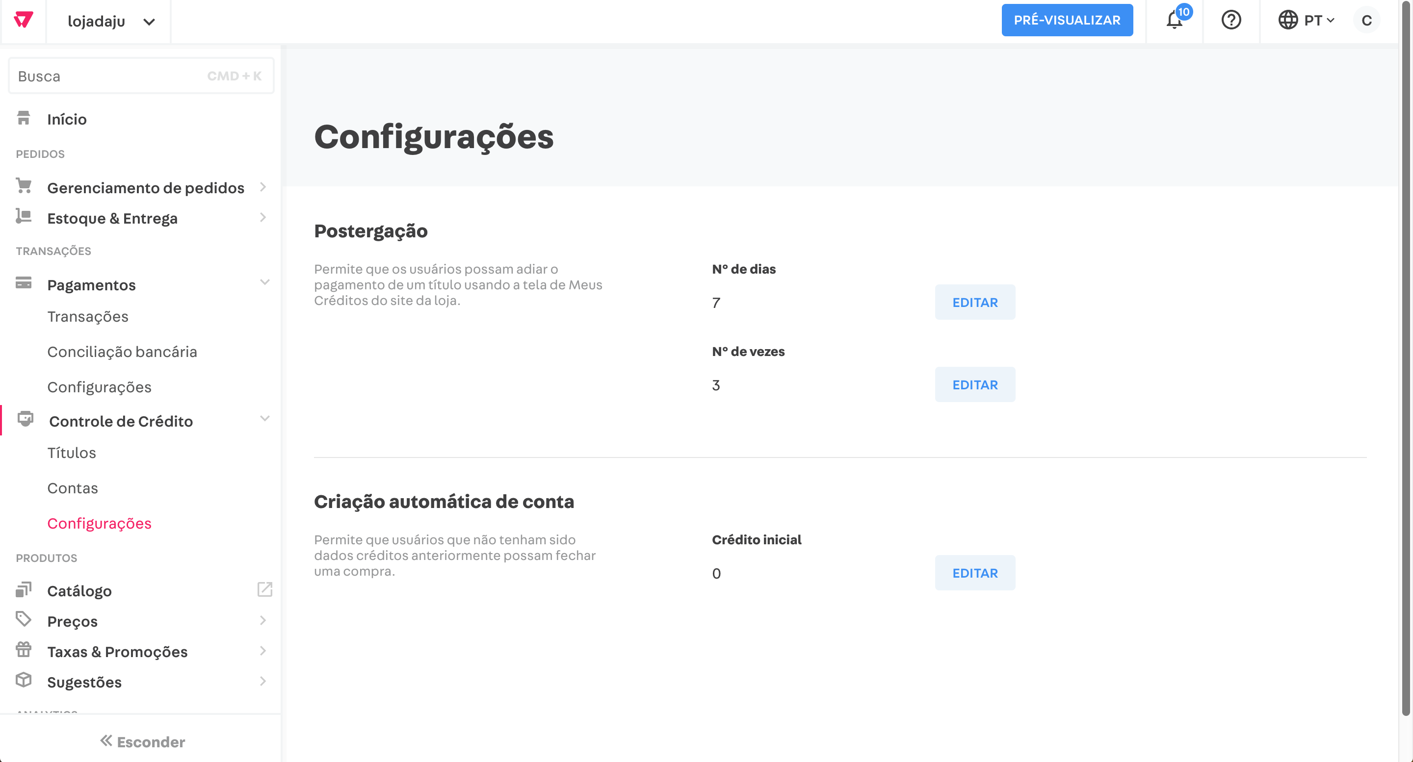
Simple Search Input

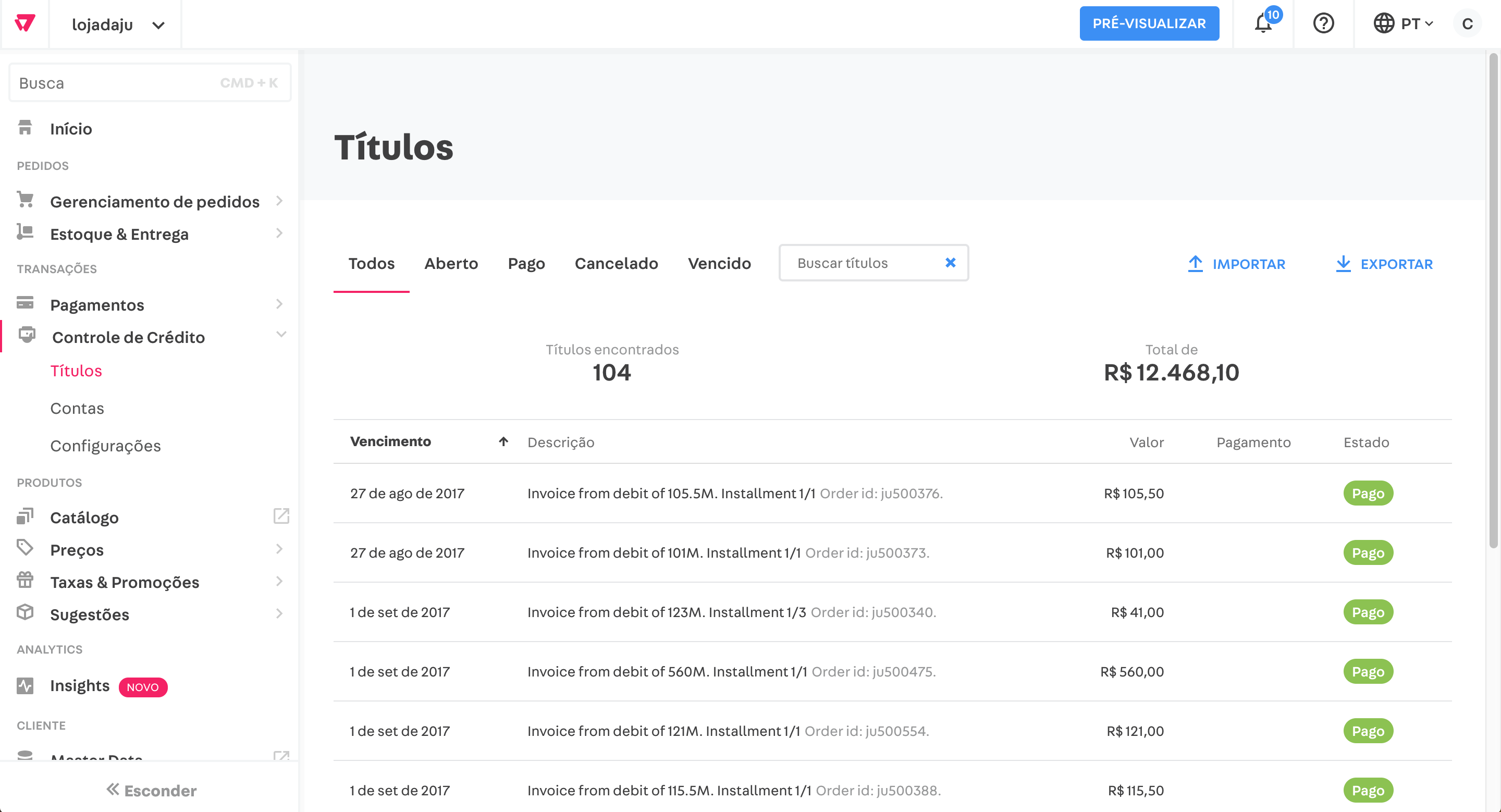
Here's a simple search field input we use in Credit Control.
(we have a working version of it in Credit Control, but it has some gambiarras so maybe it's better to start from scratch)

image

What problem it solves

Just a simple text input for simple searching needs.
If a search is "on" and the user hasn't changed the input to search for something different, the search button becomes clear button for clearing the app state.

Design decisions

  • The search button doesn't have a text label for aesthetic reasons. We think this could have had negative effects on usability if done a some years ago, however from our benchmark research this pattern it totally common place in the Internet nowadays.
  • This component is for active searching. If your app has something like a preemptive or dynamic searching (you show results while the user is typing) maybe the search button could be disabled.

Examples of application

image

image

Benchmark

Carbon: http://www.carbondesignsystem.com/components/search/code

Figma link

https://www.figma.com/file/a94lX91ZmYGIDBxvb8shwLn8/VTEX-Design?node-id=148%3A969

Datepicker

Um substituto para o <input type="date" />

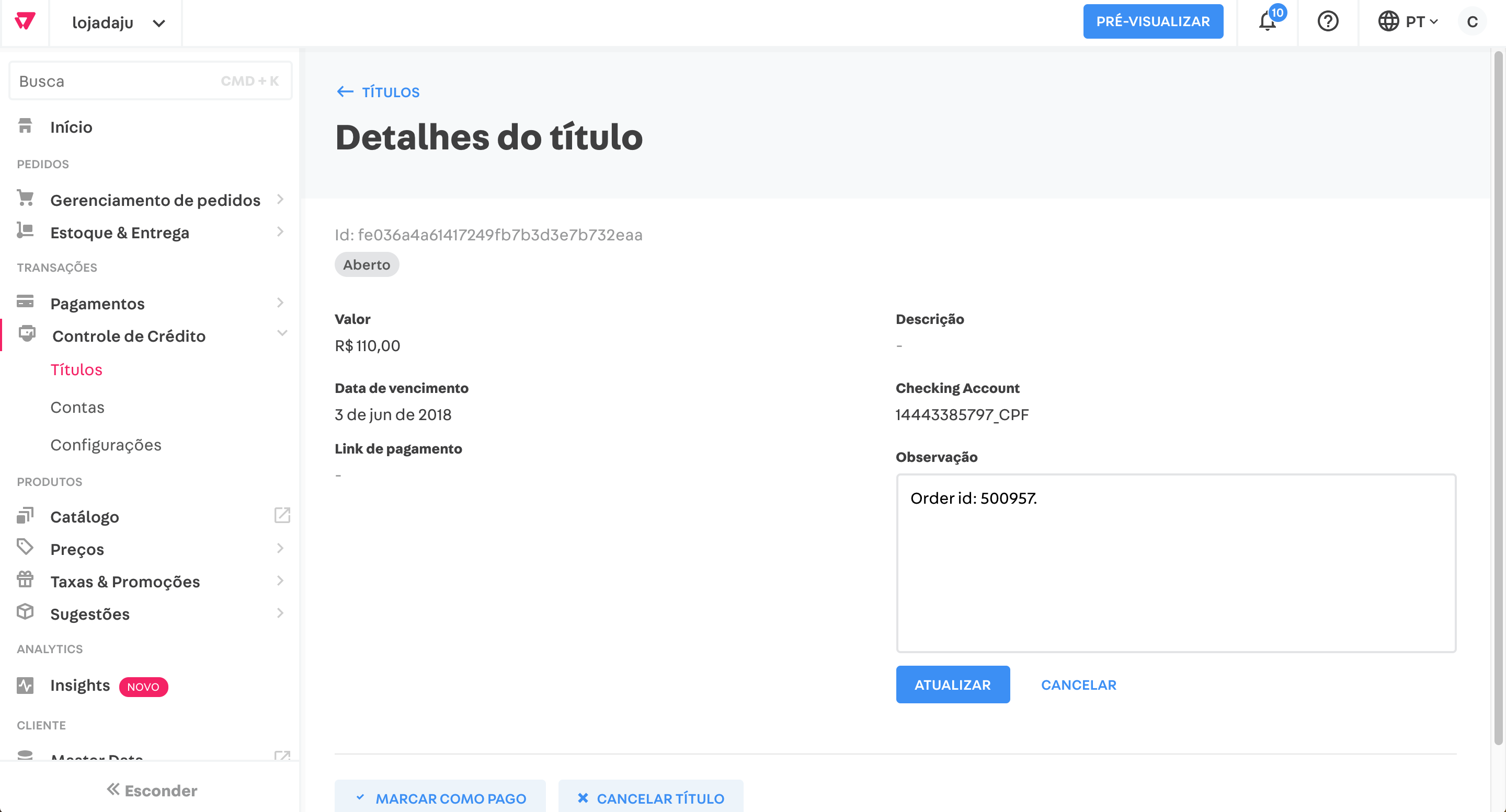
Input and Textarea inline edit

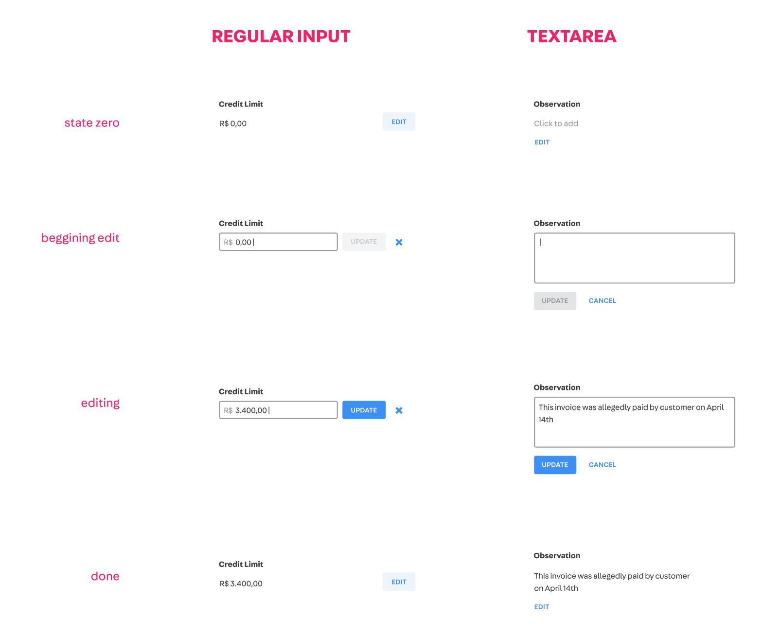
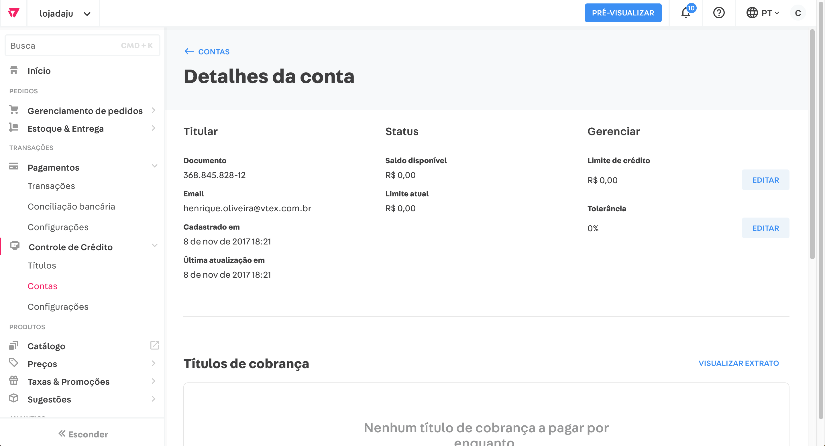
Here are the components we created for Credit Control to edit fields "inline".
(It's already implemented, so it's just a matter of extracting it :)

image

What problem it solves

Provides a simple interaction pattern to do small edits in place of fields that start as "read-only".
You might need this if you have a very long form and want to provide users the possibility of editing just small parts of it, without having to resubmit everything.
Or you just have a screen with lots of information and just some of them are editable.

Design decisions

  • the edit button has very low prominence because it should be used in places where the main user drive is not to edit information or input new one.
  • the update button starts disabled, and becomes enabled if the original information is indeed edited
  • originally the cancel button in the Regular input variation had a cancel label, but it was taking too much space in our UI so we made it a little less intuitive and converted it to be a

Examples of application

image

image

image

Figma link

https://www.figma.com/file/a94lX91ZmYGIDBxvb8shwLn8/VTEX-Design?node-id=2596%3A1

Fix buttons with color set icon

if you do this:

<Button secondary onClick={this.handleClose}>
    <Close icon color={config.colors.blue} size={10} />
</Button>

It'll display:
screen shot 2018-04-06 at 14 43 04

and on hover:
screen shot 2018-04-06 at 14 43 26

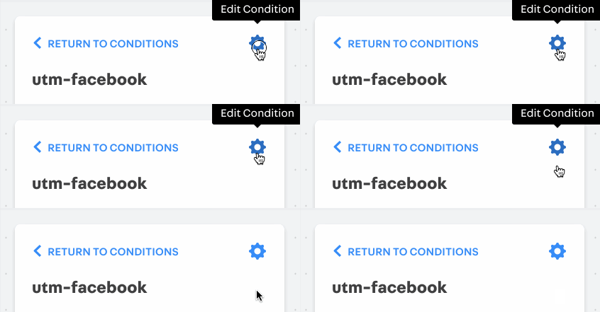
Tooltip

Overview

Tooltips are floating labels that bring quick and contextual information about something in the UI.

Purpose

  • To explain briefly a feature or option upon clicking or hovering a standard tooltip icon (something like a little i or ? icon, to be defined)
  • To explain a button without label (probably by hovering its icon)
  • A modal could be used for a similar effect, but we doesn't seem to need to interrupt the user if it's a quick tip. However we might suggest using a Modal if the content ends up too big for a Tooltip.

Context

Conditions Builder
image

Admin navbar

image

Examples

Benchmark:
https://polaris.shopify.com/components/overlays/tooltip
https://atlassian.design/guidelines/product/components/tooltips
https://vmware.github.io/clarity/documentation/v0.12/tooltips
http://www.carbondesignsystem.com/components/tooltip/code
https://www.lightningdesignsystem.com/components/tooltips/

Empty state

Here's the Empty State pattern we use in the Credit Control module.
(It's already implemented, so it's just a matter of extracting it :)

image

What problem it solves

Shows something instead of nothing.
Explains what should be in that particular space, and encourages the designer/developer to instruct the user what to do.

According to Swetha Suresh, an Empty State:

  1. Informs about the empty screen, the whats, whys, and hows
  2. Prompt towards taking an action to populate the platform
  3. Educates about the platform and all its features

Design decisions

  • A muted color and non-primary button (thx @rsimoens) are used so this component has a weak prominence in the screen.
  • The container borders helps show the space that would be normally filled in the screen if it wasn't "empty". This reduces cognitive load on consequent user visits.
  • Although Empty States in the wild often include a personalized icon, we decided not to include it here for now. In the Credit Control case we had half a dozen empty states possible, and it would be cumbersome to search for custom icons for each one, and we couldn't come up with a reusable pattern for that. In addition to that, an icon, even if with muted colors, adds a lot of visual weight to this section, which in our case wasn't desirable.
  • The rounded corners are simple decorative elements that makes this component fit better with VTEX visual patterns.

Example of application

image

Props

The idea is that all fields (heading, body and call-to-action) are optional, however at least a heading or a body should be present for it to make sense.
Optionally the call-to-action can be a link, let's say to a VTEX Help article for example.

Figma link

https://www.figma.com/file/a94lX91ZmYGIDBxvb8shwLn8/VTEX-Design?node-id=191%3A1823

Update icon import example

Right now, the example of importing icons is as follows:

const ArrowBack = require('./ArrowBack').default
const ArrowDown = require('./ArrowDown').default
const ArrowUp = require('./ArrowUp').default
...

It's not clear what is the right way to import icons on projects

Busca com filtro

This is a guide to help get your mental juices flowing, and NOT a rigid and bureaucratic form to be filled out. Scrape everything and start from scratch if it doesn't work for you ;)

Let's try to capture the best possible your context and needs so we can design a great component together!

Overview

Explain objectively in a few sentences what this component is about. This is like the component's greeting card.

Purpose

- Which problems were you trying to solve when you came up with this?
- What use cases would it cover that other components don't?
- Are there existing Styleguide components that might be similar but that don't work for you? Why?

Context

It's screenshot time! Don't worry about cropping it, it's good if you capture the full context of your application.

Examples

Can you point out to existing solutions in other products that you think would work for you?
Feel free to explore some great Design Systems listed in our References doc: https://docs.google.com/document/d/1-L3xllgWx1nF6mhOryHMw4o8d1_3-AKtC9pGO2VywBg/edit

Toggle v2

  • Props de tamanho
  • Corrigir constraste visual do estado de disable
  • Adicionar label

InputNumber

Um substituto para <input type="number"/>

Simple page header

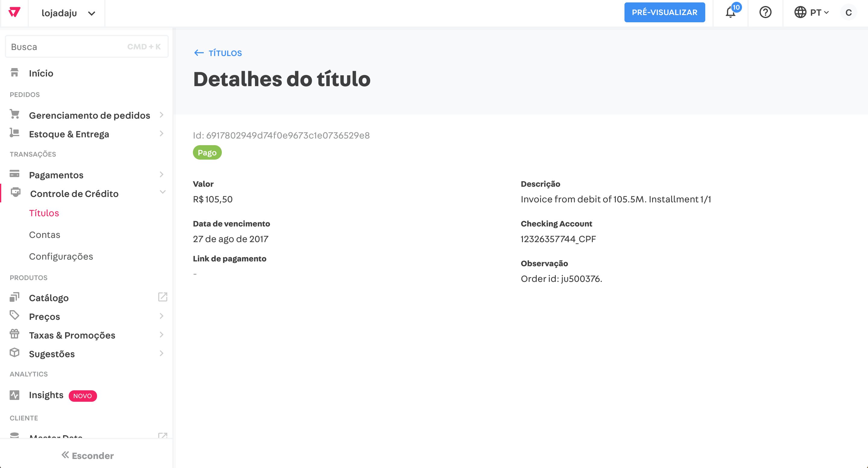
Here's a proposition of generic, simple page header to use in our admins.
(it's already implemented in Credit Control, so it's just a matter of extracting it :)

image

What problem it solves

Our new admin sidebar provides a global solution for 1st-level navigation (between modules) and 2nd-level navigation (sections inside a module), but 3rd-level navigation is left for each module team to handle.
To improve consistency in the platform I propose this generic solution for handling simple 3rd-level navigation needs.

Design decisions

In the old Admin we used to deal with this with breadcrumbs, which might end up encouraging designers to create profound information architectures.
In the spirit of the Simplicity Principle, this solution encourages modules to not going much deeper in the navigation given it doesn't provide a breadcrumb or tabs, but a simple back link in the top.

It's important that in the implementation the vertical space for the back link is left blank if the link is not available. In other words, the main heading should always have the top margin in relation to the module available viewport.

Examples of application

image

image

Figma link

https://www.figma.com/file/a94lX91ZmYGIDBxvb8shwLn8/VTEX-Design?node-id=191%3A1152

Adjust sizes of input (and possibly other controls) to match new sizing defaults

The buttons' default sizes were adjusted to be one step bigger, but other components weren't adjusted accordingly.
As an example, take this screen from Credit Control that was just updated to the latest version of the Styleguide: default buttons are now bigger, but the default input is still the same, thus ending up misaligned.

image

Change default button sizes

As we discussed everyone together in the Design meeting, our currently large size button should become the default size, and so on...
I believe prioritizing larger buttons and controls is aligned with the overall direction of VTEX of being an opinionated and simple platform. In terms of UX, it translates into not overwhelming the user with lots of controls and options and offering clear actions at each screen. In terms of UI it means prioritizing screens with less information density, more negative space and bolder call-to-actions.

Design: https://www.figma.com/file/a94lX91ZmYGIDBxvb8shwLn8/VTEX-Design?node-id=148%3A968

Timepicker

Substituto para o <input type="time" />

Recommend Projects

  • React photo React

    A declarative, efficient, and flexible JavaScript library for building user interfaces.

  • Vue.js photo Vue.js

    🖖 Vue.js is a progressive, incrementally-adoptable JavaScript framework for building UI on the web.

  • Typescript photo Typescript

    TypeScript is a superset of JavaScript that compiles to clean JavaScript output.

  • TensorFlow photo TensorFlow

    An Open Source Machine Learning Framework for Everyone

  • Django photo Django

    The Web framework for perfectionists with deadlines.

  • D3 photo D3

    Bring data to life with SVG, Canvas and HTML. 📊📈🎉

Recommend Topics

  • javascript

    JavaScript (JS) is a lightweight interpreted programming language with first-class functions.

  • web

    Some thing interesting about web. New door for the world.

  • server

    A server is a program made to process requests and deliver data to clients.

  • Machine learning

    Machine learning is a way of modeling and interpreting data that allows a piece of software to respond intelligently.

  • Game

    Some thing interesting about game, make everyone happy.

Recommend Org

  • Facebook photo Facebook

    We are working to build community through open source technology. NB: members must have two-factor auth.

  • Microsoft photo Microsoft

    Open source projects and samples from Microsoft.

  • Google photo Google

    Google ❤️ Open Source for everyone.

  • D3 photo D3

    Data-Driven Documents codes.