Edward Tufte is a professor and author known for his excellent (and beautiful!) books on the visual display of statistical information. Adam Hupp had already begun applying his ideas the excellent plotting library, matplotlib, but the project had not been updated for several years. As matplotlib happens to be my favourite plotting library too, and I appreciate the aesthetics of Tufte's designs, I decided to continue on his work by forking it.
The result is a fork of etframes, a python module that operates on matplotlib plots. So far I've implemented two new graph types described in the The Visual Display of Quantitative Information (VDQI)
Together with the original dash-dot-plot and range frames that makes four available plot types.
A cleaned up version of the traditional bar chart. Due to the design of the visuals, this chart only works for a single data series, and looks good only for data series with lengths between 6 and ca 100. If these limitations seem too constricting, try customizing the standard matplotlib barchart instead.
An example bar chart:

The pairwise scatterplots for the variables in an (observations * variables) data matrix. Can be used to visually show linear dependencies between variables. For example:

A dash-dot-plot places a tick mark on the axis for each value in a scatter plot. When there are many values in the graph this can be a more effective way to understand their distribution than looking at the raw data. For example see
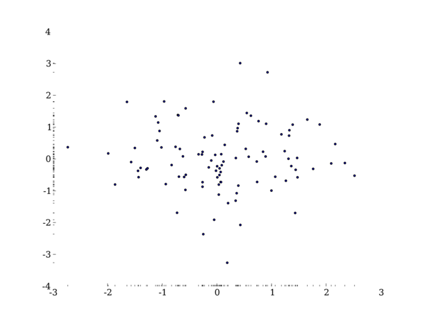
See demo_ddp.py for a working example.
The range frame re-uses the frame (edge) of a graph to display useful information. Instead of drawing a full frame around the graph the frame is only drawn from the minimum to the maximum value along that axis. For example:
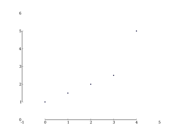
See demo_range.py for a working example.
There are several other graph types described in VDQI that would be nice to implement, particularly the extension of range frames that turns them into a box plot.
A related project is sparkplot which uses the matplotlib library to create sparklines.

