GithubHelp home page GithubHelp logo

yjose / reactjs-popup Goto Github PK

View Code? Open in Web Editor NEW
1.8K 20.0 205.0 7.49 MB

React Popup Component - Modals,Tooltips and Menus —  All in one

Home Page: https://react-popup.elazizi.com/

License: MIT License

JavaScript 1.63% CSS 3.21% TypeScript 95.17%
react react-popup react-component tooltip tooltip-library react-modal modal component

reactjs-popup's Introduction

Reactjs-popup

Build Status npm bundle size version downloads

MIT License All Contributors PRs Welcome Code of Conduct

Watch on GitHub Star on GitHub Tweet

Reactjs-popup is a simple react popup component that helps you create simple and complex Modals, tooltips, and Menus for your next React App.

You should consider using reactjs-popup for those couple of reasons :

  • ✅ Modal, Tooltip, Menu : All in one library 🏋️
  • ✅ Very tiny library (3kb) ⚡️
  • ✅ Fully accessible
  • ✅ Function as children pattern to take control over your popup anywhere in your code 💪
  • ✅ Easy to use 🚀
  • ✅ TypeScript Support 👌
  • ✅ IE Support. 🚀
  • ✅ Full style customization 👌 (js, CSS, styled-components)
  • ✅ Support for controlled Modals & Tooltips
  • ✅ Default & Custom Animations

Demo

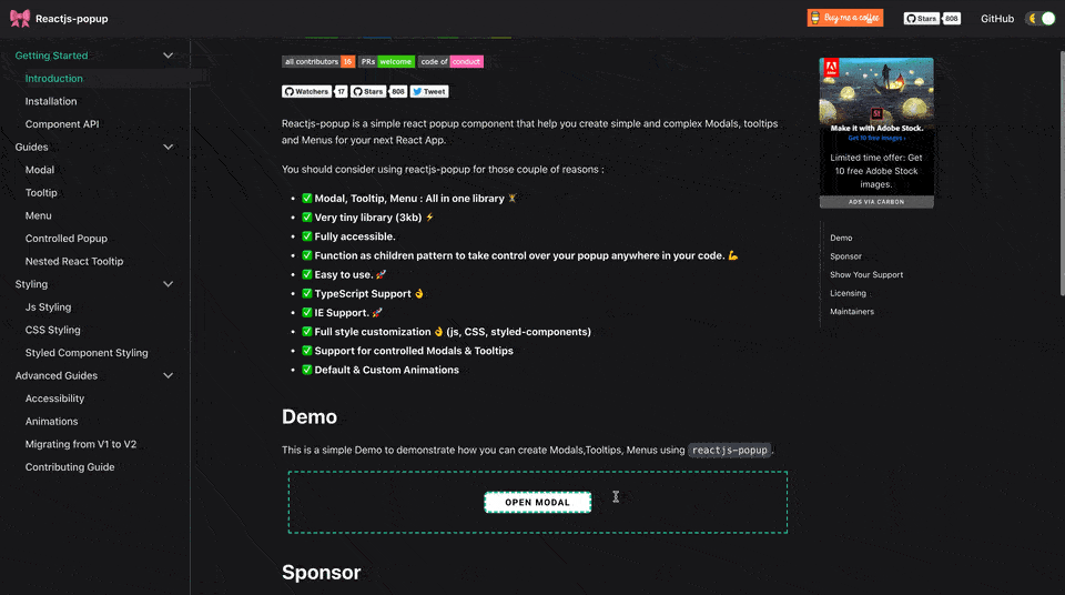
This is a simple Demo to demonstrate how you can create Modals, Tooltips, Menus using reactjs-popup.

Live Demo

 reactjs popup demo


Sponsored by

frigade-sponsor

React-JS Popup is proud to be sponsored by Frigade, a developer tool for building better product onboarding: guided tours, getting started checklists, announcements, and more.


Installing / Getting started

This package is available in NPM repository as reactjs-popup. It will work correctly with all popular bundlers.

npm install reactjs-popup --save

Using yarn

yarn add reactjs-popup

Include the Component

To start using reactjs popup you just need to import the component from the reactjs-popup package.

import React from 'react';
import Popup from 'reactjs-popup';
import 'reactjs-popup/dist/index.css';

export default () => (
  <Popup trigger={<button> Trigger</button>} position="right center">
    <div>Popup content here !!</div>
  </Popup>
);

Documentation

Contributing

Clone Repo

Fork and then clone the repo

git clone [email protected]:your-username/reactjs-popup.git

Start Developing

Install all npm scripts:

npm install
or
yarn install

we use storybook to build popup use cases.

To start storybook:

yarn storybook

Run Test in watch mode

yarn test

To make contributing simply you need to create a new story for your use case under stories directory to demonstrate the new features or the bug fix .

Make Changes 😀.

If you want to contribute check out the help wanted issues for things that need fixing.

Before submitting a pull request run npm run test to run the unit tests .

Licensing

The code in this project is licensed under MIT license.

Show your support!

Sponsor

if you are interested to Sponsor this library and list your logo in this section, Make sure to contact me.

Show Your Support

Buy Me A Coffee

That's all, thank you for your attention, please Star on GitHub the repo to show your support.

we are all made of stars Star on GitHub

Maintainers


Youssouf EL Azizi

reactjs-popup's People

Contributors

abdullahtariq1171 avatar amaranth avatar avin-kavish avatar benomatis avatar creativebernadka avatar cwb6 avatar dependabot[bot] avatar dhruvparmar372 avatar jbdemonte avatar jefferyhus avatar kmarchan avatar marek-nogiec avatar marvinzeising avatar migggz avatar mouadziani avatar ndelangen avatar nelsonomuto avatar polrk avatar quasiyoke avatar rarara avatar rschristian avatar simplycomplexable avatar sloschi avatar smakosh avatar snyk-bot avatar ssnielsen avatar steevsachs avatar tsurutan avatar yjose avatar zakariaelas avatar

Stargazers

 avatar  avatar  avatar  avatar  avatar  avatar  avatar  avatar  avatar  avatar  avatar  avatar  avatar  avatar  avatar  avatar  avatar  avatar  avatar  avatar  avatar  avatar  avatar  avatar  avatar  avatar  avatar  avatar  avatar  avatar  avatar  avatar  avatar  avatar  avatar  avatar  avatar  avatar  avatar  avatar  avatar  avatar  avatar  avatar  avatar  avatar  avatar  avatar  avatar  avatar  avatar  avatar  avatar  avatar  avatar  avatar  avatar  avatar  avatar  avatar  avatar  avatar  avatar  avatar  avatar  avatar  avatar  avatar  avatar  avatar  avatar  avatar  avatar  avatar  avatar  avatar  avatar  avatar  avatar  avatar  avatar  avatar  avatar  avatar  avatar  avatar  avatar  avatar  avatar  avatar  avatar  avatar  avatar  avatar  avatar  avatar  avatar  avatar  avatar  avatar

Watchers

 avatar  avatar  avatar  avatar  avatar  avatar  avatar  avatar  avatar  avatar  avatar  avatar  avatar  avatar  avatar  avatar  avatar  avatar  avatar  avatar

reactjs-popup's Issues

Custom media queries

Hey there!
Love the package, is there any way to add in custom media queries depending on screen width. I'd like to readjust the content style depending on device width. Currently we're using styled components on the front end.

Any help with this would be awesome, thanks!

  • Frank

Add support for CSS classes

Currently, if you want to style the popup content you need to pass a styles object to contentStyle.

It would be great if we could use className or something like customClass to style the content via CSS classes instead.

Previous Popup content not closing when using keyboard tab to focus enter ?

i have added multiple button each button have some popup content
i enter the first button. it's displaying some content fine. then without any mouse click after
i enter the another button it's also displaying the popup content... the two popup content is showing....
previous popup content is not removing....

if u mouse click or esc press only remove the popup content...

Thanks,

IE Supporting

I started using the popup in our project recently. It was awesome for chrome, firefox and safari. But it has some issue for IE. In the previous version 1.1.0, it was working, only has some style issue which I was not able to make it perfect. However, for 1.1.1, IE actually failed to render. It turned out that latest version you're using JS method "includes" in some places, and it is not supported on IE.

So are you planning to support IE also? If so, I think it's better to fix this. I love this popup actually, but we have like 10% users still using IE. So we have to support IE. Hope that you can fix it so that I can continue using you popup. Thanks.

Cannot close tooltip through a button on a non-modal pop-up

I really like this plugin as it is amazingly small and powerful. However, I just get stuck on one issue. I tried to add a button on the tooltip and allow people to allow the pop-up by clicking that button.

I am following the example at Controlled Popup. Rather than using a modal, I tried to change the example to use tooltip (e.g., using trigger). In that case, the pop-up was not closing when I invoked closeModal().

Allow `on` to take an array

Great lib!

Currently on must be hover, focus, or click. Would be great if it also took an array (so it could be triggered on any combo of these).

`prop-types` dependency is missing in package.json

The library package requires prop-types when process.env.NODE_ENV !== 'production' and the prop-types package is not added to package.json. Therefore when I try to build my application using Webpack or Rollup, I get an error saying that the prop-types package is not found.

Version

1.3.2

Expected Behavior

The prop-types package is installed automatically or a peer dependency warning is shown when one installs the reactjs-popup package.

Actual Behavior

No warning is shown, the prop-types package is not installed and a bundling fails.

Issue with staying on top and mouseover menu items

Installed this and works perfectly in most of my site's components, except for a chatroom component whose css renders the page using 'vh' and calculations for page height. I think that is the only difference in css between the chat component and the others, and there is no z-index whatsoever in the chat component.

I tried added styling of 'z-index': "100", etc to the contentStyle prop, but it still won't pop out on top.
Also, the mouseover for the menu items doesn't work on this page either. Obviously the lower menu items don't even show up, but the top menu item loses the hover just a few pixels in to the area.

This is what it normally looks like:
screen shot 2018-04-16 at 12 46 35 pm

And this is how the popup renders on the chat page (which doesn't have any z-index in css):
screen shot 2018-04-16 at 12 46 17 pm

Also, the "View Profile" mouseover doesn't work in this one, but it does in all the others...

Trigger close from code

Is there a way to trigger popup close from code? I'm using it as an input form and just want it to close if the inputs are valid and if not stay open.

Feature/Bug: Tooltip behavior on individual table cells.

Version

1.0.5

Test Case

https://codesandbox.io/s/yqp74xwo5j

Expected Behavior

When a table-like structure is used and tool-tips are desired for each cell, the tool-tip should appear for each cell.

Actual Behavior

The tooltip appears for every other cell. The enter/leave logic requires some sort of intermediate "non-triggered" space.

I have attempted to a) eliminate the timeout timer, b) give enter and exit it's own timeout timer. Neither worked. By placing console.log() messages in the code, I think the renderTrigger() code happens after onMouseEnter in the cases where the tool tip does not appear.

This issue could be considered a feature request or a bug.

Show modal in the other subtab

Hello,

I have a webpage containing several subsections under the same url, such as


nav area: subsection1 | subsection2 | subsection 3


body: Contents for subsection 1 or 2 or 3 depending on the section selected.


Under any subsection, if I start the popup, it always shows under the first subsection, that is to say, I have to click the first subsection to see the popup when I start the popup in the 2nd or 3rd subsection, is this a bug or am I did something wrong?

Thanks very much,
Yun

Overlay not blurring, instead the modal gets blurred.

When I add an object to the prop overlayStyle with filter: "blur(1px)", what happens is that only the modal itself gets blurred, but not the background/overlay.

<Popup
   open={this.state.showModal} onClose={this.closeModal} modal closeOnDocumentClick contentStyle= 
   {modalContentStyle} overlayStyle={modalOverlayStyle} >
    <div className="modalContent">
    </div>   
   </Popup>

The object with the react CSS:

        const modalOverlayStyle = {
            filter: "blur(1px)"
        }

Clicks propagate to the underlying control

If trigger is a link <a> and on is click then click triggers both the popup and the navigation to the link (or its onclick, if any). For example:

<Popup trigger={<a onClick={this.handleClick}>click me</a>} />

Click to open is useful also for tooltip for touch devices (where hover isn't available and/or annoying/confusing for the user). We may mimic the hover behavior we see, for example, on Safari for iOS devices: first click always trigger the popup, second click when popup is open is bubbled down to the target control:

togglePopup(e) {
    if (e && !this.state.isOpen) {
        e.preventDefault();
    }
   
    // ...
}

We also need to change closePopup():

closePopup(e) {
    if (e) {
        e.preventDefault();
    }

    // ...
}

full screen availability

Hi! Thank you for awesome component. What if I need fullscreen modal? Is there the opportunity?

add all possible positions in case of typescript

Version

1.3.2

Test Case

no test cases

Expected Behavior

i want this in indes.d.ts file to be merged with new release. Regarding this there is this commit 833b93c is present

type Position = 'top left' | 'top center' | 'top right' |
'right top' | 'right center' | 'right bottom' |
'bottom left' | 'bottom center' | 'bottom right' |
'left top' | 'left center' | 'left bottom';

Actual Behavior

Currently this code is present in your current release.
type Position = 'top left' | 'top right' | 'bottom right' | 'bottom left' | 'right center' | 'left center' | 'top center' | 'bottom center';

different content for different triggers

Hello, I have feature request/question

I want to show different content on different actions
Eg. on hover I want to show some simple text, but on click I want to show some list
I've tried this:

  <Popup
    trigger={open => (
      <button className="button">Trigger - {open ? "Opened" : "Closed"}</button>
    )}
    on={["hover", "click"]}
    position="right center"
    closeOnDocumentClick
    children={props => {
      return <span>{JSON.stringify(props)}</span>;
    }}
  />

but looks like it's not possible
so this can be a question if I did it wrong or a feature request

Thanks!

Animation API support timing

I've seen in documentation that Animation API will eventually be supported, do you maybe have estimation when will that be? Is that something in the works already?

Popup markup inject location

Currently, I used this popup to trigger in the dropdown menu. But i facing the issue that popup markup is injected into dropdown menu. Although the popup set as Fixed and absolute position, but to solve the issue, the markup needs to place into body. May I know is there a way can trigger the popup and insert into body level instead of trigger element level.

screen shot 2018-09-21 at 9 22 42 am

Trigger Popup from code

Unless I missed something, the only way to trigger a popup is by providing a DOM element for the trigger property. I would like the popup to be triggered by certain events (like server responses) that do not correspond to elements in the dom. Would that be possible?

Thanks!

Order of elements

For usability and accessibility it would be better to place the popup content AFTER the trigger.

This will allow TAB-index to work as expected.

As a work-around I have added tabIndex="1" to the trigger and set keepTooltipInside to true.

Add scroll-lock for modal

Add scroll-lock for modal, when opened document below modal shouldn’t be able to be scrolled and most modals are locked to bottom on mobile

Window resize inside SVG

I'm using your Popover inside a foreignObject of an SVG.

It works fine until the window is zoomed.
That is, the tooltip's position is wrong, and its trigger is misaligned.

The problem does not occur when your component is outside an SVG.
I tried repositionOnResize but it did not help.

Any help much appreciated.

not compatible with Internet Explorer 11

Is there a known bug with reactjs-popup and Internet Explorer 11? Neither the menu nor the tooltip works, and crashes the site with error:
"Object doesn't support property or method 'includes' "

Seems to be a known issue as IE 11 doesn't support includes and to get around it people change their code to use window.indexOf?

right position centring is done yet by left side

HEY. If I type<popup> contentStyle = … position="right" positioning counts itself from the left side, but not from the right.
This causes a BUG:
by clicking on a button it opens a normal width of a popup, positioning from the left
by expanding an inner menu inside the popup it recounts its width, but previous positioning from the left stays the same
popup window goes outside the webpage to the right
by closing the popup window and reopening it (with an inner menu) it recounts itself from the left and it looks fine

Popup's inside transformed elements do not have full screen overlay

Version

1.3.0

Test Case

https://codesandbox.io/s/zm44w83zm

Expected Behavior

Clicking outside the red box should close the popup.

Actual Behavior

Clicking outside the red box doesn't close the popup. This is because popup-overlay which is positioned fixed when inside a parent having transform doesn't cover entire screen. If you remove transform from red box then expected behaviour would be occurring.

Possible Fix

Allow popup content to be rendered in a different root element than application's root. for e.g
<Popup popupRootID="popupRoot"></Popup>. This could be achieved by using Portal rendering from ReactDOM.

Conditional rendering

When using a conditional render block inside <Popup>, it shows this warning:

Warning: Failed prop type: Invalid prop `children` supplied to `Popup`.

Ex. Code:

<Popup>
   {conditional ? <div /> : <span />}
</Popup>

popup arrowStyle css property "left" is been overridden

While trying to custom arrowStyle = { left: 20px } has no effect.

CodeSandbox link where the left: 50px is ignored
https://codesandbox.io/s/pmp848njwx

I see its getting overridden by this line of code here.

The Issue :

I set the offsetX props to move the popup content right (because that's my requirment) and now the arrow also moves right. So to centre align the arrow I use arrowStyle prop set the left property and that's been overridden.

Without OffsetX:

without_offset

Without OffsetX:

with_offset

Suggestions:

  1. Can we have a check if, the left property is explicitly set using arrowStyle, take the property from there without calculating arrowLeft
  2. Calculate the arrowLeft with respect to offsetX props. Like
    arrowLeft = ((triggerBounding.width / 2) - offsetX) + "px";. This would be bit buggy if the offsetX is set to very large values.
  3. Expose a extra prop offsetArrowX to specify the arrow left explicitly.

First approach is bit more cleaner and explicit.

Version

1.2.0

About Subscription

Hi there, let's say if I'm using the PopUp library that you provide and it will pop up a dialog as usual.
But my current problem is, if i'm subscribing websocket inside . when I close the popup it will show "Can't perform a React state update on an unmounted component." even that i already implement following code inside
componentDidMount() {
this._isMounted = true;
}

componentWillUnmount() {
this._isMounted = false;}

Any ideas how to solve this? Thank You.

Error building in ReactJS

Version

1.0.6 & 1.0.7

Test Case

Add this package to a project and import it. Then try to create a production build using yarn run build (react-create-app).

Note: It builds and works fine with version 1.0.5

Expected Behavior

To successfully create a production build

Actual Behavior

It throws the following error:

Creating an optimized production build...
Failed to compile.

Failed to minify the code from this file:

    ./node_modules/reactjs-popup/reactjs-popup.es.js:52

Read more here: http://bit.ly/2tRViJ9

verbose 15.369 Error: Command failed with exit code 1.
at C:\Users\Mike Schaap\AppData\Roaming\npm\node_modules\yarn\lib\util\execute-lifecycle-script.js:264:15
at Generator.throw ()
at step (C:\Users\Mike Schaap\AppData\Roaming\npm\node_modules\yarn\node_modules\babel-runtime\helpers\asyncToGenerator.js:17:30)
at C:\Users\Mike Schaap\AppData\Roaming\npm\node_modules\yarn\node_modules\babel-runtime\helpers\asyncToGenerator.js:30:13
at
at process._tickCallback (internal/process/next_tick.js:118:7)
error Command failed with exit code 1.
info Visit https://yarnpkg.com/en/docs/cli/run for documentation about this command.

Popup on right click?

Can I bring up the popup in response to a click of the right mouse button?

It looks like this is not possible, please consider this a feature request. :-) Thanks!

Popup being covered by a parent that has overflow:hidden style

When you set the parent of the Popup to have position:relative and the parent's has overflow hidden, the Popup is being covered when you try to show it.

See example: https://codesandbox.io/s/21wz7z94lp

Is there a work around with this? Maybe set an option to append the Popup node as last element on #root?

Version: 1.3.2
Test Case: https://codesandbox.io/s/21wz7z94lp
Wanted Behavior: Popup to not be covered by parent.
Actual Behavior: Popup being covered by Parent

`position` enum doesn't include 'center center'

"center center" is a valid position for the Popup, as it can be set to cover the initial element directly. However, it is rejected by the propTypes Enum.

I'm aware that it's not specifically code for and is effectively the same as "blah blah", but it works for our use-case and ought not present an error.

Version

1.3.2

Test Case

https://codesandbox.io/s/m33m9q3np8

Expected Behavior

position value is accepted

Actual Behavior

Warning: Failed prop type: Invalid prop `position` supplied to `Popup`.

Feature request: disabled property

Hi.

I want to suggest a new property for <Popup /> which is disabled. I've run into an issue where I have a tooltip displayed when the mouse is hovering over a button, and when I click on the button I change the opacity of the button to 0. But unfortunately the tooltip will still show up, which is the expected behavior.

That's why I want to suggest the new prop: disabled.

When disabled is set as a prop for <Popup />, then the tooltip will be removed if it's already displayed, and it won't show up when hovering over a disabled <Popup />.

I hope this gets implemented, and I could probably help out if there's interest.

Thanks!

When onClose is used, modal stops working when it is closed by clicking outside.

I was trying to prevent body scrolling when popup was opened. I implemented onOpen and onClose to do that. Entire code below:

<Popup open={this.state.modalOpen} closeOnDocumentClick onClose={this.closeModal} className="organization-employees-add-branch-modal" onOpen={() => (document.body.style.overflow = "hidden")} onClose={() => document.body.removeAttribute("style")} >

The this.closeModal function works fine. When you close the modal by clicking outside, modal doesn't work after. No errors.

Is there a fix?

Feature Request: Popup recalculates position when window is resized

It would be great to be able to pass a repositionOnResize prop that would recalculate the position of the popup when the widow width and possibly height changes.

Another approach would be to expose the reposition function so that components that consume this component could tell the popup when to recalculate position.

Recommend Projects

  • React photo React

    A declarative, efficient, and flexible JavaScript library for building user interfaces.

  • Vue.js photo Vue.js

    🖖 Vue.js is a progressive, incrementally-adoptable JavaScript framework for building UI on the web.

  • Typescript photo Typescript

    TypeScript is a superset of JavaScript that compiles to clean JavaScript output.

  • TensorFlow photo TensorFlow

    An Open Source Machine Learning Framework for Everyone

  • Django photo Django

    The Web framework for perfectionists with deadlines.

  • D3 photo D3

    Bring data to life with SVG, Canvas and HTML. 📊📈🎉

Recommend Topics

  • javascript

    JavaScript (JS) is a lightweight interpreted programming language with first-class functions.

  • web

    Some thing interesting about web. New door for the world.

  • server

    A server is a program made to process requests and deliver data to clients.

  • Machine learning

    Machine learning is a way of modeling and interpreting data that allows a piece of software to respond intelligently.

  • Game

    Some thing interesting about game, make everyone happy.

Recommend Org

  • Facebook photo Facebook

    We are working to build community through open source technology. NB: members must have two-factor auth.

  • Microsoft photo Microsoft

    Open source projects and samples from Microsoft.

  • Google photo Google

    Google ❤️ Open Source for everyone.

  • D3 photo D3

    Data-Driven Documents codes.