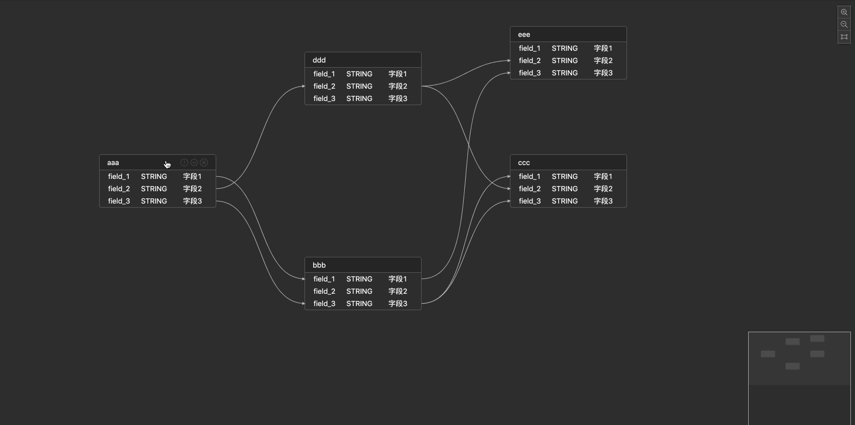
- 支持定制字段属性
- 支持定制title,title的icon
- 支持节点的收缩/展开状态,以及收缩后的映射关系
- 支持定制线段的属性以及自定义label
- 支持节点,字段的hover,focus,linked以及全链路高亮状态
- 支持节点,线段的右键菜单
- 支持minimap,以及minimap的联动移动和高亮状态
- 支持空字段内容定制
npm install react-visual-modeling
| 参数 | 说明 | 类型 | 默认值 |
|---|---|---|---|
| data | 画布数据 | any | - |
| width | 组件宽度 | number | string | - |
| height | 组件高度 | number | string | - |
| className | 组件类名 | string | - |
| columns | 列的配置描述, 见columns Prop | Array< columns> | - |
| nodeMenu | 节点右键菜单配置 | Array< menu> | [ ] |
| edgeMenu | 线段右键菜单配置 | Array< menu> | [ ] |
| config | 组件的画布配置,见config Prop | any | - |
| emptyContent | 当表字段为空时显示内容 | string | JSX. Element | - |
| emptyWidth | 当表字段为空时表容器宽度 | number | string | - |
| onLoaded | 渲染完毕事件 | (canvas) => void | - |
| onChange | 图内数据变化事件 | (data) => void | - |
| onFocusNode | 聚焦节点事件 | (node) => void | - |
| onFocusEdge | 聚焦线段事件 | (edge) => void | - |
| onFocusCanvas | 聚焦空白处事件 | () => void | - |
节点字段每列的属性设置
| 参数 | 说明 | 类型 | 默认值 |
|---|---|---|---|
| title | 每列的名字 | string | - |
| key | 每列的唯一标志,对应数据上的key值 | string | - |
| width | 每列宽度 | number | - |
| primaryKey | 这列的key对应的value是否作为键值对 | boolean | - |
| render | 支持每列的自定义样式 | (key) => void | - |
'节点/线段'的右键菜单配置
| 参数 | 说明 | 类型 | 默认值 |
|---|---|---|---|
| title | 每列的展示的名字 | string | - |
| key | 每列的唯一标志,对应数据上的key值 | string | - |
| render | 支持每列的自定义样式 | (key) => void | - |
| onClick | 每列的点击回调 | (key, data) => void | - |
画布配置
| 参数 | 说明 | 类型 | 默认值 |
|---|---|---|---|
| showActionIcon | 是否展示操作icon:放大,缩小,聚焦 | boolean | - |
| allowKeyboard | 允许键盘删除事件 | boolean | - |
| collapse | 是否允许节点收缩 | collapse Prop { } | - |
| titleRender | 节点title的渲染方法 | (title) => void | - |
| titleExtIconRender | 节点右侧按钮的渲染方法 | (node) => void | - |
| labelRender | 线段label的渲染方法 | (label) => void | - |
| minimap | 是否开启缩略图 | minimap Prop { } | - |
节点收缩属性
| 参数 | 说明 | 类型 | 默认值 |
|---|---|---|---|
| enable | 是否允许节点收缩 | boolean | - |
| defaultMode | 默认展示形式 | string | 默认以"展开/收缩"形式展示 |
缩略图属性
| 参数 | 说明 | 类型 | 默认值 |
|---|---|---|---|
| enable | 是否开启缩略图 | boolean | - |
| config | 缩略图的配置 | minimap Config Prop { } | - |
缩略图的配置
| 参数 | 说明 | 类型 | 默认值 |
|---|---|---|---|
| nodeColor | 节点颜色 | any | - |
| activeNodeColor | 节点激活颜色 | any | - |
import VisualModeling from 'react-visual-modeling';
import 'react-visual-modeling/dist/index.css';
<VisualModeling
  data={data}
  column={column}
  nodeMenu={menu}
  edgeMenu={menu}
  config={config}
  onLoaded={() => {}}
  onChange={() => {}}
  onFocusNode={() => {}}
  onFocusEdge={() => {}}
  onFocusCanvas={() => {}}
>
</VisualModeling>interface columns { // 节点字段每列的属性设置
title ? : string, // 每列的名字
key: string, // 每列的唯一标志,对应数据上的key值
width ? : number, // 每列宽度
primaryKey: boolean, // 这列的key对应的value是否作为键值对
render ? (value: any, rowData: any) : void // 可自定义每列的样式
}
interface config { //
showActionIcon ? : boolean, // 是否展示操作icon:放大,缩小,聚焦
allowKeyboard ? : boolean, // 允许键盘删除事件,todo以后支持shift多选
collapse: {
enable: boolean, // 允许节点收缩
defaultMode: string // 默认以"展开/收缩"形式展示
},
titleRender ? (title: JSX.Element) : void, // 节点title的渲染方法
titleExtIconRender ? (node: JSX.Element) : void, // 节点右侧按钮的渲染方法
labelRender ? (label: JSX.Element) : void, // 线段label的渲染方法
minimap: { // 是否开启缩略图
enable: boolean,
config: {
nodeColor: any, // 节点颜色
activeNodeColor: any // 节点激活颜色
}
}
}
interface menu { // '节点/线段'的右键菜单配置
title ? : string, // 每列的展示的名字
key: string, // 每列的唯一标志,对应数据上的key值
render ? (key: string) : void, // 支持每列的自定义样式
onClick ? (key: string, data: any) : void, // 每列的点击回调
}
interface props {
width ? : number | string, // 组件宽
height ? : number | string, // 组件高
className ? : string, // 组件classname
columns: Array < columns > , // 跟antd的table的column的概念类似
nodeMenu: Array < menu > , // 节点右键菜单配置
edgeMenu: Array < menu > , // 线段右键菜单配置
config: config, // 如上述配置
data: any, // 数据
emptyContent ? : string | JSX.Element; // 当表字段为空时显示内容
emptyWidth ? : number | string; // 当表字段为空时表容器宽度
onLoaded(canvas: any): void, // 渲染完毕事件
onChange(data: any): void, // 图内数据变化事件
onFocusNode(node: any): void, // 聚焦节点事件
onFocusEdge(edge: any): void, // 聚焦线段事件
onFocusCanvas(): void, // 聚焦空白处事件
};如需要更多定制的需求,您可以提issue或者参考Butterfly来定制您需要的需求


 React
React
 Typescript
 Django
 Laravel
 Facebook
 Microsoft
 Google
 Alibaba
 D3
D3
 Tencent