


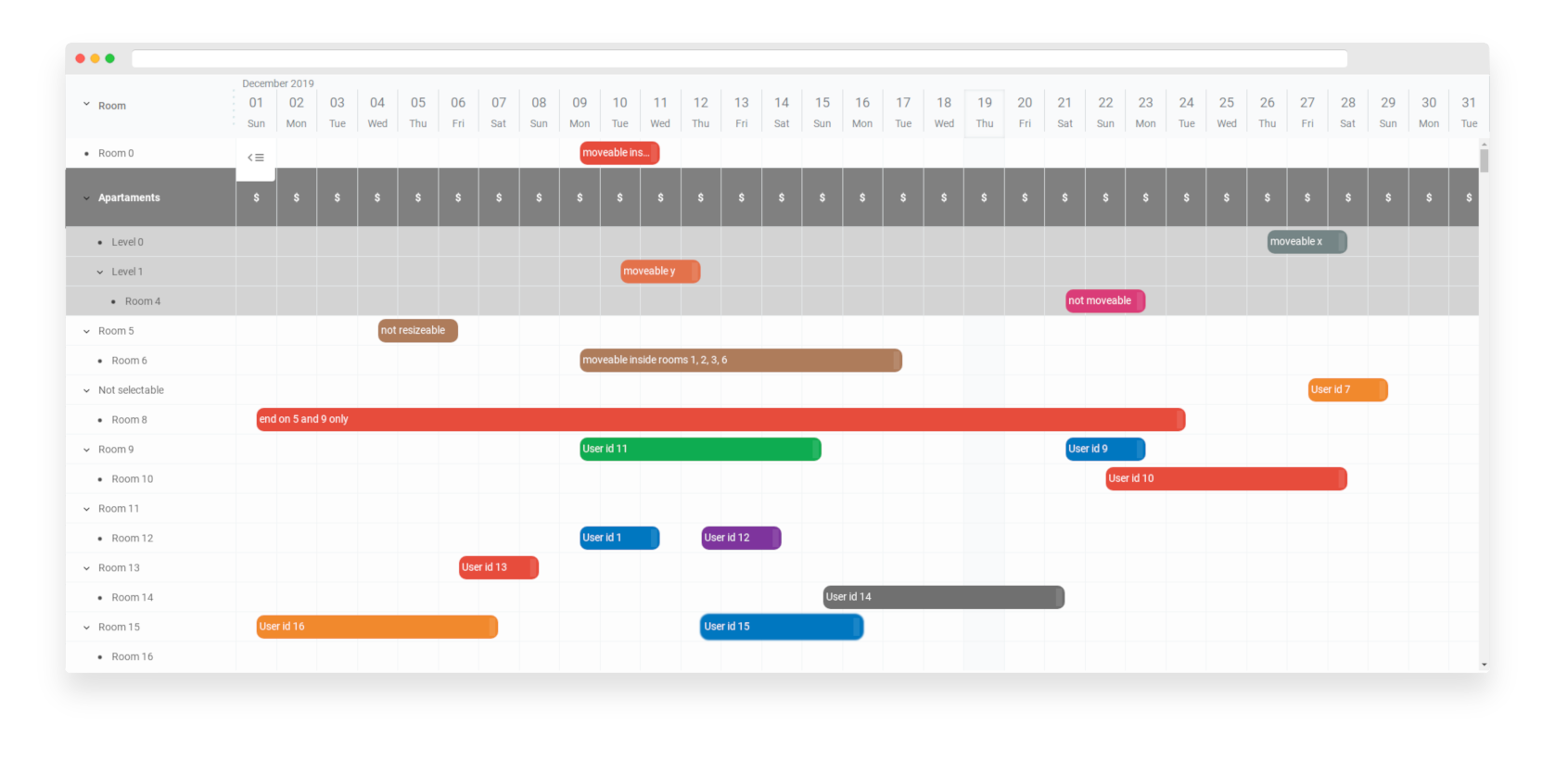
- elastic - you can change almost everything from DOM tree to logic (without any compilation)
- multiple items in one row - suitable for different usecases
- tree like structures
- moveable / resizeable items
- item movement strategies - x, xy, specified row, basically anything you want
- snap to specified time when resizing / moving
- selectable items, rows, grid cells
- you can define your selection strategy and select only what you want
- gradual time zoom up to 5 minutes
- resizeable list columns
- BEM based CSS rules
- you can easily stylize things when data has been changed (items, rows, grid)
- you can easily add third party libraries
- higly configurable
- super fast even with large dataset
- attractive visually
- written in typescript
You can use it in react, vue, angular, svelte or any other projects.
Additional versions:
- react-gantt-schedule-timeline-calendar
- angular-gantt-schedule-timeline-calendar
- vue-gantt-schedule-timeline-calendar
You can use it as schedule for reservation system. You can use it for organizing events. You can use it as gantt chart. Or you can use it as calendar for different purposes.
gantt-schedule-timeline-calendar is very extensible and elastic. You can make your own plugins or modify configuration in couple of ways to achieve your goals. You can control almost everything. You can change html structure, stylize every html element and even override original components without any compilation stage!
npm i gantt-schedule-timeline-calendar
or
<script src="https://cdn.jsdelivr.net/npm/gantt-schedule-timeline-calendar"></script>
Basically you need to create some configuration described below, create state for it and mount component to DOM.
const config = {
  /* ... */
};

const state = GSTC.api.stateFromConfig(config);

const app = GSTC({
  element: document.getElementById('your-element-id'),
  state
});gantt-schedule-timeline-calendar is using deep-state-observer so you can checkout its documentation and start having fun.
Your configuration will be merged recursively with default configuration options (default-config) so almost all options are optional.
TIP: most of the time when you need to modify html or add some events you will need to use actions
TIP: take a look at types or default-config
height{number}- component height in pixelsheaderHeight{number}- height of header and calendar in pixelslist{object}- list configurationchart{object}- chart configurationlocale{object}- locale configurationutcMode{boolean}- dayjs UTC mode on / offactions{object}- actions can operate directly onHTMLElementsand can be used to add some event listener or inject/modify some html of the componentwrappers{object}- wrappers are functions that can wrap any component html - you can wrap component html indiv's or add some html before or aftercomponents{object}- object that holds components used insideGSTC- you can replace any component you wantplugins{array}- array of plugins that needs to be initialized beforeGSTCplugin{object}- this is a container for plugins to store some data
rows{object}- rows configurationcolumns{object}- columns configurationexpander{object}- expander configurationtoggle{object}- toggle configurationrowHeight{number}- default row height in pixels - this option can be set individually for each row
Rows are listed on the left side of component (list) and are kind of containers for items (right side - chart). Rows can contain multiple items.
Rows configuration is an object where key is a row id ({string}) and value is an object with data you need for columns configuration or for your use case.
Row should have an id inside as id property {string}.
Rows can contain also those values:
parentId{string}- this is a parent row id for hierarchical data structuresexpanded{boolean}- if this row have children should it be expanded or collapsed?
// example rows configuration (minimal)
const config = {
  list: {
    rows: {
      '1': {
        id: '1'
      },
      '2': {
        id: '2',
        parentId: '1'
      },
      '3': {
        id: '3',
        parentId: '2',
        expanded: true
      },
      '4': {
        id: '4',
        parentId: '3'
      }
    }
  }
};data{object}- columns data configurationresizer{object}- resizer configurationpercent{number}- percentage width of all columns (0 - 100) if 0 list will disappear (from DOM)minWidth{number}- default minimal width of the column in pixels
Columns data configuration is an object where key is an id of the column ({string}) and value is column configuration.
Column configuration must contain id property too.
id{string}- id of the columndata{string | function}- for string it is a property name that should exists inside row configuration and will display coresponding value, if data is a function it will be executed with row as argument - that function should return a string or lit-html templateisHTML{boolean}- if set to truedataoption will be rendered as HTML so be careful and do not let user to inject anything unsafe!width{number}- width of the column in pixelsheader{object}- column header configurationexpander{boolean}- should this column contain expander?
// example rows and columns configuration (minimal)
const config = {
  list: {
    rows: {
      '1': {
        id: '1',
        label: 'Row 1'
      },
      '2': {
        id: '2',
        parentId: '1',
        label: 'Row 2'
      },
      '3': {
        id: '3',
        parentId: '2',
        expanded: true,
        label: 'Row 3'
      },
      '4': {
        id: '4',
        parentId: '3',
        label: 'Row 4'
      }
    },
    columns: {
      data: {
        'label-column-or-whatever': {
          id: 'label-column-or-whatever',
          data: 'label',
          width: 300,
          expander: true,
          header: {
            content: 'Label'
          }
        },
        'some-html': {
          id: 'some-html',
          isHTML: true,
          data: '<div>your html here</div>',
          width: 400,
          header: {
            content: 'anything'
          }
        }
      }
    }
  }
};content{string}- Label for this headerhtml{lit-html template}- lit-html template if you want html
padding{number}- left padding size in pixelssize{number}- size in pixels (width and height)icon{object}- withwidthandheightproperties in pixels{numbers}icons{object}- expander icons configuration
child{string}- svg code for non expandable child elementopen{string}- svg code for openclosed{string}- svg code for closed
display{boolean}- you can show or hide list toggleicons{object}- toggle icons configuration
open{string}- svg code for openclosed{string}- svg code for closed
width{number}- resizer width in pixelsdots{number}- number of dots
time{object}- time configurationitems{object}- items configurationgrid{object}- grid configurationspacing{number}- space between item in pixels
from{number}- can be set to limit left side of the chart to specified time in millisecondsto{number}- can be set to limit right side of the chart to specified time in millisecondszoom{number}- horizontal zoom - lower values for zoom in - values between 10 and 22
Items like rows and columns are objects where key is an item id ({string}) and value is item configuration
id{string}- item idrowId{string}- in which row this item should appearlabel{string}- item labeltime{object}- item time configuration
start{number}- start time in millisecondsend{number}- end time in milliseconds
// example rows and items configuration (minimal)
const config = {
  list: {
    rows: {
      '1': {
        id: '1',
        label: 'Row 1'
      },
      '2': {
        id: '2',
        parentId: '1',
        label: 'Row 2'
      }
    }
  },
  chart: {
    items: {
      '1': {
        id: '1',
        rowId: '1',
        label: 'Item 1',
        time: {
          start: new Date('2020-01-01').getTime(),
          end: new Date('2020-01-02').getTime()
        }
      },
      '2': {
        id: '2',
        rowId: '2',
        label: 'Item 2',
        time: {
          start: new Date('2020-01-01').getTime(),
          end: new Date('2020-01-02').getTime()
        }
      },
      '3': {
        id: '3',
        rowId: '2',
        label: 'Item 3',
        time: {
          start: new Date('2020-01-03').getTime(),
          end: new Date('2020-01-04').getTime()
        }
      }
    }
  }
};Basically locale configuration comes from dayjs locale object
name{string}- locale name (enfor example)weekdays{string[]}- array of strings with weekdays starting from sunday (Sunday,Mondayetc)weekdaysShort{string[]}- same as weekdays but little bit shorter (Sun,Mon...)weekdaysMin{string[]}- shortest weekdays (Su,Mo...)months{string[]}- month names as array of stringsmonthsShort{string[]}- shorter month namesweekStart{number}- week start number from 0 to 6 where 0 = sunday, 1 = monday
Actions are functions (or classes) that can operate directly on DOM Tree.
With actions you can add additional event listeners, add/update/inject some HTMLElements or add behavior from third party libraries like popups or dialogs.
Action structure is an object where key is component name (kebab-cased) and value is an array of actions that should be fired. One action is executed on all elements/component instances of specified type.
Available action names:
mainlistlist-columnlist-column-headerlist-column-header-resizerlist-column-header-resizer-dotslist-column-rowlist-column-row-expanderlist-column-row-expander-togglelist-togglechartchart-calendarchart-calendar-datechart-timelinechart-timeline-gridchart-timeline-grid-rowchart-timeline-grid-row-blockchart-timeline-itemschart-timeline-items-rowchart-timeline-items-row-item
Action is a function that is fired when specified DOM Node is created and should return an object with update and destroy functions.
Each of the functions takes two arguments:
- Element
{HTMLElement} - Data
{object}
update lifecycle method is fired when element stays where it was, but is reused to display another portion of data (performance optimization).
destroy is fired when element is removed from the DOM tree and component is destroyed.
Example action that will add title property to each item inside chart.
function addItemTitle(element, data) {
  // fired when element / component is created for the first time
  // you can console.log(data) to find out what is inside specified component data
  element.title = data.item.label;

  return {
    update(element, data) {
      // fired when element takes data from another item - data has been changed

      element.title = data.item.label;
    },

    destroy(element, data) {
      // fired when component is destroyed and element is to be removed from DOM tree
      // you can clean up something here
      element.title = '';
    }
  };
}

const config = {
  actions: {
    'chart-timeline-items-row-item': [addItemTitle]
  }
};
Add item click event example:
function clickAction(element, data) {
  function onClick(event) {
    // data variable will be updated in update method below so it will be always actual
    alert(`Event ${data.item.id} clicked!`);
  }

  element.addEventListener('click', onClick);

  return {
    update(element, newData) {
      data = newData; // data from parent scope updated
    },

    destroy(element, data) {
      element.removeEventListener('click', onClick);
    }
  };
}

const config = {
  /* ... */
  actions: {
    'chart-timeline-items-row-item': [clickAction]
  }
  /* ... */
};
Actions can be classes too - with constructor, update and destroy methods.
class ItemClickAction {
  constructor(element, data) {
    this.data = data;
    this.onClick = this.onClick.bind(this);
    element.addEventListener('click', this.onClick);
  }

  update(element, data) {
    this.data = data;
  }

  destroy(element, data) {
    element.removeEventListener('click', this.onClick);
  }

  onClick(event) {
    alert(`Item ${this.data.item.id} clicked!`);
  }
}

const config = {
  /* ... */
  actions: {
    'chart-timeline-items-row-item': [ItemClickAction]
  }
  /* ... */
};gantt-schedule-timeline-calendar is using lit-html from polymer project to easly render templates without compilation stage, so if you want to wrap some GSTC component to add some functionality, you can use html from lit-html and wrappers and at the end your code will be much cleaner.
Wrappers are functions that takes TemplateResult from html (from lit-html) and returns wrapped (or not) version.
Wrappers configuration options is an object where key is component name and value is just function so you can use decorator pattern (replace that function) on it.
Available component names:
MainListListColumnListColumnHeaderListColumnHeaderResizerListColumnRowListColumnRowExpanderListColumnRowExpanderToggleListToggleChartChartCalendarChartCalendarDateChartTimelineChartTimelineGridChartTimelineGridRowChartTimelineGridRowBlockChartTimelineItemsChartTimelineItemsRowChartTimelineItemsRowItem
Example that shows how to wrap list column row with div and additional class.
let oldWrapper;

function addClassWrapper(input) {
  let result = oldWrapper(input);
  result = html`
    <div class="additional-class">${result}</div>
  `;
  return result;
}

// after GSTC is loaded and running so we could save oldWrapper
state.update('config.wrappers', wrappers => {
  oldWrapper = wrappers.ListColumnRow;
  wrappers.ListColumnRow = addClassWrapper;
  return wrappers;
});In gantt-schedule-timeline-calendar you can replace any component with your implementation.
Just copy interesting component - modify it and set up in components configuration property.
Component configuration is (just like above) object where key is a component name and value is just component itself.
Available component names:
MainListListColumnListColumnHeaderListColumnHeaderResizerListColumnRowListColumnRowExpanderListColumnRowExpanderToggleListToggleChartChartCalendarChartCalendarDateChartTimelineChartTimelineGridChartTimelineGridRowChartTimelineGridRowBlockChartTimelineItemsChartTimelineItemsRowChartTimelineItemsRowItem
Components are functions that takes operational functions vido and props as second argument.
Component must return a render function with html (lit-html).
function ExampleComponent(vido, props) {
  const { html, update } = vido;

  let name = 'John';
  const onClickHandler = event => {
    name = 'Jack';
    update();
  };

  return () =>
    html`
      <div class="example-component" @click=${onClickHanlder}>Hello ${name}</div>
    `;
}GPL-3.0


 React
React
 Typescript
 Django
 Laravel
 Facebook
 Microsoft
 Google
 Alibaba
 D3
D3
 Tencent