coderuni / responsive_sizer Goto Github PK
View Code? Open in Web Editor NEWResponsive Sizer helps implement are responsive layout by providing helper widgets and extensions
Home Page: https://pub.dev/packages/responsive_sizer
License: MIT License
Responsive Sizer helps implement are responsive layout by providing helper widgets and extensions
Home Page: https://pub.dev/packages/responsive_sizer
License: MIT License


Hi, I'm having trouble switching from portrait to landscape orientation. The UI is not updated with the specified sizes until I do a manual Hot Reload
This is my main.dart
class MyApp extends StatelessWidget {
  const MyApp({super.key});

  @override
  Widget build(BuildContext context) {
    return ResponsiveSizer(
      builder: (context, orientation, screenType) {
        return MaterialApp(
          debugShowCheckedModeBanner: false,
          theme: AppTheme.appTheme,
          initialRoute: SplashScreen.routeName,
          onGenerateRoute: PageClassGenerator.getNamedScreen,
        );
      },
    );
  }
}
This is an example of how I use the library
@override
  Widget build(BuildContext context) {
    return SizedBox(
      height: 25.h,
      child: Stack(
        children: [
          Image.asset(
            ResourceImages.background,
            width: 100.w,
            height: 25.h,
            fit: BoxFit.cover,
          ),
          Center(
            child: Image.asset(
              ResourceImages.cards,
              height: 22.h,
              fit: BoxFit.cover,
            ),
          ),
        ],
      ),
    );
  }
I have tested this problem on a physical android device and on an iPad Pro (11-inch) emulator.
======== Exception caught by widgets library =======================================================
The following LateError was thrown building MyApp(dirty):
LateInitializationError: Field 'height' has not been initialized.

The relevant error-causing widget was:
  MyApp MyApp:file:///D:/OneDrive%20-%20ECAM/Projet_App_Trading_Conseils/flexmes_mobile_app/lib/main.dart:16:22
When the exception was thrown, this was the stack:
#0      Device.height (package:responsive_sizer/src/helper.dart)
#1      DeviceExt.h (package:responsive_sizer/src/extension.dart:7:33)
#2      appThemeData (package:flexmes_mobile_app/config/themes.dart:15:21)
#3      appThemeData (package:flexmes_mobile_app/config/themes.dart)
#4      MyApp.build (package:flexmes_mobile_app/main.dart:35:22)
#5      StatelessElement.build (package:flutter/src/widgets/framework.dart:4662:28)
#6      ComponentElement.performRebuild (package:flutter/src/widgets/framework.dart:4588:15)
#7      Element.rebuild (package:flutter/src/widgets/framework.dart:4311:5)
#8      ComponentElement._firstBuild (package:flutter/src/widgets/framework.dart:4566:5)
#9      ComponentElement.mount (package:flutter/src/widgets/framework.dart:4561:5)
#10     Element.inflateWidget (package:flutter/src/widgets/framework.dart:3631:14)
#11     Element.updateChild (package:flutter/src/widgets/framework.dart:3383:18)
#12     RenderObjectToWidgetElement._rebuild (package:flutter/src/widgets/binding.dart:1198:16)
#13     RenderObjectToWidgetElement.mount (package:flutter/src/widgets/binding.dart:1167:5)
#14     RenderObjectToWidgetAdapter.attachToRenderTree.<anonymous closure> (package:flutter/src/widgets/binding.dart:1112:18)
#15     BuildOwner.buildScope (package:flutter/src/widgets/framework.dart:2531:19)
#16     RenderObjectToWidgetAdapter.attachToRenderTree (package:flutter/src/widgets/binding.dart:1111:13)
#17     WidgetsBinding.attachRootWidget (package:flutter/src/widgets/binding.dart:944:7)
#18     WidgetsBinding.scheduleAttachRootWidget.<anonymous closure> (package:flutter/src/widgets/binding.dart:924:7)
(elided 11 frames from class _RawReceivePortImpl, class _Timer, dart:async, and dart:async-patch)
====================================================================================================
Hello I wanted to ask a question about the use of the package. I have been using the package and it is doing very well, the problem is that I don't know if I am using it well. Since the same thing happened to me with the other package of sizer. That is, I cannot adapt my application to all screens perfectly, and I think it is because I do not use it well. So my question would be, should I put the ResposiveSizer widget on every screen where I use it or just put it in the main as it works in the example?
I see your package to defined size is as a percentage (Max to define the size is 100, ex: 100.0.w / 100.0.h --> it's mean the size is 100% / full screen). But can we specify the size is not using a percentage but using a dp for width and height and a sp for the font?
For example, if in the mockup get the size for the font is 14, so we can't implement your package like this:
style: TextStyle(fontSize: 14.0.sp), // This is not sp, but the font size is 14% from the screen. So it not accurate with the size in the mockup that created by designer.
Also if in the mockup get width is 100 and height is 50 for the Button, so we can't implement your package like this:
SizedBox(
   width: 100.0.w,  // This is not accurate with the size in the mockup that created by designer.
   height: 50.0.h, // This is not accurate with the size in the mockup that created by designer.
   child: RaisedButton(),
),
I think this is the major issue.
This is a issue mentioned in the original Sizer package, I have the same issue, I want to use exact values from Design and the package should scale accordingly. Can you please tell me how I can do this?
I have heard, extensions can be used but I am not able to work it out.
If you could show an example, I would be highly grateful.
As the title indicates, in my opinion the extensions .h, .w, .sp, do not work correctly, maybe there is some concrete reason why you have done it and that is beyond my knowledge, but for the moment I think it should work otherwise and I'll explain why below.
1- .w and .h extensions
I was reviewing the package and I saw that when setScreenSize() changes the value of adaptiveWidth and adaptiveHeight, you put an if loop to verify that if the orientation is in portrait mode and set its value in this way, that is;
if (orientation == Orientation.portrait) {
      adaptiveWidth = boxConstraints.maxWidth;
      adaptiveHeight = boxConstraints.maxHeight;
    } else {
      adaptiveWidth = boxConstraints.maxHeight;
      adaptiveHeight = boxConstraints.maxWidth;
    }
Nothing you do not know until there, but as I said before in my humble opinion, I think it should work in another way, that is, it should not be this cycle, because when I want to change a size in landscape mode I want my adaptideWidth is the actual width that I currently have when being in landscape mode and not the width that it would have in portrait mode, perhaps for the size of the letter if it works because it is the same size in the two orientations but for the sizes of a Container() for example, in my opinion not. I repeat that maybe I'm wrong but I think it should always be the width of the screen whether you are in landscape or portrait mode, that is.
     adaptiveWidth = boxConstraints.maxWidth;
     adaptiveHeight = boxConstraints.maxHeight;
2- .sp extension
Something similar to the previous ones happens to this extension, that is, when you do the operation;
double get sp => this * (Device.adaptiveWidth / 3) / 100;
You only take into account the width of the screen, but for me this is an error, I put an example so that you understand:
Now I have a device with a size of, 1366x768 in landscape mode and 768x1366 in portrait mode (I use computer sizes because they are the ones I know the most), then I create a Container() with a size of 20% of the height and 20% of the width in portrait mode, and inside I add a Text() with a size that fits the size of the Container() but does not come out outside of it.
And now I launch my application on a device with a screen that has a size of 1280x768 in landscape mode and 768x1280 in portrait mode.
If I take as a reference the width of the screen in portrait mode to adjust the size with the extension ".sp", since the width is now 768 the same as before, and the height is 1280 less than before, my Text() It will be seen with a size the same as before, which will cause the letter to be cut off because it no longer fits the dimensions of the Container() that I had created, since the height is reduced but the font size It remains the same.
To fix this problem I have created my own test function, which would be like this:
double textSize(BuildContext context, num mySize) {
  final h = MediaQuery.of(context).size.height;
  final w = MediaQuery.of(context).size.width;

  double result = mySize * (((h + w) / 2) / 4) / 100;

  return result;
}
and if you wanted to add it to your package it would be like this:
double get sp => this * (((Device.adaptiveWidth + Device.adaptiveHeight) / 2) / 4) / 100;
In this way, if you change any of the two sizes of the screen, the text adapts accordingly because it takes into reference the total resolution of the screen and not only the width.
Even to be totally exact, the pixelRatio and the aspectRatio could also be taken into account, being this way:
double get sp => this * (((Device.adaptiveWidth + Device.adaptiveHeight + MediaQuery.of (context) .devicePixelRatio + MediaQuery.of (context) .size.aspectRatio) / 2) / 4) / 100;
which would not change the final value too much, but it would make it even more precise since not all phones are the same even if their resolutions are the same.
PS: If you divide "/ 4.5"
double get sp => this * (((Device.adaptiveWidth + Device.adaptiveHeight) / 2) / 4.5) / 100;
It will give you a result more similar to the result that it gave with
double get sp => this * (Device.adaptiveWidth / 3) / 100;
in this way it will be easier to adapt to your design if someone was using the package, since the sizes will be more or less the same but it will adapt depending on the total resolution of the screen.
What happens that I have divided by 4 because I love whole numbers XD
If I make a mistake with something, sorry, do not hesitate to correct me, but I only try to help because I like this package since I know of the headaches that adapting the application to all screens gives and I think this is the best way to do it.
Regards, and thanks for your work.
hi , if this package is used in another package and this package and another package are used in the program, there will be a problem in the context and the page size will be messed up, please check if ResponsiveSizer exists, do not set it anymore!
mian (my app)
     ResponsiveSizer (my app)
         another package (use ResponsiveSizer)
Hi,
It seems like it would be useful to add the Desktop ScreenType.
Works like this:
https://blogs.windows.com/windowsdeveloper/2017/05/01/master-master-detail-pattern/
https://en.m.wikipedia.org/wiki/Master%E2%80%93detail_interface
On mobile you navigate from the master to the detail page.
On desktop of tablet , you have master and detail page on the same screen.
This is a very common need …
routing can get tricky to do it .
typicalky I have seen it done I using a different scaffold for each which is not DRY as we would like . It would be awesome if that can be abstracted to a degree .
my feeling is that a higher level component is created that uses your library to do both scenarios in a reusable way .
Thoughts ?
Would be great to end up with an example showing it
I have a Figma design with a specific phone frame, and I want to use responsive_sizer to create a responsive design across different device sizes. As responsive_sizer involves using percentages of the screen for widget sizes, and it may seem like a hit-and-try process. If I want to convert the exact size information from the Figma design using responsive_sizer, is there a specific method or guideline to follow?
For example, in a Figma design, the device frame is 480 x 320, and the container size is 60 x 60.
How can I utilize the 60 x 60 dimensions with responsive_sizer for Flutter widgets.
The method to set screenType between mobile or tablet gives the wrong input on certain tablets whose height in landscape mode is shorter than 600. I suggest lowering the "magic number" to check height in landscape mode to 550 from 600 to support tablets with smaller screens
I don't know why it closes it, it still works badly, more than anything I mean the calculation it does for the .sp function
it does not work well, as it is now it would be better to have left it as before and I will show you.
I already said that you had to take into account the two sizes of the screen, it is useless to use only the width because when the height changes the text should change with it, that is to adapt well.
But keep with the idea of only taking width into account and now it works worse. It has been good to use pixelDensity, that is correct but the calculation is not well done and as I said I will show you with screenshots that I have made using your method and using mine with two independent functions, a .ts2 call that uses your package for the measures and the other just uses MediaQuery to have more real measures, but they both work fine.
Here I attach the photographs, two photos are in an android studio emulator where only the height changes and the other two are two real devices.
Also say that the sizes have been set in the large android studio emulator and in portrait mode, so you can see that only in that photo, all the font sizes are the same.


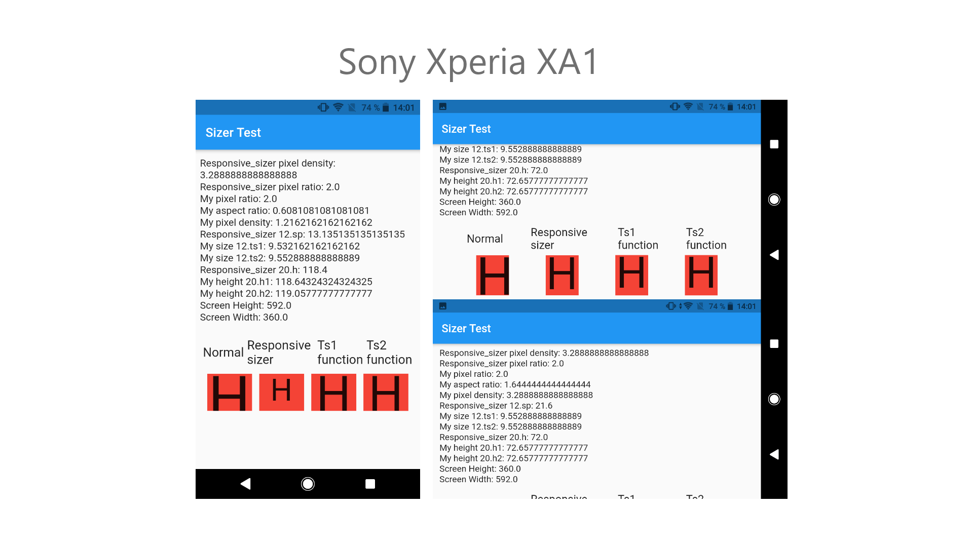
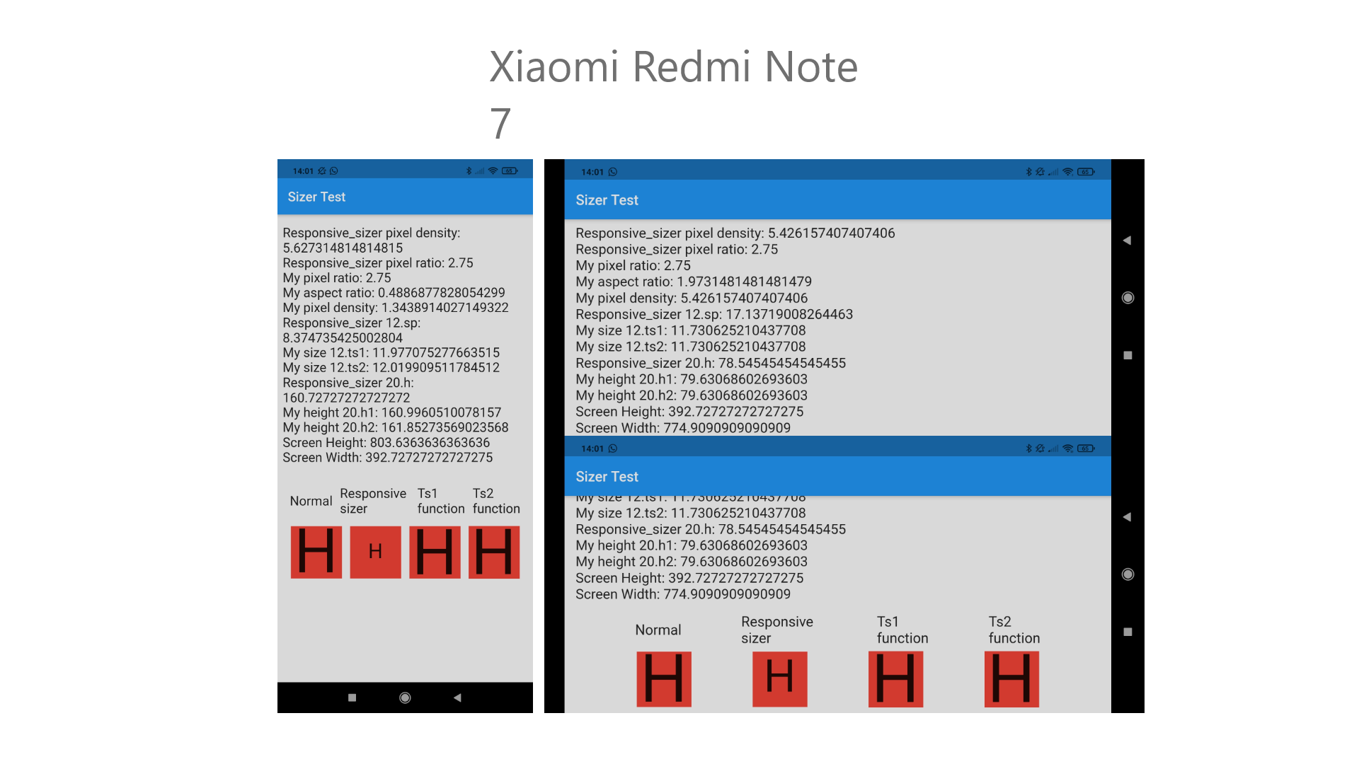
As you can see, the functions I have created are almost perfect, but almost perfect is better than totally bad.
I also want to say that the .h and .w functions now work fine, but you could also think of using pixelDensity for this, since not all screens have the same pixel density even if they have the same dimensions.
All this I leave in this drive link where the screenshots are so you can see them well, and I also attach there the folder of the project where I have done the tests. Feel free to try and if my function convinces you, do not hesitate to use it in your package, I just want to help you.
Here the project link: https://drive.google.com/file/d/1WENQoD4MmwUnEZazOpeD7qksGZUbFBbA/view?usp=sharing
Hi in flutter 3.10 with FocusScope.of(context).unfocus(); In textField responsive_sizer has bug.
sp and w and h output a different value.
after this bug when we execute setState, it is correct!
when changing screen orientation the widgets doesnt follow my settings. when tilted back and forth the ui just messed up.
ps never had this issue before. been using this package since the beginning.
I used respinsive_sizer 3.3.0 in my flutter project,when I run it, this error occurred:helper.dart:71:18: Error: Undefined name 'View'.
pixelRatio = View.of(context).devicePixelRatio;
App doesn't run correctly when I compile it to Android
[✓] Flutter (Channel stable, 3.0.4, on macOS 12.1 21C52 darwin-arm, locale en-GB)
[!] Android toolchain - develop for Android devices (Android SDK version 32.1.0-rc1)
My main.dart:
 Widget build(BuildContext context) {
    return GetMaterialApp(
      debugShowCheckedModeBanner: false,
      home: ResponsiveSizer(builder: (context, orientation, screenType) {
        return const MainScreen();
      }),
    );
  }
App screenshot on a real Android device:
Hello,
I would like to know the difference between using the following :
    final bool _isOrientationPortrait =
        Device.orientation == Orientation.portrait; // Not rebuilding

    final bool isOrientationPortrait =
        MediaQuery.of(context).orientation == Orientation.portrait; // Rebuilding
Since when using the MediaQuery and I flip my device, it automatically updates the widget, but when using it with the package it doesn't update and I have to be occupying OrientationBuilder. So I would like to know how to update a screen...
I use my ResponsiveSizer like this in my main.dart file :
      [...]
      child: MaterialApp(
        navigatorKey: navigatorKey,
        onGenerateRoute: RouteGenerator.generateRoute,
        [...]
        builder: (BuildContext context, Widget? child) => MediaQuery(
          data: MediaQuery.of(context).copyWith(
            textScaleFactor: MediaQuery.of(context)
                .textScaleFactor
                .clamp(1.0, 1.4),
          ),
          child: ResponsiveSizer(
            builder: (context, orientation, screenSize) =>
                child ?? const SizedBox.shrink(),
          ),
        ),
      ),
I want to make different UI on the bases of Screen in the current case I'm running my app on Web and I'm doing this with the help of Device.screenType but in current case i'm getting SceenType.mobile because of the logic that you wrote in if check in setScreenSize method in helper.dart class. Please correct me if i'm wrong

I can not use it with a combination of theme provider package.
I set the width to 50.sp and then to 100.sp and found that they are not 2x
I'm not sure if this is a valid issue or just the expected result since I'm not sure of the correlation between the text size setting and the device's pixel density. Nevertheless here are my findings:
iPhone 11 Simulator- Default text size


iPhone 11 Simulator - 3 sizes up


when I made flutter upgrade, then this errors shows, but the app is still running normally!!
I was talking to the flutter developers in this thread since the problem happened in the compilation phase and not in the development phase, I took their problem for granted, but thanks to the comments of another user we managed to find the fault in the resposive_sizer package and in the other called sizer, there You can see details of the user who commented on it and how he fixes the problem, maybe this can help you to deduce where the problem is in your package.
Anyway, it is clear that the problem is here, this is not critical, I like your package and if you remind me, I already tried to help you previously here, I will only mention it so that you can try to fix it.
Anyway tell you that I simply generate this class based on your package that worked well for me and in this way I only use the mediaquery but in an easier way.
sizer.dart
import 'package:flutter/widgets.dart';

/// Gets the screen type between mobile and tablet.
enum ScreenType { mobile, tablet }


class Sizer {
  static double h(BuildContext context) {
    return MediaQuery.of(context).size.height;
  }

  static double w(BuildContext context) {
    return MediaQuery.of(context).size.width;
  }

  static Orientation orientation(BuildContext context) {
    return (h(context) > w(context))
        ? Orientation.portrait
        : Orientation.landscape;
  }

  static bool isPortrait(BuildContext context) {
    return (orientation(context) == Orientation.portrait) ? true : false;
  }

  static bool isLandscape(BuildContext context) {
    return (orientation(context) == Orientation.portrait) ? false : true;
  }

  static ScreenType screenType(BuildContext context) {
    return ((orientation(context) == Orientation.portrait &&
                w(context) < 600) ||
            (orientation(context) == Orientation.landscape && h(context) < 600))
        ? ScreenType.mobile
        : ScreenType.tablet;
  }

  static bool isMobile(BuildContext context) {
    return (screenType(context) == ScreenType.mobile) ? true : false;
  }

  static bool isTablet(BuildContext context) {
    return (screenType(context) == ScreenType.mobile) ? false : true;
  }
}

extension SizerExt on num {
  /// Calculates the height depending on the device's screen size
  /// Eg: 20.h -> will take 20% of the screen's height
  double h(BuildContext context) {
    return MediaQuery.of(context).size.height * (this / 100);
  }

  /// Calculates the width depending on the device's screen size
  /// Eg: 20.h -> will take 20% of the screen's width
  double w(BuildContext context) {
    return MediaQuery.of(context).size.width * (this / 100);
  }

  /// Calculates the sp (Scalable Pixel) depending on the device's screen size
  double sp(BuildContext context) {
    return this *
        ((((MediaQuery.of(context).size.height +
                        MediaQuery.of(context).size.width) +
                    (MediaQuery.of(context).devicePixelRatio *
                        MediaQuery.of(context).size.aspectRatio)) /
                3) /
            3) /
        100;
  }
}
I divided by 3 the .sp method because I get all the data from the device using mediaquery.
If we use MediaQuery.of(context).size then the size is automatically updated when rotating the device, but when using Adaptive.w or .w the sizes are not automatically updating on rotation
This isn't specific to Textformfields but its the easiest way to reproduce the failure. Essentially when the screen/widgets are built initially everything is great, but then after opening up a Textformfield on any screen it seems that the Device value gets corrupted and all my text shrinks (likely due to the height changing in the widget).
If I replace Device with MediaQuery.of(context).size then I see no issues.
Because Device is used in quite a few places this also impacts .sp, .h, .w, .vmin and .vmax.
Let me know if you need more info, but through some trial and error I am pretty confident that my assessment should lead you down the right path to the actual bug. Once I created my own .sp the text works great across multiple devices and does not change when using textformfields.
Below is my implementation to resolve the issue
int fontSize = 21;
double sp = ((((fontSizeMediaQuery.of(context).size.height/100) + (fontSizeMediaQuery.of(context).size.width/100)) + (Device.pixelRatio * MediaQuery.of(context).size.aspectRatio))/2.08)/100;
style:TextStyle(fontFamily: "Cinzel",fontSize: (fontSize*sp)), //21.sp),
I was using sizer, then migrated to responsive sizer. With sizer 1.sp was around 1.2 px but as you can see below, it's around 1/20th of it with responsive sizer. Also i can not replace sp with dp since there's a huge difference between dp and sp.
Following are the values i get with responsive sizer.
1.sp 0.060366202945990176  (1.21 with sizer)
1.dp 192.0
1.h 7.52
1.w 3.6
Device.pixelRatio 3.0
Device.aspectRatio 0.4787234042553192
Device.height 752.0
Device.width 360.0
My initialization code is as follows:
    return ResponsiveSizer(
      builder: (context, orientation, deviceType) {
        return GetMaterialApp(
          title: 'My app',
          theme: ThemeData(
              primarySwatch: Colors.grey,
              visualDensity: VisualDensity.adaptivePlatformDensity,
              textTheme: Theme.of(context)
                  .textTheme
                  .copyWith(
                    bodyLarge: TextStyle(fontSize: Defaults.bigFontSize), // 16.sp
                    bodyMedium: TextStyle(fontSize: Defaults.fontSize),  // 14.sp
                    bodySmall: TextStyle(fontSize: Defaults.smallFontSize), // 12.sp
                  )
                  .apply(
                    fontSizeFactor: 1.sp,
                  ),
              dividerColor: Colors.transparent),
          home: HomeView()
        );
    }
);
Old one deprecated. which is really bad
I have identified a potential issue where the responsive_sizer values are not updated correctly after clicking the Maximise or Restore Down buttons in a Flutter app executed either in a web browser or as a windows application. I have included test code to demonstrate the issue below. This uses responsive_sizer version 3.0.5+1
This app displays the screen dimensions along with the responsive_sizer (_widgetheight and _widgetwidth) dimensions using the WidgetsBindingObserver mixin to track changes to the window size.
import 'package:flutter/material.dart';
import 'package:responsive_sizer/responsive_sizer.dart';

void main() {
  runApp(const MyApp());
}

class MyApp extends StatelessWidget {
  const MyApp({Key? key}) : super(key: key);

  // This widget is the root of your application.
  @override
  Widget build(BuildContext context) {
    return MaterialApp(
      title: 'Window Resize Test',
      theme: ThemeData(
        primarySwatch: Colors.blue,
      ),
      home: ResponsiveSizer(
        builder: (context, orientation, screenType) {
          return const MyHomePage(title: 'Window Resize Test');
        },
      ),
    );
  }
}

class MyHomePage extends StatefulWidget {
  const MyHomePage({Key? key, required this.title}) : super(key: key);

  final String title;

  @override
  State<MyHomePage> createState() => _MyHomePageState();
}

class _MyHomePageState extends State<MyHomePage> with WidgetsBindingObserver {
  late double _screenHeight;
  late double _screenWidth;
  late double _widgetHeight;
  late double _widgetWidth;

  @override
  void initState() {
    super.initState();

    // Add an observer to check for changes in screen size/orientation
    WidgetsBinding.instance?.addObserver(this);

    // Set the screen and widget sizes
    _setSizes();
  }

  @override
  void dispose() {
    super.dispose();

    // Remove observer for screen size changes
    WidgetsBinding.instance?.removeObserver(this);
  }

  @override
  void didChangeMetrics() {
    setState(() {
      _setSizes();
    });
  }

  // Set the height and width dimensions
  _setSizes() {
    // Screen size values
    _screenHeight = WidgetsBinding.instance!.window.physicalSize.height;
    _screenWidth = WidgetsBinding.instance!.window.physicalSize.width;

    // Responsive_sizer widget size values
    _widgetHeight = 100.h;
    _widgetWidth = 100.w;
  }

  @override
  Widget build(BuildContext context) {
    return Scaffold(
      appBar: AppBar(
        title: Text(widget.title),
      ),
      body: Center(
        child: Column(
          mainAxisAlignment: MainAxisAlignment.center,
          children: <Widget>[
            const Text('Screen Actuals:'),
            Text(_screenHeight.toInt().toString()),
            Text(_screenWidth.toInt().toString()),
            const Text('Responsize Sizer Values:'),
            Text(_widgetHeight.toInt().toString()),
            Text(_widgetWidth.toInt().toString()),
          ],
        ),
      ),
    );
  }
}
You can recreate the issue by starting with a small window on screen, then maximising the window, restoring it down again, and finally resizing the window by dragging one edge, and noting the screen and widget sizes in each case.
Following this approach, I get the following dimensions output on screen:
| A | B | C | D | E |
|---|---|---|---|---|
| Screen height | Screen width | Widget height | Widget width | |
| Initial State | 392 | 625 | 315 | 500 |
| After Maximise | 941 | 1920 | 314 | 500 |
| After Restore Down | 392 | 625 | 753 | 1536 |
| After Drag Resize | 402 | 630 | 321 | 504 |
In the initial state, the responsive_sizer values (columns D and E in the table) are proportional to the overall screen size.
After maximising the window, the responsive_sizer values are more or less unchanged. I assume that these should be about 80% of the screen height and width (as per the initial state values).
After restoring the window down to the initial size, the responsive_sizer values are updated to the values they should have been when the window was maximised.
Finally, if I select an edge of the window and drag it slightly, the responsive sizer values are set to the correct values for the current window size.
It appears as though the maximise and restore down functions for the window are not being responded to correctly by responsive_sizer.
UPDATE
I have tried this with the responsize_sizer example and that works perfectly with maximise and restore down, so I am assuming that it is my code that is the problem and not the responsive_sizer package. Any suggestions about what I am doing wrong? My aim was to set all my sizes in once place rather than having lots of "if web then size as this, else if tablet then size as this, else size as this" statements where the various sizes are used. Is that what I need to do?
LateInitializationError: Field 'width' has not been initialized.
It gave me this error when I was trying to use it in my app, specifically in a ThemeData, this is my code:
static final ThemeData theme = ThemeData(

    // blanco puro Color(0xffFFFFFF)
    scaffoldBackgroundColor: blanco,
    // negro Color(0xff000000)
    shadowColor: negro,

    colorScheme: ColorScheme(
      // color1 el del igual Color(0xff8500C7)
      primary: color1,
      // color2 el del title del appbar y el boton menu Color(0xff7D00BA)
      primaryVariant: color2,
      // color3 el del operador Color(0xff6B00A1)
      onPrimary: color3,
      // color4 el del scaffold del drawer y divider del resultado Color(0xff52007A)
      secondary: color4,
      // color5(casi negro) el de los numeros del teclado y valores resultado Color(0xff27003B)
      secondaryVariant: color5,
      // blanco puro Color(0xffFFFFFF)
      error: blanco,
      // negro Color(0xff000000)
      onError: negro,

      // color fuera numero
      surface: colorFueraNumero,
      // color dentro numero
      onSurface: colorDentroNumero,
      // color fuera igual
      background: colorFueraIgual,
      // color dentro igual
      onBackground: color4,
      // color fuera operadores
      onSecondary: colorFueraOperadores,


      brightness: Brightness.light
    ),

    visualDensity: VisualDensity.adaptivePlatformDensity,

    appBarTheme: AppBarTheme(
      color: Colors.transparent,
      elevation: 0,
      centerTitle: true,
      textTheme: TextTheme(
        headline6: GoogleFonts.exo(color: color2, fontSize: 19.0.sp, fontWeight: FontWeight.w600)
      ),
      iconTheme: IconThemeData(
        color: Colors.white,
        size: 27.0.sp
      ),
    )
  );
It says that the fault is in the line of headline: and also in that of size: inside iconTheme
I send you a capture of all the errors.

Although there it says # 1 DeviceExt.w I have tried with all of them, 19.0.sp, 19.0.w, 19.0.h, 19.sp, 19.w, 19.h.
They all give those same mistakes.
I've been testing and I can't solve it, but the fact is that I was using the sizer package, the same one where you told me in response to my request to add ".sp" also in the "int" that this package of yours will use, but for now I will finish my app with that package and the next one I will start with yours, since it will be easier for me starting from scratch to find the errors.
The ResponsiveSizer is wrapped around the MatrialAppRouter which makes it vulnerable to rebuild the whole app when a textfield is focused.
ResponsiveSizer( builder: (context, orientation, deviceType) { return MaterialApp.router( title: "Hawk", theme: ThemeClass.lightTheme, routerConfig: GoRouter()), ); } ),
I'm having trouble using the library.
I receive the following error:
No MediaQuery widget ancestor found.
LayoutBuilder widgets require the MediaQuery widget ancestor.
The specific widget that could not find a MediaQuery ancestor was:
   LayoutBuilder
The ownership chain for the affected widget is: "LayoutBuilder ← OrientationBuilder ← LayoutBuilder
   ← ResponsiveSizer ← MyApp ← [root]"
No MediaQuery ancestor could be found starting from the context that was passed to MediaQuery.of().
This can happen because you have not added a WidgetsApp, CupertinoApp, or MaterialApp widget (those
widgets introduce a MediaQuery), or it can happen if the context you use comes from a widget above
those widgets.
The size of .sp is wrong after updating ^3.0.3
my whole tree is rebuilt when the keyboard opens with a textfield.
Here the code of the textfield :
class ProfileNameTextField extends StatefulWidget {
  const ProfileNameTextField({Key? key}) : super(key: key);

  @override
  _ProfileNameTextFieldState createState() => _ProfileNameTextFieldState();
}

class _ProfileNameTextFieldState extends State<ProfileNameTextField> {
  TextEditingController? _controller;
  String _previousName = "";
  FocusNode? _focusNode;
  final String _forbiddenCharacters = "1234567890&)°(+=/,;.£\$*€<>\_#@";
  Widget _subText = Container();

  @override
  void initState() {
    // TODO: implement initState
    _controller = TextEditingController();
    _previousName = CloudUser.instance.username;
    _controller!.text = CloudUser.instance.username;
    _focusNode = FocusNode();
    _focusNode!.addListener(() {
      if(!_focusNode!.hasFocus) {
        print("Focus on name textfield is lost");
        _onSubmitted(_controller!.text);
      }
    });
    super.initState();
  }

  @override
  void dispose() {
    // Clean up the focus node when the Form is disposed.
    _focusNode!.dispose();
    super.dispose();
  }

  @override
  Widget build(BuildContext context) {
    Widget? _suffix;


    switch(Provider.of<LoadingProvider>(context).state) {
      case LoadingState.busy:
        _suffix = SpinKitRing(
          color: Theme
              .of(context)
              .primaryColor,
          lineWidth: 2,
          size: Theme.of(context).textTheme.subtitle1!.fontSize!
        );
        break;
      case LoadingState.idle:
        _suffix = Container();
        break;
    }

    return CustomTextContainer(
        child: InkWell(
            onTap: _giveFocus,
            child: Column(
                mainAxisAlignment: MainAxisAlignment.start,
                crossAxisAlignment: CrossAxisAlignment.start,
                children:
                [
                  Text(
                      "Prénom",
                      style: Theme.of(context).textTheme.bodyText2!.copyWith(
                        fontSize: Theme.of(context).textTheme.bodyText2!.fontSize!.sp
                      )
                  ),
                  Container(height: Sizer().heightSmallSpace),
                  Container(height: Theme.of(context).textTheme.bodyText1!.fontSize,
                    child: Row(children: [
                      Expanded(
                        child: TextField(
                          keyboardType: TextInputType.name,
                          controller: _controller,
                          onSubmitted: _onSubmitted,
                          focusNode: _focusNode,
                          decoration: InputDecoration(
                              isDense: true,
                              contentPadding: EdgeInsets.zero,
                          ),
                          style: Theme.of(context).textTheme.bodyText1!.copyWith(
                              color: Theme.of(context).primaryColor,

                              fontWeight: FontWeight.w600,
                              fontSize: Theme.of(context).textTheme.bodyText1!.fontSize!.sp
                          ),
                          textAlign: TextAlign.start,
                        ),),
                      _suffix,
                    ]),
                  ),
                  Container(height: Sizer().heightSmallSpace),
                  Row(children: [
                    Spacer(),
                    Container(
                        height: Theme.of(context).textTheme.subtitle1!.fontSize!*1.2,
                        child: Center(child: _subText)),
                  ]),
                  Container(height: Sizer().heightSmallSpace),
                ]
            )
        )
    );
  }

  _onSubmitted(String username) {
    RegExp regExp = RegExp('[' + _forbiddenCharacters + ']');
    if(!regExp.hasMatch(username)) {
      if(_previousName != username) {
        print("name is " + username);
        _previousName = username;
        setState(() {
          _subText = Container();
        });
        Provider.of<LoadingProvider>(context, listen: false).update('username', username).then((result) {
          if(result) {
            CloudUser.instance.username = username;
            setState(() {
              _subText = Text(
                "Enregistré",
                style: Theme
                    .of(context)
                    .textTheme
                    .subtitle1!
                    .copyWith(
                    color: color.success,
                    fontSize: Theme.of(context).textTheme.subtitle1!.fontSize!.sp
                ),
              );
            });
          }
          else
            setState(() {
              _subText = Text(
                "Erreur serveur",
                style: Theme.of(context).textTheme.subtitle1!.copyWith(
                    color: Theme.of(context).errorColor,
                    fontSize: Theme.of(context).textTheme.subtitle1!.fontSize!.sp
                ),
              );
            });
        });
      }
    } else {
      setState(() {
        _subText = Text(
          "Caractères interdits",
          style: Theme.of(context).textTheme.subtitle1!.copyWith(
              color: Theme.of(context).errorColor,
              fontSize: Theme.of(context).textTheme.subtitle1!.fontSize!.sp
          ),
          textAlign: TextAlign.right,
        );
      });
    }
  }

  _giveFocus() {
    _focusNode!.requestFocus();
  }
}
In sizer() i have this variables defined :
double padding = 2.h;

  double widgetHeight = 8.h;

  double iconButton = 4.h;

  double radius = 15;

  double lineWidth = 3.h;

  double heightSpace = 3.h;

  double heightSmallSpace = 0.9.h;

  double gridSpacing = 0.3.h;

  double widthSpace = 1.25.w;
ProfileNameTextField is included in
class _ProfileControllerState extends State<ProfileController> {
  @override
  Widget build(BuildContext context) {
    return Container(
        color: Theme.of(context).backgroundColor,
        child: Column(
            children: [
              ProfileAppBar(
                onSetting: _onSetting,
              ),
              Flexible(
                  child: Container(
                      padding: EdgeInsets.symmetric(horizontal: Sizer().padding/3),
                      color: Theme.of(context).scaffoldBackgroundColor,
                      child: Scrollbar(
                          child: SingleChildScrollView(
                              physics: ClampingScrollPhysics(),
                              child: Container(
                                  padding: EdgeInsets.symmetric(horizontal: Sizer().padding*2/3),
                                  child: Column(children:
                                  [
                                    Container(height: Sizer().heightSpace),
                                    SvgPicture.asset(
                                      "assets/icons/phone_kisses.svg",
                                      height: Sizer().widgetHeight*3,
                                      width: Sizer().getCustomWidth(66),
                                      fit: BoxFit.contain,
                                    ),
                                    _space(),
                                    ChangeNotifierProvider<LoadingProvider>(
                                      create: (BuildContext context) => LoadingProvider(),
                                      child: ProfileNameTextField(),
                                    ),
I have this problem since the import of the responsive_sizer... I do not understand where the problem can come from.
I tried resizetoavoidbottominset but nothing changed.
I had to disable this bit to actually get correct width / height
  // Sets screen width and height
    // if (orientation == Orientation.portrait) {
    width = boxConstraints.maxWidth;
    height = boxConstraints.maxHeight;
    // } else {
    //   width = boxConstraints.maxHeight;
    //   height = boxConstraints.maxWidth;
    // }
AS far as I know then LayoutBuilder is orientation aware...ie width is always width and you should not artificially change it.
Reproduce:
Take the example code from this package and give Home widget a const constructor. Also create the instance of it with const. Full example:
import 'package:flutter/material.dart';
import 'package:responsive_sizer/responsive_sizer.dart';

void main() {
  runApp(MyApp());
}

class MyApp extends StatelessWidget {
  @override
  Widget build(BuildContext context) {
    return ResponsiveSizer(
      builder: (context, orientation, screenType) {
        return MaterialApp(
          title: 'Responsive Sizer Example',
          theme: ThemeData(
            primarySwatch: Colors.blue,
          ),
          home: const Home(),
        );
      },
      maxTabletWidth: 900, // Optional
    );
  }
}

class Home extends StatelessWidget {
  const Home();

  @override
  Widget build(BuildContext context) {
    late final String screenTypeText;

    switch (Device.screenType) {
      case ScreenType.mobile:
        screenTypeText = "My screen's type is Mobile";
        break;
      case ScreenType.tablet:
        screenTypeText = "My screen's type is Tablet";
        break;
      // ScreenType can only be desktop when `maxTabletWidth`
      // is set in `ResponsiveSizer`
      case ScreenType.desktop:
        screenTypeText = "My screen's type is Desktop";
        break;
    }

    return Scaffold(
      body: Column(
        mainAxisAlignment: MainAxisAlignment.spaceEvenly,
        children: [
          Container(
            height: Adaptive.h(12.5), // or 12.5.h
            width: 50.w, // or Adaptive.w(50)
            color: Colors.black,
          ),
          Text(
            "This text is responsive",
            style: TextStyle(fontSize: 18.sp), // or Adaptive.sp(12)
          ),
          Text(
            "w=${100.w} h=${100.h}",
            style: TextStyle(fontSize: 12.sp),
          ),
          Device.orientation == Orientation.portrait
              ? Text("My orientation is Portrait")
              : Text("My orientation is Landscape"),
          Text(screenTypeText),
        ],
      ),
    );
  }
}
Then run it in web. Notice that when you change the window size, the responsive text size doesn't change as it should.
This happens because Flutter's build cycle doesn't visit const children. It's an important optimization used to enhance performance and Flutter highly recommends using it (see https://docs.flutter.dev/perf/best-practices, https://www.youtube.com/watch?v=IOyq-eTRhvo)
I get a LateInitializationError: Field width has not been initialized error which points to packages/responsive_sizer/src/helper.dart 30:22. when using TextStyle(fontSize: 60.dp)
Package version: 3.1.1
Flutter version: 3.3.10
 React
React
A declarative, efficient, and flexible JavaScript library for building user interfaces.
🖖 Vue.js is a progressive, incrementally-adoptable JavaScript framework for building UI on the web.
 Typescript
TypeScript is a superset of JavaScript that compiles to clean JavaScript output.
An Open Source Machine Learning Framework for Everyone
 Django
The Web framework for perfectionists with deadlines.
 Laravel
A PHP framework for web artisans
Bring data to life with SVG, Canvas and HTML. 📊📈🎉
JavaScript (JS) is a lightweight interpreted programming language with first-class functions.
Some thing interesting about web. New door for the world.
A server is a program made to process requests and deliver data to clients.
Machine learning is a way of modeling and interpreting data that allows a piece of software to respond intelligently.
Some thing interesting about visualization, use data art
Some thing interesting about game, make everyone happy.
 Facebook
We are working to build community through open source technology. NB: members must have two-factor auth.
 Microsoft
Open source projects and samples from Microsoft.
 Google
Google ❤️ Open Source for everyone.
 Alibaba
Alibaba Open Source for everyone
 D3
D3
Data-Driven Documents codes.
 Tencent
China tencent open source team.