Phelia is a framework that lets you build interactive Slack applications without the webhook and JSON headache. Traditionally, building an interactive Slack application required that you designed an interface with Slack's Block Kit JSON schema. When you received one of the many interaction webhook payloads you would update the message with a new JSON schema. This leads to code fragmentation and slow development.
This framework was created to help you intuitively create Slack applications without needing to know how underlying storage, state, webhooks, or message publishing works. All you gotta know is React :).
Table of Contents
- ⚡ Phelia
- Quick start
- How this works
- Documentation
- Feature Support
-
Create an express server:
import express from "express";
import Phelia from "phelia";

import RandomImage from "./random-image";

const app = express();

const client = new Phelia(process.env.SLACK_TOKEN);

// Set up your interaction webhook hook
app.post(
  "/interactions",
  client.messageHandler(process.env.SLACK_SIGNING_SECRET, [RandomImage])
);

// Post a message...
client.postMessage(RandomImage, "@max");

app.listen(3000);
-
Create your message with React:
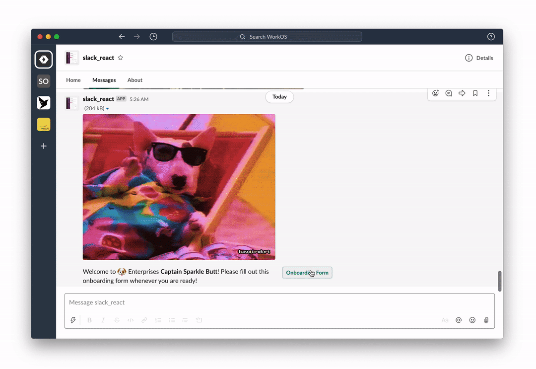
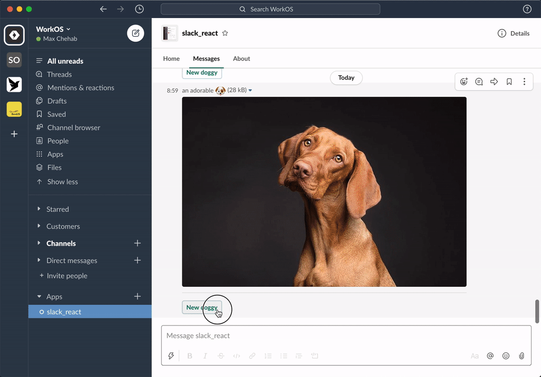
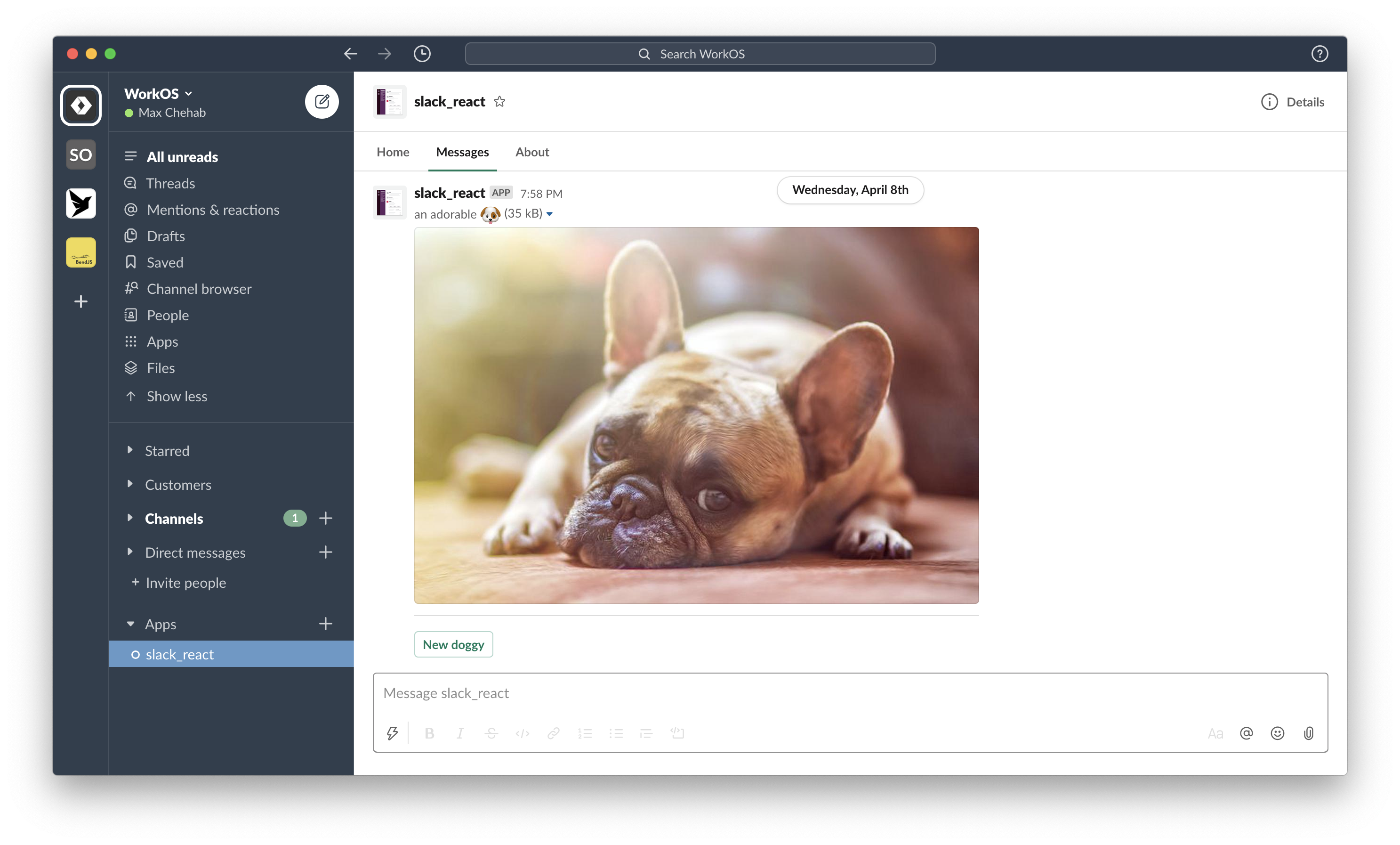
import randomImage from "../utils";

export function RandomImage({ useState }: PheliaMessageProps) {
  const [imageUrl, setImageUrl] = useState("imageUrl", randomImage());

  return (
    <Message text="Choose a dog">
      <ImageBlock
        title="an adorable :dog:"
        alt="a very adorable doggy dog"
        imageUrl={imageUrl}
        emoji
      />
      <Divider />
      <Actions>
        <Button
          style="primary"
          action="randomImage"
          onClick={() => setImageUrl(randomImage())}
        >
          New doggy
        </Button>
      </Actions>
    </Message>
  );
}
-
Interact with your message:
Phelia transforms React components into Slack messages by use of a custom React reconciler. Components (with their internal state and props) are serialized into a custom storage. When a user interacts with a posted message Phelia retrieves the component, re-hydrates it's state and props, and performs any actions which may result in a new state.
A surface is anywhere an app can express itself through communication or interaction. Each registered components should return a surface component.
App-published messages are dynamic yet transient spaces. They allow users to complete workflows among their Slack conversations.
Provided Properties:
| Properties | Type |
|---|---|
| useState | a useState function |
| useModal | a useModal function |
| props | a JSON serializable object |
Component Properties:
| Properties | Type | Required |
|---|---|---|
| children | array of Actions, Context, Divider, ImageBlock, or Section components | yes |
| text | string | no |
Example:
const imageUrls = [
  "https://cdn.pixabay.com/photo/2015/06/08/15/02/pug-801826__480.jpg",
  "https://cdn.pixabay.com/photo/2015/03/26/09/54/pug-690566__480.jpg",
  "https://cdn.pixabay.com/photo/2018/03/31/06/31/dog-3277416__480.jpg",
  "https://cdn.pixabay.com/photo/2016/02/26/16/32/dog-1224267__480.jpg"
];

function randomImage(): string {
  const index = Math.floor(Math.random() * imageUrls.length);
  return imageUrls[index];
}

export function RandomImage({ useState }: PheliaMessageProps) {
  const [imageUrl, setImageUrl] = useState("imageUrl", randomImage());

  return (
    <Message text="Choose a dog">
      <ImageBlock
        emoji
        title={"an adorable :dog:"}
        alt={"a very adorable doggy dog"}
        imageUrl={imageUrl}
      />
      <Divider />
      <Actions>
        <Button
          style="primary"
          action="randomImage"
          onClick={() => setImageUrl(randomImage())}
          confirm={
            <Confirm
              title={"Are you sure?"}
              confirm={"Yes, gimmey that doggy!"}
              deny={"No, I hate doggies"}
            >
              <Text type="mrkdwn">
                Are you certain you want to see the _cutest_ doggy ever?
              </Text>
            </Confirm>
          }
        >
          New doggy
        </Button>
      </Actions>
    </Message>
  );
}
Modals provide focused spaces ideal for requesting and collecting data from users, or temporarily displaying dynamic and interactive information.
Provided Properties:
| Properties | Type |
|---|---|
| useState | a useState function |
| props | a JSON serializable object |
Component Properties:
| Properties | Type | Required |
|---|---|---|
| children | array of Actions, Context, Divider, ImageBlock, Input, or Section components | yes |
| title | string or Text | yes |
| submit | string or Text | no |
| close | string or Text | no |
Example:
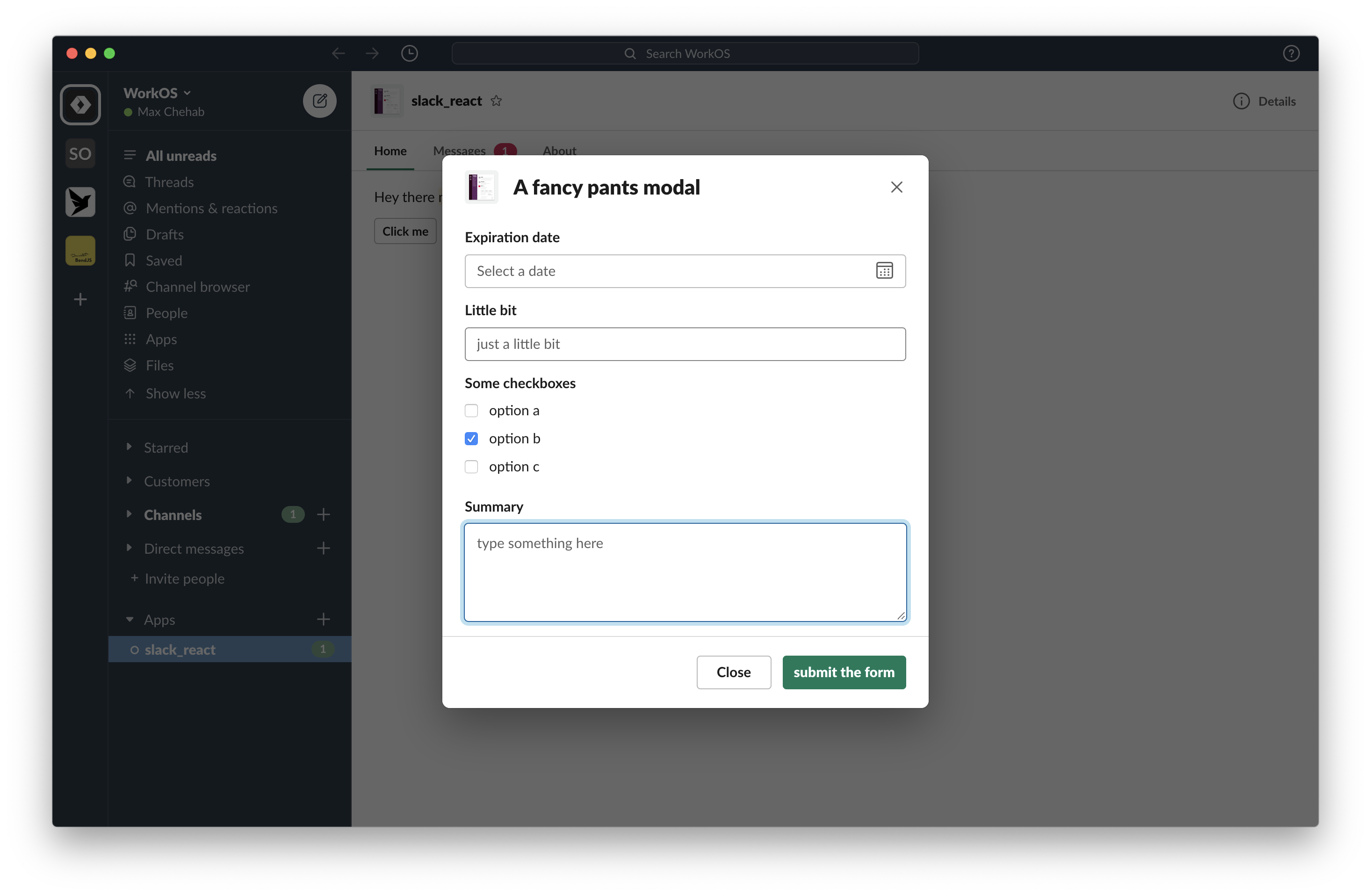
export function MyModal({ useState }: PheliaModalProps) {
  const [showForm, setShowForm] = useState("showForm", false);

  return (
    <Modal title="A fancy pants modal" submit="submit the form">
      {!showForm && (
        <Actions>
          <Button action="showForm" onClick={() => setShowForm(true)}>
            Show form
          </Button>
        </Actions>
      )}

      {showForm && (
        <>
          <Input label="Expiration date">
            <DatePicker action="date" />
          </Input>

          <Input label="Little bit">
            <TextField action="little-bit" placeholder="just a little bit" />
          </Input>

          <Input label="Some checkboxes">
            <Checkboxes action="checkboxes">
              <Option value="option-a">option a</Option>

              <Option value="option-b" selected>
                option b
              </Option>

              <Option value="option-c">option c</Option>
            </Checkboxes>
          </Input>

          <Input label="Summary">
            <TextField
              action="summary"
              placeholder="type something here"
              multiline
            />
          </Input>
        </>
      )}
    </Modal>
  );
}
The Home tab is a persistent, yet dynamic interface for apps that lives within the App Home.
Provided Properties:
| Properties | Type |
|---|---|
| useState | a useState function |
| useModal | a useModal function |
| user | *a user object |
*if scope users:read is not available, the user object will only contain an id property.
Component Properties:
| Properties | Type | Required |
|---|---|---|
| children | array of Actions, Context, Divider, ImageBlock, or Section components | yes |
| title | string or Text | no |
Example:
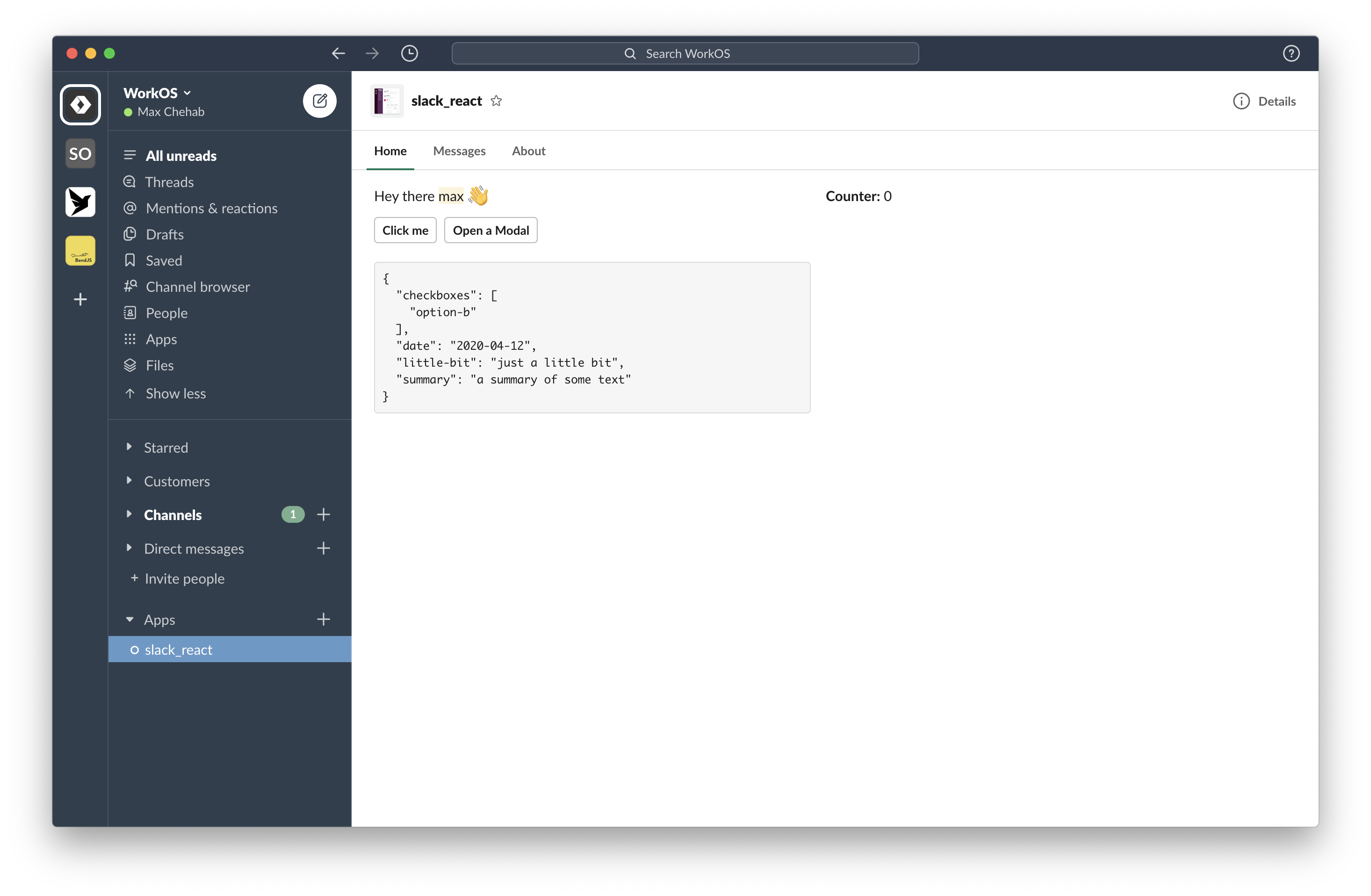
export function HomeApp({ useState, useModal, user }: PheliaHomeProps) {
  const [counter, setCounter] = useState("counter", 0);
  const [form, setForm] = useState("form");

  const openModal = useModal("modal", MyModal, event =>
    setForm(JSON.stringify(event.form, null, 2))
  );

  return (
    <Home>
      <Section>
        <Text emoji>Hey there {user.username} :wave:</Text>
        <Text type="mrkdwn">*Counter:* {counter}</Text>
      </Section>

      <Actions>
        <Button action="counter" onClick={() => setCounter(counter + 1)}>
          Click me
        </Button>

        <Button action="modal" onClick={() => openModal()}>
          Open a Modal
        </Button>
      </Actions>

      {form && (
        <Section>
          <Text type="mrkdwn">{"```\n" + form + "\n```"}</Text>
        </Section>
      )}
    </Home>
  );
}Phelia uses a custom storage object to store posted messages and their properties such as state, props, and Component type. The persistance method can be customized by use of the client.setStorage(storage) method.
A storage object must implement the following methods:
set(key: string, value: string): voidget(key: string): string
Storage methods may be asynchronous.
By default the storage object is an in-memory map. Here is an example using Redis for storage:
import redis from "redis";
import { setStorage } from "phelia/core";

const client = redis.createClient();

setStorage({
  set: (key, value) =>
    new Promise((resolve, reject) =>
      client.set(key, value, err => (err ? reject(err) : resolve()))
    ),

  get: key =>
    new Promise((resolve, reject) =>
      client.get(key, (err, reply) => (err ? reject(err) : resolve(reply)))
    )
});In order for Phelia to update your Messages or Modals you must register all of your components and setup up an interactive webhook endpoint.
Use the client.registerComponents method to register your components. You may pass in an array of components:
const client = new Phelia(process.env.SLACK_TOKEN);
client.registerComponents([MyModal, MyMessage]);
Pass a function which returns an array of components:
const client = new Phelia(process.env.SLACK_TOKEN);
client.registerComponents(() => [MyModal, MyMessage]);
Or pass in a directory which contains all of your components:
import path from "path";

const client = new Phelia(process.env.SLACK_TOKEN);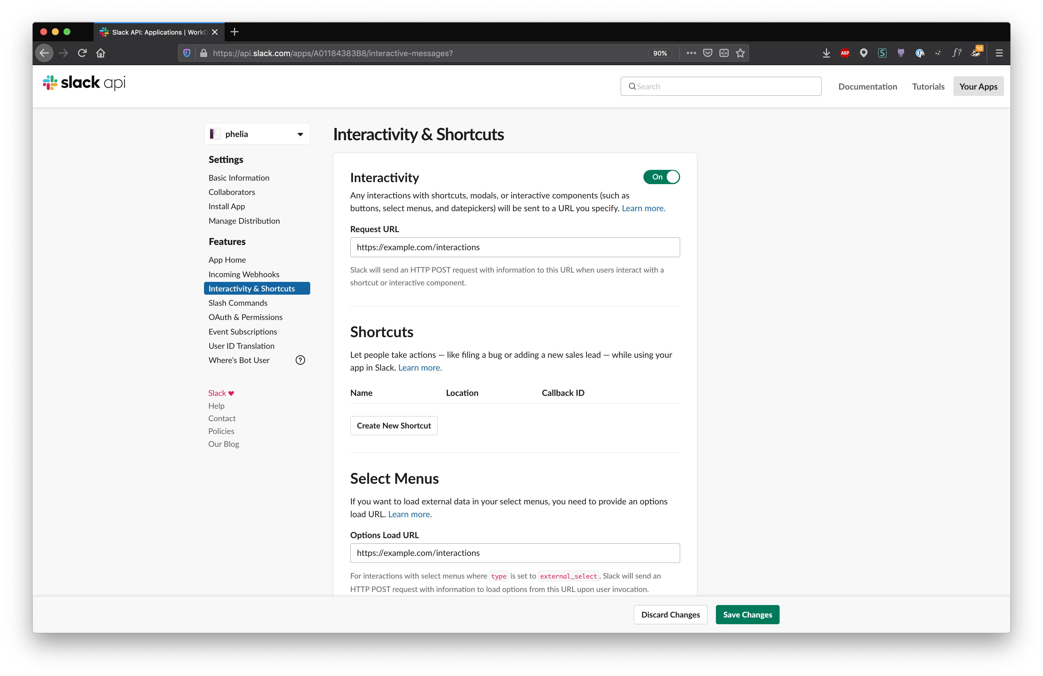
client.registerComponents(path.join(__dirname, "components"));Set a Request URL and Options Load URL in the Interactivity & Shortcuts page of your Slack application. You may need to use a reverse proxy like ngrok for local development.
Then use client.messageHandler() to intercept these webhook payloads.
const client = new Phelia(process.env.SLACK_TOKEN);

app.post(
  "/interactions",
  client.messageHandler(process.env.SLACK_SIGNING_SECRET)
);To use a Home Tab component, register a webhook for Slacks Events API and register your Home Tab component with Phelia.
Make sure that you have selected the app_home_opened bot event in the Event Subscriptions of your Slack application.
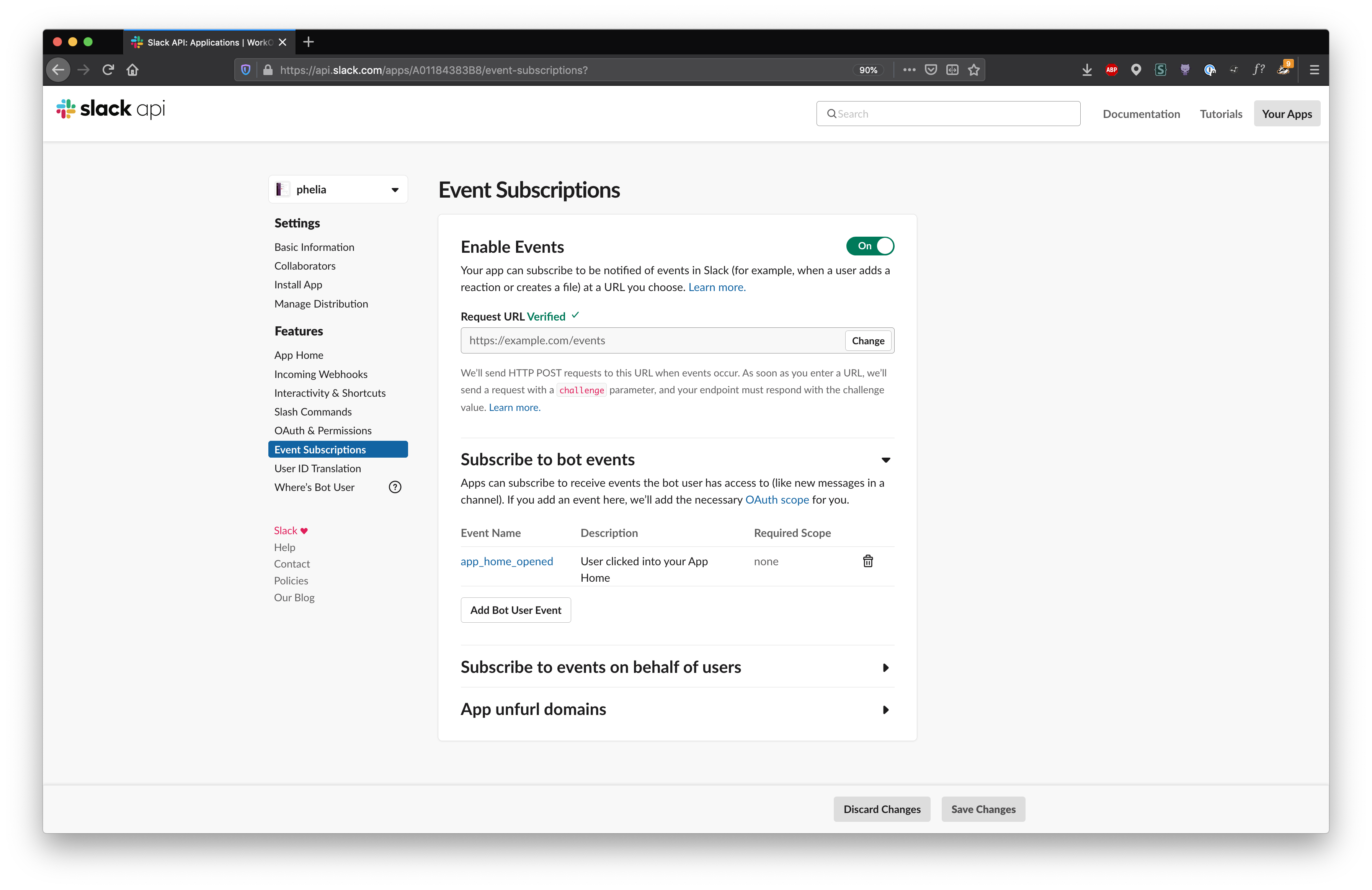
Then use client.appHomeHandler() to intercept this webhook payload.
import { createEventAdapter } from "@slack/events-api";

const slackEvents = createEventAdapter(process.env.SLACK_SIGNING_SECRET);
const client = new Phelia(process.env.SLACK_TOKEN);

slackEvents.on("app_home_opened", client.appHomeHandler(HomeApp));

app.use("/events", slackEvents.requestListener());
This requires use of Slack's SDK @slack/events-api
With this setup, whenever a user opens the Home tab it will display your Home App accordingly.
Depending on which type of component you are building, Phelia will inject a collection of functions and properties into your components function.
The useState function is very similar to it's React predecessor. Given a unique key, useState will return a pair of values; the current state and a function to modify the state. The useState function also takes an optional second parameter to specify an initial value.
Example:
function Counter({ useState }) {
  const [counter, setCounter] = useState("unique-key", 0);

  return (
    <Message>
      <Section>
        <Text type="mrkdwn">*Counter:* {counter}</Text>
      </Section>
      <Actions>
        <Button action="inc" onClick={() => setCounter(counter + 1)}>
          Increment
        </Button>
      </Actions>
    </Message>
  );
}The useModal function returns a function to open a modal. Parameters include:
- a unique key
- the modal component
- a ModalSubmittedCallback (executed when a modal is submitted)
- an InteractionCallback (executed when a modal is canceled)
The function returned can be used to open a modal from within any Interaction Callback. The returned function takes an props parameter. When included, the props will be injected into the modal component.
Example:
function ModalExample({ useModal }) {
  const openModal = useModal(
    "modal",
    MyModal,
    event => console.log(event.form),
    () => console.log("canceled")
  );

  return (
    <Message text="A modal example">
      <Actions>
        <Button
          style="primary"
          action="openModal"
          onClick={event => openModal({ user: event.user })}
        >
          Open the modal
        </Button>
      </Actions>
    </Message>
  );
}The props is a JSON serializable property injected into either Modal or Message components. props can be optional passed to either component by their respective constructors. As described above, if when opening a modal and an optional property is provided it will be passed along to the Modal component. Alternatively when using the client.postMessage function if a property is provided, it too will be passed along to the Message component.
Example:
function PropsExample({ props }) {
  return (
    <Message text="A prop example">
      <Section>
        <Text emoji>Hello {props.name} :greet:</Text>
      </Section>
    </Message>
  );
}

client.postMessage(PropsExample, "@channel", { name: "Phelia" });The user Property is injected into Home components. It describes the user who is viewing the Home Tab taking the form of:
{
  id: string;
  username: string;
  name: string;
  team_id: string;
}
If the scope users:read is not available, only the id property will be injected.
There are various different types of callback functions but all help you respond to a User interacting with your component. Each callback responds with an event object. All callback functions can be asynchronous or return a Promise.
An interaction callback is the simplest type of callback. It's event object takes the form of:
user: {
  id: string;
  username: string;
  name: string;
  team_id: string;
}When a user submits a modal, the ModalSubmittedCallback will be called with the following event object:
form: {
  [action: string]: any
}
user: {
  id: string;
  username: string;
  name: string;
  team_id: string;
}
The event.form property is a map representing each Input child's action and value. For example the following modal:
function Modal() {
  return (
    <Modal title="A fancy pants modal" submit="submit the form">
      <Input label="Expiration date">
        <DatePicker action="date" />
      </Input>

      <Input label="Little bit">
        <TextField action="little-bit" placeholder="just a little bit" />
      </Input>

      <Input label="Some checkboxes">
        <Checkboxes action="checkboxes">
          <Option value="option-a">option a</Option>
          <Option value="option-b" selected>
            option b
          </Option>
          <Option value="option-c">option c</Option>
        </Checkboxes>
      </Input>

      <Input label="Summary">
        <TextField
          action="summary"
          placeholder="type something here"
          multiline
        />
      </Input>
    </Modal>
  );
}
would create the following event.form object:
{
  "date": "2020-4-20",
  "little-bit": "something the users typed"
  "checkboxes": ["option-a"],
  "summary": "another thing the users typed"
}A SearchOptions Callback is invoked when a User types a query within a MultiSelectMenu or SelectMenu component. It must return either an array of Options or OptionGroups. It's event object takes the form of:
query: string;
user: {
  id: string;
  username: string;
  name: string;
  team_id: string;
}Used when a User selects a DatePicker. The event object takes the form of:
date: string;
user: {
  id: string;
  username: string;
  name: string;
  team_id: string;
}Used when a User selects a single option. The event object takes the form of:
selected: string;
user: {
  id: string;
  username: string;
  name: string;
  team_id: string;
}Used when a User selects multiple options. The event object takes the form of:
selected: string[];
user: {
  id: string;
  username: string;
  name: string;
  team_id: string;
}Blocks are a series of components that can be combined to create visually rich and compellingly interactive messages.
A block that is used to hold interactive elements.
Component Properties:
| Properties | Type | Required |
|---|---|---|
| children | array of Button, SelectMenu, RadioButtons, MultiSelectMenu, Checkboxes, OverflowMenu, or DatePicker components | yes |
Example:
<Actions>
  <Button action="showForm" onClick={event => setShowForm(true)}>
    Show form
  </Button>

  <DatePicker onSelect={event => setDate(event.selected)} action="date" />
</Actions>Displays message context, which can include both images and text.
Component Properties:
| Properties | Type | Required |
|---|---|---|
| children | array of Image or Text components | yes |
Example:
<Context>
  <ImageBlock imageUrl="https://google.com/image.png" alt="an image" />
</Context>A content divider, like an <hr>, to split up different blocks inside of a surface. It does not have any properties.
Example:
<Divider />A simple image block.
Component Properties:
| Properties | Type | Required |
|---|---|---|
| alt | string | yes |
| emoji | boolean | no |
| imageUrl | string | yes |
| title | string | no |
Example:
<ImageBlock imageUrl="https://google.com/image.png" alt="an image" />A block that collects information from users
Component Properties:
| Properties | Type | Required |
|---|---|---|
| children | a TextField, SelectMenu, MultiSelectMenu, or DatePicker component | yes |
| hint | string or Text | no |
| label | string or Text | yes |
| optional | boolean | no |
Example:
<Input label="Expiration date">
  <DatePicker action="date" />
</Input>A block that collects information from users
Component Properties:
| Properties | Type | Required |
|---|---|---|
| accessory | a Button, SelectMenu, RadioButtons, MultiSelectMenu, Checkboxes, OverflowMenu, or DatePicker component | no |
| children | an array of Text components | if the text property is not included |
| text | string or Text | if no children are included |
Example:
<Section
  text={"Select your birthday."}
  accessory={
    <DatePicker
      onSelect={async ({ user, date }) => {
        setBirth(date);
        setUser(user.username);
      }}
      action="date"
    />
  }
/>An interactive component that inserts a button. The button can be a trigger for anything from opening a simple link to starting a complex workflow.
Component Properties:
| Properties | Type | Required |
|---|---|---|
| action | string | if an onClick property is provided |
| children | string | yes |
| confirm | Confirm | no |
| onClick | InteractionCallback | no |
| style | "danger" or "primary" | no |
| url | string | no |
Example:
<Button action="name" onClick={event => setName(event.user.username)}>
  Set name
</Button><Button url="https://google.com">Open google</Button>A checkbox group that allows a user to choose multiple items from a list of possible options.
Component Properties:
| Properties | Type | Required |
|---|---|---|
| action | string | yes |
| children | array of Option components | yes |
| confirm | Confirm | no |
| onSelect | SelectOptionsCallback | no |
Example:
<Checkboxes action="options" onSelect={event => setSelected(event.selected)}>
  <Option value="1" selected>
    I am initially selected
  </Option>
  <Option value="2">hello</Option>
</Checkboxes>An element which lets users easily select a date from a calendar style UI
Component Properties:
| Properties | Type | Required |
|---|---|---|
| action | string | yes |
| confirm | Confirm | no |
| initialDate | string | no |
| onSelect | SelectDateCallback | no |
| placeholder | string or Text | no |
Example:
<DatePicker
  onSelect={event => setDate(event.date)}
  action="date"
  initialDate="2020-11-11"
/>An element to insert an image as part of a larger block of content. If you want a block with only an image in it, you're looking for the Image Block.
Component Properties:
| Properties | Type | Required |
|---|---|---|
| imageUrl | string | yes |
| alt | string | yes |
Example:
<Image imageUrl="https://images.com/dog.png" alt="an image of a dog" />A multi-select menu allows a user to select multiple items from a list of options.
Component Properties:
| Properties | Type | Required |
|---|---|---|
| action | string | yes |
| placeholder | string or Text | yes |
| confirm | Confirm | no |
| onSelect | SelectOptionsCallback | no |
| maxSelectedItems | integer | no |
| type | "static" "users" "channels" "external" or "conversations" | no |
| children | array of Option or OptionGroup components | if "static" type |
| initialUsers | array of User Ids | if "users" type |
| initialChannels | array of Channel Ids | if "channels" type |
| initialOptions | array of Option components | if "external" type |
| onSearchOptions | a SearchOptionsCallback | if "external" type |
| minQueryLength | integer | if "external" type |
| initialConversations | array of Conversation Ids | if "conversations" type |
| filter | a ConversationFilter object | if "conversations" type |
Examples:
<MultiSelectMenu
  onSearchOptions={event => filterUsers(event.query)}
  type="external"
  action="select-users"
  placeholder="Select a user"
/><MultiSelectMenu action="selection" placeholder="Select an option">
<OptionGroup label="an option group">
<Option value="option-a">option a</Option>
<Option value="option-b">option b</Option>
<Option value="option-c">option c</Option>
</OptionGroup>
<OptionGroup label="another option group">
<Option value="option-d">option d</Option>
<Option value="option-e" selected>
option e
</Option>
<Option value="option-f">option f</Option>
</OptionGroup>
</MultiSelectMenu>Presents a list of options to choose from with no type-ahead field, and the button always appears with an ellipsis ("…") rather than a placeholder.
Component Properties:
| Properties | Type | Required |
|---|---|---|
| action | string | yes |
| children | array of Option or OptionGroup components | yes |
| confirm | Confirm | no |
| onSelect | SelectOptionCallback | no |
Example:
<OverflowMenu action="overflow" onSelect={event => setSelected(event.selected)}>
  <Option value="dogs">Dogs</Option>
  <Option value="cats">Cats</Option>
  <Option url="https://pixabay.com/images/search/dog/" value="a-link">
    Dog images
  </Option>
</OverflowMenu>A radio button group that allows a user to choose one item from a list of possible options.
Component Properties:
| Properties | Type | Required |
|---|---|---|
| action | string | yes |
| children | array of Option or OptionGroup components | yes |
| confirm | Confirm | no |
| onSelect | SelectOptionCallback | no |
Example:
<RadioButtons
  action="radio-buttons"
  onSelect={event => setSelected(event.selected)}
>
  <Option value="option-a">option a</Option>
  <Option value="option-b" selected>
    option b
  </Option>
  <Option value="option-c">option c</Option>
</RadioButtons>A select menu creates a drop down menu with a list of options for a user to choose. The select menu also includes type-ahead functionality, where a user can type a part or all of an option string to filter the list.
Component Properties:
| Properties | Type | Required |
|---|---|---|
| action | string | yes |
| placeholder | string or Text | yes |
| confirm | Confirm | no |
| onSelect | SelectOptionCallback | no |
| type | "static" "users" "channels" "external" or "conversations" | no |
| children | an array of Option or OptionGroup components | if "static" type |
| initialUsers | User Ids | if "users" type |
| initialChannel | Channel Ids | if "channels" type |
| initialOption | Option | if "external" type |
| onSearchOptions | a SearchOptionsCallback | if "external" type |
| minQueryLength | integer | if "external" type |
| initialConversation | Conversation Ids | if "conversations" type |
| filter | a ConversationFilter object | if "conversations" type |
Examples:
<SelectMenu
  onSearchOptions={event => filterUsers(event.query)}
  type="external"
  action="select-menu"
  placeholder="Select a user"
/><SelectMenu
type="users"
action="select-groups"
placeholder="Select a user"
onSelect={event => setSelected(event.selected)}
/>A plain-text input creates a field where a user can enter freeform data. It can appear as a single-line field or a larger textarea using the multiline flag.
Component Properties:
| Properties | Type | Required |
|---|---|---|
| action | string | yes |
| initialValue | string | no |
| maxLength | integer | no |
| minLength | integer | no |
| multiline | boolean | no |
| placeholder | string or Text | no |
Example:
<TextField action="summary" placeholder="type something here" multiline />Composition Elements are commonly used elements.
An element with text.
Component Properties:
| Properties | Type | Required |
|---|---|---|
| children | string | yes |
| emoji | boolean | if "plain_text" type |
| type | "plain_text" or "mrkdwn" | no |
| verbatim | boolean | if "mrkdwn" type |
Example:
<Text emoji>Hello there :wave:</Text>An object that defines a dialog that provides a confirmation step to any interactive element. This dialog will ask the user to confirm their action by offering a confirm and deny buttons.
Component Properties:
| Properties | Type | Required |
|---|---|---|
| children | string or Text | yes |
| confirm | string or Text | yes |
| deny | string or Text | yes |
| style | "danger" or "primary" | no |
| title | string or Text | yes |
Example:
<Button
  emoji
  confirm={
    <Confirm title="Confirm me?" confirm="Yes, I confirm!" deny="No, go away!">
      Do you confirm me?
    </Confirm>
  }
>
  Click me
</Button>Represents a single selectable item in a SelectMenu, MultiSelectMenu, Checkboxes, RadioButtons, or OverflowMenu.
Component Properties:
| Properties | Type | Required |
|---|---|---|
| children | string or Text | yes |
| description | string or Text | no |
| selected | boolean | no |
| url | string | no |
| value | string | no |
Example:
<Option value="option-1" selected>
  An option
</Option>Provides a way to group options in a SelectMenu or MultiSelectMenu
Component Properties:
| Properties | Type | Required |
|---|---|---|
| children | array of Option components | yes |
| label | string or Text | yes |
Example:
<OptionGroup label="an option group">
  <Option value="option-a">option a</Option>
  <Option value="option-b">option b</Option>
  <Option value="option-c">option c</Option>
</OptionGroup>Provides a way to filter the list of Conversations in a SelectMenu or MultiSelectMenu
| Properties | Type | Required |
|---|---|---|
| include | "im" "mpim" "private" "public" | no |
| excludeBotUsers | boolean | no |
| excludeExternalSharedChannels | boolean | no |
Example:
<MultiSelectMenu
  type="conversations"
  action="select-conversation"
  filter={{
    include: "im",
    excludeBotUsers: true,
    excludeExternalSharedChannels: true
  }}
/>To request a feature submit a new issue.


 React
React
 Typescript
 Django
 Laravel
 Facebook
 Microsoft
 Google
 Alibaba
 D3
D3
 Tencent