rentalutions / elements Goto Github PK
View Code? Open in Web Editor NEWDesign kit for Avail rental management software
Home Page: https://design.avail.co
Design kit for Avail rental management software
Home Page: https://design.avail.co


![dependabot[bot] avatar](https://avatars.githubusercontent.com/in/29110?v=4 "dependabot[bot]")


Create a reusable tooltip design element that we can use pervasively throughout the app
Flexible - I just generally call it a 'Tooltip'
We have hundreds of form fields throughout the app. Need a way/place to put more descriptive text next to them, such that it doesn't render on the page by default (ie stuffed into a tooltip and only activated for users who are confused). New element not necessarily exclusive to form fields - can be used on any page/ui location.
Expectations:
See below for an example of the tooltip. However, please note that I think another component of this design element is a another UI element that would be something analogous to a "question mark in a small circle" type of icon/image. That would be the element/image that would get the click/tap/hover to present the tooltip. However, this is just an idea. Design would own the specifics of these elements, interaction, etc.

The select & input components should consume an error prop, which should be a node type, that if present, renders the appropriate error message to the user.

Update @rent_avail/feedback to typescript.
import {DateSearch} from "@rent_avail/elements/date-picker"I should be able to server render the intersection-observer polyfill without needing to backtick for a window object.
I think this should be fixed by just by importing it as a browsers' global instead of a module build.
SyntaxError: Cannot use import statement outside a module
https://www.npmjs.com/package/intersection-observer-polyfill
Open FullPageModal
Console -> View warning
No 🙅♂ warning
app.min.js:128425 Warning: Can't perform a React state update on an unmounted component. This is a no-op, but it indicates a memory leak in your application. To fix, cancel all subscriptions and asynchronous tasks in a useEffect cleanup function.

v1.6.15macOS Catalina 10.15.464-bitUsage section about halfway down the page and replace the date/text input code with the following code:<Input
error="border turns blue when input is focused"
type="date"
label="Birth Date"
icon={Calendar}
/>
<Input
error="border remains red when input is focused"
required
label="A really long label to make things extra clear for the user."
/>
When the date input is focused we lose the red border and it becomes navy blue. When the text input is focused, the red border remains.
The error message displays as expected. It's the behavior of the border that seems to be the problem.
N/A
N/A
@rentalutions/elements/buttonButton doesn't show the cursor as a pointer when hoveringThe button should set the cursor as a pointer when hovering
N/A
N/A
@rent_avail/[email protected]style-value-types.es.js:183 Uncaught (in promise) TypeError: prop.match is not a function
at Object.createTransformer (style-value-types.es.js:183)
at mixComplex (popmotion.es.js:238)
at createMixers (popmotion.es.js:274)
at interpolate (popmotion.es.js:331)
at KeyframesAnimator.createInterpolator (popmotion.es.js:431)
at new KeyframesAnimator (popmotion.es.js:421)
at animate (popmotion.es.js:601)
at startPopmotionAnimate (framer-motion.es.js:1386)
at start (framer-motion.es.js:1411)
at start (framer-motion.es.js:1437)
Zilch
Hey,
So Prakash brought this up and I am tackling it real quick.The problem is that the FullPageModal let's the body scroll when open, causing somewhat of a disjointed effect for users. I propose (and @PrakashKoneru seems to agree) that the modal should attach a "modal-open" class to the body that is then used to set overflow-y: hidden on that body.
The easiest way to do this in my mind is to make the modal component a stateful component that can read it own 'open-ness'. This being the case I also believe that it'll be cleaner and produce less footprint later for the modal to be a FAC component and pass a toggle prop (or two functions, one open and one close) down. The modal body would need again to be moved to a render prop.
I believe this is the best way to do it but before I commit anything I'd like to get a discussion going.
I'm unsure what the outline should look like. I don't love the browser default look, so we'll have to roll with a simple custom one.
This is more a reminder for myself than anything, but would be fun first issue to deal with.
We need a consistent way to guide users through multi-step processes. There should be an abstraction of the boilerplate needed to track the state of the current step in a series of steps.
There are two levels of Stepper we'll want.
This stepper is used when the process is on the shorter side and displays only a progress bar, the current step, and a button row with a next step hint text.
This stepper displays all the steps to the user before they start and is useful for longer processes or ones where the user will need to have a bunch of data ready to finish.


Update @rent_avail/popover to typescript
{
  "@rent_avail/base": "^0.4.0",
  "@rent_avail/controls": "^0.2.4",
  "@rent_avail/dialog": "^0.1.11",
  "@rent_avail/elements": "^1.7.3",
  "@rent_avail/input": "^0.1.10",
  "@rent_avail/layout": "^0.3.2",
  "@rent_avail/select": "^0.1.11",
  "@rent_avail/tag": "^0.1.10",
  "@rent_avail/typography": "^0.1.10"
}
Samsung Galaxy Note9, Android version 9Chrome@pkrawc As discussed over slack, I'm seeing some unwanted UI behavior when attempting to submit the Invite My Landlord form from the new Tenant Dashboard on mobile. When clicking INVITE MY LANDLORD, a dialog is triggered. When selecting an input field that should trigger the keyboard to pop up, the dialog is pushed much higher than it should be and the current field is no longer in view on the devices screen.
This should be easily reproducible when the tenant account has the feature flag receives-react-tenant-dashboard enabled. A new user account should display the Invite My Landlord card when visiting /app/tenants/dashboard
Keyboard should move the input field, but it should still remain in view on the user's device.
N/A
N/A

The current buttons used in Avail products have a button--danger class that can be applied to give the impression of a destructive action.
Using a button from elements, one should be able to add a danger prop to style the button appropriately.
This button should also consume backgroundColor borderColor & color props to make extending in other areas, like a green button or gold button easier.
@creaumond Opening this here so we can track changes
Also, @wade00, if you want to add anything or suggest a different approach mein ohren sind offen
N/A

When calculating for collisions to the left and the right and deciding which side to render a tooltip, if there are collisions on the both sides, the decision needs to be based on which side has more overlap (or collision).
If you're using a scrollable element that has a greater height than the window the popover will always assume there's enough space to render below the target.
The popover should render relative to the viewport height.
What I think is the offending code.
elements/packages/utils/src/index.js
Line 103 in c4e821e
Update controls package to typescript.
v1.6.15macOS Catalina 10.15.464-bit@pkrawc I noticed when using the Tag component that when an icon is not passed as a prop there is a slight vertical misalignment between tags.

Tags should be aligned whether or not there is an icon prop being used.
N/A
N/A
Just a few comments -- nothing crazy:
https://design.avail.co/packages/tag
import Tag, { FilterTag } from "@rent_avail/tooltip"
should be
import Tag, { FilterTag } from "@rent_avail/tag"
https://design.avail.co/packages/input
import { Input } from "@rent_avail/input"
should be
import Input from "@rent_avail/input"
https://design.avail.co/packages/controls
should indicateloadingprop will not work if button isdisabled
Create a Fullpage dialog and use a tooltip inside of it. If the dialog scrolls the tooltip stays bound to the document position (which doesn't scroll) and the tooltip is weirdly positioned.
The tooltip should scroll with it's highest root?
I'm actually unsure exactly how to deal with this right now.
@rent_avail/[email protected]When search on the Select component is set to false, it appears that the user cannot type into the input field, but the value is still being captured.
No value should be captured when search is set to false.
A potential solution is adding readOnly: !state.search to the inputProps in packages/select/src/select-input.js.
This was made workable by adding the readOnly prop to the select input, since it will pass that prop along to the Input component, along with search={false}.
N/A
N/A
I have not been able to personally reproduce, but multiple tooltips have been reported to show up by clicking. From Trello:

Only one would stay open at a time.
N/a
See above.
@rent_avail/[email protected]@rent_avail/feedbackFeedback is rendering behind the extra full-screen componentFullscreenFeedback takes the styling props, either via Styled System or via styles

We want a way to choose dates consistently. This component should have sane defaults but let the end developer control the date as they wish. This component has two types.


What do you think about this @creaumond ?
yarn add @rent_avail/input
import Input from "@rent_avail/input" in a React component
in the jsx of the React component, use Input
This component is not rendered, and the whole page is broken
Input component is renderedCannot read property 'ui_500' of undefinedtheme props is not passed to the Input
when theme props is provided to InputWrapper in the source code, the issue is resolved
to fix this issue;
v1.6.15macOS Catalina 10.15.464-bit@pkrawc i don't believe this is not a bug but I think it is worth bringing up. I think there had been some discussion around the new inputs and not wanting the errors to have control over other UI behavior e.g. disallowing errors from pushing other elements to make room for the message.
I'm seeing the following behavior, and it's' more of an issue with smaller inputs/longer error messages:


I don't have a solution but I don't think we should be covering other elements with our error messages unless it's an intentional behavior, like a tooltip, mini-modal, etc. The current behavior feels like a bug.
N/A
N/A
Users might not be able to find their address through the google places autocomplete API. Google has a vast majority of addresses but there are some that they don't know how to parse. This is a problem for some of our more rural and international users.
We need to let the user enter an address manually, but only after encouraging them to try and find it through places autocomplete. Google returns the top suggestions based on the user input with a limit of 5. If the suggestion list is less than 5 I propose we add a line item for the user to enter their address manually.
When they choose the manual option we should close the autocomplete dropdown list and open a ConfirmationDialog with the fields that the user is required to enter for us to have a complete address. Street Number, Street Name, City, State, Zip, Country. If the user closes the dialog before entering this info, we'll reset the component and they can start fresh.
I've started a branch that cleans up some of the folder structure of @rent_avail/autocomplete.
Feature Branch
update/manual-address-for-autocompleteWe need a reliable way to use dropdown menus in our UI. There are plenty of actions that around the landlord & tenant products that aren't necessary for each visit but should be easily editable.
@rent_avail/[email protected], @rent_avail/[email protected]
Placing a select inside a confirmation dialog. When opening the select component the list renders both wider than it's input and over the input. When selecting an option in the list it closes the modal right away.
It shouldn't close the modal right away, and it should render well inside any portal contained element.
There are two options here in my mind, one potentially more natural but a lot harder to implement.


This might be an implementation issue. Two things here, the autocomplete should be defaulted to full addresses, if we're not seeing that then we'll want to fix that. I also believe we're setting the defaultValue whenever the user chooses an address, we probably won't want to do that.
This is an easy fix in the useAutocomplete hook.
useEffect(() => {
    // Get autocomplete suggestions based on input. Limit calls to inputs over 3
    // characters so we're not trying to guess too early.
    if (input.length > 3) {
      const request = {
        input,
        types: ["address"],
        sessionToken: state.sessionToken,
      }

      autocompleteRef.current.getPlacePredictions(request, updateSuggestions)
    } else {
      dispatch({
        type: "UPDATE_SUGGESTIONS",
        payload: { suggestions: [], called: false },
      })
    }
}, [input])This is a library change. Currently, you can tab through the list but you cannot use the arrow keys to enter and or navigate. This will take a bit of a redesign of the current implementation which is below
function handleKeyDown({ keyCode }) {
    if (selection) {
      setInput("")
      return clearSelection(onClear)
    }
    switch (keyCode) {
      // Tab Key
      case 9:
        listRef.current?.firstElementChild.focus()
        break
      default:
        break
    }
  }
It should change to be more in line with what happens in the select component.
// Attached to the input component
function handleKeyDown({ key }) {
    if (key === "ArrowDown") listRef.current.firstChild.focus()
    if (key === "Tab") dispatch({ type: types.CLOSE_LIST })
  }

// Attached to the list item component
function handleKeyDown({ key, target }) {
    const itemEl = itemRef.current
    if (key === "ArrowDown" && itemEl.nextSibling) itemEl.nextSibling.focus()
    if (key === "ArrowUp" && itemEl.previousSibling)
      itemEl.previousSibling.focus()
    if (key === "Enter") selectValue({ target })
    if (key === "Escape") dispatch({ type: types.CLOSE_LIST })
  }
@antonzaloznyy Let me know if there is more context needed to get started on this.
CC: @wade00
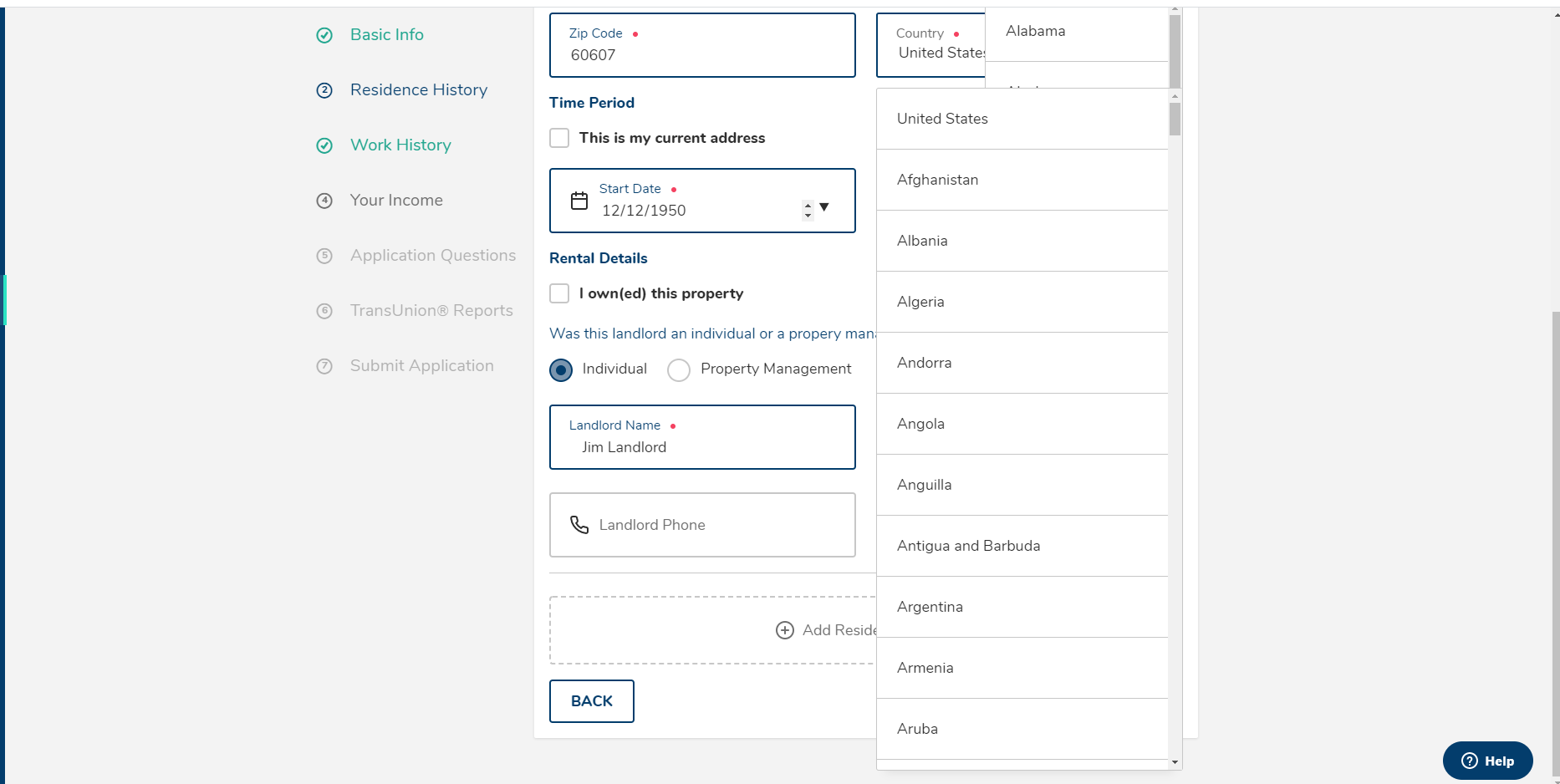
If you tab into the State and Country fields, the values show. However, when you tab away, the values continue to show. In the attached case, it shows the resulting symptom of having stacked/multiple value lists.
The list should close when the input is blurred.
We have a number of places through out the web app that we use paginated tables of data. Currently there is no centralized way to display this data.
Some of the affordances that I assume a data table would need are: pagination, row deletion?, editing. Multi-select, drag-and-drop?
Mockup TBD. I want to get feedback on whether or not this would be a useful component in the first place. We can use a lot of the learning that Nellie did when creating the calculator page.
When trying to pass a className into FluidProgress or FixedProgress it's not passed onto the underlying DOM element.
I should be able to add styles to any component through a className prop.
No actual error.
If the Tooltip was for a target in the page below the FullPageModal, the Tooltip should be gone after the FullPageModal is loaded.
It would be nice to let users to set z-index for a Tooltip.
For example,
<ToolTip name="Edit" style={{ zIndex: 100 }}>
Currently, a Popover generated by a Tooltip has a hardcoded z-index of 9999.
    <Popover
      style={{ zIndex: "9999" }}
      targetRef={targetRef}
      ref={popoverRef}
      position={position}
    >
      <StyledTooltip
        {...props}
        ref={tooltipRef}
        role="tooltip"
        id={id}
        aria-hidden={!isOpen}
      >
        {children}
      </StyledTooltip>
    </Popover>


Create a new @rent_avail/core package that contains both the base and layout packages.
Update base installation to use a ADSProvider component.
function App() {
  return (
    <ADSProvider theme={
        /* Should be merged into the base theme. */
        customTheme
    }>
      {/* App components*/}
    </ADSProvider>
  )
}
This will make is simpler to setup a new project with the Avail Design System.
This package should be created in typescript.
@rentalutions/elements/modalThe modal should render with it's current state.
ReferenceError: document is not defined
Update @rent_avail/dialog to typescript.
Import Modal from @rentalutions/elements/modal and use it on a server rendered page.
It shouldn't fire useLayoutEffect
It doesn't actually fire useLayoutEffect but react surfaces a warning like it's a problem. We should probably just switch it to useEffect because we're already bailing on the hook when the window is undefined. It won't actually make a difference and the server / client should not mismatch unless you load with a modal open (which will happen after react hydrates so I'm not even sure a mismatch would happen there.
a replacement for our current google places input to match the new input UI.
AddressInput
We will be able to use this component to replace all older styles. We should consider how we send back the address data once retrieved.
Current AddressInput:
Untouched:

On Focus:

Once we start typing:

Included inside CodeSandbox provided below
Included inside CodeSandbox provided below
N/A
Currently the placeholder isn't looked at when the input is rendered, so it's rendered not raised and looks terrible
When omitting the label prop the component still renders a p.label with no children. This should only be rendered if the prop is present.
{label ? <p className="label">{label}</p> : null}
No error
No resources
A new Issue
Version: 1.7.3
Running from: Import using webpack
Are you using a released build: Yes
Operating system: Safari (desktop) on MacOS
Bits: Not sure?
The dropdown opens and the options are able to be selected. Note: I'm able to select an option if I click into an adjacent input and tab into the select field.
None
When using the Input component, if you set its type to date the input renders in the raised position, which is expected. The border, however, is blue before the user has ever interacted with it.
The border should only be blue once the input has been focused and filled in.
N/A

Version: Release v2.0.0-beta.2
Running from: NextJS
Operating system: Mac OSX
@rentalutions/elements/avatarI would expect the class name to be passed to the html element.
No console output
...
No resources
...
After clicking on tooltip on mobile, the tooltip sticks to the screen when scrolling.
The tooltip either staying near the target, or disappears on scrolling

 React
React
A declarative, efficient, and flexible JavaScript library for building user interfaces.
🖖 Vue.js is a progressive, incrementally-adoptable JavaScript framework for building UI on the web.
 Typescript
TypeScript is a superset of JavaScript that compiles to clean JavaScript output.
An Open Source Machine Learning Framework for Everyone
 Django
The Web framework for perfectionists with deadlines.
 Laravel
A PHP framework for web artisans
Bring data to life with SVG, Canvas and HTML. 📊📈🎉
JavaScript (JS) is a lightweight interpreted programming language with first-class functions.
Some thing interesting about web. New door for the world.
A server is a program made to process requests and deliver data to clients.
Machine learning is a way of modeling and interpreting data that allows a piece of software to respond intelligently.
Some thing interesting about visualization, use data art
Some thing interesting about game, make everyone happy.
 Facebook
We are working to build community through open source technology. NB: members must have two-factor auth.
 Microsoft
Open source projects and samples from Microsoft.
 Google
Google ❤️ Open Source for everyone.
 Alibaba
Alibaba Open Source for everyone
 D3
D3
Data-Driven Documents codes.
 Tencent
China tencent open source team.