GithubHelp home page GithubHelp logo

shopify / restyle Goto Github PK

View Code? Open in Web Editor NEW
2.8K 2.8K 128.0 3.55 MB

A type-enforced system for building UI components in React Native with TypeScript.

Home Page: https://shopify.github.io/restyle/

License: MIT License

TypeScript 95.46% JavaScript 3.95% Ruby 0.59%

restyle's Introduction

Restyle Image

Getting startedInstallationPlaygroundDiscord

Build a consistent, themed UI in minutes.

RestyleTheme 2020-02-25 17_43_51

The Restyle library provides a type-enforced system for building UI components in React Native with TypeScript. It's a library for building UI libraries, with themability as the core focus.

This library assumes that the UI is built upon a design system that (at the very least) defines a set of colors and spacing constants that lays as a foundation. While the library acknowledges that there can be exceptions to the system by allowing any style to be overridden, it keeps the developer most productive when one-off values are kept to a minimum.

Installation

Add the package to your project using one of the following:

yarn add @shopify/restyle
npm install @shopify/restyle
npx expo install @shopify/restyle

Usage

See Usage in the documentation, or see below for the fixture app.

App / Playground

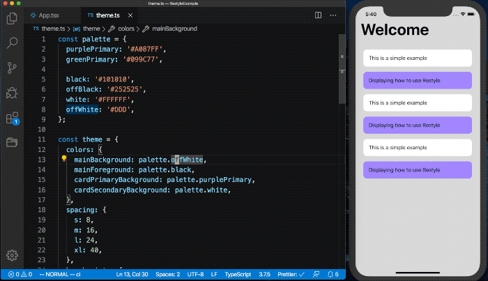
The fixture is an example app to showcase the library's usage.

Running the Documentation site locally

To run the Documentation site locally, please follow the steps below:

  1. cd documentation
  2. yarn
  3. yarn start
  4. Go to http://localhost:3000/restyle/

Migrating to restyle v2

Read more about migration to v2 here

Inspiration

Restyle is heavily inspired by https://styled-system.com.

Contributing

For help on setting up the repo locally, building, testing, and contributing please see CONTRIBUTING.md.

Code of Conduct

All developers who wish to contribute through code or issues, take a look at the CODE_OF_CONDUCT.md.

License

MIT, see LICENSE.md for details.

restyle's People

Contributors

chj-damon avatar codybrouwers avatar colinta avatar cursedcoder avatar davebcn87 avatar dependabot[bot] avatar dobrea-v avatar elviraburchik avatar fortmarek avatar gvarandas avatar jamesism avatar joelbesada avatar johan-dutoit avatar mattfrances avatar meta-dreamer avatar migueldaipre avatar mlecoq avatar naqvitalha avatar nelyousfi avatar owencraston avatar randall71 avatar robrechtme avatar roshangm1 avatar salzhrani avatar sambostock avatar sampsonjoliver avatar sbalay avatar sebastianekstrom avatar tarikfp avatar yuriazevedo11 avatar

Stargazers

 avatar  avatar  avatar  avatar  avatar  avatar  avatar  avatar  avatar  avatar  avatar  avatar  avatar  avatar  avatar  avatar  avatar  avatar  avatar  avatar  avatar  avatar  avatar  avatar  avatar  avatar  avatar  avatar  avatar  avatar  avatar  avatar  avatar  avatar  avatar  avatar  avatar  avatar  avatar  avatar  avatar  avatar  avatar  avatar  avatar  avatar  avatar  avatar  avatar  avatar  avatar  avatar  avatar  avatar  avatar  avatar  avatar  avatar  avatar  avatar  avatar  avatar  avatar  avatar  avatar  avatar  avatar  avatar  avatar  avatar  avatar  avatar  avatar  avatar  avatar  avatar  avatar  avatar  avatar  avatar  avatar  avatar  avatar  avatar  avatar  avatar  avatar  avatar  avatar  avatar  avatar  avatar  avatar  avatar  avatar  avatar  avatar  avatar  avatar  avatar

Watchers

 avatar  avatar  avatar  avatar  avatar  avatar  avatar  avatar  avatar  avatar  avatar  avatar  avatar  avatar  avatar  avatar  avatar  avatar  avatar  avatar  avatar  avatar  avatar  avatar  avatar  avatar  avatar  avatar  avatar  avatar  avatar  avatar  avatar  avatar  avatar  avatar  avatar  avatar  avatar  avatar  avatar  avatar  avatar  avatar  avatar  avatar  avatar  avatar  avatar  avatar  avatar  avatar  avatar  avatar  avatar  avatar  avatar  avatar  avatar  avatar  avatar  avatar  avatar  avatar  avatar  avatar  avatar  avatar  avatar  avatar  avatar  avatar  avatar  avatar  avatar  avatar  avatar  avatar  avatar  avatar  avatar  avatar  avatar  avatar  avatar  avatar  avatar  avatar  avatar  avatar  avatar  avatar  avatar  avatar  avatar  avatar  avatar  avatar  avatar  avatar

restyle's Issues

Using Style function to override styling

Description

I have created a custom Card Component that looks like this. I'm using Pressable as the base component.

export type CardProps = BoxProps<Theme> &
  VariantProps<Theme, 'cardVariants'> &
  PressableProps
export const Card = createRestyleComponent<CardProps, Theme>(
  [createVariant({ themeKey: 'cardVariants' })],
  createBox<Theme>(Pressable)
)

This has allowed me to use the Card like this:

<Card
      variant="horizontal"
      m="xl"
      onPress={() => {
        console.log('pressed card')
      }}>

It works but I had the question if it is possible to take advantage of the Style function provided by Pressable See here to override styles with it:

This works:

<Card
      variant="horizontal"
      m="xxl"
      onPress={() => {
        console.log('card pressed')
      }}
      style={{ backgroundColor: 'red' }}>

This doesn't:

<Card
      variant="horizontal"
      m="xxl"
      onPress={() => {
        console.log('card pressed')
      }}
      style={({pressed}) => ({ backgroundColor: 'red' })}>

I'm not sure if there's a workaround for this, but it would be cool if possible.

Thanks in advance

Using styles within custom components

Below is my custom button component.

const Button = ({onPress, label, ...rest}: Props) => {
  const props = useRestyle([buttonVariants as any], rest);

  return (
    <TouchableOpacity onPress={onPress}>
      <Box alignItems="center" {...props}>
        <Text variant="body" style={{color: props.style[0]?.color }}>
          {label}
        </Text>
      </Box>
    </TouchableOpacity>
  );
};

I am trying to change the Text color based on the chosen variant, how can I access the restyle 'color' property directly from the props rather than using the style attribute. So for example I want to use <Text variant="body" color= {props.color}> which maps to the color specified in the variant e.g primrayDark. Thanks!

Property 'children' does not exist on type 'IntrinsicAttributes & blahbah'

"@shopify/restyle": "^1.4.0",
"typescript": "~4.0.0"

use the following code to generate a component

const theme = createTheme({
  colors: {
    mainBackground: "#F0F2F3",
    cardPrimaryBackground: "#5A31F4",
  },
});

type Theme = typeof theme

export const Button = createBox<Theme, TouchableOpacityProps>(TouchableOpacity);

When you use it directly, it will give you a type error:
image

It will be fixed if we change the declaration to:

export const Button = createBox<
  Theme,
  TouchableOpacityProps & { children?: React.ReactNode }
>(TouchableOpacity);

Examples of createRestyleComponent in readme out of date

The current readme documentation on createRestyleComponent is out of date. Starting with version 1.2.0 you have to pass a theme type as well, otherwise you get an error of Expected 2 type arguments, but got 1.

const Card = createRestyleComponent<
  VariantProps<Theme, 'cardVariants'> & React.ComponentProps<typeof Box>,
  Theme
>([createVariant({themeKey: 'cardVariants'})], Box);

Web Support

Are there any plans to make this library platform agnostic?
I love the API and I would like to bring it to the web, this would also make it compatible with react-native-web and expo web

Control pressable component styles

What is the best way to style dynamic components, which style could change (i.e. during user interaction)?

For instance, I've created this custom Button component:

type Props = SpacingShorthandProps<Theme> &
  VariantProps<Theme, 'buttonVariants'> & {
    label?: string;
    onPress: () => void;
  };

export const Button = ({ label, onPress, ...rest }: Props) => {
  const props = useRestyle(restyleFunctions, rest);

  return (
    <Pressable onPress={onPress} {...props}>
      <Text variant="text">{label}</Text>
    </Pressable>
  );
};

and using it like this somewhere outside:

<Button variant='primary' onPress={_onPress} label='Submit' />

So the task is to somehow apply different styles when button is being pressed. Do I need to create another variant but for pressed state (like, primaryPressed) and somehow change the variant from outside? Or is there something I missed when reading docs and there's easier way to do this?

Module has no exported member 'createTheme'

Hello all, trying out this package for the first time. I can't seem to get my theme setup following instructions in the documentation. Please see attached snapshot. I've got version 1.0.4 installed btw.

Screenshot 2020-07-25 at 12 23 31

Being able to export and control variants in other files

Hello, wonderful library. My main concerned is that I do not have the ability to split my variants into different file and remain typing.

Is there a way createVariant to define a variant styling and typing that can be used per component?

For example, I would like to do something like the following

import { backgroundColor, BackgroundColorProps, border, BorderProps, spacing, SpacingProps, useRestyle, VariantProps } from '@shopify/restyle';
import React from 'react';
import { Pressable } from 'react-native';
import { Theme } from '../../../../contexts/Theme';
import Text from '../../../Base/Text';

const menuVariants: Variants = {
  bold: {
    fontSize: 32,
    fontWeight: 'bold'
  },
  normal: {
    fontSize: 16
  }
};

export type MenuItemProps = {
  title: string;
} &
VariantProps<Theme, menuVariants> &
SpacingProps<Theme> &
BorderProps<Theme> &
BackgroundColorProps<Theme>;

const restyleFunctions = [
  spacing,
  border,
  backgroundColor
];
export default function ({title, ...restyleProps}: MenuItemProps) {
  const props = useRestyle(restyleFunctions, restyleProps);

  return (
    <Pressable {...props} onPress={() => {
      console.log("Hello World");
    }}>
      <Text>{title}</Text>
    </Pressable>
  );
};

React native testing library support

I'm trying to unit test components with restyle on a React Native app but with no success 😢

// Box.js
import { createBox } from "@shopify/restyle";
import { Theme } from "./theme";

const Box = createBox<Theme>();

export default Box;

This is the line where the test throws an error :

const {getByText, getByPlaceholder} = render(
    <ThemeProvider theme={theme}>
      <Box />
    </ThemeProvider>
  );
  ● Test suite failed to run

    Invariant Violation: __fbBatchedBridgeConfig is not set, cannot invoke native modules

      at invariant (../node_modules/@shopify/restyle/node_modules/invariant/invariant.js:40:15)
      at Object.<anonymous> (../node_modules/@shopify/restyle/node_modules/react-native/Libraries/BatchedBridge/NativeModules.js:169:3)
      at Object.<anonymous> (../node_modules/@shopify/restyle/node_modules/react-native/Libraries/TurboModule/TurboModuleRegistry.js:13:23)

Any ideas what does that mean ?

Type safety in theme object

Hey everyone, Great project!

As I began implementing I was getting frustrated that the types in my theme object were still a bit loose. I wouldn't know until runtime that I mistyped a color or a border radius key. To remedy this I created a couple of helper functions:

type BaseTheme<
  TColors extends {[key: string]: string},
  TSpacing extends {[key: string]: number},
  TBreakpoints extends {[key: string]: number},
  TZIndices extends {[key: string]: number},
  TBorderRadii extends {[key: string]: number}
> = {
  colors: TColors;
  spacing: TSpacing;
  breakpoints: TBreakpoints;
  zIndices?: TZIndices;
  borderRadii?: TBorderRadii;
};

function makeBaseTheme<
  TColors extends {[key: string]: string},
  TSpacing extends {[key: string]: number},
  TBreakpoints extends {[key: string]: number},
  TZIndices extends {[key: string]: number},
  TBorderRadii extends {[key: string]: number}
>(
  t: BaseTheme<TColors, TSpacing, TBreakpoints, TZIndices, TBorderRadii>
): BaseTheme<TColors, TSpacing, TBreakpoints, TZIndices, TBorderRadii> {
  return t;
}

function makeTheme<
  TColorKeys extends string,
  TColors extends {[key: string]: string},
  TSpacing extends {[key: string]: number},
  TBreakpoints extends {[key: string]: number},
  TZIndices extends {[key: string]: number},
  TBorderRadii extends {[key: string]: number},
  BTheme extends BaseTheme<TColors, TSpacing, TBreakpoints, TZIndices, TBorderRadii>,
  T extends {
    [topVariant: string]: {
      [variant: string]: AllProps<BTheme>;
    };
  }
>(
  base: BaseTheme<TColors, TSpacing, TBreakpoints, TZIndices, TBorderRadii>,
  t: T
): BaseTheme<TColors, TSpacing, TBreakpoints, TZIndices, TBorderRadii> & T {
  return {...base, ...t};
}

Used as:

const baseTheme = makeBaseTheme({
  colors: {
    primary: '#F4F4F7',
    primaryDark: '#C4C4C7',
  },
  spacing: {
    s: 8,
    m: 16,
    l: 24,
    xl: 40,
  },
  zIndices: {
    behind: -1,
  },
  breakpoints: {
    phone: 0,
    tablet: 768,
  },
  borderRadii: {
    button: 5,
  },
});


export const theme = makeTheme(baseTheme, {
  buttonVariants: {
    simpleButton: {
      borderRadius: 'button',
      backgroundColor: 'primary',
      flexDirection: 'row',
      padding: 's',
    },
  },
});
export type Theme = typeof theme;

This enforces type safety on the variants appropriately!

If this is an interesting enough concept to the maintainers I can submit a PR and expose these two functions for common use.

Questions from someone coming from styled-system

  1. Sometimes I found myself wanting to use "magical one time px values" and this is what I like about styled-system vs tailwind-css, I was able to add some 3px margin here and there when needed. <Box mr={3} /> but still use theme values. Seems like typescript don't like it here. Was is the best practice here ? Generate multiples by 4 ?
  spacing: {"1": 4, 2: "8", 3: "12"}

But stuff like this doesn't allow TS to understand what I'm doing :

spacing: Object.fromEntries(
    [...new Array(20)].map((_, i) => [i.toString(), i * 4])
  )

With the spacing theme I need to generate the spacing object, not just use 4 or 5 keys. Do you have solution for this ?

EDIT: Ohhh nvm I got it, spacing is just.. well, for spacing, there are no rules for width and height.

  1. Do you plan to support arrays or objects like styled-system ?
  colors: {
    black: '#000000',
    greys: ['#F5F5F5',  '#94959F',  '#707070'],
    white: '#FFFFFF',
    blues: {
      dark: '#282C40',
      light: '#9EF2FA',
    },
  },

and use it like <Box color="grey.0" and <Box color="blues.dark" />

  1. I noticed fontSizes doesn't have theme key, is this on purpose ? I was expecting to find it in the theme and use predefined fontSizes.

Great lib btw !

Shadow offset breakpoints error

Hi. I'm trying to create a card component and was getting this error:

TypeError: undefined is not an object (evaluating 'theme.breakpoints[key]')

Here's my code:

  cardVariants: {
    regular: {
      padding: 'md',
      backgroundColor: 'cardBackground',
      shadowColor: 'cardShadow',
      shadowOffset: {
        width: 0,
        height: 5,
      },
      shadowOpacity: 0.18,
      shadowRadius: 1.0,
      elevation: 1,
    },
  },

Removing the shadowOffset key works. You will get the error even in this sample.

Test fails when performing snapshot testing via jest

I am trying to run simple snapshot test for my component build with this library using Box, Text and Theme. But when i am running the tests it fails with the error message react_native_1.Dimensions.addEventListener is not a function

Here is my test file.

import 'react-native';
import React from 'react';
import renderer, {act} from 'react-test-renderer';
import Login from '../screens/login';

import * as customHook from '../../../global/hooks/theme/useCustom';
import theme from '../../../global/styles';
import {ThemeProvider} from '@shopify/restyle';
import {LogoArea} from '../components';
import {Dimensions} from 'react-native';

jest.mock('react-native/Libraries/Utilities/Dimensions', () => {
  return {
    get: () => ({
      width: 375,
      height: 667,
    }),
    addEventListener: jest.fn(),
  };
});

describe('LoginTest', () => {
  beforeEach(() => {
    Dimensions.addEventListener.mockClear();
  });

  it('Login renders correctly', async () => {
    const spy = jest.spyOn(customHook, 'useCustom');
    spy.mockResolvedValue({loginFormMarginTop: 50});
    const tree = renderer
      .create(
        <ThemeProvider theme={theme}>
          <Login />
        </ThemeProvider>,
      )
      .toJSON();
    await expect(tree).toMatchSnapshot();
  });

  it('LogoArea renders correctly', async () => {
    const tree = renderer
      .create(
        <ThemeProvider theme={theme}>
          <LogoArea />
        </ThemeProvider>,
      )
      .toJSON();
    await expect(tree).toMatchSnapshot();
  });
});

I am very new to this library and also to jest testing. There might be something i am missing here. Please guide how to add simple snapshot test for a component like below

import {createBox, createText} from '@shopify/restyle';
import React from 'react';
const Text = createText();
const Box = createBox();

const WelcomeMessage = () => {
  return (
    <Box flex={0.1}>
      <Text variant={'xxlargerPrimaryBold'}>Welcome!</Text>
      <Text variant="largePrimaryRegular">
        Sign in to continue Clearview Pro
      </Text>
    </Box>
  );
};

export default WelcomeMessage;

Question: Split up variants

I just wanted to know if there is any future scope for split variants, currently the variants sit in a single place and can bloat the theme.
Also while developing it doesn't make sense to switch to theme and component always.
Having close variants can also help in some design patterns.
Example

TextInput.ts
TextInput.variants.ts

Where the variants will be somehow imported in the main Theme.

support logical properties

by that I mead start, end in addition to left and right.
also in padding, border and margin.
It makes supporting RTL layouts much easier.

can make a PR if you think it is useful.

borderRadius property triggers typescript error when theme values are used

Typescript Error:

(property) borderRadius?: number | {
[x: string]: number | undefined;
} | undefined
Type 'string' is not assignable to type 'number | { [x: string]: number | undefined; } | undefined'.ts(2322)

Defined in theme as:

const theme = {
borderRadii: {
s: 4,
m: 8,
l: 16,
xl: 24,
xxl: 48,
},
}

Used as:

<Box borderRadius='s'>{content}</Box>

TypeError: undefined is not a function (near '...(0, _restyle.createTheme)...')

I am trying to implement theme with createTheme but when launching my application in android it throws the following error:

17:48:10.908	client_log	TypeError: undefined is not a function (near '...(0, _restyle.createTheme)...')
17:48:10.909	client_log	Invariant Violation: Module AppRegistry is not a registered callable module (calling runApplication)
17:48:23.920	client_log	TypeError: undefined is not a function (near '...(0, _restyle.createTheme)...')
17:48:23.920	client_log	Invariant Violation: Module AppRegistry is not a registered callable module (calling runApplication)

this launch the error;
const theme = createTheme({// theme options});
this work.
const theme = {//theme};

specify default value for breakpoints

Hey there,

It's possible to somehow specify default value for a breakpoint.

Here's an example:

<Box flexDirection={{ mobile: "row", default: "column" }}  />

Use different style depend on platform

Hey 👋, first of all, thanks for this wonderful library.

Some time I would love to use different styles depending on the OS platform ( android/ios), that way I suggest if we can have a way to do it like the responsive utility.

Can not use variant

Hello here is my basic theme setup:

`const palette = {
white: '#FFFFFF',
black: '#000000',
darkGray: '#4D4D4D',
mediumGray: '#CACACA',
lightGray: '#E9E9E9',
primaryColor: '#46DB72',
secondaryColor: '#00BCFF',
thirdColor: '#2CDCA0',
successColor: '#94DE45',
errorColor: '#EF4836',
warningColor: '#FF8C2F',
facebookColor: '#3B5998',
backgroundDarkenColor: 'rgba(0,0,0,0.4)',
skyBlue: '#02bcff'
};

const theme = {
colors: {
mainBackground: palette.white,
cardPrimaryBackground: palette.white,
buttonPrimaryBackgroundColor: palette.primaryColor,
buttonFacebookColor: palette.facebookColor,
buttonWhiteColor: palette.white,
inactiveBackgroundColor: palette.mediumGray
},
spacing: {
es: 5,
s: 8,
m: 20,
l: 24,
xl: 40
},
breakpoints: {
phone: 0,
tablet: 768
},
fontWeights: {
baseFontWeight: '400',
boldFontWeight: '700',
altFontWeight: '900'
},
fontSizes: {
small: 12,
normal: 14,
medium: 16,
medim_large: 18,
large: 20,
extraLarge: 22
},
fontFamily: {
baseFontFamily: 'Lato'
},
textVariants: {
logoHeading: {
color: 'mainBackground',
padding: {phone: 'es', tablet: 's'},
fontSize: {phone: 18, tablet: 30},
fontFamily: 'Lato'
}
},
buttonVariants: {
primaryButton: {
width: {phone: 200, tablet: 300},
height: 50,
borderRadius: 20,
marginBottom: 20,
justifyContent: 'center',
alignItems: 'center'
}
}
};

export default theme;
`

And i want to use variant in card I did this:

` const variant = createVariant({
themeKey: 'buttonVariants',
defaults: {
height: 50
}
});

const Card = createRestyleComponent([variant]);`

And when want to use always get error: Value '20' does not exist in theme['spacing']

What am I doing wrong ?

using StyleSheet.create({}) instead of inline style

as I realize and read your source code you use inline style instead of StyleSheet.create({}).
is it true or not? if yes is there any plane to replace it?
because as you know StyleSheet performance is much better than inline styles.

createText missing layout props

I'd like for layout props to be exposed within createText so that I can use it like this

 <Text
    width={260}
    variant="header"
 >

Would you accept a PR with the addition or was it intentionally left out?

Jest fails with TypeError: react_native_1.Dimensions.addEventListener is not a function

While writing a test for createText I came across an issue regarding missing fields on the Dimensions object.
This seems to be an ongoing issue for the repo, however I am unable to mock the code the module manually:

jest.mock('react-native/Libraries/Utilities/Dimensions', () => {
  return {
    get: () => ({
      width: 375,
      height: 667,
    }),
    addEventListener: jest.fn(),
  };
});

Have you any suggestions?

TypeScript error when spreading an object of styles on component

Hello, I am attempting to create a custom TextInput that is styled based on a disabled (or invalid) condition. When that certain condition is met, I want to spread those style properties onto the component. The code technically works, but am getting TypeScript errors and am unsure how to go about it. Here's a contrived example of my custom component:

// Input.tsx
export const Input = (props) => {
  const inputState = props.inputState;   // <-- default/disabled state
  const inputStyles = getInputStyles(inputState);

  return (
    <Box flexDirection="row">
      <RestyleTextInput
        borderRadius="sm"
        borderStyle="solid"
        borderWidth={1}
        fontSize={16}
        height={40}
        px="lg"
        width="100%"
        color="text"
        {...inputStyles}   // <-- spreading style object 
        {...props}
      />
    </Box>
  );
}

const getInputStyles = (inputState) => {
  if (inputState.isDisabled) {
    return {
      borderColor: 'inputDisabled',
      placeholderTextColor: 'inputDisabled',
      editable: false,
    };
  }

  return {
    borderColor: 'inputDefault',
    placeholderTextColor: 'inputDefault',
    editable: true,
  };
};

This may not be helpful, but here's a screenshot of the obscure TS error I'm getting locally:

Screen Shot 2020-08-30 at 10 28 35 AM

Any ideas on how to go about this?

edit: On second thought, I may need to add a return type to getInputStyles, but need to figure this part out since I'm not good at TS.

How to access theme in class components

I can't find any reference to Context export in the docs nor in the code, just the useTheme hook. Is it possible to access the theme from within a class component?

Instruct users to set breakpoints in theme even if they aren't used.

Hi there, I'm not sure the best way to solve this but wanted to point out something that caused me some frustration. I didn't need breakpoints in my project but received a type error so I set breakpoints: {} in my theme. I didn't realize it but this resulted in all my jsx style props having {} as a valid value which in TS refers to any non null value - so none of my validations were working. After digging around I realized the mistake and set breakpoints: {phone: 0} which resolved it, but I was stumped for a while.

Creating a component which doesn't accept children causes TS error

Given this component:

import React from 'react'
import {View, Text} from 'react-native'
import {
  createStyleSystemComponent,
  createVariant,
  VariantProps,
} from '@shopify/style-system'
import {Theme} from 'shared/styleSystemTheme'

interface ButtonProps {
  text?: string
}

type Props = ButtonProps & VariantProps<Theme, 'buttonVariants'>

const Button = ({text}: Props) => {
  return (
    <View>
      <Text>{text}</Text>
    </View>
  )
}

const _Button = createStyleSystemComponent<Props>(
  [createVariant({themeKey: 'buttonVariants'})],
  Button
)

_Button.defaultProps = {
  variant: 'default',
}

export default _Button

We get the following Typescript error:

Argument of type '({ text }: Props) => JSX.Element' is not assignable to parameter of type 'ComponentClass<{}, any> | FunctionComponent<{}> | undefined'.
  Type '({ text }: Props) => JSX.Element' is not assignable to type 'FunctionComponent<{}>'.
    Types of parameters '__0' and 'props' are incompatible.
      Type '{ children?: ReactNode; }' has no properties in common with type 'Props'.ts(2345)

Adding

interface ButtonProps {
  text?: string
  children?: React.ReactNode
}

fixes the issue, but shouldn't be needed.

I want to pass textVariant as a prop to my button component, what type should the prop be?

I am trying to pass a textVariant to my button prop to control the label text. However, when I define my prop as a string like so type MyProps = { onPress: () => void; label: string; variant?: string; textVariant?: string; };

I get the typeScript error:

Type 'string' is not assignable to type '"body" | "header" | "subHeader" | "welcomeButtons" | { phone?: "body" | "header" | "subHeader" | "welcomeButtons" | undefined; tablet?: "body" | "header" | "subHeader" | "welcomeButtons" | undefined; } | undefined'.

Is there a type export from the package that tracks the textVaraints and would be appropriate in this situation? Thanks!

Typescript issues with forwardRef

HI,
Thanks for a great library, I have been using it and seems good. Previously I used to use styled-system but it was not fully supported for react-native

I am facing one issue regarding forwarding the refs.

here is my example, What i want to achieve is that I want to create a TextInput with the style props

import React, { forwardRef } from "react";
import { createBox, ColorProps } from "@shopify/restyle";
import {
  TextInput as RNTextInput,
  TextInputProps as RNTextInputProps,
} from "react-native";
import { Theme } from "styles/theme";

const TextInputBase = createBox<Theme, RNTextInputProps>(RNTextInput);

type TextInputProps = React.ComponentPropsWithRef<typeof TextInputBase> &
  ColorProps<Theme> & {
    error?: string | boolean;
  };

export const TextInput = forwardRef<typeof TextInputBase, TextInputProps>(
  (props, ref) => {
    return <TextInputBase ref={ref} {...props} />;
  },
);

But ts throws an error that Ref doesn't exist in TextInputBase.

I could have used useRestyle and customise it to my needs but in that case my variants won't work :|
Help would be appreciated.

UPDATE

I figured out a way to have variants and useRestyle but there are some issues with ts.
Everything works fine in this example except there is ts error for the restylecontainerarray,

import React, { forwardRef } from "react";
import {
  ColorProps,
  useRestyle,
  spacing,
  border,
  backgroundColor,
  BorderProps,
  BackgroundColorProps,
  createVariant,
  VariantProps,
} from "@shopify/restyle";
import { TextInput as RNTextInput } from "react-native";
import { Theme } from "styles/theme";

type TextInputProps = React.ComponentPropsWithRef<typeof RNTextInput> &
  BorderProps<Theme> &
  BackgroundColorProps<Theme> &
  ColorProps<Theme> &
  VariantProps<Theme, "textInputVariants"> & {
    error?: string | boolean;
  };

const variant = createVariant<Theme>({
  themeKey: "textInputVariants",
  defaults: {
    width: "100%",
    borderRadius: 10,
    backgroundColor: "mainBackground",
  },
});
const restyleFunctions = [spacing, border, backgroundColor, variant];

export const TextInput = forwardRef<RNTextInput, TextInputProps>(
  ({ ...rest }, ref) => {
    const props = useRestyle(restyleFunctions as any, rest);
    return <RNTextInput ref={ref} {...props} />;
  },
);

I have marked is as any for now, but i think this should be fixed as well.

Screenshot 2020-08-11 at 4 49 00 PM

Jest failes with "Value does not exist in theme['spacing']" when spacing value is used

I'm using a spacing theme value on a Box component:

import React from 'react';
import { Box, Text } from '../';

function NiceBox() {
  return (
    <Box padding="m">
      <Text>So nice!</Text>
    </Box>
  );
}

export default NiceBox;

Inside a Jest test file, I try to render the component using @testing-library/react-native (see #62 (comment))

import React from 'react';
import { render } from '@testing-library/react-native';
import NiceBox from './NiceBox';

test('renders correctly', () => {
  render(<NiceBox />);
});

Which throws this error:

Value 'm' does not exist in theme['spacing']

The spacing value exist in the theme deceleration, and renders correctly (outside Jest).

Any idea why is that? 🥺

Need animated box component

var createAnimatedBox = function (BaseComponent) { if (BaseComponent === void 0) { BaseComponent = react_native_1.Animated.View; } return createRestyleComponent_1.default(exports.boxRestyleFunctions, BaseComponent); };

Override variant default style without style

I created a Surface Component which takes a custom variant

const variant = createVariant({ themeKey: 'surfaceVariants' });

type Props = VariantProps<Theme, 'surfaceVariants'> &
  React.ComponentProps<typeof Box>;

const Surface = createRestyleComponent<Props, Theme>([variant], Box);
surfaceVariants: {
    defaults: {
      backgroundColor: 'white',
      shadowColor: 'black',
      shadowOpacity: 0.24,
      shadowOffset: { width: 0, height: 0.5 },
      shadowRadius: 0.75,
      elevation: 1,
    },
    elevatedS: {
      shadowOffset: { height: 0.75 },
      shadowRadius: 1.5,
      elevation: 2,
    },
}

When I want to override the backgroundColor like this

<Surface variant="elevatedL" backgroundColor="red">

the background color doesn't change.
Is there a way to get past this or am I getting something wrong?

Recommend Projects

  • React photo React

    A declarative, efficient, and flexible JavaScript library for building user interfaces.

  • Vue.js photo Vue.js

    🖖 Vue.js is a progressive, incrementally-adoptable JavaScript framework for building UI on the web.

  • Typescript photo Typescript

    TypeScript is a superset of JavaScript that compiles to clean JavaScript output.

  • TensorFlow photo TensorFlow

    An Open Source Machine Learning Framework for Everyone

  • Django photo Django

    The Web framework for perfectionists with deadlines.

  • D3 photo D3

    Bring data to life with SVG, Canvas and HTML. 📊📈🎉

Recommend Topics

  • javascript

    JavaScript (JS) is a lightweight interpreted programming language with first-class functions.

  • web

    Some thing interesting about web. New door for the world.

  • server

    A server is a program made to process requests and deliver data to clients.

  • Machine learning

    Machine learning is a way of modeling and interpreting data that allows a piece of software to respond intelligently.

  • Game

    Some thing interesting about game, make everyone happy.

Recommend Org

  • Facebook photo Facebook

    We are working to build community through open source technology. NB: members must have two-factor auth.

  • Microsoft photo Microsoft

    Open source projects and samples from Microsoft.

  • Google photo Google

    Google ❤️ Open Source for everyone.

  • D3 photo D3

    Data-Driven Documents codes.