GithubHelp home page GithubHelp logo

strothj / react-docgen-typescript-loader Goto Github PK

View Code? Open in Web Editor NEW
360.0 6.0 47.0 1.61 MB

Webpack loader to generate docgen information from Typescript React components.

License: Other

JavaScript 0.74% TypeScript 99.26%

react-docgen-typescript-loader's Introduction

Logo for project react-docgen-typescript-loader

Webpack loader to generate docgen information from TypeScript React components. The primary use case is to get the prop types table populated in the Storybook Info Addon.

Example screenshot of Storybook with TypeScript props
Example Storybook project
Live Storybook

Guide

Changelog

View Changelog.

Migrating from V2 to V3

Version 2 supported the options includes and excludes, which were arrays of regular expressions. If you made use of these options, remove them from and use the Webpack equivalents.

includes would default to ["\\.tsx$"] which meant that only files ending in the extension .ts or .tsx would be processed. This default behavior is already covered by Webpack's test field.

excludes would default to ["node_modules"]. This would prevent the processing of files in node_modules. This option was added to allow further filtering to hopefully speed up processing. When this loader is used in monorepo environments, this option would complicate configuration.

In version 3, the loader no longer performs its own filtering. If you relied on the additional filtering behavior, you should be able to reimplement it using options in Webpack.

This change shouldn't affect the majority of projects.

Quick Start

Requirements

The source code generation relies on being able to insert // @ts-ignore in a few select places and as such requires TypeScript 2.3 or above.

Package Installation

$ npm install --save-dev react-docgen-typescript-loader

or

$ yarn add --dev react-docgen-typescript-loader

Webpack Configuration

IMPORTANT: Webpack loaders are executed right-to-left (or bottom-to-top). react-docgen-typescript-loader needs to be added under ts-loader.

Example Storybook config /.storybook/webpack.config.js:

Storybook 4

const path = require("path");

module.exports = (baseConfig, env, config) => {
  config.module.rules.push({
    test: /\.tsx?$/,
    include: path.resolve(__dirname, "../src"),
    use: [
      require.resolve("ts-loader"),
      {
        loader: require.resolve("react-docgen-typescript-loader"),
        options: {
          // Provide the path to your tsconfig.json so that your stories can
          // display types from outside each individual story.
          tsconfigPath: path.resolve(__dirname, "../tsconfig.json"),
        },
      },
    ],
  });

  config.resolve.extensions.push(".ts", ".tsx");

  return config;
};

Storybook 3

const path = require("path");
const genDefaultConfig = require("@storybook/react/dist/server/config/defaults/webpack.config.js");

module.exports = (baseConfig, env) => {
  const config = genDefaultConfig(baseConfig);

  config.module.rules.push({
    test: /\.tsx?$/,
    include: path.resolve(__dirname, "../src"),
    use: [
      require.resolve("ts-loader"),
      {
        loader: require.resolve("react-docgen-typescript-loader"),
        options: {
          // Provide the path to your tsconfig.json so that your stories can
          // display types from outside each individual story.
          tsconfigPath: path.resolve(__dirname, "../tsconfig.json"),
        },
      },
    ],
  });

  config.resolve.extensions.push(".ts", ".tsx");

  return config;
};

Documenting Components with Storybook

Include the withInfo decorator as normal. Reference the addon documentation for the latest usage instructions: https://github.com/storybooks/storybook/tree/master/addons/info

Including Component Description

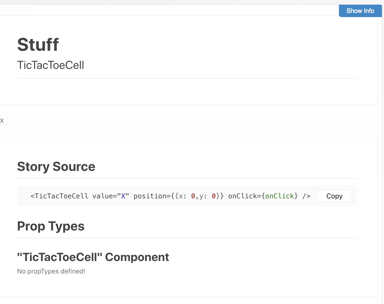
The Storybook Info Addon is able to populate the component description from your component's documentation. It does this when your story name matches the display name of your component. The prop tables will populate in either case.

Example image, how to include component description

In the first example you are able to see above Story Source the component description. The second example shows a story with a name different from the component. In the second example the component description is missing.

If you have a component named TicTacToeCell, then you would have to use something like: storiesOf("...", module).add("TicTacToeCell", ...) to have the story description come from the component description.

In addition to the description from the component, you may still include story description text using the normal withInfo api.

Exporting Components

It is important to export your component using a named export for docgen information to be generated properly.


TicTacToeCell.tsx:

import React, { Component } from "react";
import * as styles from "./TicTacToeCell.css";

interface Props {
  /**
   * Value to display, either empty (" ") or "X" / "O".
   *
   * @default " "
   **/
  value?: " " | "X" | "O";

  /** Cell position on game board. */
  position: { x: number, y: number };

  /** Called when an empty cell is clicked. */
  onClick?: (x: number, y: number) => void;
}

/**
 * TicTacToe game cell. Displays a clickable button when the value is " ",
 * otherwise displays "X" or "O".
 */
// Notice the named export here, this is required for docgen information
// to be generated correctly.
export class TicTacToeCell extends Component<Props> {
  handleClick = () => {
    const {
      position: { x, y },
      onClick,
    } = this.props;
    if (!onClick) return;

    onClick(x, y);
  };

  render() {
    const { value = " " } = this.props;
    const disabled = value !== " ";
    const classes = `${styles.button} ${disabled ? styles.disabled : ""}`;

    return (
      <button
        className={classes}
        disabled={disabled}
        onClick={this.handleClick}
      >
        {value}
      </button>
    );
  }
}

// Component can still be exported as default.
export default TicTacToeCell;

ColorButton.stories.tsx:

import React from "react";
import { storiesOf } from "@storybook/react";
import { withInfo } from "@storybook/addon-info";
import { action } from "@storybook/addon-actions";
import TicTacToeCell from "./TicTacToeCell";

const stories = storiesOf("Components", module);

stories.add(
  "TicTacToeCell",
  withInfo({ inline: true })(() => (
    <TicTacToeCell
      value="X"
      position={{ x: 0, y: 0 }}
      onClick={action("onClick")}
    />
  )),
);

Loader Options

Option Type Description
skipPropsWithName string[] or string Avoid including docgen information for the prop or props specified.
skipPropsWithoutDoc boolean Avoid including docgen information for props without documentation.
componentNameResolver function If a string is returned, then the component will use that name. Else it will fallback to the default logic of parser. https://github.com/styleguidist/react-docgen-typescript#parseroptions
propFilter function Filter props using a function. If skipPropsWithName or skipPropsWithoutDoc is defined the function will not be used. Function accepts two arguments: object with information about prop and an object with information about component. Return true to include prop in documentation. https://github.com/styleguidist/react-docgen-typescript#parseroptions
tsconfigPath string Specify the location of the tsconfig.json to use. Can not be used with compilerOptions.
compilerOptions typescript.CompilerOptions Specify TypeScript compiler options. Can not be used with tsconfigPath.
docgenCollectionName string or null Specify the docgen collection name to use. All docgen information will be collected into this global object. Set to null to disable. Defaults to STORYBOOK_REACT_CLASSES for use with the Storybook Info Addon. https://github.com/gongreg/react-storybook-addon-docgen
setDisplayName boolean Automatically set the components' display name. If you want to set display names yourself or are using another plugin to do this, you should disable this option. Defaults to true. This is used to preserve component display names during a production build of Storybook.
shouldExtractLiteralValuesFromEnum boolean If set to true, string enums and unions will be converted to docgen enum format. Useful if you use Storybook and want to generate knobs automatically using addon-smart-knobs. https://github.com/styleguidist/react-docgen-typescript#parseroptions
savePropValueAsString boolean If set to true, defaultValue to props will be string. https://github.com/styleguidist/react-docgen-typescript#parseroptions
typePropName string Specify the name of the property for docgen info prop type.
shouldRemoveUndefinedFromOptional boolean If set to true, types that are optional will not display `

Performance

There is a significant startup cost due to the initial type parsing. Once the project is running in watch mode, things should be smoother due to Webpack caching.

Alternative Implementation

This plugin uses a Webpack loader to inject the docgen information. There is also a version which works as a Webpack plugin. I will be supporting both versions. The loader version more accurately generates the injected code blocks and should work with all module types but at the cost of a longer initial startup. The plugin version may be faster.

The Webpack plugin version is available here: https://github.com/strothj/react-docgen-typescript-loader/tree/plugin

Limitations

This plugin makes use of the project: https://github.com/styleguidist/react-docgen-typescript. It is subject to the same limitations.

React Component Class Import

When extending from React.Component as opposed to Component, docgens don't seem to be created. Ref issue #10 (thanks @StevenLangbroek for tracking down the cause).

Doesn't work:

import React from 'react';

interface IProps {
  whatever?: string;
};

export default class MyComponent extends React.Component<IProps> {}

Works:

import React, { Component } from 'react';

export default class MyComponent extends Component<IProps> {}

Export Names

Component docgen information can not be generated for components that are only exported as default. You can work around the issue by exporting the component using a named export.

import * as React from "react";

interface ColorButtonProps {
  /** Buttons background color */
  color: "blue" | "green";
}

/** A button with a configurable background color. */
export const ColorButton: React.SFC<ColorButtonProps> = props => (
  <button
    style={{
      padding: 40,
      color: "#eee",
      backgroundColor: props.color,
      fontSize: "2rem",
    }}
  >
    {props.children}
  </button>
);

export default ColorButton;

Contributing

Pull requests are welcome. For major changes, please open an issue first to discuss what you would like to change.

Please make sure to update tests as appropriate.

Credits

SVG Logos

Projects

License

MIT

react-docgen-typescript-loader's People

Contributors

adammockor avatar ashikmeerankutty avatar buhichan avatar denieler avatar evless avatar folz avatar hipstersmoothie avatar jiavan avatar nekitk avatar patricklafrance avatar rkostrzewski avatar shiatsumat avatar strothj avatar zetoke avatar

Stargazers

 avatar  avatar  avatar  avatar  avatar  avatar  avatar  avatar  avatar  avatar  avatar  avatar  avatar  avatar  avatar  avatar  avatar  avatar  avatar  avatar  avatar  avatar  avatar  avatar  avatar  avatar  avatar  avatar  avatar  avatar  avatar  avatar  avatar  avatar  avatar  avatar  avatar  avatar  avatar  avatar  avatar  avatar  avatar  avatar  avatar  avatar  avatar  avatar  avatar  avatar  avatar  avatar  avatar  avatar  avatar  avatar  avatar  avatar  avatar  avatar  avatar  avatar  avatar  avatar  avatar  avatar  avatar  avatar  avatar  avatar  avatar  avatar  avatar  avatar  avatar  avatar  avatar  avatar  avatar  avatar  avatar  avatar  avatar  avatar  avatar  avatar  avatar  avatar  avatar  avatar  avatar  avatar  avatar  avatar  avatar  avatar  avatar  avatar  avatar  avatar

Watchers

 avatar  avatar  avatar  avatar  avatar  avatar

react-docgen-typescript-loader's Issues

Docs aren't updated on reload

We use recent react-docgen-typescript-loader with typescript being compiled using babel-loader + @babel/preset-typescript . Docs are showing up very well (component name, description, props table) on initial build; but they aren't being updated at all on code reload. We need to restart webpack in order to see changes in docs.

EDIT: I just looked up the example app in this repo and there docs also aren't updated on reload. (That app uses ts-loader.)

  1. Is it normal? Or did something break recently?

  2. What's the cause?

  3. If it's desired to work like that, can we update README on that? (I can send a PR.) The non-typescript react-docgen plugin works on reload, thus I was a bit surprised seeing that TS version doesn't work in that case.

Not working with React.StatelessComponent

I am trying to use react-docgen-typescript-loader v3 with storybook v4 and the storybook info addon, but am running into an issue where the component name shows up as an empty string (null?) and the prop types info displays "No propTypes defined" even when the component has a props interface.

Here's my Webpack config for Storybook:

const path = require("path");

module.exports = (baseConfig, env, defaultConfig) => {
  // TypeScript module rule for components
  defaultConfig.module.rules.push({
    test: /\.tsx?$/,
    include: path.resolve(__dirname, "../src"),
    use: ["ts-loader", "react-docgen-typescript-loader"]
  });

  // TypeScript module rule for stories
  defaultConfig.module.rules.push({
    test: /\.tsx?$/,
    include: path.resolve(__dirname, "../stories"),
    use: ["ts-loader"]
  });

  // CSS module rule replacement
  const cssTest = /\.css$/;
  const cssRuleIndex = defaultConfig.module.rules.findIndex(
    obj => obj.test.toString() === cssTest.toString()
  );
  defaultConfig.module.rules[cssRuleIndex] = {
    test: cssTest,
    use: [
      "style-loader",
      {
        loader: "css-loader",
        options: {
          importLoader: 1
        }
      },
      "postcss-loader"
    ]
  };

  defaultConfig.resolve.extensions.push(".ts", ".tsx");

  return defaultConfig;
};

And here's a component that isn't working:

import React from "react";
import { FontFamily, FontSize, LineHeight, Text } from "./text";

interface HeadingProps {
  /** Level of hierarchy */
  level: "1" | "2" | "3";
}

export const Heading: React.StatelessComponent<HeadingProps> = props => {
  let fontSize;
  switch (props.level) {
    case "3":
      fontSize = FontSize.Large;
      break;
    case "2":
      fontSize = FontSize.Huge;
      break;
    default:
      fontSize = FontSize.Giant;
  }

  return (
    <Text fontSize={fontSize}>
      {props.children}
    </Text>
  );
};

Any idea what's going wrong here?

Support for defaultProps declaration

Typescript 3.0 added support for react's defaultProps declaration click.

Is there any plan to support it in this loader?

interface ButtonProps {
  children: string
  disabled: boolean
}

Button.defaultProps = {
  disabled: false,
}

export function Button(props: ButtonProps) {
  return (
    <button className={styles.button}>
      {props.children}
    </button>
  )
}

Would be cool if disabled props would be marked as optional.

Property '__docgenInfo' is missing in type ...

Hi, I'm using your loader in my project and I'm using JSS for styling. Everything works fine until I try to add styling to my component. For example, I have a Button component. If I try to inject styles with injectSheet(styles)(Button), the compiler fails with this message:

[tsl] ERROR in C:\...\src\components\Button\index.tsx(57,28)
      TS2345: Argument of type '{ (theme: ITheme): { root: { margin: number; letterSpacing: number; lineHeight: number; outline: string; border: string; borderRadius: number; cursor: string; }; primary: { background: string; color: string; '&:hover': { ...; }; }; ... 5 more ...; fullWidth: { ...; }; }; __docgenInfo: { ...; }; }' is not assignable to parameter of type 'Record<"medium" | "large" | "small" | "disabled" | "primary" | "secondary" | "root" | "fullWidth" | "__docgenInfo", CSSProperties> | StyleCreator<"medium" | "large" | "small" | "disabled" | ... 4 more ... | "__docgenInfo", ITheme>'.
  Type '{ (theme: ITheme): { root: { margin: number; letterSpacing: number; lineHeight: number; outline: string; border: string; borderRadius: number; cursor: string; }; primary: { background: string; color: string; '&:hover': { ...; }; }; ... 5 more ...; fullWidth: { ...; }; }; __docgenInfo: { ...; }; }' is not assignable to type 'StyleCreator<"medium" | "large" | "small" | "disabled" | "primary" | "secondary" | "root" | "fullWidth" | "__docgenInfo", ITheme>'.
    Type '{ root: { margin: number; letterSpacing: number; lineHeight: number; outline: string; border: string; borderRadius: number; cursor: string; }; primary: { background: string; color: string; '&:hover': { ...; }; }; ... 5 more ...; fullWidth: { ...; }; }' is not assignable to type 'Record<"medium" | "large" | "small" | "disabled" | "primary" | "secondary" | "root" | "fullWidth" | "__docgenInfo", CSSProperties>'.
      Property '__docgenInfo' is missing in type '{ root: { margin: number; letterSpacing: number; lineHeight: number; outline: string; border: string; borderRadius: number; cursor: string; }; primary: { background: string; color: string; '&:hover': { ...; }; }; ... 5 more ...; fullWidth: { ...; }; }'.

My styles are generated as:

export const styles = (theme: ITheme) => ({
  root: {
    margin: 0,
    letterSpacing: 0.5,
  },
})

If I add __docgenInfo: {}, into the styles, everything works fine.

export const styles = (theme: ITheme) => ({
  __docgenInfo: {},
  root: {
    margin: 0,
    letterSpacing: 0.5,
  },
})

I guess the loader is somehow interfering with HOC from react-jss. I can live with this workaround but would be nice to solve it directly in the library. Can you look at it?

"react": "^16.6.0"
"react-jss": "^8.6.1"
"@storybook/react": "^4.0.2"
"react-docgen-typescript-loader": "^3.0.0"
"typescript": "^3.1.6"
"webpack": "^4.25.1"

Display as panel in storybook5?

I'm using storybook5 and instead of rendering in the top-menu (as shown below), i'd like the props and source code to render in separate panels. Is there a way to do that?

image

Use with TypeScript compiled with Babel 7

I'm using Storybook 4 alpha and Babel 7 to compile typescript. Also using v3.0.0-rc0 of this lib. Here's my custom webpack config for Storybook:

module.exports = (baseConfig, env, defaultConfig) => {
  // Add Typescript Files
  defaultConfig.resolve.extensions.push(".ts", ".tsx");

  // Find Babel Loader
  const babelRules = defaultConfig.module.rules.filter(rule => {
    let isBabelLoader = false;

    if (rule.loader && rule.loader.includes("babel-loader")) {
      isBabelLoader = true;
    }

    if (rule.use) {
      rule.use.forEach(use => {
        if (typeof use === "string" && use.includes("babel-loader")) {
          isBabelLoader = true;
        } else if (
          typeof use === "object" &&
          use.loader &&
          use.loader.includes("babel-loader")
        ) {
          isBabelLoader = true;
        }
      });
    }

    return isBabelLoader;
  });
  // Add Typescript to Babel Loader Test
  // Add react-docgen-typescript-loader to rule
  babelRules.forEach(rule => {
    rule.test = /\.(jsx|tsx)$/;
    rule.use.push({
      loader: require.resolve("react-docgen-typescript-loader")
    });
  });

  return defaultConfig;
};

Still get no Props defined
screen shot 2018-08-30 at 6 12 27 pm

And my component

import React, { Component } from "react";
import { resolve } from "styled-jsx/css";
interface Props {
  /** The type of button */
  type: "primary" | "default";

  /** The click action */
  onClick?: () => void;
}

export class Button extends Component<Props> {
  buttonStyle = resolve`
    .button.primary {
        background-color: lightgreen;
    }
    .button.default {
        background-color: #fff;
        border: 1px solid lightblue;
    }
  `;

  render() {
    return (
      <button
        className={`button ${this.props.type} ${this.buttonStyle.className}`}
        type="button"
        onClick={this.props.onClick}
      >
        {this.props.children}
        {this.buttonStyle.styles}
        <style jsx>{`
          .button {
            border-radius: 0.5em;
            border: 0;
            cursor: pointer;
            padding: 1em;
          }
        `}</style>
      </button>
    );
  }
}

export default Button;

propTypes unknown

The rendered propTypes on the documentation all look like the following:

Screen Shot 2019-08-05 at 5 31 41 PM

But my interface looks like:

type Color = "warning" | "primary" | "success" | "danger";

export interface AlertProps extends React.HTMLAttributes<HTMLElement> {
  canBeToggled?: boolean;
  canTimeout?: boolean;
  color?: Color;
  timeout?: number;
}

My webpack.config.js looks like this:

const path = require("path");

module.exports = ({ config, mode }) => {
  // mode has a value of 'DEVELOPMENT' or 'PRODUCTION'
  // You can change the configuration based on that.
  // 'PRODUCTION' is used when building the static version of storybook.

  // make changes as needed
  config.module.rules.push({
    test: /\.(ts|tsx)$/,
    loader: require.resolve("awesome-typescript-loader"),
    options: {
      getCustomTransformers: path.join(
        __dirname,
        "./webpack.ts-transformers.js"
      )
    }
  });

  config.module.rules.push({
    test: /\.(ts|tsx)$/,
    include: path.resolve(__dirname, "../src"),
    use: [require.resolve("react-docgen-typescript-loader")]
  });

  config.module.rules.push({
    test: /\.stories.tsx?$/,
    loaders: [
      {
        loader: require.resolve("@storybook/addon-storysource/loader"),
        options: { parser: "typescript" }
      }
    ],
    enforce: "pre"
  });

  config.resolve.extensions.push(".ts", ".tsx");

  // Return the altered config
  return config;
};

Anyone know why this is happening?

Can I use inline loader?

button-page.tsx

import docsInfo from "!!react-docgen-typescript-loader!../../../../../core/button.tsx";

button.tsx

import "acux/core/button.css";
import classNames from "classnames";
import * as React from "react";
import { Component } from "react";

export interface ButtonProps
  extends React.DetailedHTMLProps<
    React.ButtonHTMLAttributes<HTMLButtonElement>,
    HTMLButtonElement
  > {
  size?: string;
  variant?: string;
  iconLeft?: React.ReactNode;
  /** Right icon */
  iconRight?: React.ReactNode;
}

/** Button element */
export default class Button extends Component<ButtonProps> {
  render() {
    const {
      className,
      children,
      size,
      variant,
      iconLeft,
      iconRight,
      ...rest
    } = this.props;
    return (
      <button
        className={classNames(
          "ac-button",
          size && "ac-button--size-" + size,
          variant && "ac-button--variant-" + variant,
          className
        )}
        {...rest}
      >
        {iconLeft && (
          <span className="ac-button__icon ac-button__icon--left">
            {iconLeft}
          </span>
        )}
        {children}
        {iconRight && (
          <span className="ac-button__icon ac-button__icon--right">
            {iconRight}
          </span>
        )}
      </button>
    );
  }
}

Get webpack error:

ERROR in ./core/button.tsx (./node_modules/react-docgen-typescript-loader/dist!./core/button.tsx) 6:7
Module parse failed: Unexpected token (6:7)
You may need an appropriate loader to handle this file type.
| import { Component } from "react";
| 
> export interface ButtonProps
|   extends React.DetailedHTMLProps<
|     React.ButtonHTMLAttributes<HTMLButtonElement>,
 @ ./docs/pages/components/core/button/button-page.tsx 14:0-87 21:12-20 31:69-77
 @ ./docs/routes.ts
 @ ./docs/demo.tsx
 @ ./docs/index.tsx

Slowness

Hey guys,

I was wondering if using this loader is really that slow or I'm doing something wrong.
So creating the docs for ~57 components takes about ~1.5 minutes. Without docgen it builds around ~10 seconds.
Is there a way to only create these docs for storybook-static and not for start-storybook?

Performance issue with Storybook 5, babel-loader and TypeScript

Hey, I'm currently running into performance issues when I try to display a props table in storybook 5.

Current Behavior

Starting Storybook takes currently around 180 seconds for 35 components.
By simply leaving out react-docgen-typescript-loader, build time goes down to 40 seconds.

slow fast

Context

The project is build using react and typescript. But instead of the awesome-typecript-loader (like suggested in the storybook-docs) I'm using the babel-loader.

I'm using react-docgen-typescript-loader in order to display the props in the newly released docs-addon from storybook.

My custom webpack.config.js looks like this:

const path = require('path')

module.exports = ({ config, mode, defaultConfig }) => {
  config.module.rules.push(
    {
      test: /\.(ts|tsx)$/,
      exclude: path.resolve(__dirname, '../node_modules/'),
      use: [
        {
          loader: 'babel-loader',
        },
        {
           // commenting this out, improves performance significantly 
           loader: 'react-docgen-typescript-loader',
        },
      ],
    },
    {
      test: /\.stories\.(ts|tsx)$/,
      exclude: path.resolve(__dirname, '../node_modules/'),
      use: [
        {
          // needed for storysource-addon
          loader: require.resolve('@storybook/addon-storysource/loader'),
          options: { parser: 'typescript' },
        },
        {
          // needed for docs addon
          loader: '@storybook/source-loader',
          options: { injectParameters: true },
        },
      ],
    },
  )
  config.resolve.extensions.push('.ts', '.tsx')
  return config
}

What I tried

The listed attempts didn't improve build time or made it worse.

Specs

  • Operating System: Windows 10
  • Framework: React 16.8, Create-react-app 3.0.1
  • Typescript 3.5.1
  • Storybook 5.2.0-alpha.35

If you need any additional information, please let me know.

Example doesn't work

Repro

g clone https://github.com/strothj/react-docgen-typescript-loader.git
cd react-docgen-typescript-loader/examples/storybook/
npm install
npm run storybook

Then storybook launches with following errors in console

vendors~main.cdf74dd3eaf77bf6fb57.bundle.js:101429 Warning: Each child in a list should have a unique "key" prop.

Check the render method of `TreeBeard`. See https://fb.me/react-warning-keys for more information.
    in TreeNode (created by TreeBeard)
    in TreeBeard (created by Stories)
    in div (created by Context.Consumer)
    in Styled(div) (created by ForwardRef)
    in ForwardRef (created by Stories)
    in Stories (created by StoriesPanel)
    in div (created by Context.Consumer)
    in Styled(div) (created by ForwardRef)
    in ForwardRef (created by StoriesPanel)
    in StoriesPanel (created by Container(StoriesPanel))
    in Container(StoriesPanel) (created by storiesPanel)
    in storiesPanel (created by Layout)
    in div (created by Context.Consumer)
    in Styled(div) (created by ForwardRef)
    in ForwardRef (created by Layout)
    in div (created by Context.Consumer)
    in Styled(div) (created by ForwardRef)
    in ForwardRef (created by Layout)
    in div
    in Pane
    in div
    in SplitPane (created by Layout)
    in Layout (created by Layout)
    in div (created by Context.Consumer)
    in Styled(div) (created by ForwardRef)
    in ForwardRef (created by Layout)
    in div (created by Layout)
    in Unknown (created by Layout)
    in Layout (created by Container(Layout))
    in Container(Layout)
    in div
warningWithoutStack @ vendors~main.cdf74dd3eaf77bf6fb57.bundle.js:101429
3vendors~main.cdf74dd3eaf77bf6fb57.bundle.js:15168 Uncaught TypeError: Cannot convert undefined or null to object
    at from (<anonymous>)
    at push../node_modules/babel-runtime/helpers/toConsumableArray.js.exports.default (vendors~main.cdf74dd3eaf77bf6fb57.bundle.js:15168)
    at Container.render (vendors~main.cdf74dd3eaf77bf6fb57.bundle.js:98268)
    at finishClassComponent (vendors~main.cdf74dd3eaf77bf6fb57.bundle.js:80530)
    at updateClassComponent (vendors~main.cdf74dd3eaf77bf6fb57.bundle.js:80485)
    at beginWork (vendors~main.cdf74dd3eaf77bf6fb57.bundle.js:81433)
    at performUnitOfWork (vendors~main.cdf74dd3eaf77bf6fb57.bundle.js:85101)
    at workLoop (vendors~main.cdf74dd3eaf77bf6fb57.bundle.js:85141)
    at HTMLUnknownElement.callCallback (vendors~main.cdf74dd3eaf77bf6fb57.bundle.js:65938)
    at Object.invokeGuardedCallbackDev (vendors~main.cdf74dd3eaf77bf6fb57.bundle.js:65988)
vendors~main.cdf74dd3eaf77bf6fb57.bundle.js:82906 The above error occurred in the <Container> component:
    in Container (created by ContainerDecorator)
    in div (created by MenuItem)
    in MenuItem (created by ContainerDecorator)
    in ContainerDecorator (created by Context.Consumer)
    in Unknown (created by NodeHeader)
    in NodeHeader (created by TreeNode)
    in li (created by Context.Consumer)
    in Styled(li) (created by TreeNode)
    in TreeNode (created by TreeNode)
    in ul (created by Context.Consumer)
    in Styled(ul) (created by TreeNode)
    in Transition (created by VelocityTransitionGroupChild)
    in VelocityTransitionGroupChild (created by VelocityTransitionGroup)
    in div (created by TransitionGroup)
    in TransitionGroup (created by VelocityTransitionGroup)
    in VelocityTransitionGroup (created by Drawer)
    in Drawer (created by TreeNode)
    in li (created by Context.Consumer)
    in Styled(li) (created by TreeNode)
    in TreeNode (created by TreeBeard)
    in ul (created by Context.Consumer)
    in Styled(ul) (created by TreeBeard)
    in TreeBeard (created by Stories)
    in div (created by Context.Consumer)
    in Styled(div) (created by ForwardRef)
    in ForwardRef (created by Stories)
    in Stories (created by StoriesPanel)
    in div (created by Context.Consumer)
    in Styled(div) (created by ForwardRef)
    in ForwardRef (created by StoriesPanel)
    in StoriesPanel (created by Container(StoriesPanel))
    in Container(StoriesPanel) (created by storiesPanel)
    in storiesPanel (created by Layout)
    in div (created by Context.Consumer)
    in Styled(div) (created by ForwardRef)
    in ForwardRef (created by Layout)
    in div (created by Context.Consumer)
    in Styled(div) (created by ForwardRef)
    in ForwardRef (created by Layout)
    in div
    in Pane
    in div
    in SplitPane (created by Layout)
    in Layout (created by Layout)
    in div (created by Context.Consumer)
    in Styled(div) (created by ForwardRef)
    in ForwardRef (created by Layout)
    in div (created by Layout)
    in Unknown (created by Layout)
    in Layout (created by Container(Layout))
    in Container(Layout)
    in div

Consider adding an error boundary to your tree to customize error handling behavior.
Visit https://fb.me/react-error-boundaries to learn more about error boundaries.
logCapturedError @ vendors~main.cdf74dd3eaf77bf6fb57.bundle.js:82906
2vendors~main.cdf74dd3eaf77bf6fb57.bundle.js:82906 The above error occurred in the <Container> component:
    in Container (created by ContainerDecorator)
    in a (created by RoutedLink)
    in RoutedLink (created by Context.Consumer)
    in Styled(RoutedLink) (created by ForwardRef)
    in ForwardRef (created by Container(ChildComponent))
    in Container(ChildComponent) (created by ContainerDecorator)
    in ContainerDecorator (created by Context.Consumer)
    in Unknown (created by NodeHeader)
    in NodeHeader (created by TreeNode)
    in li (created by Context.Consumer)
    in Styled(li) (created by TreeNode)
    in TreeNode (created by TreeNode)
    in ul (created by Context.Consumer)
    in Styled(ul) (created by TreeNode)
    in Transition (created by VelocityTransitionGroupChild)
    in VelocityTransitionGroupChild (created by VelocityTransitionGroup)
    in div (created by TransitionGroup)
    in TransitionGroup (created by VelocityTransitionGroup)
    in VelocityTransitionGroup (created by Drawer)
    in Drawer (created by TreeNode)
    in li (created by Context.Consumer)
    in Styled(li) (created by TreeNode)
    in TreeNode (created by TreeBeard)
    in ul (created by Context.Consumer)
    in Styled(ul) (created by TreeBeard)
    in TreeBeard (created by Stories)
    in div (created by Context.Consumer)
    in Styled(div) (created by ForwardRef)
    in ForwardRef (created by Stories)
    in Stories (created by StoriesPanel)
    in div (created by Context.Consumer)
    in Styled(div) (created by ForwardRef)
    in ForwardRef (created by StoriesPanel)
    in StoriesPanel (created by Container(StoriesPanel))
    in Container(StoriesPanel) (created by storiesPanel)
    in storiesPanel (created by Layout)
    in div (created by Context.Consumer)
    in Styled(div) (created by ForwardRef)
    in ForwardRef (created by Layout)
    in div (created by Context.Consumer)
    in Styled(div) (created by ForwardRef)
    in ForwardRef (created by Layout)
    in div
    in Pane
    in div
    in SplitPane (created by Layout)
    in Layout (created by Layout)
    in div (created by Context.Consumer)
    in Styled(div) (created by ForwardRef)
    in ForwardRef (created by Layout)
    in div (created by Layout)
    in Unknown (created by Layout)
    in Layout (created by Container(Layout))
    in Container(Layout)
    in div

Consider adding an error boundary to your tree to customize error handling behavior.
Visit https://fb.me/react-error-boundaries to learn more about error boundaries.

Styled Components

Hey, i think this is more a question and am happy to close this issue if so but...
i am using React-Emotion and Typescript and am using Storybook to document props.

Example Button

interface IButton {
  buttonColour?: string;
  fontColour?: string;
}
export const Button = styled.button<IButton>({label: "button", ...})

The prop table in Storybook details my x2 props from the interface but also all the standard html/csspropTypes including about 50 aria ones.

Is there a setting other than listing every single one to exclude i can use so i only see the props from my interface?

Thanks in advance!

Usage of PropFilter with webpack plugin

Hi I have react-docgen-typescript-webpack-plugin used in storybook webpack configuration.

const TSDocgenPlugin = require('react-docgen-typescript-webpack-plugin');

defaultConfig.plugins.push(new TSDocgenPlugin());

How should I pass options with propFilter to that plugin so it can actually filter them?

i also tried something like:

loaders: [
      {
        loader: require.resolve('awesome-typescript-loader')
      },
      {
        loader: require.resolve('react-docgen-typescript-loader'),
        options: {
          propFilter: (prop) => prop.name === 'variant'
          
        }
      },
    ]

The propFilter is called then, but the props are not filtered.

Props table is not coming

Proptable is not coming when I am using babel 7 to transpile the typescript file. Github link for the code.

image

My webpack config file for the storybook is like this

const path = require('path');
const TsconfigPathsPlugin = require('tsconfig-paths-webpack-plugin');
const ForkTsCheckerWebpackPlugin = require('fork-ts-checker-webpack-plugin');

const packages = path.resolve(__dirname, '../', 'packages');
const utils = path.resolve(__dirname, '../', '.storybook/utils');

module.exports = ({ config, mode }) => {
    config.module.rules.push({
        test: /\.(ts|tsx)$/,
        include: [packages, utils],
        exclude: [/node_modules/, /\.test.tsx?$/, /__snapshots__/, /__tests__/, /__dist__/],
        use: ['babel-loader', 'stylelint-custom-processor-loader', 'react-docgen-typescript-loader']
    });
    config.plugins.push(new ForkTsCheckerWebpackPlugin());

    config.resolve.extensions.push('.ts', '.tsx');
    config.resolve.plugins = [new TsconfigPathsPlugin()];

    return config;
};

My Code for the component looks like this

import { WithStyle } from '@core-utils/types';
import React from 'react';
import Text from '../Text';
import { ButtonStyled } from './Button.styled';
import { Props } from './types';

import { isValidStringOrNumber } from '@core-utils/helpers/ReactHelper';

export const Button: React.SFC<Props> & WithStyle = props => {
    return (
        <ButtonStyled {...props}>
            {React.Children.map(props.children, c => {
                return isValidStringOrNumber(c) ? (
                    <Text textWeight="Strong" uppercase>
                        {c}
                    </Text>
                ) : (
                    c
                );
            })}
        </ButtonStyled>
    );
};
Button.displayName = 'Button';
Button.Style = ButtonStyled;

export default Button;

And types file looks like this

import { HTMLProps, WithThemeProp } from '@core-utils/types';

export interface Props extends HTMLProps<HTMLButtonElement>, WithThemeProp {
    type?: 'button' | 'reset' | 'submit';
    solid?: boolean;
    flat?: boolean;
    outlined?: boolean;
}

Text children of components get removed

If one of the components importer has text children, those get removed when imported into Storybook.

See the screenshots below

Removed children
Children being kept

You can see that a workaround is to put whatever text into a variable and then pass that variable as the child of the elements but that's not very ideal obviously 😅

Interestingly, I managed to reproduce the same issue in the example configuration available in the repo by applying this diff

diff --git i/example/src/components/ColorButton.stories.tsx w/example/src/components/ColorButton.stories.tsx
index 46d2b05..d59c3d5 100644
--- i/example/src/components/ColorButton.stories.tsx
+++ w/example/src/components/ColorButton.stories.tsx
@@ -2,11 +2,14 @@ import * as React from "react";
 import { storiesOf } from "@storybook/react";
 import { withInfo } from "@storybook/addon-info";
 // import ColorButton from "./ColorButton";
-import { ColorButton } from "./ColorButton";
+import { ColorButton, Dummy } from "./ColorButton";
 
 storiesOf("Components", module).add(
   "ColorButton",
   withInfo({ inline: true })(() => (
-    <ColorButton color="blue">Color Button</ColorButton>
+    <div>
+      <Dummy />
+      <ColorButton color="blue">Color Button</ColorButton>
+    </div>
   )),
 );
diff --git i/example/src/components/ColorButton.tsx w/example/src/components/ColorButton.tsx
index 1b9bd95..e46bdb8 100644
--- i/example/src/components/ColorButton.tsx
+++ w/example/src/components/ColorButton.tsx
@@ -28,4 +28,8 @@ export const ColorButton: React.SFC<ColorButtonProps> = props => (
   </button>
 );
 
+export const Dummy: React.SFC = () => <div>
+  Lorem ipsum dolor sit amet consectetur adipisicing elit. Voluptates, beatae? Voluptas vero, blanditiis, maiores atque provident iste eveniet corrupti officia placeat quae pariatur aspernatur dolore dolores quia! Eos, omnis aperiam.
+</div>
+
 export default ColorButton;

Docs Not Displayed or in STORYBOOK_REACT_CLASS (TS / Styled-Components)

Hi guys, I'm having an issue getting PropTypes to render.

I'm using Styled Components - TypeScript - Storybook - Storybook info add-on - react-docgen-typescript-loader.

I Have done a good amount of googling, but I haven't been able to fix my issue. I've dug into my node_modules file for react-docgen-typescript-loader and here's what i've found.

Here's my code (Please excuse copy/paste formatting)

(.storybook and src is in root)

./storybook/decorators/webpack.config.js

const path = require("path");
const include = path.resolve(__dirname, '../');

module.exports = {
    resolve: {
        extensions: ['.ts', '.tsx', '.js', '.json']
    },
    module: {
        rules: [
            {
                test: /\.(ts|tsx)$/,
                use: [
                    'ts-loader',
                    {
                        loader: 'react-docgen-typescript-loader',
                        options: {
                            skipPropsWithoutDoc: false,
                            setDisplayName: true,   
                        }
                    }
                ],
                exclude: /node_modules/,
                include
            }
        ]
    }
};

./storybook/decorators/CenterDecorator.tsx

import * as React from 'react';

import { RenderFunction } from '@storybook/react';

const CenterDecorator = (story: RenderFunction) => (
    <div style={{ textAlign: 'center' }}>{story()}</div>
);

export default CenterDecorator;

src/Box/Box.tsx

import { color, fontSize, space, width } from 'styled-system';
import styled from '../styled-components';
import ISpaceProps from '../system-types';

export interface IBox extends ISpaceProps {
    /** testing */
    dude?: any;
    /** background color */
    bg?: string | string[];
    children?: any;
    color?: string | string[];
    fontSize?: number | number[];
    css?: any;
    width?: string | number | string[] | number[];
}

/**
 * Testing
 */
const Box = styled.div<IBox>`
	${color}
	${fontSize}
	${p => p.css}
	${space}
	${width}
`;

Box.displayName = 'Box';

export default Box;

Using my Box component in a story like so

import * as React from 'react';

import { withInfo } from '@storybook/addon-info';
import { storiesOf } from '@storybook/react';
import { Box } from '../index';
import theme from '../theme';

// tslint:disable-next-line
console.log('window.STORYBOOK_REACT_CLASSES', window);

storiesOf('Box', module)
    .add(
        'Component Summary',
        withInfo({
            inline: true,
            text: 'Replacement for a basic div'
        })(() => <Box p={3}>Hello</Box>)
    )
    .add('Basic', () => <Box>Hello</Box>)
    .add('Half Width', () => (
        <Box width={1 / 2} bg={theme.colors.darkBlue} color="white">
            Hello
        </Box>
    ));

Placing a console log in loader.js in my node_modules

 // Configure parser using settings provided to loader.
    // See: node_modules/react-docgen-typescript/lib/parser.d.ts
    var parser = parser_js_1.withDefaultConfig(parserOptions);
    if (options.tsconfigPath) {
        parser = parser_js_1.withCustomConfig(options.tsconfigPath, parserOptions);
    }
    else if (options.compilerOptions) {
        parser = parser_js_1.withCompilerOptions(options.compilerOptions, parserOptions);
    }
    var componentDocs = parser.parse(this.resourcePath);

    console.log(' component docs ', componentDocs);

    // Return amended source code if there is docgen information available.
    if (componentDocs.length) {
        return generateDocgenCodeBlock_1.default({
            filename: this.resourcePath,
            source: source,
            componentDocs: componentDocs,
            docgenCollectionName: options.docgenCollectionName,
            setDisplayName: options.setDisplayName,
        });
    }

Gives me the following for componentDocs for Box:

(note: displayName is set to 'StyledComponentClass' and not 'Box'. My interface props are defined at the end of the object)

resource path /Users/nicholas/Development/[route-name-filler]/src/Box/Box.tsx
 component docs  [ { description: '',
    displayName: 'StyledComponentClass',
    props:
     { ref: [Object],
       key: [Object],
       defaultChecked: [Object],
       defaultValue: [Object],
       suppressContentEditableWarning: [Object],
       suppressHydrationWarning: [Object],
       accessKey: [Object],
       className: [Object],
       contentEditable: [Object],
       contextMenu: [Object],
       dir: [Object],
       draggable: [Object],
       hidden: [Object],
       id: [Object],
       lang: [Object],
       placeholder: [Object],
       slot: [Object],
       spellCheck: [Object],
       style: [Object],
       tabIndex: [Object],
       title: [Object],
       inputMode: [Object],
       is: [Object],
       radioGroup: [Object],
       role: [Object],
       about: [Object],
       datatype: [Object],
       inlist: [Object],
       prefix: [Object],
       property: [Object],
       resource: [Object],
       typeof: [Object],
       vocab: [Object],
       autoCapitalize: [Object],
       autoCorrect: [Object],
       autoSave: [Object],
       color: [Object],
       itemProp: [Object],
       itemScope: [Object],
       itemType: [Object],
       itemID: [Object],
       itemRef: [Object],
       results: [Object],
       security: [Object],
       unselectable: [Object],
       'aria-activedescendant': [Object],
       'aria-atomic': [Object],
       'aria-autocomplete': [Object],
       'aria-busy': [Object],
       'aria-checked': [Object],
       'aria-colcount': [Object],
       'aria-colindex': [Object],
       'aria-colspan': [Object],
       'aria-controls': [Object],
       'aria-current': [Object],
       'aria-describedby': [Object],
       'aria-details': [Object],
       'aria-disabled': [Object],
       'aria-dropeffect': [Object],
       'aria-errormessage': [Object],
       'aria-expanded': [Object],
       'aria-flowto': [Object],
       'aria-grabbed': [Object],
       'aria-haspopup': [Object],
       'aria-hidden': [Object],
       'aria-invalid': [Object],
       'aria-keyshortcuts': [Object],
       'aria-label': [Object],
       'aria-labelledby': [Object],
       'aria-level': [Object],
       'aria-live': [Object],
       'aria-modal': [Object],
       'aria-multiline': [Object],
       'aria-multiselectable': [Object],
       'aria-orientation': [Object],
       'aria-owns': [Object],
       'aria-placeholder': [Object],
       'aria-posinset': [Object],
       'aria-pressed': [Object],
       'aria-readonly': [Object],
       'aria-relevant': [Object],
       'aria-required': [Object],
       'aria-roledescription': [Object],
       'aria-rowcount': [Object],
       'aria-rowindex': [Object],
       'aria-rowspan': [Object],
       'aria-selected': [Object],
       'aria-setsize': [Object],
       'aria-sort': [Object],
       'aria-valuemax': [Object],
       'aria-valuemin': [Object],
       'aria-valuenow': [Object],
       'aria-valuetext': [Object],
       dangerouslySetInnerHTML: [Object],
       onCopy: [Object],
       onCopyCapture: [Object],
       onCut: [Object],
       onCutCapture: [Object],
       onPaste: [Object],
       onPasteCapture: [Object],
       onCompositionEnd: [Object],
       onCompositionEndCapture: [Object],
       onCompositionStart: [Object],
       onCompositionStartCapture: [Object],
       onCompositionUpdate: [Object],
       onCompositionUpdateCapture: [Object],
       onFocus: [Object],
       onFocusCapture: [Object],
       onBlur: [Object],
       onBlurCapture: [Object],
       onChange: [Object],
       onChangeCapture: [Object],
       onInput: [Object],
       onInputCapture: [Object],
       onReset: [Object],
       onResetCapture: [Object],
       onSubmit: [Object],
       onSubmitCapture: [Object],
       onInvalid: [Object],
       onInvalidCapture: [Object],
       onLoad: [Object],
       onLoadCapture: [Object],
       onError: [Object],
       onErrorCapture: [Object],
       onKeyDown: [Object],
       onKeyDownCapture: [Object],
       onKeyPress: [Object],
       onKeyPressCapture: [Object],
       onKeyUp: [Object],
       onKeyUpCapture: [Object],
       onAbort: [Object],
       onAbortCapture: [Object],
       onCanPlay: [Object],
       onCanPlayCapture: [Object],
       onCanPlayThrough: [Object],
       onCanPlayThroughCapture: [Object],
       onDurationChange: [Object],
       onDurationChangeCapture: [Object],
       onEmptied: [Object],
       onEmptiedCapture: [Object],
       onEncrypted: [Object],
       onEncryptedCapture: [Object],
       onEnded: [Object],
       onEndedCapture: [Object],
       onLoadedData: [Object],
       onLoadedDataCapture: [Object],
       onLoadedMetadata: [Object],
       onLoadedMetadataCapture: [Object],
       onLoadStart: [Object],
       onLoadStartCapture: [Object],
       onPause: [Object],
       onPauseCapture: [Object],
       onPlay: [Object],
       onPlayCapture: [Object],
       onPlaying: [Object],
       onPlayingCapture: [Object],
       onProgress: [Object],
       onProgressCapture: [Object],
       onRateChange: [Object],
       onRateChangeCapture: [Object],
       onSeeked: [Object],
       onSeekedCapture: [Object],
       onSeeking: [Object],
       onSeekingCapture: [Object],
       onStalled: [Object],
       onStalledCapture: [Object],
       onSuspend: [Object],
       onSuspendCapture: [Object],
       onTimeUpdate: [Object],
       onTimeUpdateCapture: [Object],
       onVolumeChange: [Object],
       onVolumeChangeCapture: [Object],
       onWaiting: [Object],
       onWaitingCapture: [Object],
       onClick: [Object],
       onClickCapture: [Object],
       onContextMenu: [Object],
       onContextMenuCapture: [Object],
       onDoubleClick: [Object],
       onDoubleClickCapture: [Object],
       onDrag: [Object],
       onDragCapture: [Object],
       onDragEnd: [Object],
       onDragEndCapture: [Object],
       onDragEnter: [Object],
       onDragEnterCapture: [Object],
       onDragExit: [Object],
       onDragExitCapture: [Object],
       onDragLeave: [Object],
       onDragLeaveCapture: [Object],
       onDragOver: [Object],
       onDragOverCapture: [Object],
       onDragStart: [Object],
       onDragStartCapture: [Object],
       onDrop: [Object],
       onDropCapture: [Object],
       onMouseDown: [Object],
       onMouseDownCapture: [Object],
       onMouseEnter: [Object],
       onMouseLeave: [Object],
       onMouseMove: [Object],
       onMouseMoveCapture: [Object],
       onMouseOut: [Object],
       onMouseOutCapture: [Object],
       onMouseOver: [Object],
       onMouseOverCapture: [Object],
       onMouseUp: [Object],
       onMouseUpCapture: [Object],
       onSelect: [Object],
       onSelectCapture: [Object],
       onTouchCancel: [Object],
       onTouchCancelCapture: [Object],
       onTouchEnd: [Object],
       onTouchEndCapture: [Object],
       onTouchMove: [Object],
       onTouchMoveCapture: [Object],
       onTouchStart: [Object],
       onTouchStartCapture: [Object],
       onPointerDown: [Object],
       onPointerDownCapture: [Object],
       onPointerMove: [Object],
       onPointerMoveCapture: [Object],
       onPointerUp: [Object],
       onPointerUpCapture: [Object],
       onPointerCancel: [Object],
       onPointerCancelCapture: [Object],
       onPointerEnter: [Object],
       onPointerEnterCapture: [Object],
       onPointerLeave: [Object],
       onPointerLeaveCapture: [Object],
       onPointerOver: [Object],
       onPointerOverCapture: [Object],
       onPointerOut: [Object],
       onPointerOutCapture: [Object],
       onGotPointerCapture: [Object],
       onGotPointerCaptureCapture: [Object],
       onLostPointerCapture: [Object],
       onLostPointerCaptureCapture: [Object],
       onScroll: [Object],
       onScrollCapture: [Object],
       onWheel: [Object],
       onWheelCapture: [Object],
       onAnimationStart: [Object],
       onAnimationStartCapture: [Object],
       onAnimationEnd: [Object],
       onAnimationEndCapture: [Object],
       onAnimationIteration: [Object],
       onAnimationIterationCapture: [Object],
       onTransitionEnd: [Object],
       onTransitionEndCapture: [Object],
       dude: [Object],
       bg: [Object],
       fontSize: [Object],
       css: [Object],
       width: [Object],
       m: [Object],
       mt: [Object],
       mr: [Object],
       mb: [Object],
       ml: [Object],
       mx: [Object],
       my: [Object],
       p: [Object],
       pt: [Object],
       pr: [Object],
       pb: [Object],
       pl: [Object],
       px: [Object],
       py: [Object],
       theme: [Object],
       innerRef: [Object] } } ]

Using .addDecorator(CenterDecorator) like so:

import * as React from 'react';

import { storiesOf } from '@storybook/react';
import CenterDecorator from '../../.storybook/decorators/CenterDecorator';
import { Button } from '../index';

storiesOf('Button', module)
    .addDecorator(CenterDecorator)
    .add('Blue', () => <Button>yo</Button>)
    .add('Red', () => <Button size="large">yo</Button>);

Results in CenterDecorator being added to window.STORYBOOK_REACT_CLASS. None of the components show up in the object, only CenterDecorator

I placed a console.log
screen shot 2018-09-12 at 4 56 08 pm

If I remove the .addDecorator(CenterDecorator) from the code above, then the CenterDecorator is no longer appears in window.STORYBOOK_REACT_CLASS

Also, none of the other component docs are anywhere to be found.

Not having an issue with the other info pieces like Story Source rendering.

Any idea what I'm doing wrong here? Thank you

Support extends interface?

I use react-docgen-typescript-loader on storybook with react typescript project and see it does not support interface props with extends.

Example:

interface WidgetBodyProps {
  md?: GridSize;
  sm?: GridSize;
  xs?: GridSize;
}

interface Props extends WidgetBodyProps {
  data: Array<{ name: string; pv: number; uv: number }>;
  loading?: boolean;
  pvName: string;
  uvName: string;
  xAxisLabel?: string;
  yAxisLabel?: string;
}

export const WidgetBarChart: React.FC<Props> = props => {}

image

How to choose just specific props to be generated?

I have an ui-elements repo that extends ant-design, some components like Button, Input, etc have many native default props but I just want to document a few of them, is there a way to do that?

This is what it's generate by default:

screen shot 2018-10-15 at 12 36 35 pm

But what I really want is just a few of them.

Uncaught SyntaxError: Invalid or unexpected token

I'm using the following setup:

  • React + ReactDOM 16.6.0
  • Typescript 3.1.3
  • Storybook.js 4.0.0-alpha.23
  • styled-components 4.0.2
  • types/styled-components 4.0.2

When I attempt to render a component in Storybook, I get a SyntaxError that points me to this section, specifically the line that begins with "description":

"aria-autocomplete": {
          defaultValue: null,
          description: "Indicates whether inputting text could trigger display of one or more predictions of the user\'s intended value for an input and specifies how predictions would be
\npresented if they are made.",
          name: "aria-autocomplete",
          required: false,
          type: {
            name: "\"none\" | \"inline\" | \"list\" | \"both\""
          }
        },

where the description line appears to be cut off incorrectly. My setup looks like this:

export type sizes = "xs" | "sm" | "md" | "lg" | "xl";

export type textAlignments = "left" | "center" | "right" | "justify";
export type itemAlignments =
  | "baseline"
  | "start"
  | "center"
  | "stretch"
  | "end";
export type contentJustifications =
  | "start"
  | "end"
  | "center"
  | "around"
  | "between";

export type itemAlignmentObject = {
  align: itemAlignments;
  size: sizes;
};

export type justificationObject = {
  justify: contentJustifications;
  size: sizes;
};

interface FlexBaseProps {
  inlineFlex?: boolean | sizes;
  alignItems?: itemAlignments | itemAlignmentObject[];
  justifyContent?: contentJustifications | justificationObject[];
  textAlign?: textAlignments;
}

export const StyledFlex = styled.div<FlexBaseProps>`
...
`;

// actual flex component
const Flex: React.SFC<FlexProps> = (props: FlexProps) => (
  <StyledFlex {...props} data-ut="flex" />
);

Replacing the StyledFlex component inside Flex with something like <div {...props} data-ut="flex /> solves the issue, but is obviously not what I want to do. I'm not even sure this problem is specifically caused by the @types/styled-components package, but this seemed like a good place to start.

Comments aren't rendered at all

I've created a button with styled-components. My Button has different variants

export interface ButtonProps {
  /**
   * Text of the button
   * @default "test"
   */
  text?: string;
  /** Is the button disabled? */
  disabled?: boolean;
  /**
   * Text of the button
   * @default "test"
   */
  onClick?(): void;
  icon?: string;
  preloader?: boolean;
  tooltipConfig?: any;
  light?: boolean;
  dark?: boolean;
  small?: boolean;
  primary?: boolean;
  secondary?: boolean;
  className?: any;
  $log?: any;
}

/**
 * This is a button
 */
const BaseButton: StatelessComponent<ButtonProps> = ({
  onClick,
  icon,
  text,
  disabled,
  dark,
  primary,
  secondary,
  className,
  $log,
}) => {
  if ($log) {
    $log.info('LOG SERVICE FROM REACT');
  }
  return (
    <button className={className} onClick={onClick}>
      {icon && <i />}
      <span>{text}</span>
    </button>
  );
};

export const Button = styled<ButtonProps>(BaseButton)`
  cursor: pointer;
  display: inline-block;
  height: ${props => props.theme.button.height}px;
  line-height: ${props => props.theme.button.lineHeight}px;
  padding: 0 20px;
  text-align: center;
  width: auto;
  min-width: 145px;
  background: transparent;
  font-size: ${props => props.theme.button.fontSize};
  font-weight: 600;
  -webkit-appearance: none;
  position: relative;
  border-radius: ${props => props.theme.button.borderRadius};
  &:focus,
  &:active,
  &:active:focus {
    outline: none;
    text-decoration: none;
    border: none;
    box-shadow: none;
    outline-style: none;
  }
  &:disabled {
    border: 1px solid $btn-disabled-border-color;
    background: $btn-disabled-bg-color;
    color: $btn-disabled-txt-color;
    opacity: 1;
    pointer-events: none;
  }
`;

export const PrimaryButton = styled<ButtonProps>(Button)`
  background: ${props => props.theme.button.primary.background};
  color: ${props => props.theme.button.primary.color};
  &:hover {
    background: ${props => props.theme.button.primary.hover.background};
  }
`;

In storybook the result is

image

Allow loading options from query string

Hi,
Could this plugin use https://github.com/webpack/loader-utils for loading options and not assume that passed options are always an object? It's used by docz https://github.com/pedronauck/docz/blob/master/packages/docz-core/src/bundlers/webpack/loaders.ts#L29 but passing options there as an object, makes them available to react-docgen-typescript-loader as a query string, not sure how to overcome that without actually changing react-docgen-typescript-loader to read options even if passed as query string.
Thanks!

Preserve Parent Info

It'd be nice if the type info (source file, parent) that react-docgen-typescript produces were preserved in some form.

We're currently producing components with interfaces like this:

type CtaLinkProps = React.ComponentPropsWithoutRef<'a'> & {
    /** Contains a URL that the hyperlink points to. */
    href: string;

    children: ReactRequiredChildren;
};

The upshot of this being that in addition to the explicitly defined propTypes, we also get all the HTML props. We like this behavior however....it'd be nice to break the props table that Info displays into "defined by Component" props and "defined by underlying element" prop. We could do this with a custom PropTable, but without the source type info we can't break down the prop types without some really bizzare hacks. Are only other option is to filter out the HTMLElement props using propFilter, but we'd like to keep them in some form.

I'd be willing to make a PR to this end if there is interest.

Perform source code transform in a Webpack loader

I've started work on a Webpack loader which is able to tap into the original source code and amends it with code generated using the abstract syntax tree functions from the TypeScript compiler.

Looking good so far. This will probably resolve both the issues with multiline text strings and the different module types.

It should be usable as a Webpack plugin or loader (Webpack plugin will simply inject the loader).

Goals for this loader:

  • Resolve issue with line wrappings when importing third party components under certain conditions
  • Enable support for module target esnext
  • Implement loader and AST generation of docgen information
  • Package loader, add additional test fixtures

First version of the loader is available here (remove plugin version first):
https://github.com/strothj/react-docgen-typescript-webpack-plugin/tree/feature/add-loader

Webpack configuration fails to build typescript.

Proposed webpack configuration fails to build typescript.

Random number of tsx files are reported with error TS1005: ';' expected. during storybok's build.

This is my tsconfig:

{
  "compilerOptions": {
    "baseUrl": ".",
    "outDir": "build/dist",
    "module": "esnext",
    "target": "es5",
    "lib": ["es6", "dom"],
    "sourceMap": true,
    "allowJs": true,
    "jsx": "react",
    "moduleResolution": "node",
    "rootDirs": ["src"],
    "forceConsistentCasingInFileNames": true,
    "noImplicitReturns": true,
    "noImplicitThis": true,
    "noImplicitAny": true,
    "strictNullChecks": true,
    "suppressImplicitAnyIndexErrors": true,
    "noUnusedLocals": true
  },
  "exclude": [
    "node_modules",
    "build",
    "scripts",
    "acceptance-tests",
    "webpack",
    "jest",
    "src/setupTests.ts",
    "**/*.test.tsx"
  ]
}

I am using create-react-app-ts and if I use the storybook's webpack configuration from storybook (https://storybook.js.org/configurations/typescript-config/) the code compiles and storybook starts, however it's using the older plugin instead of loader

Any ideas?

Not working with compiled TypeScript declarations?

I'm trying to use this loader with a Node package that contains both .js files compiled from TypeScript and .d.ts declaration file counterparts. However, it appears that this loader might not be reading the declaration files to generate a proper docgen, and therefore isn't getting component names or proptypes. In Storybook, I'm seeing the following:

image

Does this loader support compiled TypeScript with declarations? If not, is there any workaround for this?

Filter Components

In my storybook documentation I have some components that are using others components, the docgen loader is generating prop documentation for all of them, however I'd like to document just one specific, for instance:

Form.storybook.js

<Form>
  <FormItem>
       <Input /> 
       <Input />
   <FormItem>
</Form>

The <Input /> props are being documented again, however I want to filter it out since I have another storybook for it.

Any ideas how can I achieve it?

Component Description not displayed

Component info is no longer appearing in Storybook

screen shot 2019-03-07 at 14 06 31

Checking the example project, it no longer appears, although the component has comments and the story name matches the display name of your component.

screen shot 2019-03-07 at 14 07 33

screen shot 2019-03-07 at 14 07 05

EXAMPLE:
If the top level storiesOf function has the same name as a sub-level component such as FormInputElement, the component description displays for ALL sub components. However, we want a different component description for each subcomponentof the .add function, which is not currently working.

screen shot 2019-03-08 at 09 20 02

Current storybook webpack config file:

const TSPropTypeDocgen = require.resolve('react-docgen-typescript-loader')

module.exports = (baseConfig, env) => {

  baseConfig.module.rules.push({
    test: /\.(ts|tsx)$/,
    use: ['babel-loader', TSPropTypeDocgen]
  })

  baseConfig.module.rules.push({
    test: /\.(sa|sc|c)ss$/,
    loaders: ['style-loader', 'css-loader', 'postcss-loader', 'sass-loader']
  })

  baseConfig.module.rules.push({
    test: /\.(woff|woff2)$/,
    loaders: ['file-loader']
  })

  baseConfig.module.rules.push({
    test: /\.(png|jpg|gif)$/,
    loader: 'file-loader'
  })
  
  baseConfig.resolve.extensions.push('.ts', '.tsx', '.scss')

  return baseConfig
}

TypeError: Cannot read property 'escapedText' of undefined

Bug summary

I am trying to run Storybook 4.0.0-alpha.8 with Typescript and react-docgen-typescript-loader. Currently I am trying to make it work using ts-loader. Whenever I run yarn storybook, i get the error:

Module build failed: TypeError: Cannot read property 'escapedText' of undefined at 
/Users/.../node_modules/react-docgen-typescript/lib/parser.js:410:32

Steps to reproduce

.storybook/config.js

...
function loadStories() {
	const req = require.context('../src', true, /^.*\.stories\.tsx$/)
	req.keys().forEach(filename => req(filename))
}
...

.storybook/webpack.config.js

const path = require("path");
module.exports = (baseConfig, env, config) => {
	config.module.rules.push({
		test: /\.(ts|tsx)$/,
		use: [
			require.resolve("ts-loader"),
			require.resolve("react-docgen-typescript-loader")
		]
	});
	config.resolve.extensions.push(".ts", ".tsx");
	return config;
};

Folder structure

├── .storybook
└── src
    └── components
        └── Button
            ├── Button.tsx
            └── Button.stories.tsx

Run yarn storybook

Storybook version and affected addons

"@storybook/addon-actions": "^3.4.6",
"@storybook/addon-info": "^3.4.6",
"@storybook/addon-links": "^3.4.6",
"@storybook/addons": "^3.4.6",
"@storybook/react": "4.0.0-alpha.8",
"react-docgen-typescript-loader": "^2.1.0",
"ts-loader": "^4.3.1",
"tslint": "^5.9.1",
"typescript": "^2.9.1",
"webpack": "^4.11.1",
"webpack-cli": "^2.1.3"

Screenshot:
screen shot 2018-06-07 at 13 02 06

"No propTypes defined!" with react-redux connect

This doesn't work

export class ExampleModule extends Component<IProps> {
  componentDidMount() {
    this.props.initApp();
  }

  render() {
    const { appName = 'app' } = this.props;
    return (
      <div>Hello!!11 {appName}</div>
    )
  }
}

const mapStateToProps = ({ example }: AppState) => ({
  appName: example.app,
});

export default connect(mapStateToProps, { initApp })(ExampleModule);

But this one works fine

export class ExampleModule extends Component<IProps> {
  componentDidMount() {
    this.props.initApp();
  }

  render() {
    const { appName = 'app' } = this.props;
    return (
      <div>Hello!!11 {appName}</div>
    )
  }
}
export default ExampleModule;

Package.json

{
  "name": "tst",
  "version": "1.0.0",
  "description": "",
  "main": "index.js",
  "scripts": {
    "clean": "rimraf ./dist",
    "build:webpack": "cross-env NODE_ENV=production webpack --config webpack/webpack.config.js",
    "watch": "webpack --watch",
    "dev": "NODE_ENV=development node server.js",
    "test": "echo \"Error: no test specified\" && exit 1",
    "storybook": "NODE_ENV=development start-storybook -p 6006"
  },
  "husky": {
    "hooks": {
      "pre-commit": "lint-staged"
    }
  },
  "lint-staged": {
    "linters": {
      "*.{ts,tsx}": [
        "prettier --single-quote --parser typescript --write",
        "git add"
      ],
      "*.{css, json}": [
        "prettier --write",
        "git add"
      ]
    }
  },
  "author": "",
  "license": "ISC",
  "dependencies": {
    "@babel/runtime": "^7.3.1",
    "@storybook/addon-actions": "^5.0.10",
    "axios": "^0.18.0",
    "history": "^4.7.2",
    "react": "^16.8.3",
    "react-dom": "^16.8.3",
    "react-redux": "^6.0.1",
    "react-router": "^4.3.1",
    "react-router-dom": "^4.3.1",
    "redux": "^4.0.1",
    "redux-saga": "^1.0.2",
    "redux-thunk": "^2.3.0"
  },
  "devDependencies": {
    "@babel/cli": "^7.2.3",
    "@babel/core": "^7.2.2",
    "@babel/node": "^7.2.2",
    "@babel/plugin-transform-runtime": "^7.2.0",
    "@babel/preset-env": "^7.3.1",
    "@babel/preset-react": "^7.0.0",
    "@babel/register": "^7.0.0",
    "@storybook/addon-info": "^5.0.10",
    "@storybook/react": "^5.0.10",
    "@types/history": "^4.7.2",
    "@types/react": "^16.8.4",
    "@types/react-dom": "^16.8.2",
    "@types/react-redux": "^7.0.1",
    "@types/react-router": "^4.4.4",
    "@types/react-router-dom": "^4.3.1",
    "@types/redux-thunk": "^2.1.0",
    "@types/storybook__addon-actions": "^3.4.2",
    "@types/storybook__addon-info": "^4.1.1",
    "@types/storybook__react": "^4.0.1",
    "@typescript-eslint/eslint-plugin": "^1.4.1",
    "awesome-typescript-loader": "^5.2.1",
    "babel-eslint": "^10.0.1",
    "babel-jest": "^24.0.0",
    "babel-loader": "^8.0.5",
    "babel-polyfill": "^6.26.0",
    "clean-webpack-plugin": "^1.0.1",
    "css-loader": "^2.1.0",
    "eslint": "^5.12.1",
    "eslint-config-airbnb-base": "^13.1.0",
    "eslint-plugin-babel": "^5.3.0",
    "eslint-plugin-import": "^2.15.0",
    "eslint-plugin-jest": "^22.1.3",
    "extract-text-webpack-plugin": "^4.0.0-beta.0",
    "html-webpack-plugin": "^3.2.0",
    "husky": "^1.3.1",
    "jest-cli": "^24.0.0",
    "lint-staged": "^8.1.4",
    "node-sass": "^4.11.0",
    "prettier": "^1.16.4",
    "react-docgen-typescript-loader": "^3.1.0",
    "redux-devtools": "^3.5.0",
    "sass-loader": "^7.1.0",
    "source-map-loader": "^0.2.4",
    "style-loader": "^0.23.1",
    "stylelint": "^9.10.1",
    "stylelint-config-recommended-scss": "^3.2.0",
    "stylelint-scss": "^3.5.4",
    "typescript": "^3.3.3333",
    "webpack": "^4.29.0",
    "webpack-cli": "^3.2.1",
    "webpack-dev-server": "^3.1.14"
  }
}

.storybook/webpack.config.js

const path = require('path');

module.exports = ({ config }) => {
  config.module.rules.push({
    test: /\.(ts|tsx)$/,
    use: [
      {
        loader: require.resolve('awesome-typescript-loader'),
      },
      // Optional
      {
        loader: require.resolve('react-docgen-typescript-loader'),
        options: {
          tsconfigPath: path.resolve(__dirname, '../tsconfig.json')
        }
      },
    ],
  });
  config.resolve.extensions.push('.ts', '.tsx');
  return config;
};

config.ts

import { configure } from '@storybook/react';
// automatically import all files ending in *.stories.tsx
const req = require.context('../src', true, /\.stories\.tsx$/);

function loadStories() {
  req.keys().forEach(req);
}

configure(loadStories, module);

Not pulling props

Hope I'm not being daft and missing something obvious here, but I'm following the README and not having luck getting this to operate like I would expect.

Given a simple test component app/javascript/components/Form/TextInput/TextInput.tsx:

import React from 'react';
import FieldText from '@atlaskit/field-text'

export interface ITextInputProps {
  /**
   * Name of field
   *
   * @default "input"
   **/
  name: string,
}

/**
 * Simple form input
 */
export class TextInput extends React.Component<ITextInputProps> {

  render() {
    return (
      <FieldText
        {...this.props}
      />
    );
  }
}

export default TextInput;

and it's story app/javascript/components/Form/TextInput/TextInput.stories.js

import React from 'react';

import { storiesOf } from '@storybook/react';
import { withInfo } from '@storybook/addon-info';

import TextInput from './TextInput'

const stories = storiesOf("Form", module);

stories.add('TextInput', withInfo()(() => (
    <TextInput
      label="Required with default value"
      required
      pattern="[A-Z]{3}"
      value="A default value!"
      name="example-text"
    />
  )));

and the .storybook/webpack.config.js of

const path = require("path");

module.exports = (baseConfig, env, config) => {
  config.module.rules.push({
    test: /\.(ts|tsx)$/,
    include: path.resolve(__dirname, "../app/javascript"),
    use: [
      require.resolve("ts-loader"),
      require.resolve("react-docgen-typescript-loader"),
    ],
  });
  config.resolve.extensions.push(".ts", ".tsx");

  return config;
};

and stories/index.stores.js of

import React from 'react';

import { storiesOf } from '@storybook/react';
import { action } from '@storybook/addon-actions';
import { linkTo } from '@storybook/addon-links';
import { withInfo, setDefaults } from '@storybook/addon-info';

setDefaults({
  header: false, // Toggles display of header with component name and description
  inline: true,
});

I'm getting the story, but no props displayed:
image

Appreciate any guidance!

Make this an integral part of storybook

Hey @strothj I'd love to work with you and use this package to make storybook better for typescript users by default! Do you have some ideas how that could work?

In fact I'll soonish start work on improving the documentation side of things in storybook and would love your help if you'd be up for it!

Imported `enum` types are displayed with propType "any"

If a component uses a prop of an enum that is imported from another file, the propType will be shown as any.

This will correctly label the color property as propType Color:

// SomeComponent.tsx
import * as React from 'react';

export enum Color {
  PRIMARY = 'primary',
  SECONDARY = 'secondary',
  COMPLEMENTARY = 'complementary',
  TERTIARY = 'tertiary',
  ANCILLARY = 'ancillary',
}

interface Props {
  /** The color */
  color?: Color;
}

const SomeComponent: React.SFC<Props> = (props) => {
  return 'test';
};

export default SomeComponent;

This will incorrectly label the color property as propType any:

// Color.ts
export enum Color {
  PRIMARY = 'primary',
  SECONDARY = 'secondary',
  COMPLEMENTARY = 'complementary',
  TERTIARY = 'tertiary',
  ANCILLARY = 'ancillary',
}
// SomeComponent.tsx
import * as React from 'react';
import { Color } from './Color';

interface Props {
  /** The color */
  color?: Color;
}

const SomeComponent: React.SFC<Props> = (props) => {
  return 'test';
};

export default SomeComponent;

Type defined in another file

So I am importing a type from another file and using that as a type in one of my prop declarations:

import Task, { TaskInfo } from './Task';

export interface TaskListProps {
  loading?: boolean;
  tasks?: TaskInfo[]
};

I get the following:
image

Notice the any[]. Am I doing something wrong?

No propTypes defined

I'm using react-docgen-typescript-loader with the following configurations. In Storybook props are shown only is there are propTypes defined, but in I do it on TypeScript as interface Props {...} in info is written No propTypes defined!. Have tried to use with ts-loader or awesome-typescript-loader nothing changes.

@storybook/react": "^5.1.1

webpack.config.js

const autoprefixer = require('autoprefixer');
const alias = require('./alias');
const paths = require('./paths');
const webpack = require('webpack');

module.exports = ({config}) => {
  const rules = config.module.rules;

  rules.push({
    test: /\.(ts|tsx)$/,
    use: [
      {
        loader: require.resolve('awesome-typescript-loader'),
      },
      {
        loader: require.resolve("react-docgen-typescript-loader"),
      }
    ],
  });

  rules.push({
    test: /\.styl$/,
    use: [
      {
        loader: 'style-loader', // creates style nodes from JS strings
      },
      {
        loader: 'css-loader',
        options: {
          modules: true,
          importLoaders: 2,
          sourceMap: true,
          localIdentName: '[local]__[hash:base64:5]-[emoji:1]',
        },
      },
      {
        loader: require.resolve('postcss-loader'),
        options: {
          // Necessary for external CSS imports to work
          // https://github.com/facebookincubator/create-react-app/issues/2677
          ident: 'postcss',
          plugins: () => [
            require('postcss-flexbugs-fixes'),
            autoprefixer({
              browsers: [
                '>1%',
                'last 4 versions',
                'Firefox ESR',
                'not ie < 9', // React doesn't support IE8 anyway
              ],
              flexbox: 'no-2009',
            }),
          ],
        },
      },
      {
        loader: 'stylus-loader',
      },
    ],
  });

  rules.push({
    test: /\.svg$/,
    loader: 'svg-react-loader'
  });

  const fileLoaderRule = rules.find(rule => rule.test.test('.svg'));
  fileLoaderRule.exclude = /\.svg$/;

  config.plugins.push(
    new webpack.LoaderOptionsPlugin({
      options: {
        stylus: {
          import: [paths.assets + '/styles/app']
        }
      }
    })
  );

  config.resolve.extensions.push('.ts', '.tsx', '.styl');
  config.resolve.alias = alias;

  return config;
};

config.js

import React from 'react';
import { configure, setAddon, addDecorator } from '@storybook/react';
import JSXAddon from 'storybook-addon-jsx';
import { withInfo } from '@storybook/addon-info';

setAddon(JSXAddon);
addDecorator(withInfo({inline: true}));
addDecorator(story => <div style={{ padding: '10rem' }}>{story()}</div>)

function loadStories() {
  const req = require.context('../src/components', true, /\.stories\.js$/);

  req.keys().forEach(filename => req(filename));
}

configure(loadStories, module);

Not working when used with typescript config using module: "esnext"

Hi,

This tools really makes storybook way more useful for typescript users like me. However, when i tried to implement this into my react application which is built with create-react-app-typescript the proptypes was not extracted.

After a few ours of debugging i discoverred that the this package wouldn't work as long as my tsconfig.compilerOptions.module was set to "esnext". It works nicely when it is "CommonJS" instead. I dont know why this behavior is as it is but i think it might have to be fixed or at least mentioned in the docs in order to save other people some time :-)

`Uncaught SyntaxError` in browser console when using plugin for storybook

Hi, thank you for this plugin, I understand that this project was written quick and dirty, the idea is very cool!

At work, I use typescript and storybook for React components. I added react-docgen-typescript-webpack-plugin to my .storybook webpack.config.js because I wanted to use the power of Storybook Info Addon and to have the prop types displayed in the rendered story. Unfortunately, with plugin added to webpack.config.js file, storybook fails in the browser with error
Uncaught SyntaxError: Unexpected identifier (very javascripty)
There is a screenshot of this state but I guess it isn't very verbose 😞

screen shot 2018-02-10 at 01 19 31

So I'll try to solve the problem next week but if you'll face it in your development, could you please explain the error here.

JSDoc block is displaying inline

My code looks like:

/**
 * Hook to check the action permission based on the rules and user's roles
 *
 * @param action - Action to check permission for
 * @param data - Any data necessary for dynamic checks
 * @param options - Allows overriding the rules and/or roles
 * @return - True, if the user has permission to perform the provided action
 */
export function useAccess(action: ValidRule, data?: object, options: AccessOverrides = {}) {
  //...
}

It generates a "description" of:

Hook to check the action permission based on the rules and user’s roles @param action - Action to check permission for @param data - Any data necessary for dynamic checks @param options - Allows overriding the rules and/or roles @return - True, if the user has permission to perform the provided action

I would expect it to pull the description out and parse the params/returns into the props table.

Ability to Specify Component for which docs should be extracted.

Below is the sample code which is story for Switch component.
Since Switch is controlled component, I use a State/Store addon to control .

import * as React from 'react';
import { SwitchProps } from './Switch';
import { Store, State } from "@sambego/storybook-state";
import { boolean, withKnobs } from '@storybook/addon-knobs';

// state for controlled component
const store = new Store({
    checked: false
});
  
export default(storiesOf:any, {
  Switch,
}:{
  Switch: React.ComponentType<SwitchProps>,
}) =>
  storiesOf('Switch', module)
    .addDecorator(withKnobs)
    .add('simple', () => {
        const disable = boolean('Disable Switch', false, 'switch');
        return (
            <State store={store}>
                {state => 
                    <Switch
                        onChange={() => {
                            store.set({ checked: !store.get('checked')});
                        }}
                        disabled={disable}
                        checked={state.checked}
                    >
                    </Switch>
                }
            </State>
        )
    }
);

The info addon is configured at a global level using following .storybook/config.js:

function loadStories() {
  addDecorator(withInfo({inline:false}));
  // automatically import all files ending in *.stories.js
  const req = require.context('../src/components', true, /.stories.tsx$/);
  return req.keys().forEach(filename => req(filename));
}

configure(loadStories, module);

When trying to see Info about the Switch component used in the story,
It shows info about the State component.

No propTypes defined! when using create-react-app and babel-loader 8.0.4

I created a test project with create-react-app, added Typescript and Storybook by following the recommendations in the following storybook issue:

storybookjs/storybook#4739

Then I added the docgen generator as described here:

https://storybook.js.org/configurations/typescript-config/

This left me with following files.

webpack.config.js:

const path = require('path');
const TSDocgenPlugin = require('react-docgen-typescript-webpack-plugin');
module.exports = (baseConfig, env, config) => {
  config.module.rules.push({
    test: /\.(ts|tsx)$/,
    loader: require.resolve('awesome-typescript-loader'),
  });
  config.plugins.push(new TSDocgenPlugin()); // optional
  config.resolve.extensions.push('.ts', '.tsx');
  return config;
};

package.json:

{
  "name": "react-demo-ts",
  "version": "0.1.0",
  "private": true,
  "dependencies": {
    "@storybook/addon-knobs": "^4.0.7",
    "@types/jest": "^23.3.9",
    "@types/node": "^10.12.8",
    "@types/react": "^16.7.6",
    "@types/react-dom": "^16.0.9",
    "react": "^16.6.3",
    "react-dom": "^16.6.3",
    "react-scripts": "2.1.1",
    "typescript": "^3.1.6"
  },
  "scripts": {
    "start": "react-scripts start",
    "build": "react-scripts build",
    "test": "react-scripts test",
    "eject": "react-scripts eject",
    "storybook": "start-storybook -p 9009 -s public",
    "build-storybook": "build-storybook -s public"
  },
  "eslintConfig": {
    "extends": "react-app"
  },
  "browserslist": [
    ">0.2%",
    "not dead",
    "not ie <= 11",
    "not op_mini all"
  ],
  "devDependencies": {
    "@storybook/addon-actions": "^4.0.7",
    "@storybook/addon-info": "^4.0.7",
    "@storybook/addon-links": "^4.0.7",
    "@storybook/react": "^4.0.7",
    "@types/storybook__addon-actions": "^3.4.1",
    "@types/storybook__addon-info": "^3.4.2",
    "@types/storybook__addon-knobs": "^3.4.1",
    "@types/storybook__addon-links": "^3.3.2",
    "@types/storybook__react": "^4.0.0",
    "babel-loader": "^8.0.4",
    "fork-ts-checker-webpack-plugin": "^0.4.15",
    "react-docgen-typescript-loader": "^3.0.0",
    "react-docgen-typescript-webpack-plugin": "^1.1.0"
  }
}

The result looks like this:
screen shot 2018-11-16 at 00 05 27

I guess this issue might be related to #23. Any idea how to solve it?

Working even though the story name doesn't match

Hi,

As i was testing i had a hard time debugging why some of my stories wont populate the prop table.

After trying severel ways of defining stories i discovered that the main thing one have to do in order to get the docgen working is to have a named export :-)

This code below works for my setup at least with have a story name that matches :-)

LanguageTerm.stories.tsx

import * as React from 'react';
import { storiesOf } from '@storybook/react';
import { withInfo } from '@storybook/addon-info';
import { LanguageTerm } from './LanguageTerm';

//
storiesOf('Components/Localisation', module).add(
  'LanguageTerm - simple',
  withInfo({ inline: true })(() => (
    <LanguageTerm term="LTerm">Term</LanguageTerm>
  ))
);

LanguageTerm.tsx

import * as React from 'react';
import { inject, observer } from 'mobx-react';

// Constants
import { ENV } from 'constants/environment';

//
interface IProps {
  term: string;
}
export const LanguageTerm: React.SFC<IProps> = props => {
  return <span>{ENV.DEVELOPMENT ? props.children : props.term}</span>;
};

export default inject('store')(observer(LanguageTerm));

The docs says one have to use "storiesOf("...", module).add("ColorButton", ...)" in order to get the docgen detecting the component. That might not be the case :-) ?

Maybe it's my build config that is unsual but at least i think it's worth knowing :-)

Suggestion: consider removal of `includes` and `excludes` options

Reason: duplicative with Webpack's Rule.exclude and Rule.include options.

I bring this up because I am using a non-standard Storybook webpack configuration: I want react-docgen-typescript to run on a particular node_modules folder. It took me quite a lot of debugging to figure out that, even though I was invoking invoking this loader for my files, I was not running the loader on these files because they matched the default excludes.

@storybook/[email protected], @storybook/[email protected], [email protected], [email protected]

Sample webpack configuration:

// cat webpack.config.js
module.exports = (baseConfig, env, config) => {
  config.module.rules.push({
    test: /\.(ts|tsx)$/,
    // Exclude all node_modules EXCEPT @corp/components
    // so that the plugins pick up the source code from that lib
    exclude: /\/node_modules\/(?!@corp\/components)/,
    use: [
      require.resolve('awesome-typescript-loader'),
      require.resolve('react-docgen-typescript-loader'),
    ],
  });
  return config;
};

Fixed version w/ hacky excludes option:

// cat webpack.config.js
module.exports = (baseConfig, env, config) => {
  config.module.rules.push({
    test: /\.(ts|tsx)$/,
    // Exclude all node_modules EXCEPT @corp/components
    // so that the plugins pick up the source code from that lib
    exclude: /\/node_modules\/(?!@corp\/components)/,
    use: [
      require.resolve('awesome-typescript-loader'),
      {
        loader: require.resolve('react-docgen-typescript-loader'),
        options: {
          excludes: [],
        },
      },
    ],
  });
  return config;
};

(Incidentally, I believe that the way the plugin acts with an includes parameter but without an excludes parameter is confusing: if I use options: { includes: [new RegExp('node_modules/some_module')] } the loader will not pick up node_modules/some_module/some_file.tsx; to make it work I would need to additionally provide an empty excludes, as in options: { includes: [new RegExp(node_modules/some_module'), excludes: [] })

`__docgenInfo` object is undefined

Hi, I'm sorry for troubling you for the second time, I'm really excited with your plugin 😇

When I commented 'react-select' import #1, all my stories have been compiled and run well. But the was no propTypes table, although I left the comments for every prop, as Storybook Addon Info described.

After debugging I found the reason if this absence.

In your example of plugin usage, the tsconfig.json file defines the module type option as
"module": "commonjs".

In our project, we use ES6 modules, so our tsconfig.json contains this line:
"module": "esnext".
As a result, the Info Addon doesn't recognize the __docgen object of the passed component function: the isNotEmpty method of makeTableComponent module returns undefined. This is because Webpack references all variables in our component with __WEBPACK_IMPORTED_MODULE_{number}_{variableName} thing.
screen shot 2018-02-10 at 22 25 39

In comparison, the check for __docgenInfo in your example works as expected:
screen shot 2018-02-11 at 01 21 40

I see that the react-docgen-typescript also uses commonjs modules in its tsconfig.json. Maybe this is react-docgen-typescript issue, not your. Or maybe there is a known solution for my case and I didn't found it.
I'm not familiar with Webpack internal process, so for the moment, I don't know how to solve this issue.

How to filter props with a regex?

I have performed a pretty standard integration of react-docgen-typescript-loader but it shows me all of the inherited props of the function as well. I was able to filter almost half of the props with specifying skipPropsWithoutDoc option in the webpack loader config. Now I'm still being shown the aria-* props which I need to skip. I tried placing regex in the skipPropsWithName option but to no avail.

Take a look:
image

As for the filtering function, I have no idea how to specify both of my requirements (filter by regex and filter undocumented props) in the filtering function. Any ideas?

Tech Stack:

  • React v16
  • Typescript v3.1.4
  • Styled Components v9.7
  • Storybook v4
  • Babel v7

Thanks in advance for your help & time!

Recommend Projects

  • React photo React

    A declarative, efficient, and flexible JavaScript library for building user interfaces.

  • Vue.js photo Vue.js

    🖖 Vue.js is a progressive, incrementally-adoptable JavaScript framework for building UI on the web.

  • Typescript photo Typescript

    TypeScript is a superset of JavaScript that compiles to clean JavaScript output.

  • TensorFlow photo TensorFlow

    An Open Source Machine Learning Framework for Everyone

  • Django photo Django

    The Web framework for perfectionists with deadlines.

  • D3 photo D3

    Bring data to life with SVG, Canvas and HTML. 📊📈🎉

Recommend Topics

  • javascript

    JavaScript (JS) is a lightweight interpreted programming language with first-class functions.

  • web

    Some thing interesting about web. New door for the world.

  • server

    A server is a program made to process requests and deliver data to clients.

  • Machine learning

    Machine learning is a way of modeling and interpreting data that allows a piece of software to respond intelligently.

  • Game

    Some thing interesting about game, make everyone happy.

Recommend Org

  • Facebook photo Facebook

    We are working to build community through open source technology. NB: members must have two-factor auth.

  • Microsoft photo Microsoft

    Open source projects and samples from Microsoft.

  • Google photo Google

    Google ❤️ Open Source for everyone.

  • D3 photo D3

    Data-Driven Documents codes.