w3c / alreq Goto Github PK
View Code? Open in Web Editor NEWDocumenting gaps and requirements for support of Arabic and Persian on the Web and in eBooks.
License: Other
Documenting gaps and requirements for support of Arabic and Persian on the Web and in eBooks.
License: Other


While working on the Tibetan layout requirements doc at http://w3c.github.io/tlreq/ it seemed useful to separate out the information that simply described how the script worked into a separate section, Tibetan script overview. The actual layout requirements start in the following section, Typography for Tibetan Characters.
i suspect that a similar Arabic Script Overview section could be useful to gather together descriptive text for alreq.
I’m opening this issue to discuss the ideas and questions about current state of the document.
Let's have a discussion on whether to include Math, as one of the "special cases" we like to document, in the first version.
One reason to not do so is the topic being fairly independent from the rest of the document.
See also:
The topic of numbering is repeated under different headers. I suggest we create a section in the document to numbering. Other parts of the document that need numbering can refer to this section.
We need a section under Introduction to summarize the languages and locales covered by the document.
(Imported from https://www.w3.org/International/groups/arabic-layout/track/actions/23)
Control characters are shown using images in the character tables, but the alt text of the images is the character itself, which is not very useful. Replace that with the code or the name of the character.
I have made a start on my action to draft questions to help prompt completion of the main sections of the document. Before adding more, i'd like feedback on the approach i'm using, to check that i'm not going in the wrong direction.
You can see a version of the document with the new text at:
http://htmlpreview.github.io/?https://github.com/r12a/alreq/blob/af96cf655a38948746d0267d7b5fb5c77f818787/index.html
Fwiw, the diff is at:
r12a@af96cf6
Topic Font and Typographical considerations already mentions “font size considerations for mixed-script text,” i.e., being able to select different font sizes for different scripts when mixing them.
My suggestion is that font size is not the only property that need that level of control for different scripts: other text-related properties like baseline shift, line height, and letterspace require different values for mixed scripts too.
This issue also needs more thought about how we want to say these different properties should be applied: per script or per font?
We want to gather all external links (normative and informative) in a separate appendix.
It is sometimes a requirement in educational texts to style a single character of a word. This requires putting that single character (or a small group of successive characters) in a new group. This should not lead to broken joining.
This image compares the expected behavior with what may be achieved in a poor implementation:

Hi,
in section Punctuations and symbols I find that these three symbols are marked as not being used in Arabic but only in Farsi:
U+066A ARABIC PERCENT SIGN
U+066B ARABIC DECIMAL SEPARATOR
U+066C ARABIC THOUSANDS SEPARATOR
Which characters are used for that purpose in Arabic documents? Just the Western/European percent, comma, and point?
Any advice very much appreciated,
In different countries in which Arabic script is used the direction of math formula is different. It is by all means different in those countries from rest of the world.
In some countries it can be LTR:
x + y = z
While in others it can be RTL:
z = y + x
Some initial information on preferences in different countries is available from: http://www.wiris.com/editor/docs/resources/arabic-numbers-countries


Not all countries in which Arabic script is used are represented on the images above.
As we are creating more samples images, we need to make sure they follow a uniform looks, specially on font family and size for sample (Arabic) text, as well as annotations (Latin).
For example, the ARABIC LETTER MEEM image has larger Arabic font size, and large sans-serif annotations, but the ARABIC LETTER REH image, sitting close to that, has smaller sizes and a sans annotations.

Hi all,
I just put a draft of the "font and typographical considerations" part.
Google docs:
https://docs.google.com/document/d/1IRgcMygoovniN_qL1cjD2WB-FiSyYFKlzEblvJuxRgY/edit?usp=sharing
My (html) working version is at http://www.w3c.org.ma/Tests/Alreq/Font-and-Typographical-considerations.html (or .pdf)
Thank for your comments and suggestions
Najib
I think it's to some level necessary to cover the special case of Quran, as it's been one of main corners of the development of the script, and many techniques have been developed and maintained for this use case.
But we need to discuss how far we like to go on this topic for the first version of the document.
We have a wiki page to hold the draft for this section. The discussion can happen here. At the moment the draft is only an outline. I’ll be adding text under each title.
Importing from https://www.w3.org/International/groups/arabic-layout/track/actions/48
We want to improve the transliterator, specially for the terms used in the glossary.
TODO: Go over the glossary and see if we can add rules to reduce ambiguity.
Arabic glyphs have overlap when they join. This shows itself in an unwelcome form in some contexts, like when opacity or text border is applied to texts.
The following image demonstrates this problem: glyph joins should not be seen (like in the “normal” text), but they become visible when transparency or text border is applied in a poor implementation.

A proper implementation would unify glyph paths into a single one before applying these filters. This is what the correct rendering would result in:

Is this something we should mention as a requirement?
As I was drafting my sections, some style-related questions came to my mind:
We don’t have to think about these yet. I did my work without worrying about these questions. But I created this issue to have a place to gather these issues as they come up while we work.
BTW, there might be a W3C style guide that we can use.
I already learned that decimal numbers use the same positions as in other languages, i.e. the notation is the same. But in the real world there are applications of numbers like e.g. telephone numbers which require localization.
E.g. a telephone number separated by spaces entered as "+49 (555) 123 4567" may appear as "4567 123 (555) 49+" which is possibly wrong.
I suggest to collect more samples of real world numbers and their appearance in Arabic documents.
A discussion happened on Unicode mailing list regarding properties of presenting numerical fraction in Arabic script. Although the W3C TR on math has some text on this topic, but it would be useful to cover it somewhere in ALReq.
Hi,
Here are the source links for the images (see bellow [1])
For most of them, the Commun wikimedia page proposes how to use the images. With at least a href to "the page URL" and a src to the "file URL". There is also an "attribution", but "not not legally required"
Two questions arise :
src = "images/...") or point to them at wikimedia (src = "_the origine at wikipedia_") ?[1]
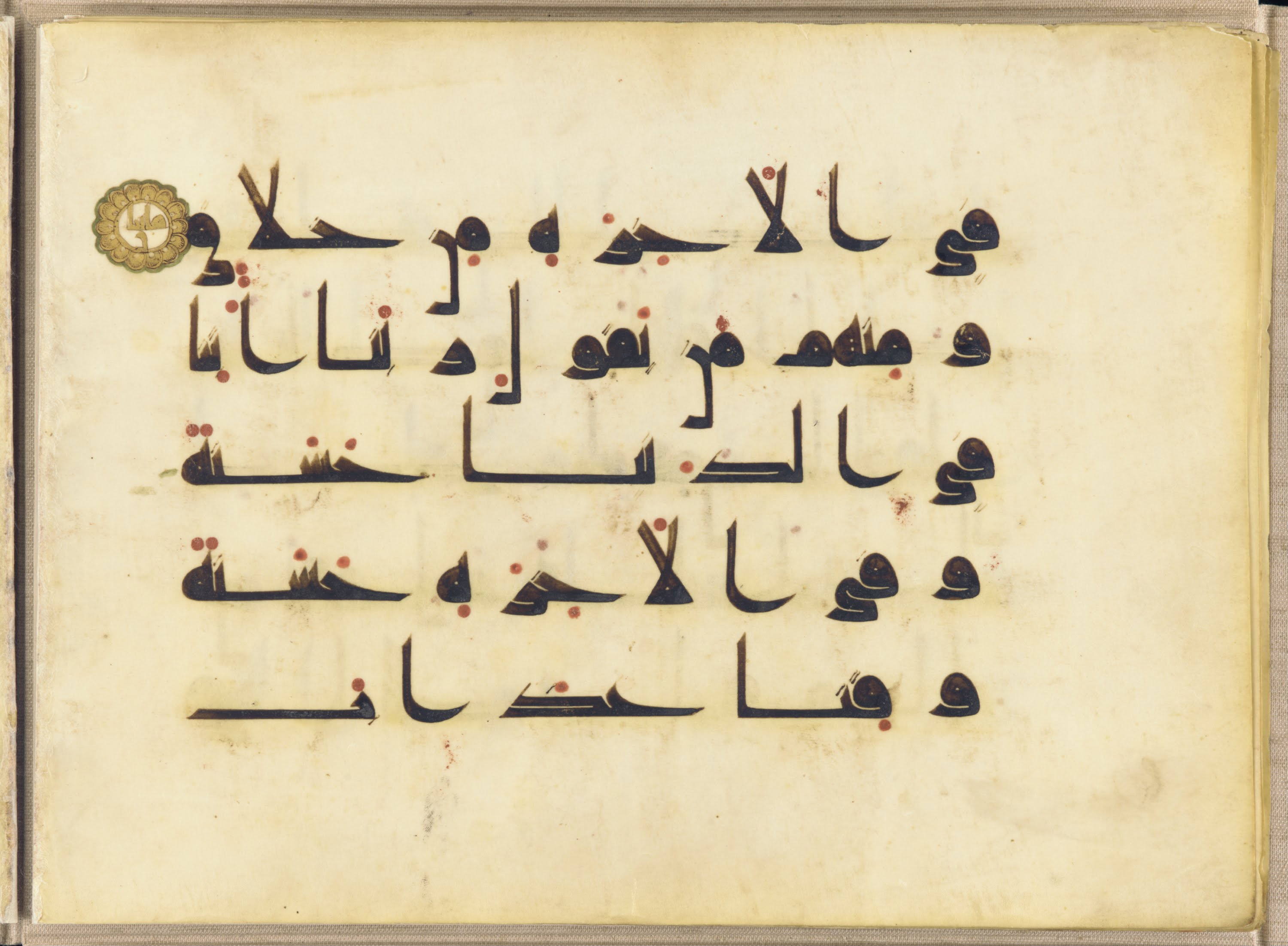
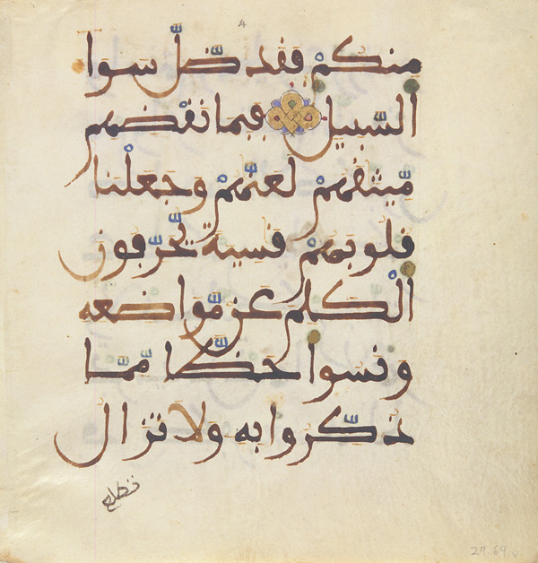
Kufic script
src = https://upload.wikimedia.org/wikipedia/commons/b/b6/A_section_of_the_Koran_-_Google_Art_Project.jpg
href = https://commons.wikimedia.org/wiki/File:A_section_of_the_Koran_-_Google_Art_Project.jpg
Thuluth script
src = https://upload.wikimedia.org/wikipedia/commons/thumb/b/be/Basmalah-1wm.png/220px-Basmalah-1wm.png
href = https://commons.wikimedia.org/wiki/File:Basmalah-1wm.png
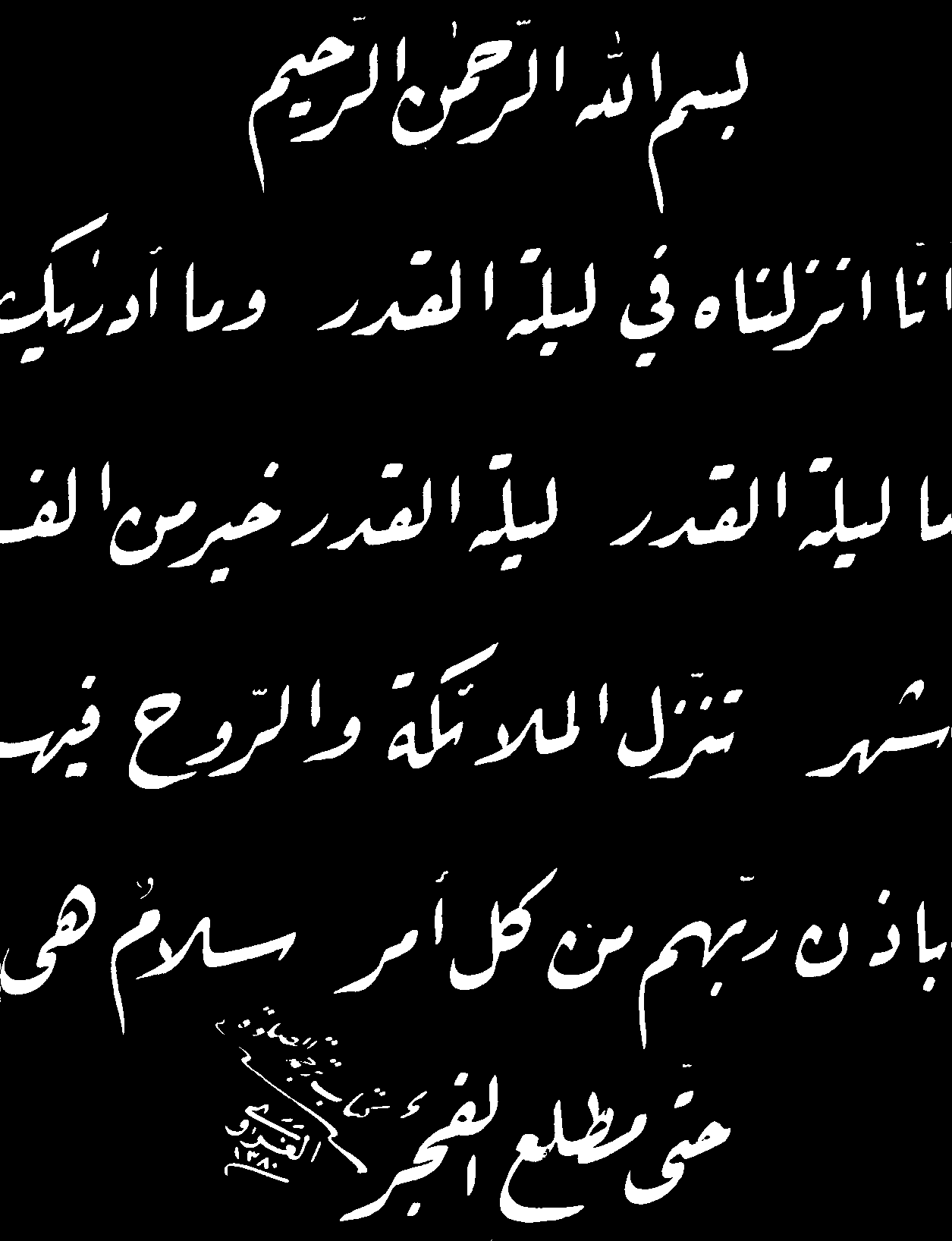
Naskh script
src = https://upload.wikimedia.org/wikipedia/commons/8/83/FirstSurahKoran_%28fragment%29.jpg
href = https://commons.wikimedia.org/wiki/File:FirstSurahKoran_%28fragment%29.jpg
Ruq'ah script
src = https://upload.wikimedia.org/wikipedia/fa/f/f9/Ruq_ah.gif
href = https://fa.wikipedia.org/wiki/پرونده:Ruq_ah.gif
Taaliq
src = https://upload.wikimedia.org/wikipedia/commons/d/df/Miremad-1.jpg
href = https://commons.wikimedia.org/wiki/File:Miremad-1.jpg
Diwani script
src = https://upload.wikimedia.org/wikipedia/commons/0/01/Izzet_44.png
href = https://commons.wikimedia.org/wiki/File:Izzet_44.png
Nasta'liq script
src = https://upload.wikimedia.org/wikipedia/commons/9/9b/Khatt-e_Nastaliq.jpg
href = https://commons.wikimedia.org/wiki/File:Khatt-e_Nastaliq.jpg
Maghribi script
src = https://upload.wikimedia.org/wikipedia/commons/3/35/Maghribi_script_sura_5.jpg
href = https://commons.wikimedia.org/wiki/File:Maghribi_script_sura_5.jpg
@shervinafshar, The Style Guide from IUP is an interesting reference, specially its second half that covers recommendations for mathematics, physics, and chemistry writing, book pages, tables of contents, and glossaries.
But I don’t think that a digital version exists. Just wanted to let you know about it. We may be able to find a way to share it with the group as we need it in the future.
In various styles of Persian/Arabic script, glyphs of letters may overlap intentionally. I think we need to cover this script feature under letter positioning section.
An example from Zarnegar 5.2 Catalog (http://sinasoft.com/Downloads/zarnegar5.2/catalog/Zar52Cat.pdf): on the right we have "before repositioning" and on the left we have "after repositioning".

We should also note that sometimes, mostly because of bad (mainly practical) font glyph data, unintentional glyph overlap may occur. This unintentional behavior is different from the intentional design mentioned above, and a shaping engine may decide to be smart about this and resolve it somehow.
Importing from ACTION-80 (https://www.w3.org/International/groups/arabic-layout/track/actions/80)
This will set the ground (specially, some definitions) for #91 .
CSS and browser implementers are looking for information about how to position underlines for various scripts, including Arabic. Can we provide them with the information they need (and add it to the layout requirements doc)? See w3c/csswg-drafts#459 (comment)
From a typographical point-of-view, we need to answer the following questions:
As discussed on the weekly meeting, we want to document the existing methods for using slanted text, slanted to the left or to the right, as it's been a common practice for the past few decades.
The goal is to document the details of the existing methods, and try to find the common names for them.
Also, we want to note that using slanted text is not a traditional way of emphasis/quotation/etc, but a half-baked borrowing from Latin-script Italic/Oblique methods.
Hi,
My ACTION-39 - Lead the discussion on having transliteration/pronunciation columns in the glossary
http://www.w3.org/2015/12/08-alreq-minutes.html#action01]
Added a transcription column for each language, instead of fully vowelling the glossary.
Regards,
Najib
Our ligatures section (currently numbered as 2.4.2) only talks about lam and alef ligatures. It should cover other ligatures as well.
Also, this is the last sentence of the section:
Each of these ligatures also provides a special shape for joining from its right side (to the preceding letter).
It is talking about variations of the lam and alef ligature, but that’s not clear enough and it can confuse readers into thinking that all ligatures are right-joining only.
Najib started a draft for the topic keyword "Font and Typographical Considerations" here.
We can use this issue for discussing this section.
To populate 3.8 Arabic numbering
Draft is here: https://github.com/w3c/alreq/wiki/Arabic-numerals-(Draft)
please ignore
I believe our character list contains all of the characters ق and ڧ, and the characters ف and ڢ? Given that each pair represents two visual variants of the same letter, if someone in North Africa wants to use a shape relevant to their region, such as ڢ, is it appropriate to use a separate character, or should one expect the difference to be produced by using a different font? Same question for the qaf.
Of course, the reason i ask is that spelling the same word in two different ways is not ideal for searching, security (eg. IDNs), etc.
Dear all,
When styling Arabic letters within a word (e.g. with colors), they may not join in some rendering tools. For example, in Firefox letters joins but not in Safari or Chrome.
Arabic Presentation Forms-B (U+FE70..U+FEFF) or Arabic Presentation Forms-A (U+FB50..U+FDFF), are deprecated but may helps solve this problem.
Please see the example here:
http://www.w3c.org.ma/Tests/joiningColoredLetters.html
where deprecated contextual letters, or deprecated ligature character are used (case 4 and 5).
Opinion?
Najib
Could we add vowelling to the glossary items? Not only would this be useful for cases such as رُقعة vs رِقعة , but it would also help non-native speakers, like me, to know how to pronounce the words.
I have a draft here in Google Drive. This is very short, because the role of this section is to introduce the direction of the Arabic script briefly and introduce references for further reading and I couldn’t think of more information to put here. If you have any suggestions for what can be added here, please leave a comment.
In handwritten Persian text, a symbol similar to double quotation mark is used as the Ditto Mark.
In movable-type Persian text, sometimes, right-pointing double angle quotation mark (U+00BB) is used as the Ditto Mark. Here's an example from Persian Grammer (by Parviz Natel-Khanlari):

IMHO, the angle marks are used instead of non-angle marks only because:
I believe this is one of those things that may actually need a new character, eventually, as both the meaning and shape of the mark is different from any existing characters. Either way, we need more evidence from various languages.
Looking at the way Najib spelled 'Riqaa' made me realise that we need to establish some standard approach to transliterating Arabic and Persian words. I really don't want this to get in the way of creating real content for the document, but it's something we should take a look at (and spend as little time on as possible).
Related to our recent cleanup changes to the document, I noticed that we are not consistent about the HTML tags for titles.
Most of the document uses h2 for all levels of headers, depending on nested sections for building hierarchy, but we also have some h3s in similar situations.
Is this something that we should care about? And if so, what is the suggested solution? I can send a PR if we have a policy for this.
I suggest we change the title to 'Arabic Script Layout Requirements'.
I think we need a section in ALReq to cover the needs of predefined-counter-styles for Arabic script.
https://w3c.github.io/predefined-counter-styles/#arabic-styles
The table is specifically very useful, providing comparison between methods:

The document needs tables listing exemplar characters for the Arabic script. The tables we need can be seen in this document.
We have used these scripts an initial set of charts available in this spreadsheet, and are customizing the scripts to match what we want.
There are various methods for abbreviating words in Persian/Arabic text, and I think covering best-practices can help with software tooling.
If so, we can add the text to chapter 3. Characters and Words, or in an Appendix.
Anyways, I'll keep posting some examples here for reference.
Several people have found the ●, ○, and ✕ characters confusing. They should be replaced with better alternatives.
Questions to address:
Are all numbers equal in category and directional property?
There is also a difference in Bidi behavior : the same visual text 
will be displayed in RTL context as  if
if  is Arabic number, and
  , if European number (simply like "a 2 b"). Aren't ALL numbers WEAK in directional property?
I’m drafting this section here in Google Docs. It’s still very early.
Comments are very welcome.
(Following issue w3c/i18n-drafts#81)
Independently from body texts that run normally vertically (e.g. CJK, Mongolian), small Arabic text can be set vertically, e.g. on a book spine or in table header.
Although the flow direction may depend on writing style, countries or what ever, it might be desirable to have text read from top to bottom
Example-1) Vertical Arabic text running from top to bottom, and Latin from bottom to top (book spine).
https://app.box.com/s/i4j6xx6kn6gu5nt2ha5ynno7qemoxlq4
writing-mode: sideways-lr; appear appropriate for this case. Implemented only in Firefox.
(BTW: sideways value "is at-risk and may be dropped" from CSS3!
Example-2) Vertical Arabic, letters upright (isolated form)
http://farm4.static.flickr.com/3277/2830543747_de05b47f02.jpg
text-orientation : upright; is doing this.
In Firefox, Arabic run from top to bottom (in parallel to Latin, by the way!..)
In Safari and Chrome Arabic run from bottom to top.
A declarative, efficient, and flexible JavaScript library for building user interfaces.
🖖 Vue.js is a progressive, incrementally-adoptable JavaScript framework for building UI on the web.
TypeScript is a superset of JavaScript that compiles to clean JavaScript output.
An Open Source Machine Learning Framework for Everyone
The Web framework for perfectionists with deadlines.
A PHP framework for web artisans
Bring data to life with SVG, Canvas and HTML. 📊📈🎉
JavaScript (JS) is a lightweight interpreted programming language with first-class functions.
Some thing interesting about web. New door for the world.
A server is a program made to process requests and deliver data to clients.
Machine learning is a way of modeling and interpreting data that allows a piece of software to respond intelligently.
Some thing interesting about visualization, use data art
Some thing interesting about game, make everyone happy.
We are working to build community through open source technology. NB: members must have two-factor auth.
Open source projects and samples from Microsoft.
Google ❤️ Open Source for everyone.
Alibaba Open Source for everyone
Data-Driven Documents codes.
China tencent open source team.