GithubHelp home page GithubHelp logo

waldyrious / downstyler Goto Github PK

View Code? Open in Web Editor NEW
27.0 4.0 5.0 158 KB

A stylesheet and bookmarklet that trims webpage styles down to near-bare HTML.

Home Page: http://waldyrious.net/downstyler

License: ISC License

CSS 6.01% HTML 93.99%
css html stylesheets minimal classless-css

downstyler's Introduction

Downstyler

A tool to fight CSS bloat.

Visit the web page for a live demo and usage instructions.

Differences from existing tools

Downstyler takes inspiration in pre-existing similar tools, but fills a different niche:

  • The original css reset completely wipes out all of the browser's default styles to provide a clean slate upon which custom stylesheets can be built;
  • normalize.css is much less drastic, and focuses on ironing out cross-browser styling differences and harmonizing them to provide consistent look and behavior everywhere;
  • sanitize.css is kind of a more comprehensive version of normalize.css, covering all HTML elements, but using hand-picked default styles, rather than reset.css's nuclear approach.

Downstyler, on the other hand, is intended as a stand-alone style — one that pays homage to HTML's natural readability and flexibility, and attempts to produce readable and visually pleasing output, while remaining faithful to the default look of unstyled HTML.

It follows the philosophy brilliantly championed by Fluidity, MotherfuckingWebsite.com and BetterMotherfuckingWebsite.com, which (with various degrees of —ahem— enthusiasm) praise the merits of plain HTML as a format for rich documents.

Here's a live comparison of how plain a variety of HTML markup looks with the various "base" stylesheets:

It's also worth comparing the outputs of Downstyler and BetterMotherfuckingWebsite. Particularly, note the differences in the <table>, <blockquote>, <pre> and <form> elements. These demonstrate Downstyler's goal of providing a stand-alone stylesheet for 99% of HTML content, while remaining quite close to unstlyled HTML.

Details of included CSS rules

Downstyler combines elements from various simple rulesets created to demonstrate how only a few minor tweaks to the default HTML styling can produce massive improvements in legibility and layout.

The origin and motivation of each ruleset is detailed below:

  • From Fluidity, by Adam Morse (@mrmrs):
    Make HTML more responsive:

    HTML is almost 100% responsive by default. These 247 bytes of css fix the 'almost' part.

    img, canvas, iframe, video, svg, select, textarea { max-width: 100%; }
    pre { overflow-x: auto; }

    These rules allow elements that don't adjust to the size of the container by default, to behave like the rest of the basic HTML elements like, say, paragraphs, which flow the text as the window resizes.

  • From CSS Tricks, by Marie Mosley (@mariemosley):
    Adjust the box model to match [intuitive expectations] (https://en.wikipedia.org/wiki/Internet_Explorer_box_model_bug#Support_for_Internet_Explorer.27s_box_model).
    This ensures that when defining sizes of elements in CSS, they correspond better to the mental model of a physical box, whose dimensions normally refer to the box itself (outer size), not to its content alone (inner size).

    html { box-sizing: border-box; } *, *:before, *:after { box-sizing: inherit; }
  • From CSS Tricks, by Chris Coyier (@chriscoyier) from an original idea by Tim Brown (@tbrown):
    Size text according to screen width

    html { font-size: clamp(0.9rem, calc(13px + 0.5vw), 1.1rem); }

    These rules allow text to resize dynamically to adapt to the width of the container. It's the same concept as flowtype.js, but implemented entirely in CSS.

  • From Better Motherfucking Website, by Drew McConville (@drewmcc): Improve default typography:

    Let it breathe
    Look at lines 1 and 2 of some shitty website you're building. Assuming they're not married they probably shouldn't be humping. The defaults are trash -- pick a minimum line-height: 1.4 for body copy. Headings should be tighter. If you can't see that...piss off.

    A little less contrast
    Black on white? How often do you see that kind of contrast in real life? Tone it down a bit, asshole. I would've even made this site's background a nice #EEEEEE if I wasn't so focused on keeping declarations to a lean 7 fucking lines.

    Line-width, motherfucker
    Looking at an LCD screen is strainful enough. Don't make me read a line of text that's 200 fucking characters long. Keep it to a nice 60-80 and users might actually read more than one sentence of your worthless dribble.

    h1, h2, h3, h4, h5, h6 { line-height: 1.2; }
    body { line-height: 1.6; color: #444; margin: 1em auto; max-width: 35em; }

    Note: This is the set of rules that makes the biggest visual difference, even though it fits in a tweet. It's quite opinionated, sure, and not right for every design -- but a much better default to start from. The only rule not included here was the font size, which is better handled by the responsive text sizing described in the CSS Tricks entry above.

  • From Skeleton, by Dave Gamache (@dhg):
    Clean table style:

    table { border-collapse: collapse; font-family: sans-serif; font-size: 90%; }
    th, td { padding: 0 .75em; text-align: left; border-bottom: 1px solid #ddd; }
    th { border-bottom-color: #aaa; }
    th:first-child, td:first-child { padding-left: 0; }
    th:last-child, td:last-child { padding-right: 0; }
  • Additional adjustments (my own)

    a { text-decoration: none; } a:hover { text-decoration: underline; }
    a { color: RoyalBlue; } a:visited { color: Indigo; }
    pre, code, kbd, samp { padding: .2em .5em; background: #eee; border-radius: 4px; }
    img { margin: .5em; }
    textarea { vertical-align: text-top; }

downstyler's People

Contributors

hatscripts avatar olivierh avatar waldyrious avatar

Stargazers

 avatar  avatar  avatar  avatar  avatar  avatar  avatar  avatar  avatar  avatar  avatar  avatar  avatar  avatar  avatar  avatar  avatar  avatar  avatar  avatar  avatar  avatar  avatar  avatar  avatar  avatar

Watchers

 avatar  avatar  avatar  avatar

downstyler's Issues

Use ch units instead of em

Since the goal is to ensure a certain number of characters per line, ch units should work better than em. From 7 CSS Units You Might Not Know About:

The units ex and ch, similar to em and rem, rely on the current font and font size. However, unlike em and rem, these units also rely on the font family, as they are determined based on font-specific measures.

The ch unit, or the character unit, is defined as being the ... width of the zero character, 0. Some very interesting discussion about what this means can be found on Eric Meyers's blog, but the basic concept is that, given a monospace font, a box with a width of ... 40ch can always contain a string with 40 characters in that particular font.

Improve sizing of headings

The default heading sizes are not quite appropriate -- h6 is smaller than body text, which doesn't make much sense IMO for a heading.

Since h1 appears to be consistently sized at 2em (200%) by browsers' native stylesheets, it would be nice to have a progression from h6 at the minimum acceptable heading size (100% of body text size) to h1 at 200%.

Now, one would think that the most natural way of doing this would be using a linear scale (100%, 120%, 140% ... 200%). However, that results in apparent font sizes that paradoxically don't grow linearly. Below is the result of this scale, where the left image is using the default serif font, and the right image is using Palatino (introduced after #25). We can see that the intermediate heading sizes "bulge out" of the red line that indicates a constant growth rate:

linear-serif linear-palatino

Indeed, if we think some more about this, we realize that such a scaling method is not even mathematically sound (in the sense of describing a pattern that can be cleanly generalized), since it wouldn't work well if we were to extend it to even smaller heading sizes: we'd quickly reach size zero at h12, and beyond that we'd have negative font sizes!


A more elegant solution would then be using an exponential function to fit the two extremes (100% at the lower end, and 200% at the upper end), so that we could theoretically continue to decrease the size and never reach zero. The natural exponential function, f(x)=ex (aka exp(x)), is the perfect candidate.

We already know that exp(0) = 1, so we can express the lower limit in terms of the exponential function. We now want exp(?) = 2 to also express the upper limit in the same way; and (as brilliantly elucidated by 3Blue1Brown), we can figure out the ? by using the natural logarithm: ? = ln(2) ≈ 0.693.

Now, to cover the 6 heading sizes, we just need to go from 0 to 0.693 in five steps of 1/5 that length and take the value of the exponential function at each of those points. Once we do this, WolframAlpha helpfully points out that the result can even be simplified to the neat sequence 2^(0/5), 2^(1/5), 2^(2/5), 2^(3/5), 2^(4/5), 2^(5/5), thus yielding the final result:

h1 { font-size: 200.00%; /* 2^(5/5) = 2^1 = 2 */ }
h2 { font-size: 174.11%; /* 2^(4/5) */ }
h3 { font-size: 151.57%; /* 2^(3/5) */ }
h4 { font-size: 131.95%; /* 2^(2/5) */ }
h5 { font-size: 114.87%; /* 2^(1/5) */ }
h6 { font-size: 100.00%; /* 2^(0/5) = 2^0 = 1 */ }

And indeed, behold the final rendered page, showing the headings growing linearly in apparent size, even though they're growing exponentially in actual size (again, default serif font on the left, Palatino on the right):

exp-serif exp-palatino

(It would be nice to use calc() to provide precise values rather than approximations, but alas, only elementary arithmetic operators are available, and they are not sufficient to calculate fractional exponents.)

Prior art

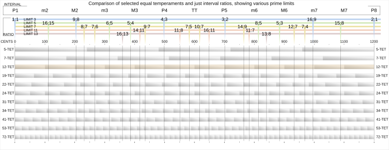
Interestingly, this scaling factor (where each step represents an increase of 2^(1/5), i.e. the 5th root of two ≈ 1.1487...) does not seem to be included by default in neither Type-Scale.com nor ModularScale.com, but following their theme of applying musical intervals to typography, we could equate the scale used here to five-tone equal temperament (just like common musical intervals refer to the 12-tone equal temperament, which divides the octave into 12 equal parts in a logarithmic scale, with a ratio equal to 2^(1/12), i.e. the 12th root of 2 ≈ 1.05946).

Owen Gregory's "Composing the New Canon: Music, Harmony, Proportion" has a nice table with typographic size ratios based on musical intervals of the 12-TET scale, as well as some background to the motivation for these scales.

The fact that all these tools and proposals use 12-TET as a basis explains their lack of a ratio matching the one calculated here, which, as mentioned above, corresponds to 5-TET.

The following diagrams showcase the difference between the various divisions of the octave that one can make, where we can see that the steps of 12-TET don't match those of 5-TET:

Equal temperament scales and limits
(source)

Equal divisions of the octave
(source)

Tweak selection color for paperlike style

As originally mentioned in #41. Since then, ::selection became supported in the major browsers (e.g. it became unprefixed in Firefox in v62, released on 5 Sep 2018), so it should now be safe to use.

Some options:

  • A lemon-lime color resembling the fluorescent yellow of highlighter markers:
    ::selection { background-color: #EF6; }
  • A warmer yellow (maize), similar to Gold but not as dark:
    ::selection { background-color: #FE6; }

Style HR

<hr> by default (TODO: confirm in various browsers) is shown as a zero-height box with 1px borders. That means the top and bottom borders combine to give it a 2px thickness, which is perhaps too strong. Maybe we should e.g. remove the top (or bottom) border, leaving it with 1px width.

Make tables responsive

See a detailed description of the (potential) issue here. The rulesets adapted from Fluidity may already cover this, but it wold be good to actually confirm that.

Add hyphens:auto for paperlike

Since the paperlike style's text-align is set to justify, it would be easier on the eyes to let the browser hyphenize the words, which reduces the variation on space width. Note that this works based on language-specific rules, so the page needs to have a lang attribute for this to work:

<html lang="en">

(Alternatively, we could also make the default style justified, and use hyphens:auto by default.)

Limit max font size (and page width)

My personal experience is that often the font size is too big for comfortable reading, when using large screens, and end up using the browser zoom feature to reduce the font size (and consequently page width) to a comfortable size -- usually 80%. It would be nice if the style itself capped those sizes to a reasonable default. Or perhaps the growth rate could be reduced.

Fix selection color in Firefox

Currently Firefox seems to be automatically reversing the selection colors (which are, by default, white text on blue highlight) if one of the elements containing the selection has a dark background color -- in particular, the <html> root element, which currently grey in the "bookify" mode, even though the body is set to white. This doesn't seem to happen with Chrome. I'm sure there's a bug reported for this, but didn't manage to find one.

While it is possible to manually specify a selection color using the experimental ::selection CSS selector, its background-color property doesn't seem to support the values initial, unset or inherit, as in:

::-moz-selection{ background-color: initial; /* or "inherit", or "unset" */ }

All three simply produce transparent highlight and unchanged text color.

Again, this is only an issue in the "bookify" mode, which I was planning on adapting to provide a more highlighter-like text selection bacground (say, ::-moz-selection{ background-color: #EF6; } but that's a separate issue. For now I really ought to fix the selection because it's barely visible.

One way to fix it is to simply use a lighter background color, which may be warranted. This page, for example, shows how a lighter grey may be less conspicuous. In my tests, a #ccc grey is sufficient to make Firefox stop applying the color inversion, but if we're going for light grey, #ddd actually looks better IMO, so probably I'll do that.

Add dark mode

custom colors for @media (prefers-color-scheme: dark)

Make heading margins asymetric

possibly with a calculation based on text size (larger type = smaller margin?), but maybe a fixed em-based value could work too. In any case, the spacing above the heading should be larger than the space below it.

Handle tables used for layout

Such tables should not be styled the same way as actual data tables. Fortunately, this is becoming rarer, but it's still found in the wild every now and then.

Note: Before working on this, I want to collect a list of pages here that demonstrate the issues with tables, so that implementations addressing this can be tested against them.

(I'll keep editing this comment to add more, and crossing out those that have since changed their source code.)

Add styles for aside elements

Here's an example:

aside {
	float: right;
	background: #def;
	border-left: 1px solid #789;
	width: 50%;
	font-size: 90%;
	padding: 0.5em 1em;
	margin: 0.3em -4em 0px 2em;
}

Result, in the "paper-like" mode for this article:

Screenshot 2020-01-16 at 18 40 33

Experiment: quote marks around blockquotes

The left bar is becoming somewhat of a standard, and inconspicuous enough, but quote marks (if they could be added in a similarly unobtrusive way) could be more intuitive.

Maybe even try to emulate an effect like this (in a subtler way, though), using CSS only.

Typography improvements: sans serif titles, non-default serif body

Rather than using a wide serif (Georgia), it would perhaps be better to use plain sans-serif for the titles (headings).

Additionally, it could be worth looking into a nicer-looking (while still cross-platform) old-style serif for the body, rather than the default Times (New Roman) — for example, Palatino (fontfamily.io, cssfontstack.com).

Wikipedia lists similar fonts that could be used to cover Windows (Palatino Linotype, Book Antiqua) and Linux (URW Palladio L, FPL Neu, TeX Gyre Pagella). It might be worth looking at which of these are the closest visual equivalents, as well as reasonably widespread, and adjust the font definition accordingly.

mention other style simplification tools in the README

Something like this:

Readability and Instapaper are similar tools to clean up blog posts and cluttered websites for a cleaner reading experience, but they are more than just a stylesheet — they incorporate a large library of rules for cleaning up news websites and blogs that are known to have a certain structure (so they can hide everything that isn’t the main content).

It's worth mentioning that at least one of them had (have?) a bookmarklet, but it didn't work on the client-side -- it replaced the current page with a version parsed in their servers.

Add styles for forms and input elements

One interesting inspiration source could be Baseline.css' form styles: http://stephanecurzi.me/baselinecss.2009/form.html (check how they look in multiple platforms)

The source doesn't appear to be browsable online, but here's the entirety of 0.5.3's baseline.form.css:

/*
Baseline - a designer framework
Copyright (C) 2009 Stephane Curzi, ProjetUrbain.com
Creative Commons Attribution-Share Alike 3.0 License
version 0.5
*/

/******************** Form ********************/

form                            { overflow: auto; }
legend                          { padding-bottom: 18px; }
label                           { width: 100%; position: relative; top: 5px; margin-bottom: 18px; line-height: 18px; display: block; }

input[type="text"],
input[type="password"],
input[type="select"],
input[type="search"]            { width: 100%; margin-bottom: -1px; display: block; }

input[type="radio"]             { top: -1px; margin: 0 4px 3px 1px; }
input[type="checkbox"]          { top: -2px; margin: 0 4px 3px 1px; }
input[type="file"]              { margin: 0px 6px 3px 6px; }

input[type="submit"],
input[type="reset"],
input[type="button"]            { position: relative; top: 5px; margin-bottom: 18px; }

select                          { display: block; margin: 0px; }
textarea                        { width: 99%; line-height: 18px; margin-bottom: -2px; display: block; clear: left; overflow: auto; }

XML error at http://waldyrious.net/downstyler/ in Firefox

XML Parsing Error: not well-formed
Location: http://waldyrious.net/downstyler/
Line Number 86, Column 74:
            '&lt;link rel=&quot;stylesheet&quot; type=&quot;text/css&quot href=&quot;'+
-------------------------------------------------------------------------^

Also, an SSL redirect would be great.

Thank you!

Collect challenging pages to test against

Ideally we'll want to setup CI to prevent changes from inadvertently breaking current functionality.

If you know of heavily styled pages that could be used to stress-test unstyle, please mention them in a comment below!

Rename project

To a less pretentious (and hopefully more self-explanatory) name than 'default.css'. How about 'raw-html.css'?

Suggestion: mention that it plays nicely with Firefox's "keyword" feature?

So I just discovered this amazing little bookmarklet (thank you for making it!)

After adding it to my bookmark toolbar I edited the bookmark to add a keyword:

image

(I always prefix my keywords with : since that doesn't interfere with search or URIs).

So now I can just hit ctrl + L, type :ds, and instantly downstyle any page.

Recommend Projects

  • React photo React

    A declarative, efficient, and flexible JavaScript library for building user interfaces.

  • Vue.js photo Vue.js

    🖖 Vue.js is a progressive, incrementally-adoptable JavaScript framework for building UI on the web.

  • Typescript photo Typescript

    TypeScript is a superset of JavaScript that compiles to clean JavaScript output.

  • TensorFlow photo TensorFlow

    An Open Source Machine Learning Framework for Everyone

  • Django photo Django

    The Web framework for perfectionists with deadlines.

  • D3 photo D3

    Bring data to life with SVG, Canvas and HTML. 📊📈🎉

Recommend Topics

  • javascript

    JavaScript (JS) is a lightweight interpreted programming language with first-class functions.

  • web

    Some thing interesting about web. New door for the world.

  • server

    A server is a program made to process requests and deliver data to clients.

  • Machine learning

    Machine learning is a way of modeling and interpreting data that allows a piece of software to respond intelligently.

  • Game

    Some thing interesting about game, make everyone happy.

Recommend Org

  • Facebook photo Facebook

    We are working to build community through open source technology. NB: members must have two-factor auth.

  • Microsoft photo Microsoft

    Open source projects and samples from Microsoft.

  • Google photo Google

    Google ❤️ Open Source for everyone.

  • D3 photo D3

    Data-Driven Documents codes.