creativecommons / cc-resource-archive Goto Github PK
View Code? Open in Web Editor NEWCollection of resources on Creative Commons (CC) tools and other open topics
Home Page: https://resources.creativecommons.org/
License: MIT License
Collection of resources on Creative Commons (CC) tools and other open topics
Home Page: https://resources.creativecommons.org/
License: MIT License
The resourcenavbar currently has a very basic look. Upgrade the look & feel of it.
This can be done in either of 2 ways:
This will improve the look and feel of the website

Adding Gitpod support
we can add Gitpod support for contributors and users to try and setup the repo fast , without taking time to locally setup if wanting to test some changes quickly and see the results
The closing </p> tag is missing in all.html file.
</p> tag is missing inside the last div at line 60.I expected the closing </p> tag to be present inside the last division of the all.html file.
Here's the problem

the UI of the website is outdated and does not match the cc open-source website
I have created some figma wireframes of the modifications which we can make and uniform the UIto the cc opensource UI
Please let me know if there are any suggestions or changes I can make.
If you approve the design, I can start working on their code.


Suggestion: Create a "This page is available in the following languages" section at the bottom of the resources homepage, with translations of the front matter.
Currently, there is no tag to differentiate the resources as articles, blogs, news, workshop, webinar, tutorial or FAQs.
Currently there seems to be no license for this project. The code contribution guidelines mention that contribution should be made only to the projects with license. This project is also listed on GSoC19 page. Kindly add license to this project.
This issue is regarding feature enhancement, the logo does not remain sticky on scrolling the site
With the help of the feature of sticky scrolling, this feature can be implemented
There is missing description in some pages
go to http://localhost:4000/build-on-the-past/
4. See error.
A general description (may be containing lorem ispum) can be there in places where specific description is not provided.

As of now there is no setup guidance to run the project in the local environment
We should have proper guidance for local setup of the project
There is no mention of how I can set up the resource archive website on my local machine. Thus, I have been struggling with contributing to this rep.
Details of commands/steps of how to get started with contributing to this repo should be mentioned in the README file.
Design System is not implemented
All the links , content of the page are shown at once . (At very beginning )
links are not styled
No media queries in the CSS
this problem leads to bad user experience
Implementing the Design System for the website.
Designing the responsive nav bar and styling the elements in it.
improving the UI by using modern CSS.
technology used
styling : - CSS3
logic :- modern JavaScript
and by using attributes like aria controls , aria expanded ,. . . . .

By making it fixed and background blur and transparent , transitions , little animations . . .

A small GitHub Instruction for the github setup can be useful i have done the same for the cc-search github repo the same can be implemented
creativecommons/search#51
The landing page is not responsive and doesn't look good on all kinds of devices. This affects the accessibility of the website.
The task can be broken down into working on the responsiveness of 3 parts:
Improve the look and feel of a website, enhance the user experience across all devices
As mentioned in resources.creativecommons.org should be explained to discontinued · Issue #2 · RCEurope1/central-resources-repository, the project status should be clearly documented.

Not sure but the download button rather than downloading content just redirects to different websites or broken links.
Is this how these buttons are supposed to work?
The Thumbnails currently have a basic look and can be redesigned to improve the look and feel
Make the thumbnails look more attractive and aesthetic

When we go to an individual resource page then it shows an error.
This will be a In progress work , I have found quite a Number of Broken HTML syntax in the codebase.
The top navigation bar simply contains the logo of CC in green color. https://creativecommons.org/ on the other hand has a top navigation bar with an orange linear gradient with the logo in white.
To change the color of the CC logo to white and and a linear gradient that resembles the current CC aesthetics using the internal Design System (Vocabulary).
The thumbnail list currently has a very basic look
Improve the look and feel of the thumbnaillist in either of the 2 ways:
Instead of having a "See all" option we will redesign this part either as a carousel or use pagination to display the thumbnails

The CSS Style sheet lacks css global variables.
The CSS style sheet does not contain any global variables (which would reduce the work load if any changes are to be made in the future).
This would also be crucial if a dark mode is added to the website, as changing/toggling the stylings would be fairly simple .
This will also help in improving the responsiveness of the website as all necessary attributes can be stored using these variables and can be changed or added any point of time.
Submission form is missing
visit http://resources.creativecommons.org/submit/
(?) How should the new form be implemented?
Update repository to use master branch /docs folder instead of gh-pages branch.
For additional context, see Configuring a publishing source for GitHub Pages - GitHub Help.
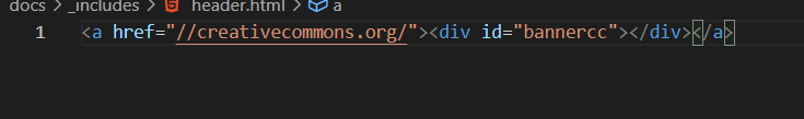
Clicking on the Creative commons Resource Archive logo on the localhost opens the CreativeCommons.org website in the same tab, which may cause users to lose their work progress or navigate away from their localhost unintentionally
To solve this problem, the proposed feature is to open the CreativeCommons.org website in a new tab when the user clicks on the logo.
By opening the website in a new tab, users can continue working on their localhost without losing their progress or navigating away from the page unintentionally. This feature would improve the user experience and help prevent frustration or errors caused by the current behavior of the logo link. Additionally, adding a tooltip or some form of text indicating that the logo links to CreativeCommons.org could help prevent users from inadvertently clicking on it and experiencing the issue in the first place.
The CONTRIBUTING.md file currently doesn't have detailed step-by-step instructions for setting up the project on various OS:
Having a detailed CONTRIBUTING.md will help new contributors easily get started with contributing to the project.
Currently, the bottom of the page looks a bit odd.
Adding a footer there will improve the look and feel of the page and it will also match the current CC aesthetics
The whole header div is enclosed inside the anchor tag due to which the whole header act as link but technically only the logo should act as link.
Also according to UX, clicking the logo should redirect the home page but here it is opening the CreativeCommons.org
before image

after changing the code

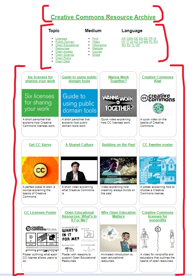
Currently, we have to go through all the resources to spot a particular resource we want. There is no way we can directly search for the resource we want using the title. Hence, it takes a lot of time to search for and access the resource we want
There's a very cool footer on the open source website https://opensource.creativecommons.org/ which can be implemented in this archive's website also with some things common from the open source website but not all (Example: The donate button, contact section, social media links, etc). I can present a design for the footer if we can move forward with this issue.
@possumbilities Please look into this feature and give your valuable input.
There are few grammatical mistakes in the Readme file

and few other missing articles.

Improving the JavaScript syntax to a more readable one
I actually modified all the three functions to use a much modern javascript syntax
here is the old code for getting url params ie getUrlVals()
function getUrlVars()
{
    var vars = [], hash;
    var hashes = window.location.href.slice(window.location.href.indexOf('?') + 1).split('&');
    for(var i = 0; i < hashes.length; i++)
    {
        hash = hashes[i].split('=');
        vars.push(hash[0]);
        vars[hash[0]] = hash[1];
    }
    return vars;
}
here is the new implementation of the getUrlVals() using modern syntax
function getUrlVars() {
	const vars = {};
	const queryString = window.location.search.substring(1);
	const params = new URLSearchParams(queryString);
	for (const [key, value] of params) {
		vars[key] = value
	}
	return vars
}I think the modern syntax enhances a much smoother experience.
I've updated two more functions ie func updateQueryString() & removeQueryString()
here:
There are several links that are broken on resources.creativecommons.org
You can see some of the broken links by viewing the following pages "Get CC Savvy (https://resources.creativecommons.org/get-cc-savvy/)," "Creative Commons Kiwi (https://resources.creativecommons.org/creative-commons-kiwi/)," "CC Licenses Poster (https://resources.creativecommons.org/cc-licenses-poster/ -- the linked page still exists but a readable image is no longer there)," or "Creative Commons licenses for nonprofits (https://resources.creativecommons.org/creative-commons-licenses-for-nonprofit-organizations/)." This is not an exhaustive list of all the broken links on resources.creativecommons.org.
Delete the pages with broken links, or provide working links.
The Design of the Resouce page ( which can be navigated to by clicking any of the thunbnails ) is very basic .
The above stated problem can be solved by adding more description of the resource , improving the frontend ( by grouping them up in a card/box ) , tweaking the color palette of the page and adding some basic animations using gsap , aos (animation-on-scroll) or using keyframes.
Quite strangely the whole CC-resource-archive page is running on quirks mode as the Doctype Tag is missing from the Page, being in quirks mode can make the page not serving the modern HTML and CSS efficiently
open the CC-archive site and open the console

Adds a button to allow the visitor to navigate to other CC websites
An alternative could be implementing a suitable footer to the website but adding the Explore CC button will improve the UX of the website.
It should work in a similar manner as on the CC opensource site.
It's very confusing and time taking process of setting up the project locally and hosting it on a local host.
Based on my understanding of the problem and the user's perspective, I suggest the addition of a set by step procedure of local hosting of the website. By this feature, we eliminate confusion. This could increase clarity, improve usability, or a better overall user experience. I personally spent an hour trying to understand how to set up the project locally. It could enhance user engagement and motivates them to work on things that truly matters rather than just being on setting up.
An alternative solution can be docker , but based on my understanding
Setting up GitHub Pages using Jekyll can be better than using Docker for a few reasons:
Simplicity: GitHub Pages and Jekyll are relatively straightforward to set up and use. Jekyll is a static site generator that allows you to create a website from plain text files, and GitHub Pages is a hosting service that allows you to publish your Jekyll site to the web. Docker, on the other hand, is a more complex tool that requires additional knowledge and configuration.
Cost: GitHub Pages is free, while Docker requires you to set up and maintain your own server infrastructure, which can be expensive.
Maintenance: With GitHub Pages and Jekyll, you don't have to worry about maintaining server infrastructure, as GitHub takes care of that for you. With Docker, you would need to ensure that your server infrastructure is up to date and secure.
Version control: GitHub Pages is tightly integrated with Git, so you can easily version control your website and collaborate with others. Docker, on the other hand, doesn't have the same level of integration with Git.
Currently, the Thumbnail images are very basic and need a redesign

Liquid Warning generated upon running the project locally due to the use of incorrect syntax.
Navigate to the root directory and enter jekyll serve in the terminal.
Resolve the issue by using the correct syntax.


no 404 error should occur

Reasons for this errror:-
destination url might be updated
typo error in the url .....
The current stylesheet in the docs/style.css needs a small amount of default styles to ensure we don't include the browser default styles
it should start with something like:-
*.
::after.
:::before{
margin:0;
padding:0;
box-sizing: border-box;
}the tyle.css need some resetting
Currently, the website lacks accessibility for users with disabilities
This feature will display all the links in Topic, Medium and Language in the Landing page of the site in a good manner like websites of today.
The resourcenavtopicknown currently uses list items. We can replace that with checkboxes to make the UI look better.
Replace list items of the resourcenavtopicknown with checkboxes for a better look

the font used for the heading and paragraph is sans-serif
but the font family used in https://opensource.creativecommons.org/ and all other Creative Commons websites are "Roboto Condensed" for the header and "Source Sans Pro" for the paragraph
we can change the font, and also we can remove unnecessary underline under hyperlinks
also, align the topic and list the items in one line by adding a margin-left in the h2 heading
if we want, we can also increase the font size a little bit
Before Image

After Image

Currently, the resource pages don't have a good UI and UX. The improved resource page will facilitate easy download and preview of the resources in different languages.
The individual resource page, like the one in the image doesn't show PDF preview before downloading, which is a useful feature in case a person can't download a resource due to storage limitations.

I have considered a few solutions to improve the page's overall UI and UX.
Currently, the website doesn't have a dark-mode implementation
Implementing a dark mode for a website can be a great way to improve the user experience and accessibility for users who prefer a darker colour scheme or have light sensitivity.
Here are a few things to keep in mind while implementing it:
Current design of cards on the homepage is very basic and doesn't matches with the current visual aesthetic card design of Creative Commons sites.
Current Card Design:

Proposed Design:

Currently, there is no way users can provide feedback or rate resources
Add a feature to allow users to provide feedback and rate resources. This helps users to find the best resources and also provides valuable insights for website administrators.
A declarative, efficient, and flexible JavaScript library for building user interfaces.
🖖 Vue.js is a progressive, incrementally-adoptable JavaScript framework for building UI on the web.
TypeScript is a superset of JavaScript that compiles to clean JavaScript output.
An Open Source Machine Learning Framework for Everyone
The Web framework for perfectionists with deadlines.
A PHP framework for web artisans
Bring data to life with SVG, Canvas and HTML. 📊📈🎉
JavaScript (JS) is a lightweight interpreted programming language with first-class functions.
Some thing interesting about web. New door for the world.
A server is a program made to process requests and deliver data to clients.
Machine learning is a way of modeling and interpreting data that allows a piece of software to respond intelligently.
Some thing interesting about visualization, use data art
Some thing interesting about game, make everyone happy.
We are working to build community through open source technology. NB: members must have two-factor auth.
Open source projects and samples from Microsoft.
Google ❤️ Open Source for everyone.
Alibaba Open Source for everyone
Data-Driven Documents codes.
China tencent open source team.