primer / design Goto Github PK
View Code? Open in Web Editor NEWPrimer Design Guidelines
Home Page: https://primer.style/design
License: MIT License
Primer Design Guidelines
Home Page: https://primer.style/design
License: MIT License
It's time ⏱ for another issue. I could't find any information regarding usage of timestamps and thought this could make a great addition to our docs in the future.
🔦 Some examples I've found:
🎉 What I expect in the docs:
The Now "path alias" that I set up in primer/primer.style#100 isn't working. I can curl https://primer.style/design and it looks like there's content in the response, but Next is doing something funky and redirecting to /design/ on the client side, which causes the server to keel over.
@emplums, maybe we can pair on this next week? 😭
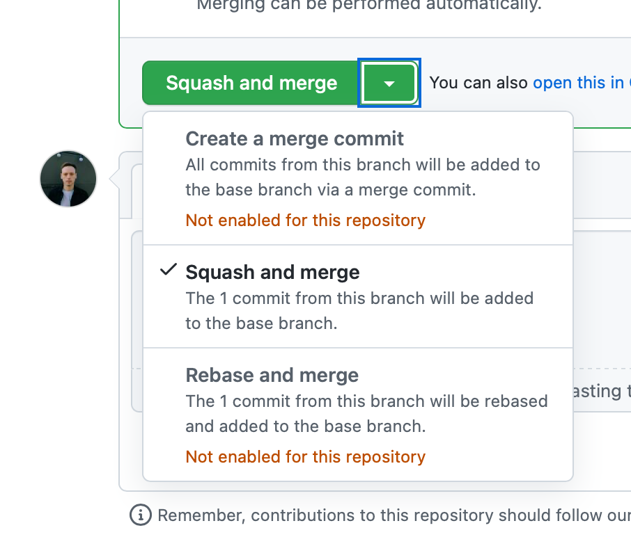
I found this pattern where a single selection item is used together with a confirm button.

We should provide better guidelines and examples on what the best alternatives are to this.
Concern with this pattern
Check marks (single selection ActionList items) are meant for final actions as they don't provide the feeling of confirming your selection.
Things that come to my mind that could use clarification:
Testing issue triage
Our saving docs is already doing a great job at providing guidelines but on when to use cancel button and when not.
One relevant bit on saving is:
When data is not automatically saved after the user makes changes, buttons are used to submit or cancel the changes.
This might imply we should always include a cancel button but that isn't correct. For example on a login page this won't be useful.
Considerations:
cancel button be used on intermediate form pages (not just modals)This issue arose from primer/react#2593.
The SplitPageLayout component uses a small form with an input and submit button to allow for adjusting the pane width without the need for pointer input. This form is visually hidden, meaning that in its current implementation that only screen reader users will be aware of its presence.
Controls such as this need to also be visually apparent on focus. While only the SplitPageLayout component has this need right now, I anticipate other components needing similar functionality—and therefore a consistent visual treatment—as our Primer accessibility work continues.
Currently there is no one set way to handle this kind of content. The closest examples I am aware of are our Skip to main content link and our dashboard favorites reordering functionality:


I am thinking that this is worth codifying as something that can be used as a subcomponent for other components, to help ensure a consistent, accessible experience that feels like it is a part of Primer. We'll likely want something along the lines of how our Dialog component looks.
Currently the Codepen 2 Col Layout Template is experiencing roadblocks due to some SCSS and CSS difficulties.
I found out later that the link in the templates is only calling on primer's CSS, and doesn't contain complete styling: https://unpkg.com/primer/build/build.css
Even after trying to call it directly, codepen is still having trouble:
https://github.githubassets.com/assets/github-12f3b278e437ae91b8bc11dcaa8f135f.css
Currently the 2 Col Demo is being run on a Jekyll + Primer github pages site, but will need to be fully ported over after Responsive Navigation designs have been decided upon.
http://joshuashao.design/2ColPrimerTest/
Edit: Another reason porting this over into another environment was that it was helpful to see the underlying of the styling; unfortunately this isn't possible in codepen
Creating Typography Guidelines for Primer Design Guidelines.
Live Iterations can be found here:
https://primer-design-typography.now.sh/design/foundation/typography
Our form guidelines already provides a lot of good information on how to provide validation in multiple scenarios however it's missing cases where the input it limited to just numbers.
Currently there are no examples of disabled states as well as no pattern for letting the user know why an item is disabled.
Considerations
Links
We need to add a redirect for primer.style/design ➡️ primer.style/interface-guidelines
Page: https://primer.style/design/global/accessibility
In the Overview section, 508 Reference Guide - 1194.22 points to a link which returns a 404 page.
This came up in response to: https://github.com/github/github/pull/107687
(also https://github.com/github/github/issues/106809)
We don't have an easily repeatable pattern for clearing filters across the site, which leaves people to create a custom solution when needed. It may be worth coming up with a consistent pattern here.
I think it might be worth including Filters/Clear Filters patterns in the design guidelines to help inform future design decisions.
PRs and Issues

File Diffs - Clear File Filters (Old)

File Diffs - Clear File Filters (Updated)**

👇 no filters selected/applied 👇

👇 commit and file filters applied 👇

https://styleguide.github.com/primer/principles/accessibility/
image on this page https://primer.style/design/tools/figma is being squashed on safari; appears normal on chrome + firefox.


I'm running Safari Version 14.0.3 (16610.4.2) on macOS Big Sur 11.2 Beta (20D5029f)
but also tested on Safari Version 13.1.2 (15609.3.5.1.3) on macOS Catalina Version 10.15.6 (19G2021) and it's the same thing...

Docs for truncation has been removed, but we have a link to that page on website, that causes 404 error.


The truncation page is remove from Navigation menu and A11Y main page
Looks like something went wrong between after effects and shipping the animation, the Primer blue's are all dulled and not rendering correctly. It's possible this is on the after effects export end, or may be something we can fix in code.
cc @ashygee
Problem
There are currently no guidelines on how to use loading states throughout GitHub.
Considerations
Originally posted by @broccolini in https://github.com/_render_node/MDIzOlB1bGxSZXF1ZXN0UmV2aWV3VGhyZWFkMTQyNTMzOTYzOnYy/pull_request_review_threads/discussion
@broccolini's idea to create a global support notice for Design Guidelines
Rather than create redundant sections for User Support across articles, creating a global notice applicable to all other guideline articles that aid users in navigating help and support from the Primer Team.
Creating a reusable "support component" for us to use could be really helpful!
Color & design tools
Currently our components are lacking guidelines as well as functionality on how clearing selections in a SelectPanel or SelectMenu should work. This is especially a problem when you have multiple items selected and quickly want to clear those
Exploration by @asiermartinez

Now that we have the wonderful Dialog documentation out, we might want to expand the documentation around dialog when used for alerts, warnings, or destructive purposes.
As @edokoa pointed out here, this sort of dialog doesn't follow a clear set of patterns, therefore we end up with different variations often used for similar use cases.

Add a new Dialog usage section (similar to the Button usage), or a subsection inside the Messaging guidelines. This documentation could cover:
Slack thread reference (internal)

These guidelines summarize how we use typography at Github, and serve as guardrails for designers to design freely with best practices in mind.
Good typography enhances the user’s experience by providing a well-structured vessel to hold a product’s content
At Github, our teams utilize system-fonts, which allow for optimized performance. This design decision takes advantage of:
Segoe UI for Windows
San Francisco for macOS and iOS
Ubuntu for Ubuntu Linux (most commonly used in Linux distros)
font-family: -apple-system, BlinkMacSystemFont, "Segoe UI",
Helvetica, Arial, sans-serif, "Apple Color Emoji", "Segoe UI Emoji", "Segoe UI Symbol";
For more information on how Github uses typography for product design, check out Mark Otto’s article: Shipping System fonts to Github.com

Utilize components
Primer has many typographic solutions that have been created for developers and designers. Please refer to the docs to access them
List of helpful components:
Be aware of our usage of system-fonts:
Because Github font-stack defaults to system-fonts, it is important for designers to be aware of this fact when making design decisions. It’s recommended designers become familiar with typefaces themselves, and understand their nuances.
Please refer to the Typefaces section of this document to access our font-stack and resources.
Layouts and Typographic Guidance:
Line length:
Line length is important to consider when designing with body text in mind. Cases vary depending on the situation, but this serves as a general rule of thumb for developing products at Github
Type Consistency:
Don’t overuse different type sizes, weights, and styling. Try to keep this to a minimum in order to
etc.
hello!
all the links to figma resources listed in: https://primer.style/design/tools/figma#Resources are broken (at least to me)
Broken link sample: https://www.figma.com/file/WARYmZzsypbLrC6CDyE29dRA/primer-navigation
are the figma links updated?
I think we'd have to store and load those fonts ourselves, probably use @fontface to specifically target the fonts. This would be nice but not essential right now. Let's make an issue to follow up with this. Ideally we would have use the live editor too so that people can type and test how the font would look like on google fonts. Only thing I'm not sure about is copyright so that's worth checking.
Originally posted by @broccolini in #15
Live Editor for typography implemented into Design Guidelines, allowing users to test out different typefaces for different use cases
Add the illustration guidelines from this PR: primer/primer.style#101
Just linking to components isn't super helpful. We should show components when giving examples on how to use typography. I'd like this to be replaced with a section on "Applying typography" with examples of it in practice, in components and chunks of UI. However I think that could be a lot of work and would be happy if you make an issue for that for now and we follow up with that at a later date.
Originally posted by @broccolini in #15
11.28.2018
'Applying Typography' section has been added. This can be expanded in future iterations to house visual usages. Possibly as sub-section called “In Use” or “Use Cases” or something
GitHub links don't open in a new tab. Or at least that seems to be the norm across most of the website. Our UI Guidelines should document this pattern and detail if, by any special reason, we should ever allow target="_blank" to be used.
I came across this usage of a Flash alert inside of a details-dialog that felt a bit off:

Should we add some documentation about whether or not Flash alerts should be used inside of dialog components? To me it feels a bit redundant since the dialog itself is sort of like an alert but I wasn't 100% sure if this is something we should discourage or not.
I noticed that the Messaging section doesn't include anything about details-dialog elements that are frequently used to confirm actions or provide more information. Though we don't maintain details-dialog I still think it would make sense to provide usage guidelines for them as they are frequently used bits of our UI.
Example of a details-dialog being used to confirm actions:

It also seems anti-pattern to put a question in the header/title of the dialog - maybe we could provide some usage guidelines for that as well.
Hello!
Do you plan to update community shared Figma designs to reflect the latest changes in Github UI (which is experimental, I guess)? I'd like to use Primer for my personal project, and I'd like to use updated design.
Right now, it's not immediately clear how to style an Octicon when it's paired with a link.
Should the Octicon be wrapped within the link, and have the same color/hover states applied? Or should the link color/hover color behave independently of the icon it's paired with.
Examples:


The current ship of the new blankslate component will include replacing major empty states with pictogram-based blankslates. However, for new users, illustrations can provide a much more personalized experience and and introduce the user to the octocat as a symbol of GitHub.
We need to add design documentation for when to use these illustration blankslates. This can come after the new blankslate design is merged into both Primer CSS and Primer Design.
Initial thoughts and draft of the copy for this section can be found at the bottom of this Gist.
Our ActionList guidelines already provides a lot of good information on how to use it but I've spotted one use case that's missing.
Currently there are no examples of disabled states as well as no pattern for letting the user know why an item is disabled.
Action
Examples of what designers have come up with in the past:


These button usage guidelines will guide designers and developers in implementing consistent buttons across GitHub products.
Currently, Primer CSS and Primer Components all house code and technical implementation instructions. These guidelines are meant to serve as a way to understand best practices and common usages.
I was reading the Primer interface guidelines for icons and noticed that quite a few of the links are broken. For example, the Library section contains a link:
At Primer, we utilize the Octicons icon library.
Looking at the source for this link, it's obviously meant to point to https://primer.style/octicons/, which is the correct URL, but something on the site is prepending /design to the path, even though the link starts with a slash. This means the document links to https://primer.style/design/octicons/ instead, which is 404'ing.
This problem also exists for many other links on the same page, and possibly other pages in the guidelines.
A current issue mentioned problems with the flash banner being semi-transparent in dark mode.

However I believe the issue arises from incorrect usage of the flash component due to the documentation missing content on the positioning.
I think the flash alert is not supposed to be floating above the page but should be part of the default layout flow.
This needs to be clarified in the guidelines.
Could you add a license to this repo? thanks. :)
Some issues with accessiblity we should write about in the tooltips design guidelines https://github.com/github/github/issues/120980
When designing for the Figma docs page, I accidentally created something that looked like it could be iterated upon to become the landing page for primer/design. I noticed that the front page didn't have much guidance on where to go right now, so I thought I might take a shot at getting this started.
Currently the page looks like:

What I would like is for the page to have some actionable, custom React components that welcome the user and tell them where to get started:

I would love to build this, but would like some feedback about whether we are comfortable going this direction. If so, I can pair with Shawn or Emily to create the component and open up a PR.
Here's the Figma
cc/ @emilybrick @ashygee
When <img> is does not have self closing slash like <img />, vercel deploys broke completely.
<img > is considered valid HTML as it is a void element, but for some reason <img > breaks vercel deploys.
Apparently <img> is not valid in XHTML or XML and needs to be <img /> so maybe XHTML or XML is being used under the hood somewhere? Not sure
We should investigate why this breaks and/or add a lint rule so we catch this at the linting stage and prevent future headaches.
700. Should this be 600 as seen on Primer CSS or leave as is which is in line with Primer Components? (cc @broccolini)These should be mark as "in maintenance mode" with a link to Figma as our supported design tool.
This should feel like part of the family of primer.style illustrations used on primer.style and primer.style/components.
Though the illustration style is abstract, the components illustration hints at the idea of "components", and so the design guidelines illustration should hint at design, interaction, UX, and documentation.
Links to Figma ressources in the tools page are redirecting to Figma's File not found page.
 React
React
A declarative, efficient, and flexible JavaScript library for building user interfaces.
🖖 Vue.js is a progressive, incrementally-adoptable JavaScript framework for building UI on the web.
 Typescript
TypeScript is a superset of JavaScript that compiles to clean JavaScript output.
An Open Source Machine Learning Framework for Everyone
 Django
The Web framework for perfectionists with deadlines.
 Laravel
A PHP framework for web artisans
Bring data to life with SVG, Canvas and HTML. 📊📈🎉
JavaScript (JS) is a lightweight interpreted programming language with first-class functions.
Some thing interesting about web. New door for the world.
A server is a program made to process requests and deliver data to clients.
Machine learning is a way of modeling and interpreting data that allows a piece of software to respond intelligently.
Some thing interesting about visualization, use data art
Some thing interesting about game, make everyone happy.
 Facebook
We are working to build community through open source technology. NB: members must have two-factor auth.
 Microsoft
Open source projects and samples from Microsoft.
 Google
Google ❤️ Open Source for everyone.
 Alibaba
Alibaba Open Source for everyone
 D3
D3
Data-Driven Documents codes.
 Tencent
China tencent open source team.